查看完整案例

收藏

下载

翻译
Children gathered at the playground in every alley. It was a place to talk, run around with friends, and do what you wanted. All the scenery we could see looked around. It was a free and dynamic space, but we felt completely at ease when we remembered that time. When I first met the client and entered the space, there was an unknown partition installed that made it impossible to guess whether it was a dining hall in the past. The traces surrounded by mold gave the impression that it had been there for many years.
The client said they wanted a warm space where everyone felt comfortable, along with vibrant and colorfully colored drinks. While listening to the story, I saw a playground where children played outside the curved window. At that time, some of the old memories that came to me during my busy daily life were of warmth. I started this project by recalling childhood memories of playing at the playground and how ordinary daily life became filled with various colors and emotions.
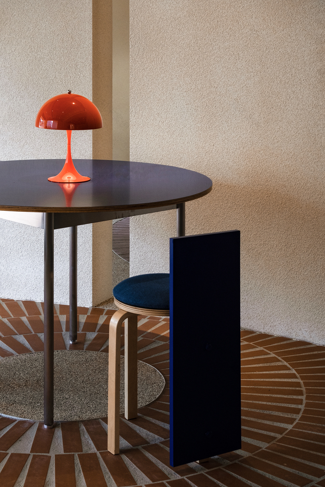
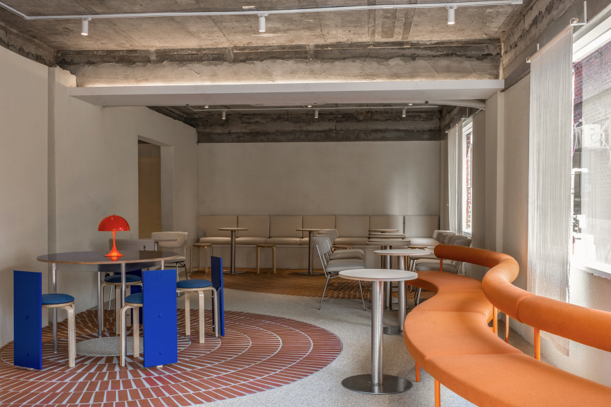
The space is part of the playground outside the window, and we thought it was important to create harmony as an extension of it. We tried to imbue the space with the impression of primary color tones and free shapes that characterize the playground. However, including only a fully vibrant play area design was lacking in providing the sense of comfort and coziness that our clients were looking for. Therefore, we hope the colorful ade will become an element of the space under the well-organized tone and warm atmosphere. The primary-colored furniture and the scenery outside the window become the center of the space, and the curved facade of the existing building naturally connects with the interior, creating a dynamic sense of life as the surface of the interior space rolls as if children are playing. I wanted the design to coexist in two directions: dynamism and comfort.
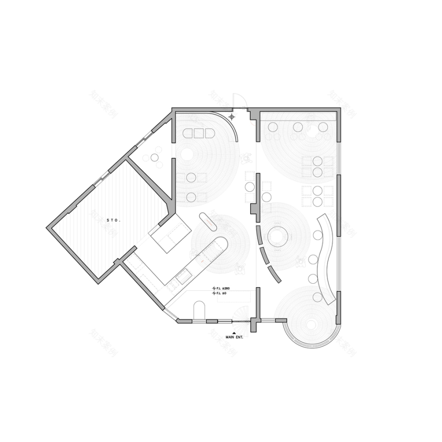
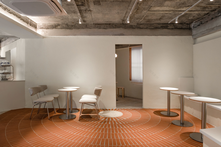
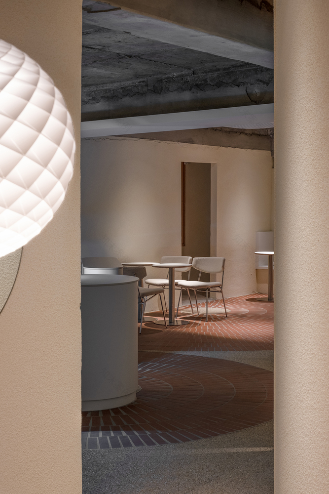
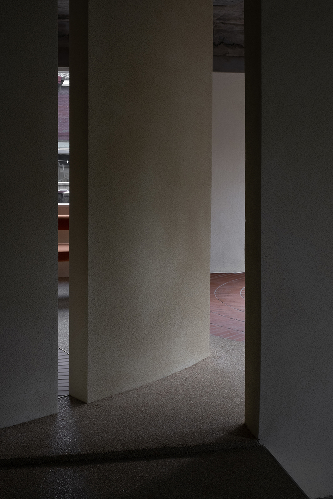
As you enter the entrance, the diagonal counter is intended to utilize the space but is arranged as if to play a prank on customers entering the space. The diagonal curved shape allows natural light coming through the window to flow through the curve, giving a strong warmth while also raising questions about the space behind it, visible through the gap. The interior floor was designed in a dynamic form, imagining the feel of a park walkway, and harmonized with the burgundy brick exterior of the existing building. Brick tiles and epoxy gravel materials were chosen to add warmth and connection between the interior and exterior. The warm white color makes the curved shape and light stand out more. It will harmonize with the primary colored furniture and dynamic flooring. Afterward, I hope to be able to look out the window and see the disappearing border between the inside and the playground outside the window.
To put it simply, a playground is a play of colors and a feast of shapes. Although it looks like a combination of complex shapes and colors, I simplified it with lines and understated tones throughout the study. The branding logo evokes the afterimage of "nori" (the Korean word for play is pronounced as "nori" when pronounced verbally), which is pronounced like a baby cooing, and the "o" rolls down and embodies the "norrri" logo.
客服
消息
收藏
下载
最近


