查看完整案例

收藏

下载

翻译
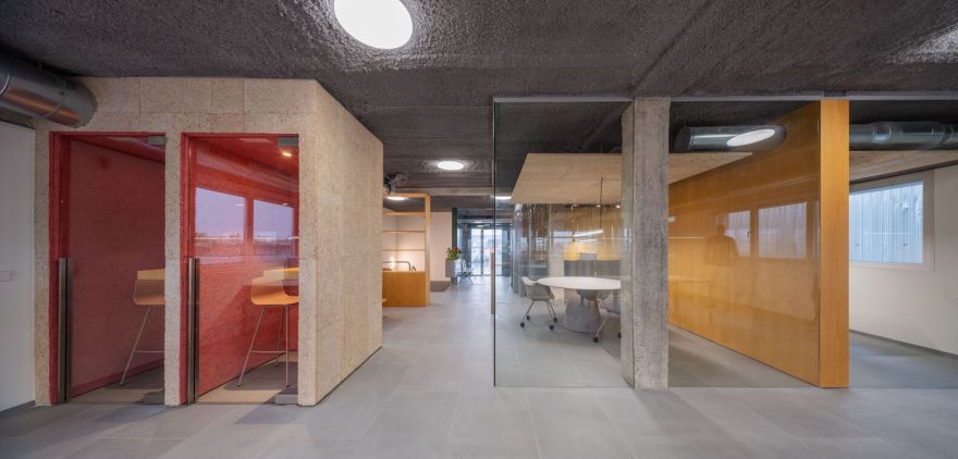
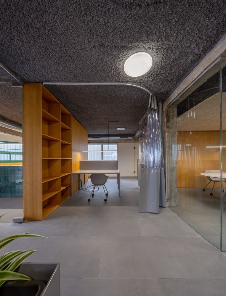
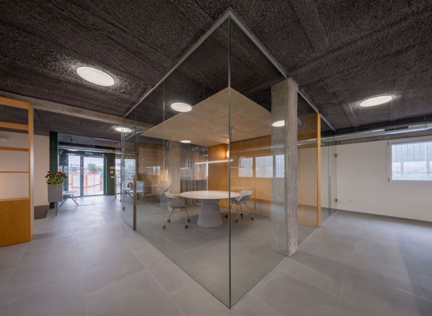
The renovation of the offices of this SME dedicated to the sale of agricultural products represents a significant change in its work environment. The need to update the facilities arose as a response to the evolving demands of a changing work world and the ambition to align the company's image with its growth strategy. The existing building had an inefficient layout and an overall outdated appearance. A dark central corridor served as access to a series of offices of varying sizes, creating a fragmented atmosphere and a perception of an opaque organization. The lack of connection between the multiple rooms hindered collaboration, communication among employees, and the welcoming of visitors.
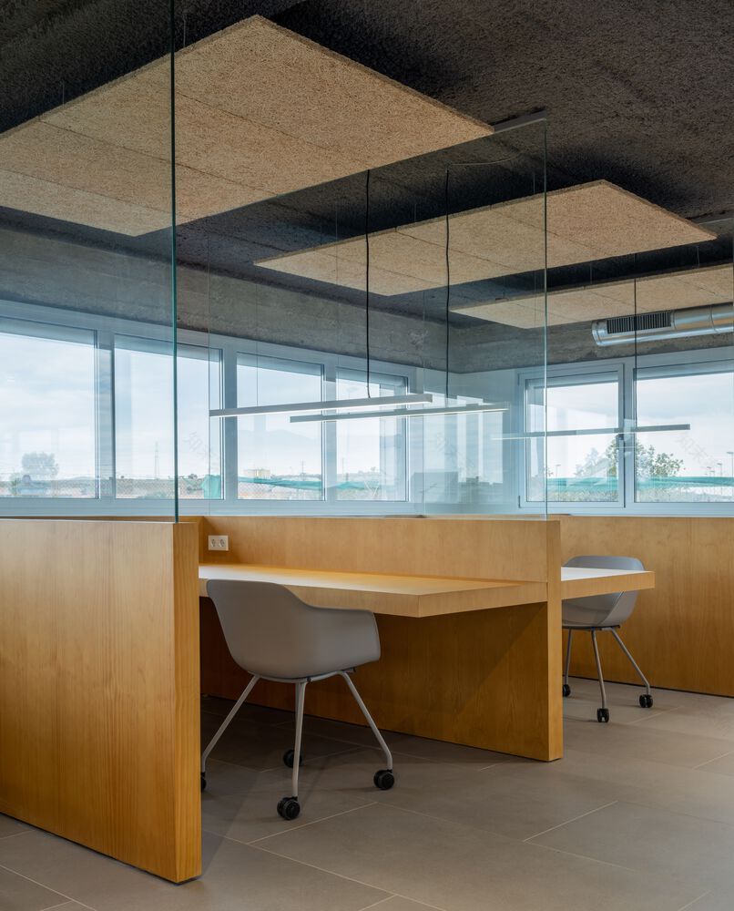
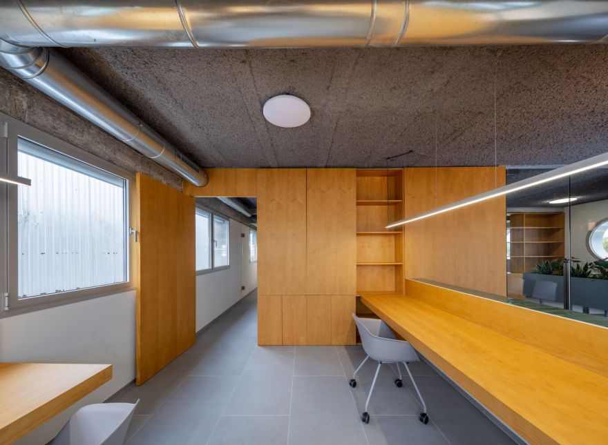
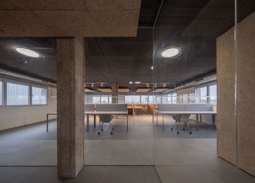
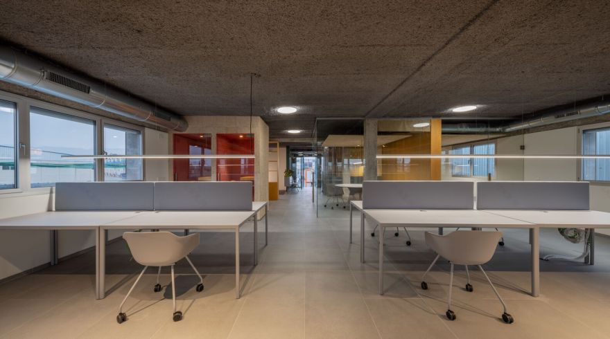
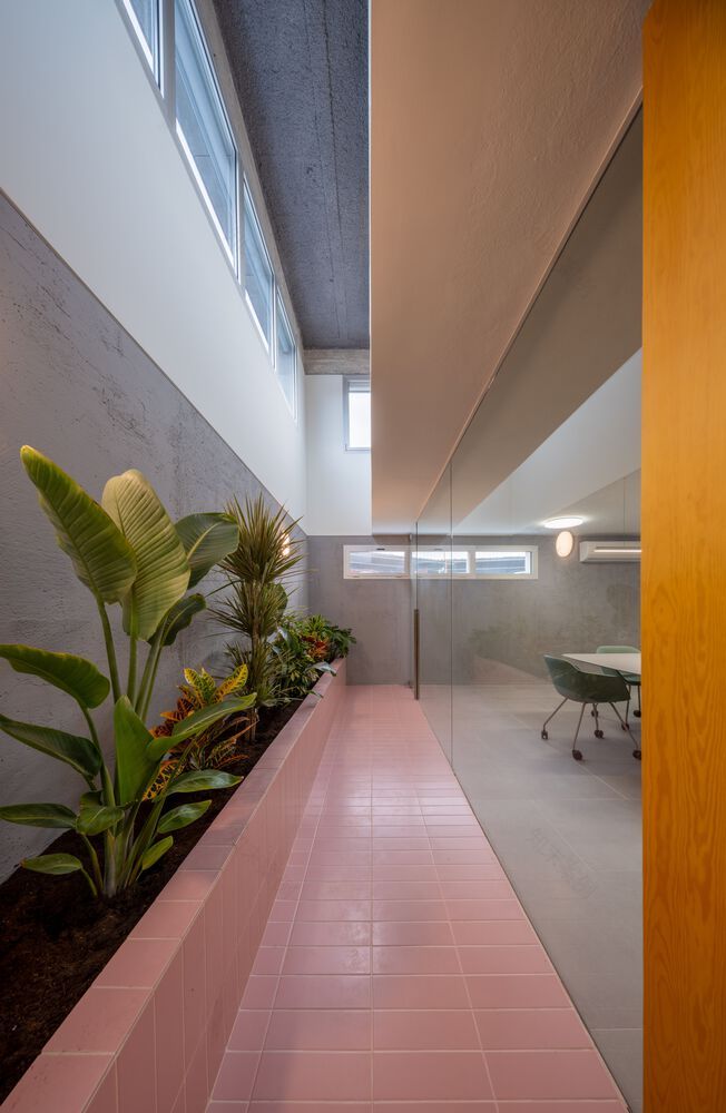
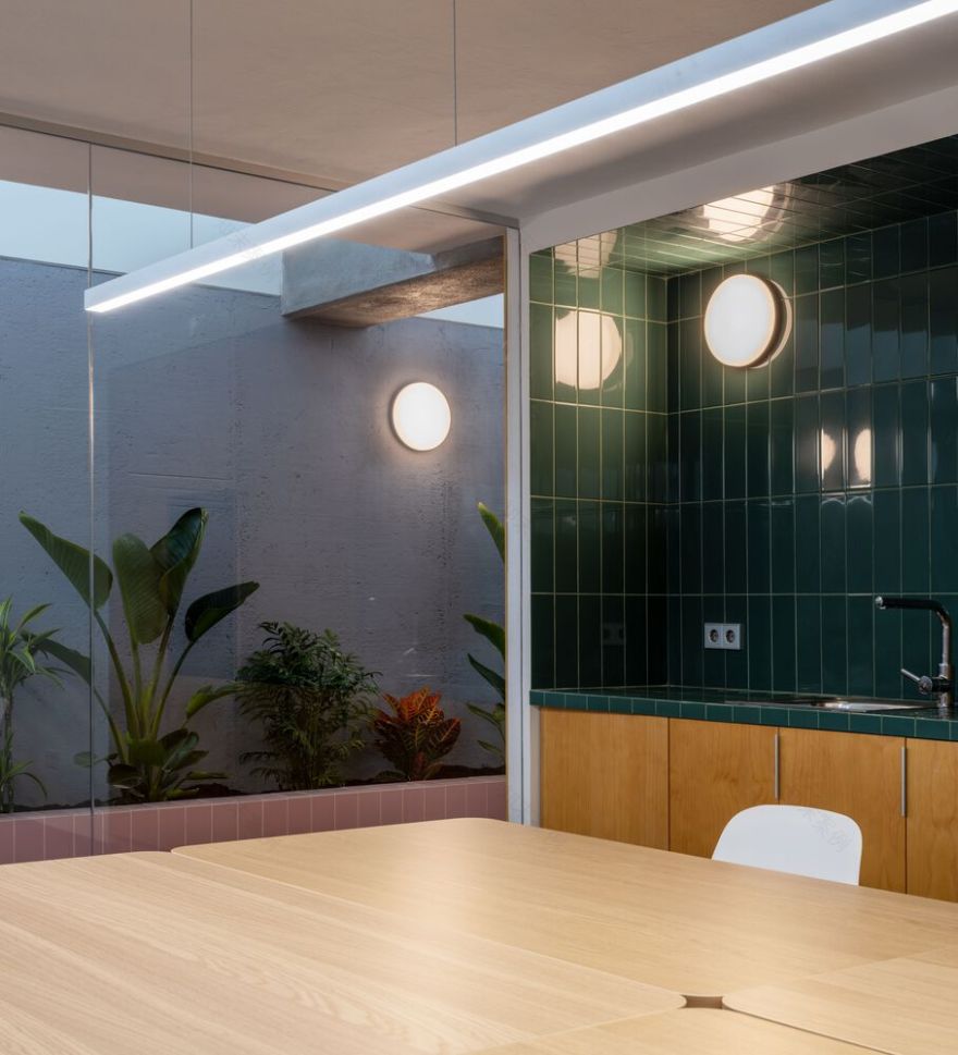
The main focus of the project was to optimize the available space, maximize the number of functional workstations, and ensure adequate natural lighting and ventilation for all of them. As a result, all workstations were relocated to the main floor, adopting a semi-open layout that encourages interaction among employees. To enhance the quality of the environment on the lower floor, an opening was made in the floor, creating a small landscaped interior courtyard that serves as a lung and a source of light for the spacious meeting rooms located on this floor.
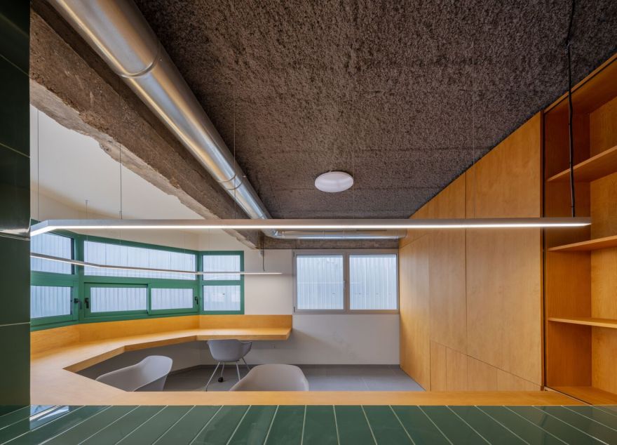
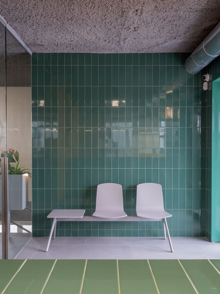
The selection of materials and the color palette used in the design align directly with the brand identity. We chose to harness the possibilities offered by honest and durable materials such as wood and ceramic. The chosen colors reflect the company's brand and the spatial hierarchy and organization seek to create a welcoming and familiar atmosphere for both workers and visitors, reflecting some of the company's core values. This focus on the spatial experience contributes to strengthening the company's identity and creating a healthy, pleasant, and cohesive work environment.
In summary, the office renovation project of this SME, traditionally distant from the world of design, has successfully transformed an outdated space into an attractive and functional environment. The new layout, openness, and transparency of the space, along with attention to design details, reflect the company's commitment to growth, efficiency, and team cohesion. This project not only improves the functionality of the offices but also contributes to strengthening the brand identity while creating a healthy and productive work environment.
客服
消息
收藏
下载
最近


