查看完整案例

收藏

下载

翻译
WilkinsonEyre was appointed for the redevelopment of the former River Plate House, Finsbury Circus, following a design competition in 2011. Their scheme works to the client’s overall requirements for an ‘exemplary’ new office building in this historic City setting. The site, which is adjacent to the listed Britannic House by Edwin Lutyens, has access from both Finsbury Circus and South Place.
Full planning permission was granted in 2012 to replace the existing 1980s building with the new scheme, which provides more than 15,000m2 of Grade A, flexible office space with ground floor retail.
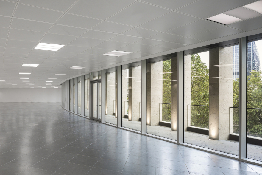
The main challenge was convincing the City Planners to allow the demolition of the existing building. Further constraints required that the new building should retain a mansard, as other buildings in the Circus, and that the building should not be seen above the height of the existing mansard when viewed from the south side of the Circus. Careful modelling resulted in stepping back the upper levels to create generous terraces, allowing the net area on the site to increase by approximately 23%.
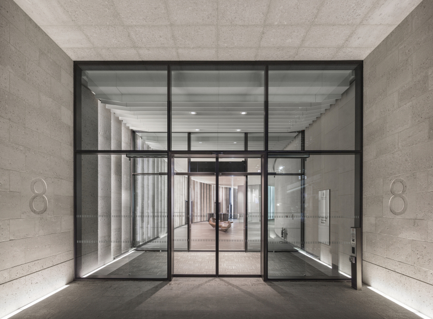
WilkinsonEyre’s interpretation of a traditional City building has resulted in deeply modelled Portland stone and bronze facades, detailed in a contemporary manner. A portion of the north façade, dating from the 1920s, has been retained with an existing colonnade opened up to form a new entrance. Juliet balconies and dormer windows within the mansard with their crisp, frameless glazing continue the theme of traditional elements given a modern twist. Castings from the building’s original railings have been retained and embodied into the walls of the entrance.
WilkinsonEyre’s proposals maximise the full development potential of the extremely constrained site, whilst respecting the surrounding listed buildings. Entrances on both the north and south provide access to a generous lobby that runs through the length of the ground floor anticipating the change in the movement of office workers to the building following the opening of new ticket halls at Liverpool Street and Moorgate for Crossrail in 2018, also designed by WilkinsonEyre.
The building is configured around a central core, providing large column free office space at all levels. A sculptural main circulation stair has been positioned with good visibility from the core to encourage use of the stair between floors.
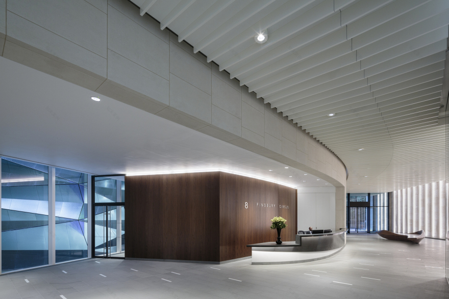
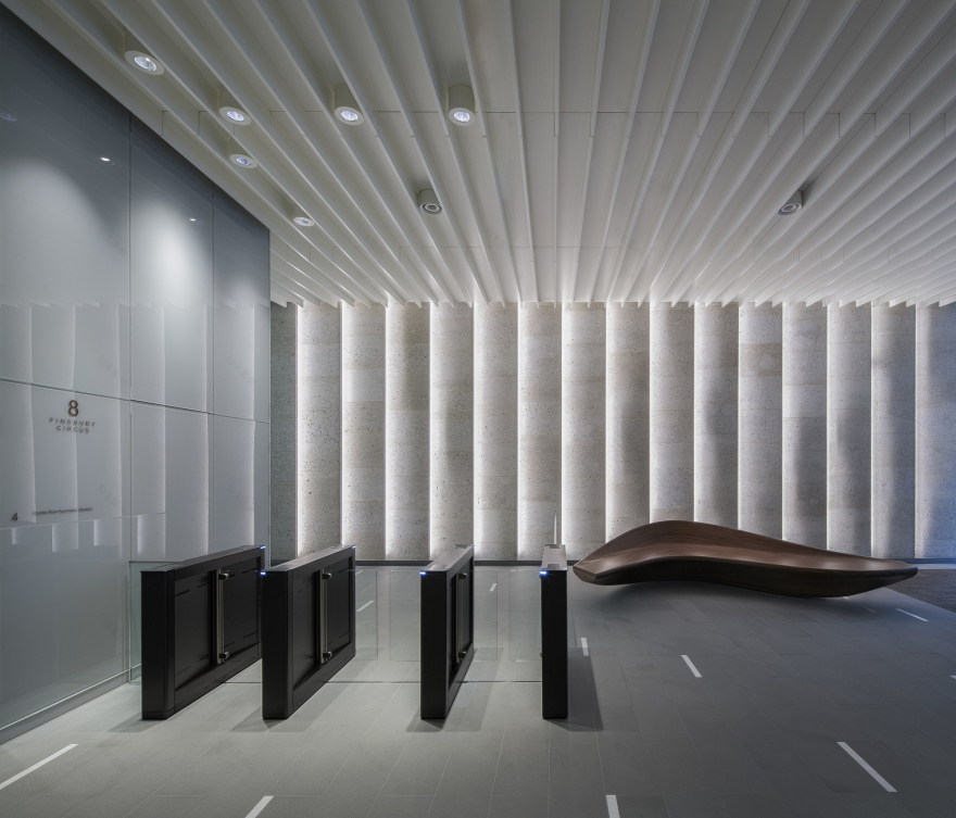
Within the impressive reception a traditional palette of stone, bronze and walnut is imaginatively detailed to provide an uplifting environment for the occupiers. The lift shafts, in translucent glazing, provide both a source of light and movement, with the lift cars casting shadows as they rise and descend. WilkinsonEyre has designed two walnut veneered sculptures which act as focal points within the large space and provide a place to sit.
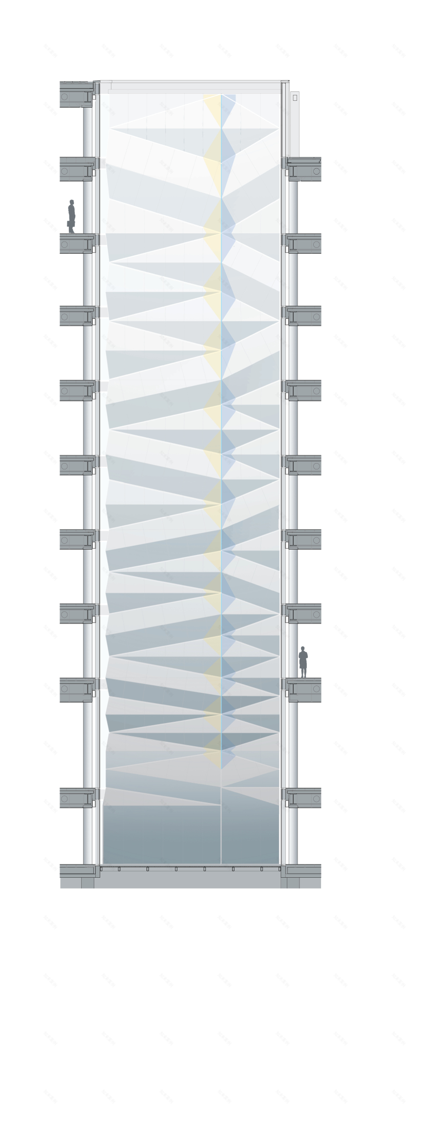
A walnut clad recess in the curved stone wall on the east side of the reception houses a sleek reception desk and provides views into the lower levels of the lightwell. The lightwell brings daylight down through the building and provides a visible connection between floors. An art installation by Carpenter Lowings, commissioned for the project, runs the full height of the lightwell. The dynamic piece, composed of folded stainless steel panels, was developed in response to a brief prepared by WilkinsonEyre that sought both a focal point and device to introduce reflected light into the depth of the building.
’Folded Light’ – which has been designed specifically for a slender void space in the building measuring approximately 9 metres by 4.5 metres – serves as a strong visual connection between the lower ground floor and roof. Manufactured from pattern-rolled stainless steel, ’Folded Light’, is an asymmetrical arrangement of mostly triangular, three-dimensional folded panels of varying sizes and different folding angles. Together, these create a single continuous rippled surface that appears more compacted toward the bottom as if compressed by the weight of the form above. The angles of the folds are intended to enhance the drama in the existing light conditions by catching natural light from above and contrasting it with shadow below. The entire wall is split by a vertical blade of dichroic glass which separates the spectrum of light into two, complementary sections. This results in a contrasting range of colours when viewed from either side of the void space.
客服
消息
收藏
下载
最近


