查看完整案例


收藏

下载
架构师提供的文本描述。反思、惊奇、颠覆传统光学商店的审美逻辑和功能逻辑。总的来说,挑战在于将传统的太阳镜和眼镜销售转变为新的产品曝光和客户生产方式。与概念设计一样重要的是,工作成本是大多数体系结构决策的指导方针。每平方米工程的估计起价应比平均市场成本低60%。
Text description provided by the architects. Rethink, surprise and subvert the aesthetic and functional logic of traditional optical stores. Overall, the challenge was to transform traditional sunglasses and eyeglasses sales to new perspectives of product exposure and customer-production approach. As crucial as the conceptual design, the cost of the work was the guiding line for most architectural decisions. The estimated starting price for each square meter of work should correspond to 60% less than the average market cost.
Text description provided by the architects. Rethink, surprise and subvert the aesthetic and functional logic of traditional optical stores. Overall, the challenge was to transform traditional sunglasses and eyeglasses sales to new perspectives of product exposure and customer-production approach. As crucial as the conceptual design, the cost of the work was the guiding line for most architectural decisions. The estimated starting price for each square meter of work should correspond to 60% less than the average market cost.
© Ilana Bessler
(c)IlanaBessle
对产品的感知以及商店的布局应该参考艺术画廊:产品曝光和生产故事的中性基础。
The perception of the product as well as the layout of the store should refer to art galleries: neutral base for product exposure and production storytelling.
The perception of the product as well as the layout of the store should refer to art galleries: neutral base for product exposure and production storytelling.
作为墙上的“像素”,眼镜的类型和名称将取代传统的架子和/或展示柜。贴在墙上的文字会显示出对品牌和产品的好奇。
As "pixels" on the wall, the types and names of the glasses would replace the traditional shelves and / or display cabinets. Texts applied to the walls would show curiosities about the brand and the products.
As "pixels" on the wall, the types and names of the glasses would replace the traditional shelves and / or display cabinets. Texts applied to the walls would show curiosities about the brand and the products.
© Ilana Bessler
(c)IlanaBessle
由于预算减少,我们决定将大部分资源用于两条战线-入口处和“画廊”。我们用石膏,水泥做地板和楼梯,用铅照明。在大厅里,目标是创造一种温暖而诱人的气氛。一片的低光地区,墙上有植物和图片,地板上有佩洛巴木,这应该传达出“家”的想法。除了主楼层和入口大厅外,我们还设计了地下空间,作为摄影展览的基础。
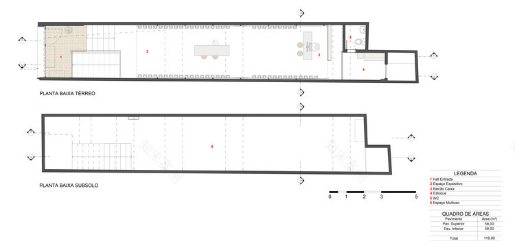
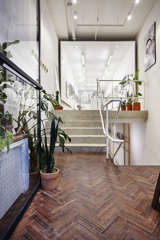
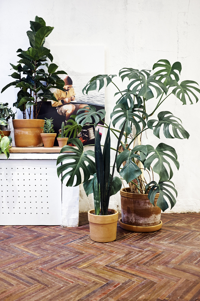
Due to reduced budget, we decided to apply most of the resources in two fronts –entrance hall and "Gallery". We used gypsum plaster, cement for floor and stairs, and led lighting. On the hall, the goal was to create a warm and inviting atmosphere. An area of low light, with plants, and pictures on the wall, and Peroba wood on the floor should convey an idea of "home". Apart from the main floor and the entrance hall, we also designed the underground space, which received a pinewoods structure as base to photographic exhibitions.
Due to reduced budget, we decided to apply most of the resources in two fronts –entrance hall and "Gallery". We used gypsum plaster, cement for floor and stairs, and led lighting. On the hall, the goal was to create a warm and inviting atmosphere. An area of low light, with plants, and pictures on the wall, and Peroba wood on the floor should convey an idea of "home". Apart from the main floor and the entrance hall, we also designed the underground space, which received a pinewoods structure as base to photographic exhibitions.
© Ilana Bessler
(c)IlanaBessle
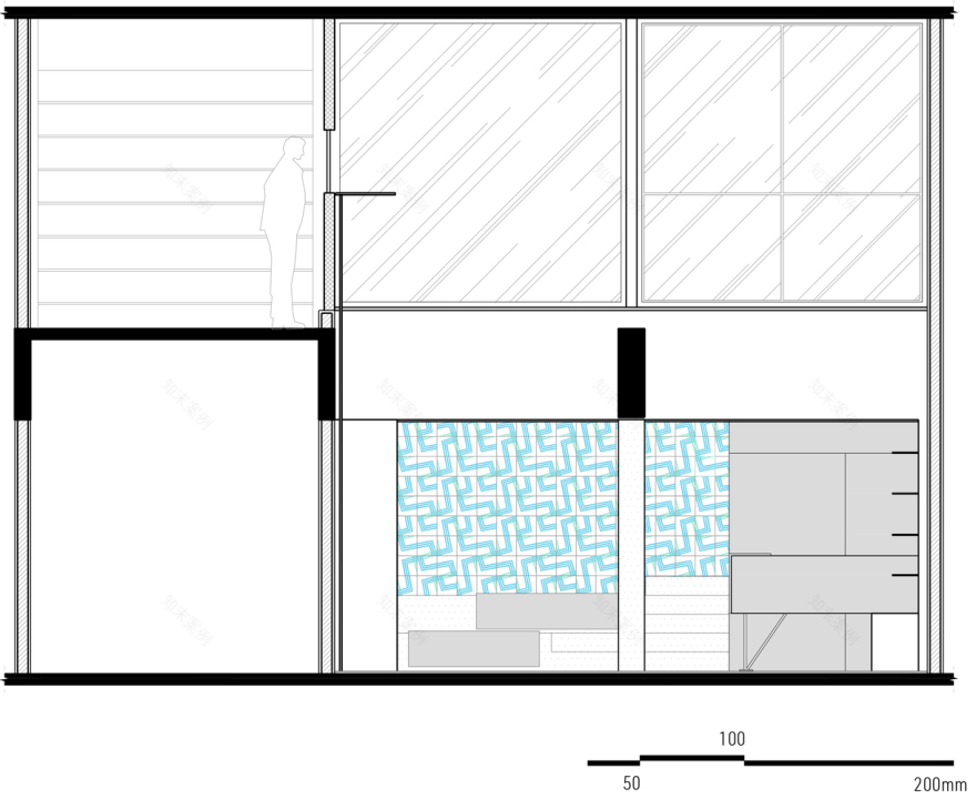
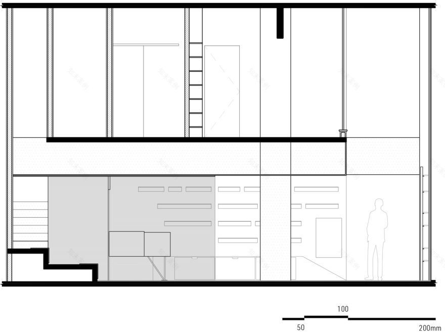
The "great idea" of the project was the so-called FLOATING GALLERY. An “exhibition tunnel”, loose on all sides, with predominant lighting in regard to other spaces of the store, should stand out and stimulate the curiosity of pedestrians at the street. The perspective of the box and the illumination design conduct the gaze and direction of the flow. Due to the experience inside the store, it is possible to understand some of the history of how the glasses are produced and experiment products in different mirrors. Immediately behind the counter, we set the stock. To solve doubts about quantity of models stocked while in the clients area, we used a translucent panel. Thus, it is possible to have control without having to move there. An acrylic weave separates the stockpiled collections into cardboard boxes. In the lower floor, a free plant allows multiple uses, from photographic exhibitions, classes and events.
The "great idea" of the project was the so-called FLOATING GALLERY. An “exhibition tunnel”, loose on all sides, with predominant lighting in regard to other spaces of the store, should stand out and stimulate the curiosity of pedestrians at the street. The perspective of the box and the illumination design conduct the gaze and direction of the flow. Due to the experience inside the store, it is possible to understand some of the history of how the glasses are produced and experiment products in different mirrors. Immediately behind the counter, we set the stock. To solve doubts about quantity of models stocked while in the clients area, we used a translucent panel. Thus, it is possible to have control without having to move there. An acrylic weave separates the stockpiled collections into cardboard boxes. In the lower floor, a free plant allows multiple uses, from photographic exhibitions, classes and events.
© Ilana Bessler
(c)IlanaBessle
为了使每个项目具有唯一性、永恒、忠诚于品牌和客户期望,我们致力于创造性的协作过程。在本项目中,品牌的设计者和所有者参与了一个重要的工作:他们负责家具的共同创造。从建筑到家具,存在着不浪费的问题。商店的原始结构已经被保存并被完全利用,以在美学上对最终的氛围做出贡献。
In order for each project to have uniqueness, timelessness, fidelity to branding and customer expectations, we are committed to creative collaborative processes. The designers and owners of the brand participated in a significant way in this project: they were responsible for the co-creation of the furniture. From architecture to furniture, concern for non-waste was present. The original structure of the store has been preserved and totally exploited to contribute aesthetically to the final ambience.
In order for each project to have uniqueness, timelessness, fidelity to branding and customer expectations, we are committed to creative collaborative processes. The designers and owners of the brand participated in a significant way in this project: they were responsible for the co-creation of the furniture. From architecture to furniture, concern for non-waste was present. The original structure of the store has been preserved and totally exploited to contribute aesthetically to the final ambience.
© Ilana Bessler
(c)IlanaBessle
客服
消息
收藏
下载
最近


