查看完整案例

收藏

下载
你的人生永远不会辜负你的。那些转错的弯,那些走错的路,那些流下的泪水,那些滴下的汗水,那些留下的伤痕,全都会让你成为独一无二的自己!
「家的简介」
本案是位于江苏海门的一套精装修改造案例,业主是一位 90 后的年轻时尚辣妈,有一个可爱的女儿,难以接受精装房交付后的丑陋样貌,她决定大刀阔斧的改造一番,为了追求自己内心想要的未来空间。相较于对功能更多的追求,她更加想要的是一个包容她精神需求的住宅,相比较空间的外在美感,她更在意空间的体验感。
This case is a set of fine decoration and renovation cases located in Haimen, Jiangsu Province. The owner is a young and fashionable hot mom born in the 1990s, and has a lovely daughter, who can’t accept the ugly appearance of the hardcover room after delivery. She decided to make a drastic renovation in order to pursue the future space she wants. Compared with the pursuit of more functions, what she wants more is a house that accommodates her spiritual needs. Compared with the external beauty of space, she cares more about the sense of experience of space.
「屋主需求」
1. 需要开放的,有互动体验的空间;
2. 喜爱轻食料理,咖啡重度爱好者,希望有个独立做咖啡和做轻食的区域,希望有足够多的储物空间,但又不能显的过分凌乱无序;
3. 需要给女儿预留一个独立学习的空间,而且便于她去辅导作业;
结合屋主的这些需求我们将设计的重心放在如何将空间打开,让空间更具互动性,更具开阔性,最大程度的放大整个空间。
1. Need an open space with interactive experience;
2. Lovers of light food and heavy coffee lovers hope to have an independent area for making coffee and light food, and hope to have enough storage space, but not too messy;
3. It is necessary to reserve a space for her daughter to study independently, and it is convenient for her to help with her homework;
Combined with these needs of homeowners, we will focus on how to open the space, make the space more interactive and open, and enlarge the whole space to the greatest extent.
「原始户型图」
1. 入户玄关南侧的墙体阻碍了门厅的视野,空间显得有些逼仄。
2. 狭小的厨房空间让屋主难以施展伸手,没有多余的空间给到咖啡和轻食制作。北侧的墙垛遮挡了北阳台良好的采光和视野。
3. 通往卧室的过道两侧除了门洞都是实墙,采光的缺乏让给原本紧凑的过道更显狭小。
4. 主卫的门洞正对着卧室床,让原本宽敞的卧室空间缺少隐私性,降低了屋主的居住体验。
1. The wall on the south side of the entrance hall blocks the view of the hall, and the space seems a little cramped.
2. The narrow kitchen space makes it difficult for the owner to reach out and there is no extra space for coffee and light food. The battlements on the north side block the good lighting and vision of the north balcony.
3. Both sides of the corridor leading to the bedroom are solid walls except the doorway, and the lack of lighting makes the originally compact corridor more narrow.
4. The doorway of the master guard is facing the bedroom bed, which makes the spacious bedroom space lack privacy and reduces the living experience of the owner.
「设计达成」
1. 将原本正对玄关的隔墙拆除,将墙体做薄向南偏移,扩大了门厅的进深感,墙面的挂墙收纳柜一直延伸至电视墙,底部和顶部悬空的设计让南面的采光更好引入到玄关。
2. 厨房连接过道的部分墙体拆除,只保留了剪力墙,让原本紧凑的厨房和餐厅空间更加开阔,增加了屋主的使用体验感。
3. 书房空间的打开增加了与客厅空间的互动性,而且让过道获得了更多的采光,移门的开合形式让书房空间更加富有灵活性。
4. 考虑到北卧空间的属性,屋主将其作为衣帽间使用,原来的主卫门洞重新移至面向衣帽间,不仅解决了卫生间门对床的尴尬与不适,其次卫生间门面向衣帽间更加利于屋主日常洗浴更衣,增加了实际居住体验。
1. Dismantle the partition wall originally facing the porch, and shift the wall thinly to the south, which expands the depth of the hall. The wall-hung storage cabinet on the wall extends all the way to the TV wall, and the suspended design at the bottom and top makes the lighting in the south better introduced to the porch.
2. Part of the wall connecting the kitchen aisle was removed, only the shear wall was retained, which made the originally compact kitchen and dining room more open and increased the owner’s experience.
3. The opening of the study space increases the interaction with the living room space, and makes the corridor get more lighting. The opening and closing form of the sliding door makes the study space more flexible.
4. Considering the properties of the north bedroom space, the owner used it as a cloakroom, and the original master guard door was moved to face the cloakroom, which not only solved the embarrassment and discomfort of the bathroom door to the bed, but also facilitated the owner’s daily bathing and changing clothes, which increased the actual living experience.
01 FOYER 玄关
门厅的整个柜体悬空处理,地面抽屉柜将白色一直延伸与电视柜相连接,增加整体空间的连贯性,让收纳更加细致,视觉上变得更加轻盈不显厚重,整体色调简单明了。并将儿童房的门外移,设计暗门的开启方式,与玄关柜门板颜色材质相统一,整个门厅的更具连贯性。
The whole cabinet in the foyer is suspended, and the ground chest of drawers extends white to connect with the TV cabinet, which increases the coherence of the whole space, makes the storage more detailed, visually becomes lighter and less heavy, and the overall tone is simple and clear.
The door of children’s room is moved outward, and the opening mode of secret door is designed, which is consistent with the color and material of porch cabinet door panel, so that the whole hall is more coherent.
02KITCHEN 厨房
拆除厨房两侧的墙体,放大了空间体验感,北侧的水槽下柜向外延伸,从而增加了厨房的操作及储物空间。整体的橱柜采用深色地柜与白色的吊柜的组合方式,吊柜的中间木纹板平衡了两侧高低柜之间的视觉冲突。
Demolition of the walls on both sides of the kitchen magnifies the sense of space experience, and the lower cabinet of the sink on the north side extends outward, thus increasing the operation and storage space of the kitchen. The whole cabinet adopts the combination of dark floor cabinet and white hanging cabinet, and the wood grain board in the middle of the hanging cabinet balances the visual conflict between the high and low cabinets on both sides.
03RESTAURANT 餐厅
本案用了不同层次的天花将其包裹起来,厨房餐厅高低层次的天花设计也区分了中西厨空间。考虑到餐厅北侧除了低矮的梁位之外,顶面的新风管道也占据顶面部分空间,为了让顶面天花更加协调,我们将冰箱柜的门板延伸到顶面充当天花饰面,顶面不同材质的区分也增加空间的层次感。
In this case, it was wrapped with different levels of smallpox, and the ceiling design of the kitchen and dining room also distinguished the Chinese and western kitchen spaces. Considering that in addition to the low beam position on the north side of the restaurant, the fresh air duct on the top also occupies part of the space on the top, in order to make the ceiling on the top more harmonious, we extend the door panel of the refrigerator cabinet to the top as the ceiling decoration, and the distinction of different materials on the top also increases the layering of the space.
考虑到餐厅北侧除了低矮的梁位层次感之外,顶面的新风管道也占据顶面部分空间,为了让顶面天花更加协调,将冰箱柜的门板延伸到顶面充当天花饰面,顶面不同材质的区分也增加了空间的层次感。
从餐厅看向客厅,开放式厨房的设计让客餐厨区域相互贯通,增加了不同空间的联系感,让屋主和家人能够实现多样化的交流和互动。
Considering that in addition to the low beam position on the north side of the restaurant, the fresh air duct on the top surface also occupies part of the space on the top surface, in order to make the ceiling on the top surface more harmonious, the door panel of the refrigerator cabinet is extended to the top surface to serve as the ceiling decoration, and the distinction of different materials on the top surface also increases the layering of the space. Looking from the dining room to the living room, the design of the open kitchen allows the guest kitchen area to communicate with each other, increases the sense of connection between different spaces, and enables homeowners and their families to realize diversified exchanges and interactions.
04DINING ROOM 客厅
原始的客厅两侧墙垛挡住了客厅的南侧的部分视野和采光,吊顶也是传统的回字形灯槽天花压低了客厅的层高,让人在这个空间中倍感压抑。改后将客厅四周的边吊全部拆除,在原始顶的基础上加上了一层薄顶用来遮挡一些隐藏灯具以及管道,尽可能在不动承重墙的基础上扩大通向阳台的门洞,客厅的空间感最大限度的得到拓展。
The original wall battlements on both sides of the living room block part of the view and lighting on the south side of the living room, and the ceiling is also a traditional zigzag light trough ceiling, which depresses the height of the living room and makes people feel depressed in this space. After the modification, all the side cranes around the living room were removed, and a thin roof was added to cover some hidden lamps and pipes on the basis of the original roof. As far as possible, the doorway leading to the balcony was enlarged without moving the load-bearing wall, and the sense of space in the living room was expanded to the maximum extent. 从客厅看向书房
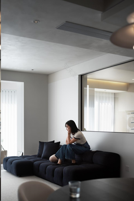
客厅与书房之间用部分玻璃作为隔断,既可以保持一定的私密性也可以增加空间的通透性。深蓝色 Tufty sofa 深得屋主的喜爱,柔软的面料让空间中大面的冷色基调增添一丝温暖的气息。
Part of the glass is used as a partition between the living room and the study, which can not only maintain a certain degree of privacy but also increase the permeability of the space. The dark blue Tufty sofa is deeply loved by homeowners, and the soft fabrics add a touch of warmth to the cool tone in the space. 客餐厅
客厅电视墙底部的收纳柜和餐边吊柜用相同的材质相呼应,白色的柜门连接转角的护墙强化了空间的连贯性,让客餐厅连接更加紧密,开敞的空间为屋主带来更完美的居住体验。
The storage cabinet at the bottom of the TV wall in the living room and the hanging cabinet at the side of the meal echo with the same material. The white cabinet door connects the corner wall to strengthen the coherence of the space, which makes the guest restaurant more closely connected, and the open space brings a more perfect living experience to the owner.
05 BALCONY 阳台
阳台的洗衣柜组合将原有的低矮的管道包裹进去,并将洗烘机和扫拖机器人全部嵌入柜内,在保证实用性的前提下尽量保持外观整洁干净。阳台的西侧作为晾晒区,在西墙上放置了一块装饰镜,镜面增加阳台的趣味性,利用梁位的落差在顶面还隐藏了一根小型电动晾衣架,实用且美观。
The laundry cabinet combination on the balcony wraps the original low pipes and embeds the washer and dryer and the sweeping robot into the cabinet, so as to keep the appearance as clean as possible on the premise of ensuring practicality. The west side of the balcony is used as a drying area, and a decorative mirror is placed on the west wall to increase the interest of the balcony. A small electric clothes rack is hidden on the top surface by using the gap between beams, which is practical and beautiful.
06 BEDROOM 卧室
主卧选用了意大利品牌 B&B 的 tufty-bed 泡芙床,奶呼呼的很温柔,搭配了深灰色的木饰面墙裙,墙裙上口暗藏了灯带,为卧室床头提供了柔和的氛围光,也可以充当夜间照明。床头搭配了瑞士品牌 USM 的床头柜,一款极具结构美学的模块化家具,轻盈的体块平衡了空间中床的厚重感。飘窗的西侧利用墙体内凹的空间植入了一组开放柜,上面可以摆放一些屋主爱看的书籍以及一些好看的装饰物品,丰富了卧室空间的功能性。
Tufty-bed Puff Bed of Italian brand B&B is selected as the master bedroom. The milk is very gentle, and it is matched with a dark gray wood-faced dado. A light belt is hidden at the top of the dado, which provides a soft atmosphere light for the bedside of the bedroom and can also be used as night lighting. The bedside table is matched with the bedside table of Swiss brand USM, a modular furniture with great structural aesthetics, and the light body balances the heavy feeling of the bed in the space. On the west side of the bay window, a group of open cabinets are implanted in the concave space of the wall, on which some books that the owner likes to read and some beautiful decorative items can be placed, which enriches the functionality of the bedroom space. From the bedroom to the cloakroom.
07CLOCK ROOM 衣帽间
在卧室门厅的一侧设计了梳妆区域,梳妆利用悬浮的设计方式减轻了整个衣柜体量感,台面下的隐藏灯光增加了空间氛围感。为了衣帽间衣柜的整体性,我们将空调的进出风方式进行了调整,通过增加回风箱的方式使得空调可以在一个风口进行出风与回风,同时兼顾功能与美观。
Adressing area is designed on one side of the bedroom entrance hall. Dressing reduces the sense of the whole wardrobe by suspended design, and the hidden lights under the countertop increase the sense of space atmosphere. For the integrity of the wardrobe in the cloakroom, we have adjusted the air inlet and outlet mode of the air conditioner, and by adding the air return box, the air conditioner can provide air outlet and return air at one outlet, taking into account both function and beauty.
08CHILDREN’S ROOM
儿童房
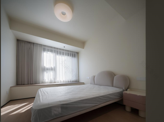
儿童房的墙顶面整体运用了奶油色和原木色的组合方式,使得整个空间更加温暖阳光。
The combination of cream color and log color is used on the top wall of the children’s room as a whole, which makes the whole space warmer and sunnier.
09STUDY 书房
我们用一组收纳柜堵住书房通往阳台的入口,柜门面向阳台可以增加阳台的储物功能。书房的西墙用一款深色的意式实木书架提升空间的质感。
We use a set of storage cabinets to block the entrance of the study to the balcony, and the cabinet door facing the balcony can increase the storage function of the balcony. The western wall of the study is enhanced with a dark Italian solid wood bookshelf to enhance the texture of the space.
10TOILET
卫生间
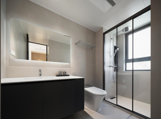
卫生间用深灰色的台盆柜搭配奶油色的仿古砖,营造出清爽干净的卫浴空间。
The bathroom features a dark gray countertop cabinet paired with cream colored antique bricks, creating a refreshing and clean bathroom space.
更多平台了解 @木泽设计空间
客服
消息
收藏
下载
最近


