查看完整案例

收藏

下载
项目是位于常熟世茂 75 号公馆高层写字楼内的瑜伽馆,我们先前设计了它的一期,此次是业主交给我们的第二次委托,扩建一期的瑜伽馆场地并设计一个更加自然写意、轻松灵动的瑜伽教学空间。
The project is a yoga studio located in No. 75 Mansion, Changshu, a high-rise office building. Previously we designed phase 1. Then we were given the commission to design phase 2. It is an extension of the yoga studio, which is more natural and flexible yoga teaching space.
▼室内概览,overview©AR-J
项目背景 Project Background
由于瑜伽馆藏于写字楼的高层,人们需要从城市街道经过由写字楼门厅、大堂、电梯厅、走道构成的冗长且枯燥的路线,才能抵达瑜伽馆的主入口。人们穿梭在这条路线上,身心容易被困在疲惫与乏味的情绪中,难以疏解。而瑜伽倡导的是“追求身心合一”,接近于自然和平衡。
Since the yoga studio is located on the upper floors of an office building, people have to go through quite a long and boring way from the city streets, foyer, lobby, elevator hall, and corridors to the main entrance of the yoga studio. While walking along, people would easily feel exhausted and bored both mentally and physically, which is difficult to relieve. However, yoga is a kind of sport that pursues the unity of mind and body, which is closely connected to nature and balance.
▼走过玻璃看室内空间,view through the glass©AR-J
于是我们联想到了“建造于城市缝隙中的苏州园林”,打算以古人“咫尺之内再造乾坤”的理念在现代性化的办公楼内进行一场造园实验,将自然的闲情野趣引入刻板的梁柱空间,实现心境从乏味到愉悦的转换。
Therefore, we were thinking to make this project a Suzhou garden, built in a gab of the city buildings, based on the theory of creating a big universe in a small space. And it would be a gardening experiment inside a modern high-rise buildings. We try to introduce natural and pleasant elements into the modern boring beam-column space to achieve the transition from dull to cheerful.
▼将闲情野趣引入梁柱空间 introducing natural elements into the modern beam-column space ©AR-J
设计策略 Design Strategy
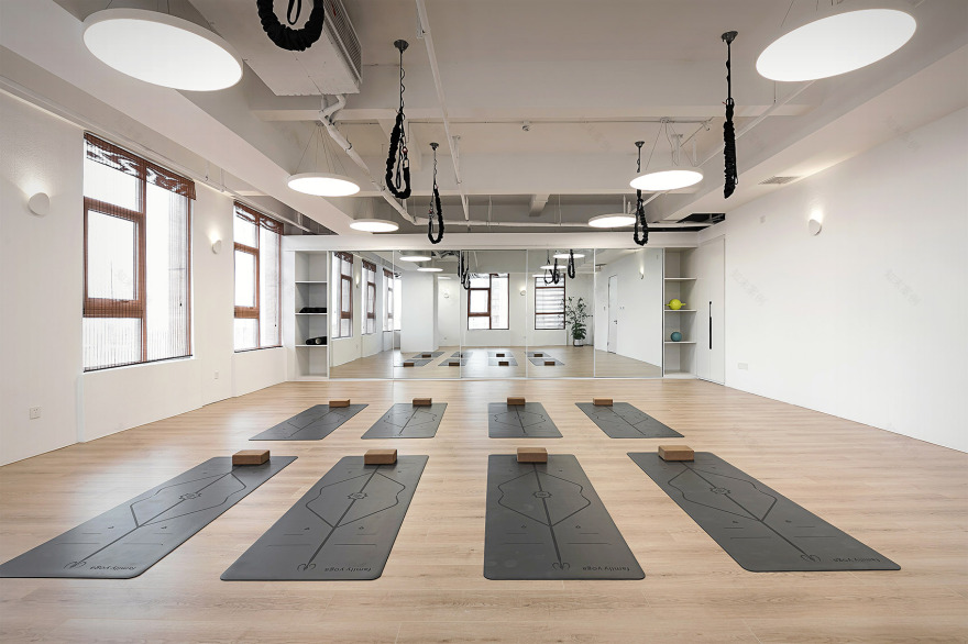
要施行改造的二期是块 270 平的长条空间,与一期相通,场地规则的布置着粗大的结构柱。根据瑜伽馆的功能设置,我们需要在狭长的场地内安排普拉提教室、瑜伽教室、景观区、公共健身区、洗漱更衣区等空间,这样留给“造园”的空间非常有限。同时,布置规整的结构柱也很不利于打造园林般自由随性的空间。
Phase 2 is a 270-square-meter long space which is connected to phase 1 with several thick columns regularly arranged on the site. According to the basic functions of the yoga studio, we need to arrange two Pilates classrooms, a yoga classroom, a landscape area, a public fitness area and a washing and dressing area in the long and narrow venue. Accordingly, the space left for gardening is very limited. At the same time, the well-arranged structural columns are also not conducive to creating a free and casual space like a garden.
▼走过窗口看折廊空间,looking through the window©AR-J
因此我们想到了园林里的折廊,园林的造型手法很多,其中折廊最能体现园林“小中见大”的精髓。折廊“强迫”游人在行进的路线中不断变换透视角度,通过引导变换角度对同一精致的反复观赏来获得空间的复杂性。相比通直的长廊,它能带给人们更多审美上的惊喜与雅趣。
Therefore, we were thinking to apply the zigzag corridor element of Suzhou garden in this project. There are plenty of design methods and elements of Suzhou garden. Among them, the zigzag corridor is the best way to reflect the idea of “see a big world through a small one”. The zigzag corridor ‘forces’ visitors to constantly change their perspectives along the route and obtain the complexity of the space by repeatedly viewing the same scenery through the change of angles. Compared with a straight corridor, it can bring more impression and beauty.
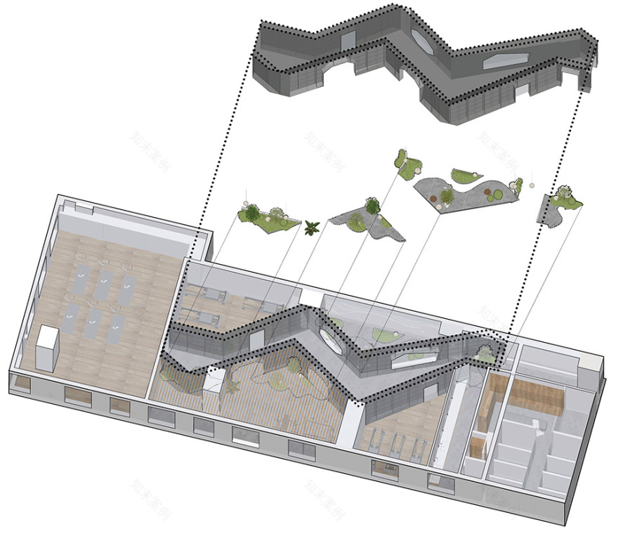
▼二期折廊分析图,axonometric©夏天设计工作室
利用折廊的另一个好处是避开主导空间秩序的结构柱,我们把廊子的转折点设置在了结构柱的位置,可以使人忽视掉结构柱的存在,并达到有效延长游走在其中人的心理距离。将各类功能空间以非对称的形式布局在折廊两侧。通过对视线与动线的刻意引导,营造一种轻松、愉悦的空间氛围,带领人们从多种角度去欣赏空间的角角落落。
Another advantage of using the zigzag corridor is to avoid the structural columns that dominate the spatial order. We put the turning points of the zigzag corridor in the position of the load-bearing columns, which can make people ignore the existence of the structural columns and effectively extend the psychological distance of the people who walk in it. Various functional spaces are arranged on both sides of the zigzag corridor in an asymmetrical manner. Through deliberate guidance of sight and movement, we managed to create a relaxing and pleasant space atmosphere, guiding people to appreciate the corners of the space from various angles.
▼“造园”空间,creating a space like a garden ©AR-J
露而不尽的折廊 The zigzag corridor is in half revealed and half hidden。透过巧妙设置廊子的开洞方式,获得空间的“透明性”。我们将人们的视线时而聚焦在走廊上,时而又穿过折廊看向远方,营造一种露而不尽,耐人寻味的游园观感。
A set of interesting holes in the zigzag corridor, we created the transparency of the space. While walking along the zigzag corridor, people can see the inside space of the zigzag corridor, and sometimes can see through the zigzag corridor towards even for the outside space. It makes people have an endless and intriguing experience wondering in a garden.
▼折廊内的视角,view inside the corridor©AR-J
电梯通道视角下的景观区 Look towards the landscape area from the elevator passage。我们将景观区设计在正对电梯通道的位置。无边框玻璃可以最大限度保留室内景色,带来更加流畅的视觉印象。通过景观区内的景致营造与电梯通道间的鲜明对比,可以转换行人的心境,给乏闷的情绪增点新鲜感。
The landscape area is facing the elevator passage. The frameless glass could show the indoor view to a large extent, creating more transparency. The huge contrast between the indoor landscape area and the boring elevator passage could enlighten the visitors’ mood and bring more freshness.
▼透过窗看电梯通道,view of the elevator passage through the window©AR-J
从苏州园林八角窗抽象而来的门洞&漏窗
Door & window openings are developed from octagonal windows in Suzhou gardens
折廊两侧设有以八角窗为原型抽象而来的门洞和漏窗。这种隔而未隔,界而未界的形态,既丰富了空间的层次,又拉长了景致的深度。
There are door and window openings which is the variation of traditional Chinese octagonal window on both sides of the zigzag corridor. This form of being separated but not separated, bounded but not bounded, not only creates more layers of space, but also lengthens the depth of the scenery.
▼以八角窗为原型的漏窗
the variation of traditional Chinese octagonal window ©AR-J
来回动线上各异的景致 Different scenery along circulation 折廊两旁以非对称的布局手法嵌入各类功能空间。在折廊与门洞的角度引导下,使得来回动线上的人们欣赏到截然不同的景致,再现园林的移步异景,并创造交通空间的新奇体验。
We installed different functions along the zigzag corridor in a asymmetrical way. With the guidance of the zigzag corridor and the door openings at different angles, people can appreciate totally different view along the zigzag corridor, which is quite similar to “moving pace and changing scenery” of the garden. It creates a novel experience of traffic space.
▼移步异景,moving pace and changing scenery ©AR-J
如同行走于画中的折廊 People walking in the zigzag corridor seem to be in the world of a painting。折廊最大的亮点是使人如同行走于画中,正如园林推崇的“着眼于画意”一般。
The most significant design point of the zigzag corridor is to make people feel like they are walking in the world of a painting. This is a theory of garden design that uses painting to design a garden.
▼行走于画中,walking in the world of a painting ©AR-J
杜邦纸
DuPont paper
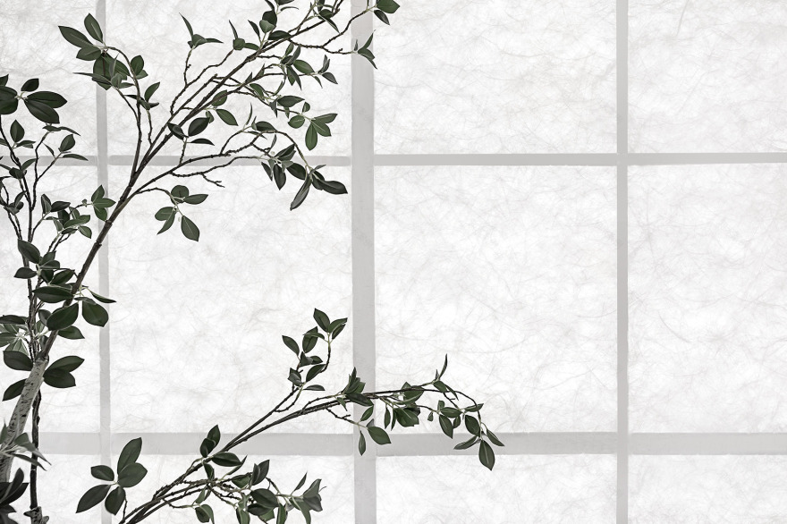
折廊立面采用与东方气质相吻合的杜邦™ Tyvek®,去模拟烟雨江南的慵懒与朦胧。杜邦纸既有着纸的斑驳美感,又有着撕不坏、耐腐蚀的特性。它是一款实力与颜值并存的材料,与江南古建的白墙有着很高的相似度,是折廊立面材质的不二之选。
The side of the zigzag corridor is made of DuPont™ Tyvek® by simulating the cozy and translucent feeling of Jiangnan. DuPont paper not only has the mottled beauty of paper, but also has the properties of being tear-proof and corrosion-resistant. It is a material with both quality and beauty. Also, it has a high degree of similarity with the white walls of ancient buildings in the south of Yangtze River. And it is the best choice for the facade material of the zigzag corridor.
▼立面采用杜邦™ Tyvek®,wallmade of DuPont™ Tyvek® ©AR-J
似透非透的朦胧光感 Hazy light
经过反复的推敲与试验,我们终于找到了朦胧光感的解决方案。先是拉长龙骨的宽度,并在龙骨两侧糊上一层杜邦纸;再是在龙骨架上均匀地附上 4 层灯带。在照明与非照明的两种状态下,折廊自带一层阴翳的美感,使得空间蒙上一层禅意的气息。
After several rounds of experiments, we finally found a solution to the hazy light. First of all, we need to enlarge the weight of wooden structure with a layer of DuPont paper on both sides. And secondly, we apply 4 layers of light strips from the ground to the ceiling evenly. In two conditions with the lights on or off, the zigzag corridor shows a beauty of translucency which could reflect the Zen atmosphere in space.
▼朦胧光感,the hazy light ©AR-J
人在景观区内的互动体验 People’s interactive experience in the landscape area
真正的园林里设有亭台轩榭,以供行人休息。留给设计发挥的空间不多,所以我们将门洞改成了漏窗。并在用微地形打造的地台上设置了蒲团坐垫,在写字楼里也能体会到打坐冥想的意境。
In traditional Suzhou garden, there are pavilions for visitors to rest. Since there is not enough space, we changed the door opening into the window opening. And we put some futon cushions on the platform of man-made landscape, which allow people to experience the atmosphere of meditation in an office building.
▼营造打坐冥想的意境
creating the atmosphere of meditation ©AR-J
几何化处理的人造绿植
Artificial vegetation is geometrically processed
园林的美少不了花花草草的辅助。受限于场地条件,我们无法种植花草树木,便以人造绿植去替代真实花草。同时,利用几何化处理的手法,有规律地在空间内植入几簇青翠的绿意,更有助于舒缓人们紧张的情绪。
Flowers and vegetation always contribute the beauty of Suzhou garden. Due to the limits of site condition, we couldn’t really plant trees and flowers. So we replaced real flowers and plants with artificial vegetation. At the same time, by applying geometric methods, we installed those artificial vegetation, which is more helpful to relieve people’s nervous emotions.
▼景观细部,details©AR-J
由微地形转换的抽象山水 The abstract landscape is transformed from the micro-topography。同样,我们借助微地形的优势,以抽象的手法,在小空间内塑造叠山理水的情景。再搭配由水泥自流平粉饰的地面,打破原始地面的单调与沉闷,丰富地面的层次与肌理。
Meanwhile, we take the advantage of micro-topography to create the scene of stacking mountains and water in a small space with abstract techniques. Matched with the cement flooring, it breaks the monotony and dullness of the original flooring. And we managed to enrich the layers of flooring and texture.
▼抽象山水,abstract landscape ©AR-J
▼二期功能布局演示,functions©夏天设计工作室
▼二期平面图,plan of the second phase ©夏天设计工作室
客服
消息
收藏
下载
最近


