查看完整案例

收藏

下载
利落建造
具有医学背景的独立护肤品牌FORMORAL委托lialawlab设计其在中国杭州的概念旗舰店。
FORMORAL, an independent skincare brand with medical science background, entrusted lialawlab to design its concept flagship store in Hangzhou, China.
从品牌自然与科技相结合的产品属性中汲取灵感,设计团队创造性地构思了一系列以“Retro-Futurism”为主题的空间场景。该空间被设想为一个对比鲜明但统一的整体,打破了现代城市实体零售空间的“同质化”形象,探索了自然与人工、生物科学和生活方式美学之间的深层关系。
Drawing inspiration from the brands product attribute that combines nature and technology, the design team creatively conceived a series of spatial scenes based on the theme Retro-Futurism. The space was envisioned as a contrasting yet unified whole, which breaks the homogeneous image of physical retailing spaces in modern cities and explores the deep relationship between nature and the artificial, bioscience and lifestyle aesthetics.
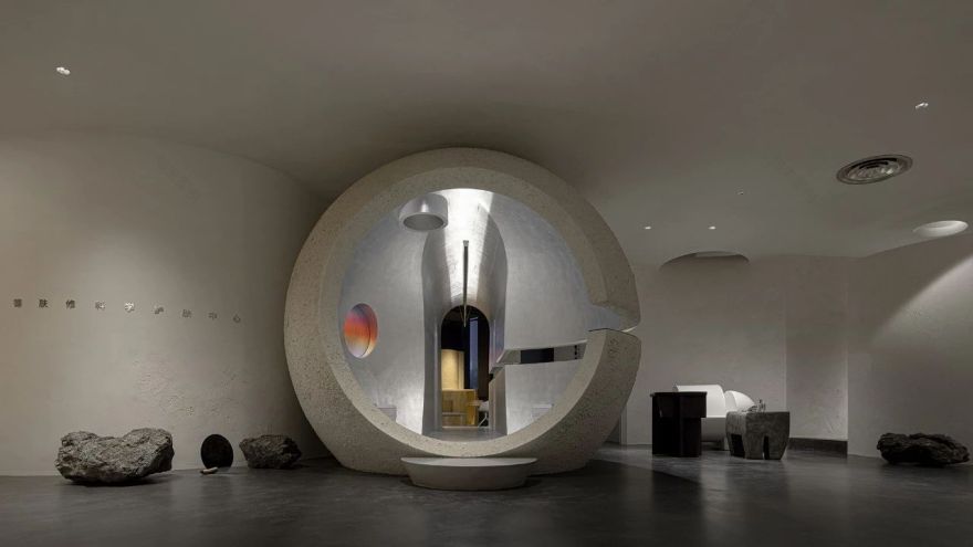
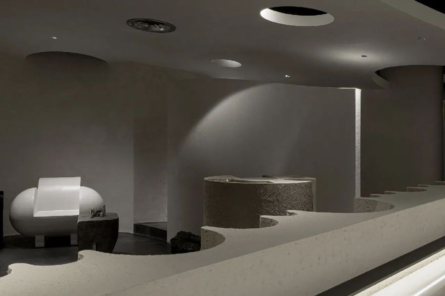
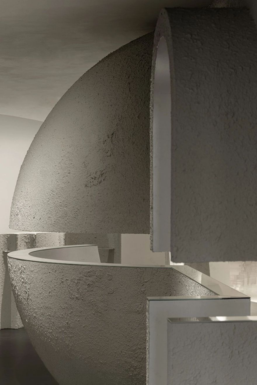
灰色纹理漆以一种非常规的方式应用于大面积的室内表面,以设定空间的整体基调。简约的饰面呼应了品牌对自然的亲和力,同时突出了原始“沙漠星球”的形象。结合功能、技术和美学的弧线从门厅延伸到室内空间,创造出熟悉而新颖的感官体验。
Gray textural paint is applied to large areas of interior surfaces in an unconventional manner, to set the overall tone of the space. The austere finishes echo the brands affinity for nature, whilst highlighting the image of a primitive desert planet. Arcs that combine functionality, techniques and aesthetics extend from the foyer to the interior space, creating familiar yet novel sensory experiences.
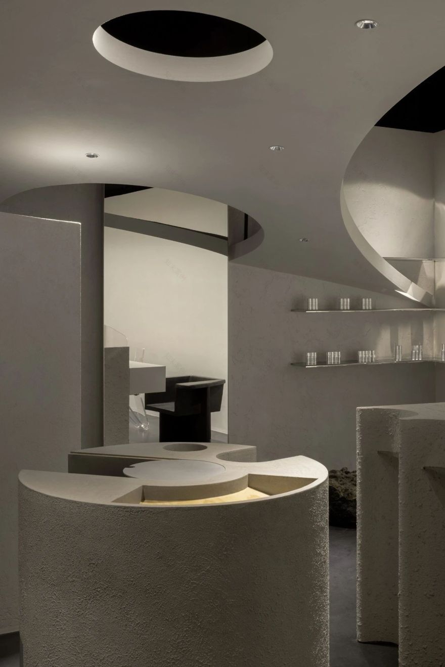
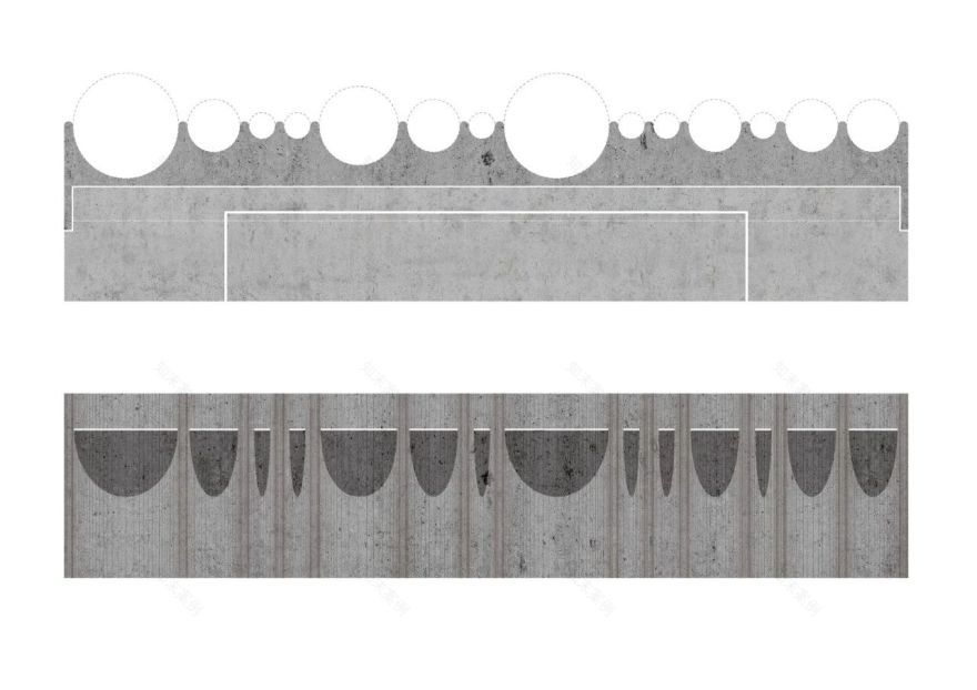
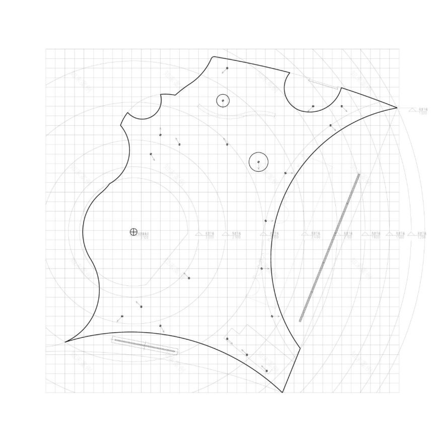
在整个空间中使用的弧有四种不同的形式和尺度,都是从切线圆中切割出来的。半径小于600毫米的曲线应用于家具上,而半径在1500毫米到1800毫米之间的弧线应用于大型球体和墙壁上。天花板上的开口主要由半径为6000毫米的弧形突出。
Arcs utilized in the overall space have four different forms and scales, and are all cut out from tangent circles. The curves with a radius of less than 600 mm are applied to furniture, while the arcs with a radius between 1,500 mm and 1,800 mm are used on the massive sphere and walls. The openings on the ceiling are mainly highlighted by arcs with a radius of 6,000 mm.
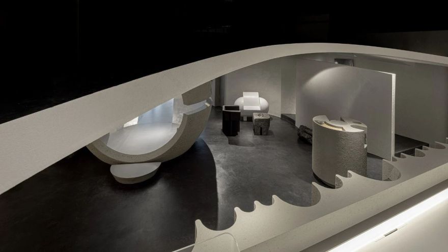
一个上升的“星球”,一个覆盖着哑光银箔和铝板的未来主义隧道,以及沿着隧道的两个舱门,将八个功能联系在一起,包括品牌展示,皮肤测试和产品销售,休息和交流,活动和演示,自我护理和洗涤,办公室,产品存储和员工休息室,同时也有助于表示“内部”和“外部”,并定义公共和私人领域。
A rising planet, a futuristic tunnel clad with matte silver foil and aluminum plates and two cabin doors along the tunnel tie together the eight functions, including brand display, skin testing - product selling, rest - communication, events - demonstration, self care - washing, office, product storage and a break room for employees, while also helping denote the inside and outside and define the public and private realms.
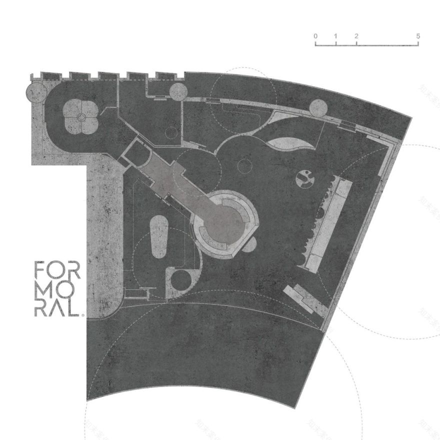
在120平方米有限的场地面积内,设计团队根据空间策略和互动设计组织布局和交通,有效地容纳不同隐私要求的各个功能区域。
Within a limited site area of 120-square-meter, the design team organized the layout and circulation based on spatial strategies and interactive designs, to efficiently accommodate various functional areas with different privacy requirements.
为了激发人们探索空间的欲望,设计师在巨大的球体和隧道之间的1.25米高的地方挖出了一个200毫米宽的缺口。间隙用镜面材料补充,让顾客停留,好奇,凝视和休息。
To trigger peoples desire to explore the space, the designers carved out a 200mm-wide gap at the height of 1.25 meters of the massive sphere and the tunnel.The gap is complemented with mirrored material, allowing customers to stay, wonder, stare and rest.
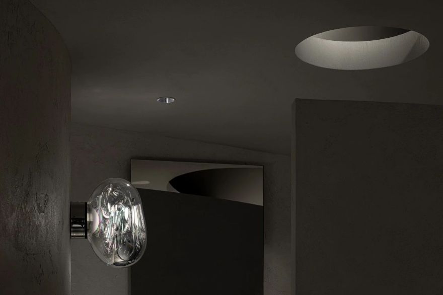
设计师巧妙地创造了一个开放的弧形天花板,以应对场地的限制。最高点2.75米的弧形屋顶与中央大球体重叠。当屋顶到达最低点1.25米时,与墙体相遇,形成无缝过渡,成为稳定的支点。接待处的正上方是一个半径为6米的弧形开口,消除了任何压抑感,避免了环保部的大量装修工作。同时,屋顶有效地将接待区延伸到公共领域,实现了功能和形式之间的平衡。
The designers skillfully created an open curved ceiling to deal with the site limitations.The arc-shaped roof with the highest point of 2.75 meters overlaps the central massive sphere.When the roof reaches the lowest point of 1.25 meters, it meets the wall to create a seamless transition and become a stable fulcrum. Right above the reception desk is an arc-shaped opening with a radius of 6 meters which subdues any sense of inhibition and avoids a lot of renovation work of MEP. Simultaneously, the roof effectively extends the reception to the public realm, achieving a balance between functionality and form.
图片版权 Copyright :利落建造
客服
消息
收藏
下载
最近


