查看完整案例

收藏

下载
ORIGINALFRESH是一个主打健康、新鲜概念的鲜榨果汁品牌,以上乘的选料和专业的运营在业界著名。ORIGINALFRESH在所有门店中坚持开放式格局,为顾客呈现全透明的果汁制作流程。延续同样的策略,绘造社在其浦东嘉里城店的设计中强调了对功能性的追求,并通过优化布局设计和材料选择,将ORIGINALFRESH的品牌精神加以体现。
ORIGINALFRESH is a juice brand promoting health and freshness and has established its predominance in the business for its high standard on fruit selection and professional management. In all its branch shops, ORIGINALFRESH is always featured with an open layout to provide the customers with the transparency of juicing process. Following the same strategy, Drawing Architecture Studio keeps the focus on the functionality of the interior design for ORIGINALFRESH Kerry Parkside Shanghai and enhances the embodiment of the brand’s spirit by optimizing the design of layout and selection of materials.
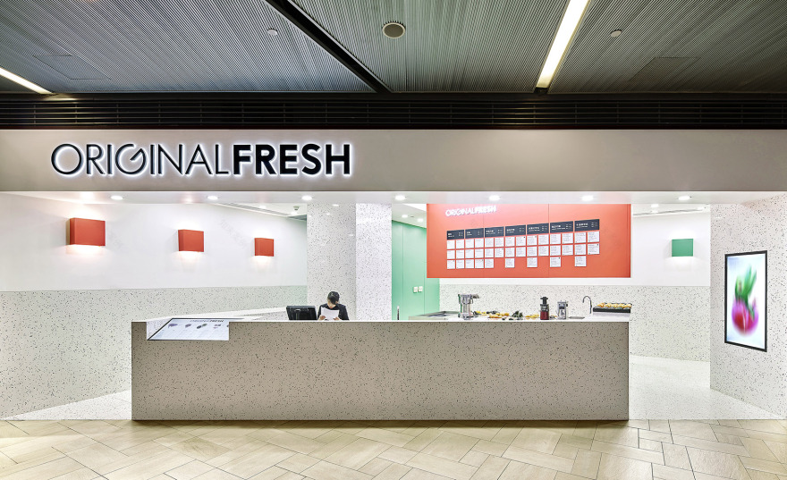
▼门店一览,view of the shop
为了与ORIGINALFRESH所提倡的新鲜、健康、纯粹的积极精神所呼应,绘造社在设计中着重通过色彩打造店面形象。整体空间以纯净的白色为基调,后吧台上压低吊顶的粉红金属罩、储藏室的粉绿墙壁、以及同色的壁灯点缀其中,形成明亮、清新的第一印象。而白色中也蕴含着明艳的色彩。
As an echo to ORIGINALFRESH’s advocacy of positive spirits of freshness, health, and pureness, Drawing Architecture Studio puts emphasis on the use of colors for the shop image. The bright and refreshing first impression is achieved by a clean white space ornamented with rose pink metal cover for the lowered ceiling over the back bar counter, pomona green walls of the storage room, and the same colored wall lamps. The tone of white also contains vivid colors.
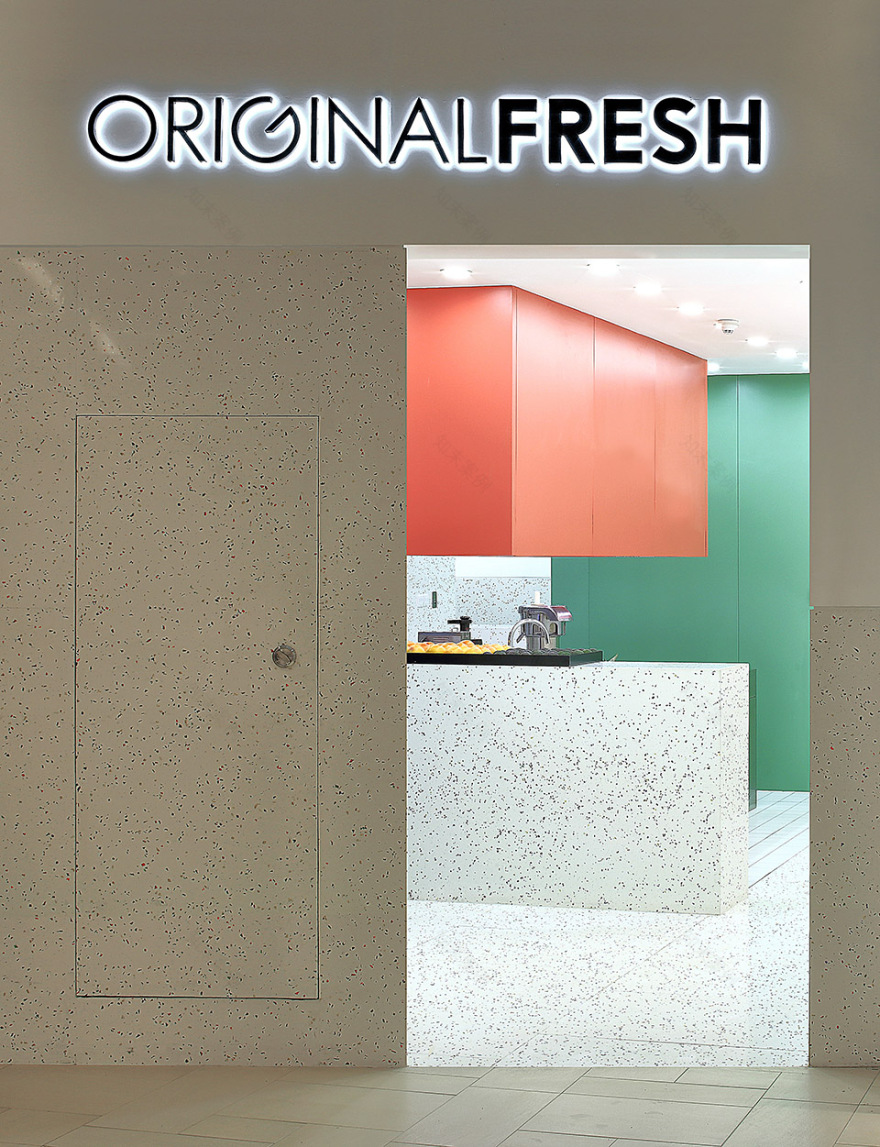
▼压低吊顶的粉红金属罩和储藏室的粉绿墙壁,形成明亮清新的第一印象,the bright and refreshing first impression is achieved by a rose pink metal cover for the lowered ceiling over the back bar counter and pomona green walls of the storage room
前吧台、立柱、地面和墙裙都采用彩色颗粒白色水磨石,其灵感来源于ORIGINALFRESH的产品原料本身——石榴、菠萝、鲜橙、蓝莓、苹果、牛油果等各色新鲜水果。白色石材中随机洒落的鲜红、明黄、紫蓝、翠绿的不规则形状玻璃颗粒,仿佛鲜榨过程中四处迸溅的果汁。石材本身的厚重为空间带来稳重的质感,而彩色玻璃颗粒又让它显得活泼轻盈,整体带来令人轻松、愉快的感官体验。单一材料的使用将小空间高度整合,所有的体块仿佛从地面中拉伸出来,店面形象鲜明又清晰,使ORIGINALFRESH新鲜的原料和产品与专业的制作流程成为往来顾客关注的核心。
The front bar counter, pillars, floor and dado are all covered in white terrazzo with multi-colored particles. The inspiration comes from the raw materials of ORIGINALFRESH products – fresh fruits like pomegranate, pineapple, orange, blueberry, apple, and avocado. The bright red, yellow, blue, and green organic-shaped glass particles are randomly scattered in the white stone, just like fresh juice splashed during the juicing process. The solidness of the stone itself adds the quality of steadiness to the space while the colored glass particles lights it up, which brings a relaxing and joyful sensation to the space in general. The use of one single material highly integrates the small space as all the blocks seem to grow from the floor, which sets up a distinctive and clear shop image and draws the customers’ attention to ORIGINALFRESH’s fresh juice and professional production process.
▼彩色颗粒白色水磨石灵感来源于ORIGINALFRESH的产品原料本身,the white terrazzo with multi-colored particles is inspired by the raw materials of ORIGINALFRESH products
ORIGINALFRESH浦东嘉里城店的空间由前吧台、后吧台、储藏间三个部分组成。绘造社将前后吧台组成的制作区域在布局上做最大化处理,以此强化全透明的制作流程的呈现。前吧台延门店外沿打造,客座区、点单区、出杯区、展示区,依次被串联在一体化吧台中,形成流畅、合理的动线。
The space of ORIGINALFRESH Kerry Parkside Shanghai consists of 3 sections – front bar counter, back bar counter, and storage room. The production area which includes the front and back bar counters is maximized in order to reinforce the display of the juicing process. The integrated front bar counter sits along the outside edge of the shop in which the seating, ordering, pick-up, and display areas are arranged in order following a fluid and rational circulation.
▼前吧台延门店外沿打造,the integrated front bar counter sits along the outside edge of the shop
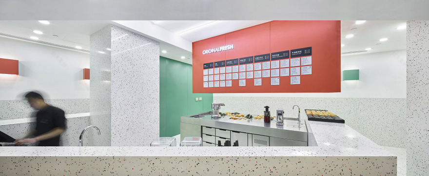
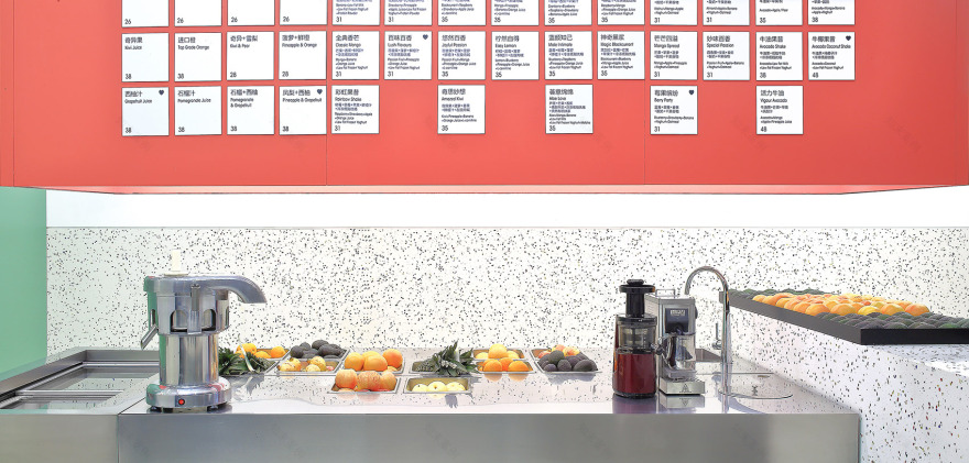
后吧台是处理水果和榨果汁的区域,以中岛式不锈钢结构将原有的不同规格的冰柜整合为一个体块,并对桌面上的制作设备和工具的布局进行优化,以提高果汁制作的效率。后吧台上方局部压低吊顶,并以金属板包裹,既有效遮挡榨汁过程中四溅的果汁,也用于悬挂式果汁菜单的呈现,成为店内的视觉焦点。全封闭式的储藏间位于空间后部,将制作区域与杂乱隔绝。空间中高低层次和色彩不同的体块让有限的空间不显单调,令ORIGINALFRESH的顾客穿行其中,得以领略丰富的空间趣味。
The back bar counter is where the fruits are processed and juices are produced. It is a stainless steel island structure integrating the refrigerator and worktables of different sizes into one block. The processing equipment and utensils on the worktables are also rearranged to increase the efficiency of production. Above the back bar counter, part of the ceiling is lowered and covered with rose pink metal sheets both as a shield for splashing juice and as a menu board, which also becomes a visual focus in the shop. The fully-enclosed green storage room occupies a corner in the back of the shop, isolating the mess from the production area. The blocks of different heights and colors prevent the small interior from being monotonous and bring to the ORIGINALFRESH customers various spatial delights when they visit the shop.
▼后吧台局部的压低吊顶成为店内的视觉焦点,the lower ceiling of the back bar counter becomes a visual focus in the shop
▼制作设备和工具的布局优化提高了果汁制作效率,the worktables are rearranged to increase the efficiency of production
▼全封闭储藏间位于空间后部,the fully-enclosed green storage room occupies a corner in the back of the shop
▼平面图,plan
▼立面图,elevation
设计团队:李涵 / 胡妍 / 张欣桐 / 陈鹏宇
建筑面积:54 m2
设计/建成时间:2017
摄影师:王洪跃 / 鲁雯泋
Design Team: Li Han / Hu Yan / Zhang Xintong / Chen Pengyu
Construction Area: 54 m2
Year of Design / Completion: 2017
Photography: Wang Hongyue / Lu Wenhui
客服
消息
收藏
下载
最近


