查看完整案例

收藏

下载
圣保罗-莫伦比地铁站不仅是一座城市交通设施,也是圣保罗市的一个综合运输节点。行人、骑自行车的人、搭便车的旅行者、以及公交地铁乘客每天在此交汇,开始或结束他们的城市之旅,或者仅仅是换乘不同的交通工具。
The São Paulo-Morumbi station, more than an urban transport facility, is an intermodal connection in the city of São Paulo. Pedestrians, cyclists, “hitchhikers” and bus and metro passengers cross this space daily, whether to start or finish an urban journey, or just to transfer from one form of mobility to another.
▼施工中的地铁站整体鸟瞰,overall aerial view of the station under construction ©Danilo Verpa
地铁站的建筑设计产生于对通勤运动的组织,同时考虑了当地的需求和典型地铁轨道交通网络中的都市流线。城市道路宽阔,车辆川流不息,对行人很不友好。设计策略中对垂直平面的安排体现了对不同流线的最佳调和方式,不仅创造了通往地铁站台和相邻公交站的宽敞入口,还设定出了适宜停留的舒适空间。
The station’s architectural design was born from the organization of commuting movements that result from the interaction of local demands with the metropolitan flows typical of a metro-railway network. In a hostile context to pedestrians, with wide and heavily loaded avenues, the strategic arrangement of vertical planes expresses the best accommodation of these flows, in order not only to create generous access to the subway platforms and the attached bus terminal, but also to configure spaces pleasant stay.
▼分解轴测图,exploded axonometric
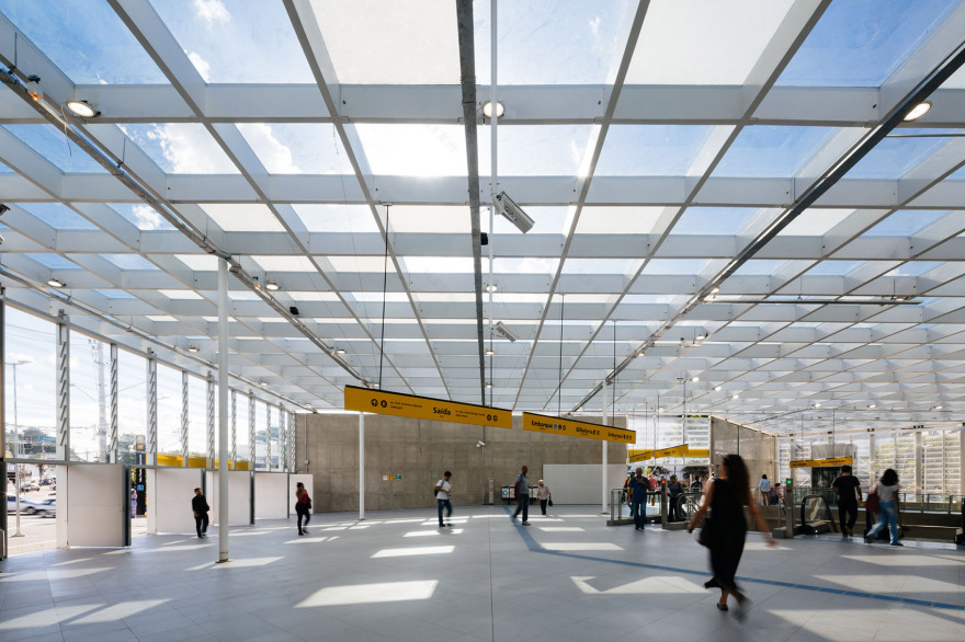
全部表面层的设计都被组织在了巨大的平屋顶上,由纤细的金属柱和混凝土墙体支撑。它将地铁站不同的功能区块整合在了一起,赋予建筑属于自身的特征,同时与周边环境形成谦逊的对话。半透明的屋面加强了对光照的控制,使得交通轴线部分更加明亮,而某些区域则一直被阴影覆盖,在一天持续不断的运动中勾画出丰富的光影。
A large flat roof organizes the entire surface-level design, supported on slender metal pillars and concrete walls. It is what gives unity to the different functional sectors of the station, giving the building its identity and, at the same time, a respectful dialogue with its surroundings. The translucent cover promotes controlled light filtering, leaving the circulation axes more illuminated and the areas of permanence shaded, drawing lights and shadows in constant movement throughout the day.
▼施工中的大屋顶,large roof under construction ©Danilo Verpa
▼地铁站谦逊地融入环境,station merged into the urban environment ©Pedro Kok
▼主入口,main entrance ©Pedro Kok
▼次入口,secondary entrance ©Pedro Kok
▼宽敞的集散空间,generous distributing space ©Pedro Kok
▼入口与公交站相连,entrance connected to the attached bus station ©Pedro Kok
▼大屋顶下的公交站,bus station under the large roof ©Pedro Kok
▼公交候车处,waiting space ©Pedro Kok
▼屋顶形成的光与影
light and shadows created by the roof ©Pedro Kok
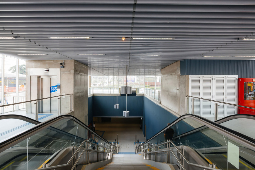
▼通往地下的电梯和楼梯,escalators and stairs towards the mezzanine level ©Pedro Kok
▼墙面上的光影,light and shadows on the wall ©Pedro Kok
▼从楼梯仰望屋顶,look up at the roof from the staircase ©Pedro Kok
地铁站的建筑、景观和视觉传达的开发均遵从地铁设计初期的建造指引以及在上一个阶段已经设计好的站内分区,后者以站台管道为关注重点。然而,诸多条件显示项目需要重新设计已经完成的部分,改造地面层的所有入口、地下一层和北入口处的主通风井。
The station’s executive architectural, landscaping and visual communication project was developed based on the construction guidelines defined by the Metro in the basic design stage and on sections of the station already carried out in the previous phase, which focused on the platform tunnel. However, several conditions indicated the need for the executive project to significantly redesign what had been adopted, with changes, mainly, on the ground floor in both accesses, on the first underground floor (mezzanine) and on the main shaft of the north access.
▼地下一层集散空间,distributing space on the mezzanine level ©Pedro Kok
▼通往站台的电梯和楼梯
escalators and stairs towards the platform ©Pedro Kok
▼垂直交通,vertical circulation ©Pedro Kok
▼通道,passage ©Pedro Kok
▼站台,platform ©Pedro Kok
项目由23 SUL和HNL共同实施。
This project was carried out by 23 SUL with the Hidroconsult Consortium, Noronha, LENC (HNL)
▼车站夜景,view of the station in the night ©Pedro Kok
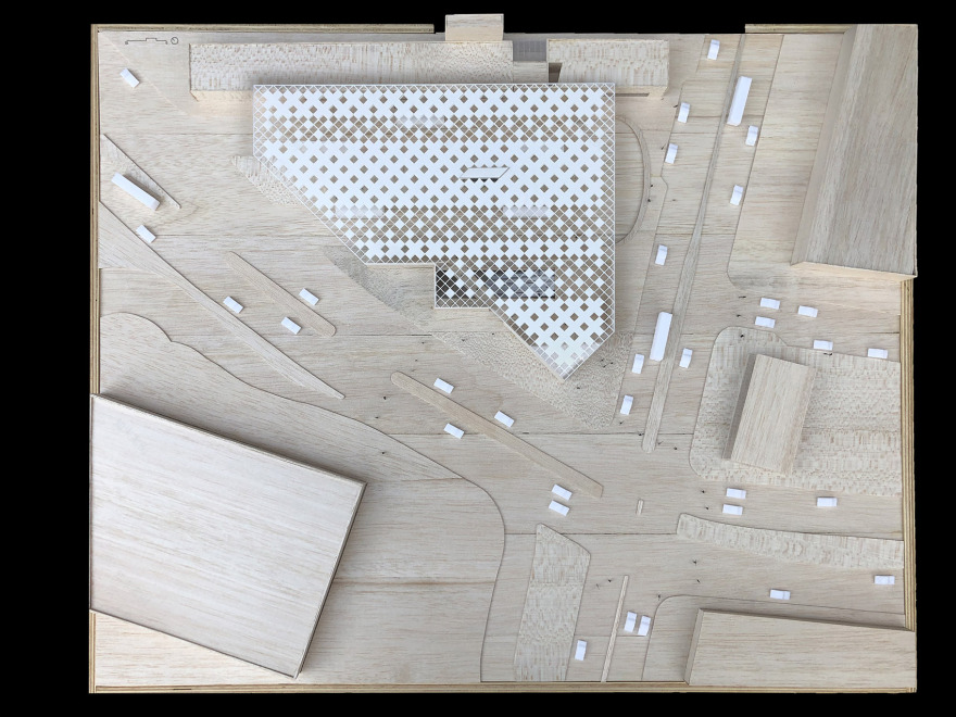
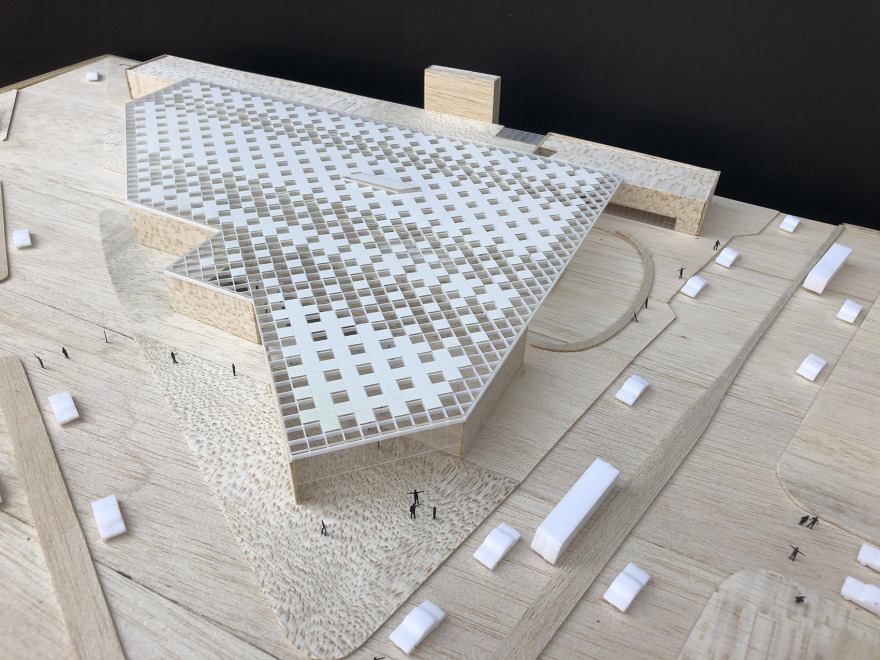
▼模型,model ©23 SUL
▼项目区位,project location ©23 SUL
▼总平面图,site plan ©23 SUL
▼地下一层平面图,first underground floor plan ©23 SUL
▼地下二层平面图,second underground floor plan ©23 SUL
▼站台层平面图,platform floor plan ©23 SUL
▼剖面图,section ©23 SUL
客服
消息
收藏
下载
最近


