查看完整案例


收藏

下载
▲项目视频©ZEEKR
隐藏在现代建筑里的“碧瓦红墙”
极氪城市中心
Green Tiles and Red Walls
Concealed within Modern Architecture
ZEEKR Center
中国,北京
Beijing, China
北京是一座多面的城市。厚重的历史带来沉稳的气质,而随着城市的发展孕育出新鲜的活力,古老和现代交融。
Beijing, a city of multifaceted charm, carries the weight of its profound history, infusing it with enduring urban grace. As the city evolves, it orchestrates a dynamic interplay between tradition and innovation.
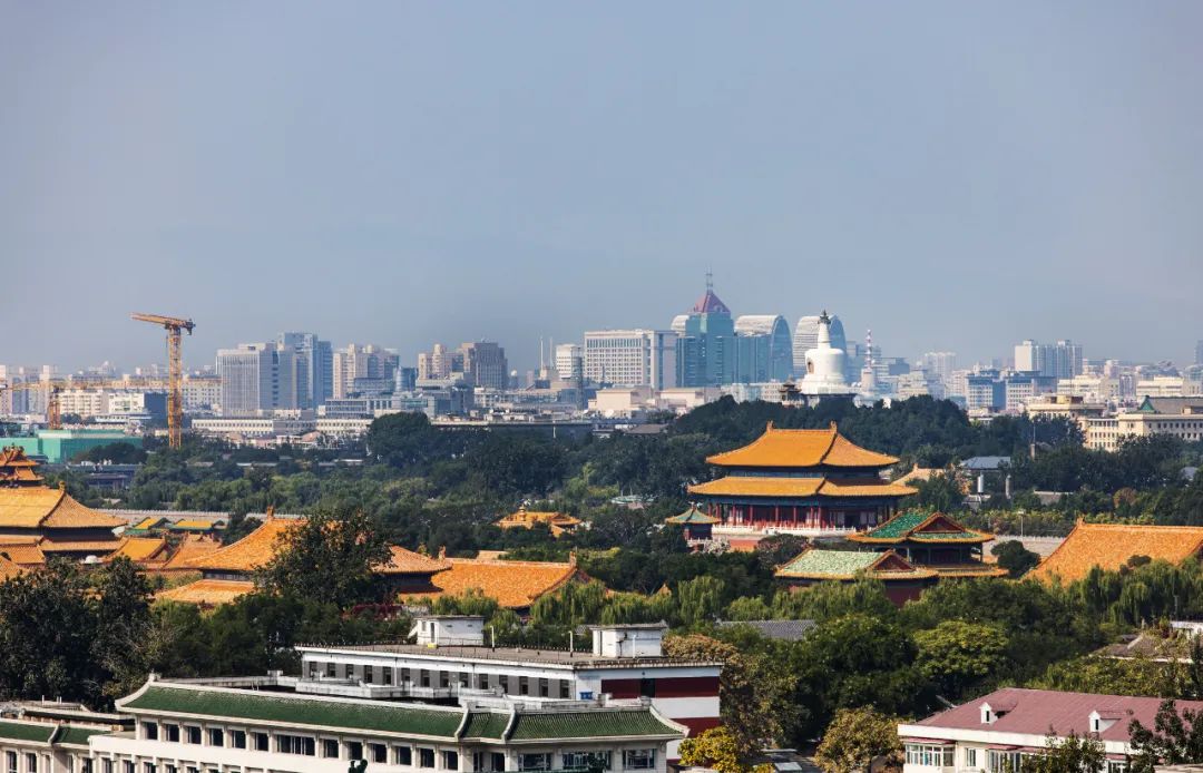
▲从项目顶楼看出去的城市景观,古老与现代交融。
Nestled in Beijing’s Wangfujing, this project provides a captivating blend of ancient and modern cityscapes from its top floor.
#01 过去与未来的相遇
Encounter of the Past and Future
项目位于王府国际中心一二层,拥有得天独厚的地理位置——咫尺之遥是古老的紫禁城,项目坐落于具有百年历史、热闹繁华的王府井大街。
Nestled on the first and second floors of the Wangfu International Center, just steps away from the ancient Forbidden City, this project strategically positions itself in the bustling Wangfujing Street, a thoroughfare rich with a century of history.
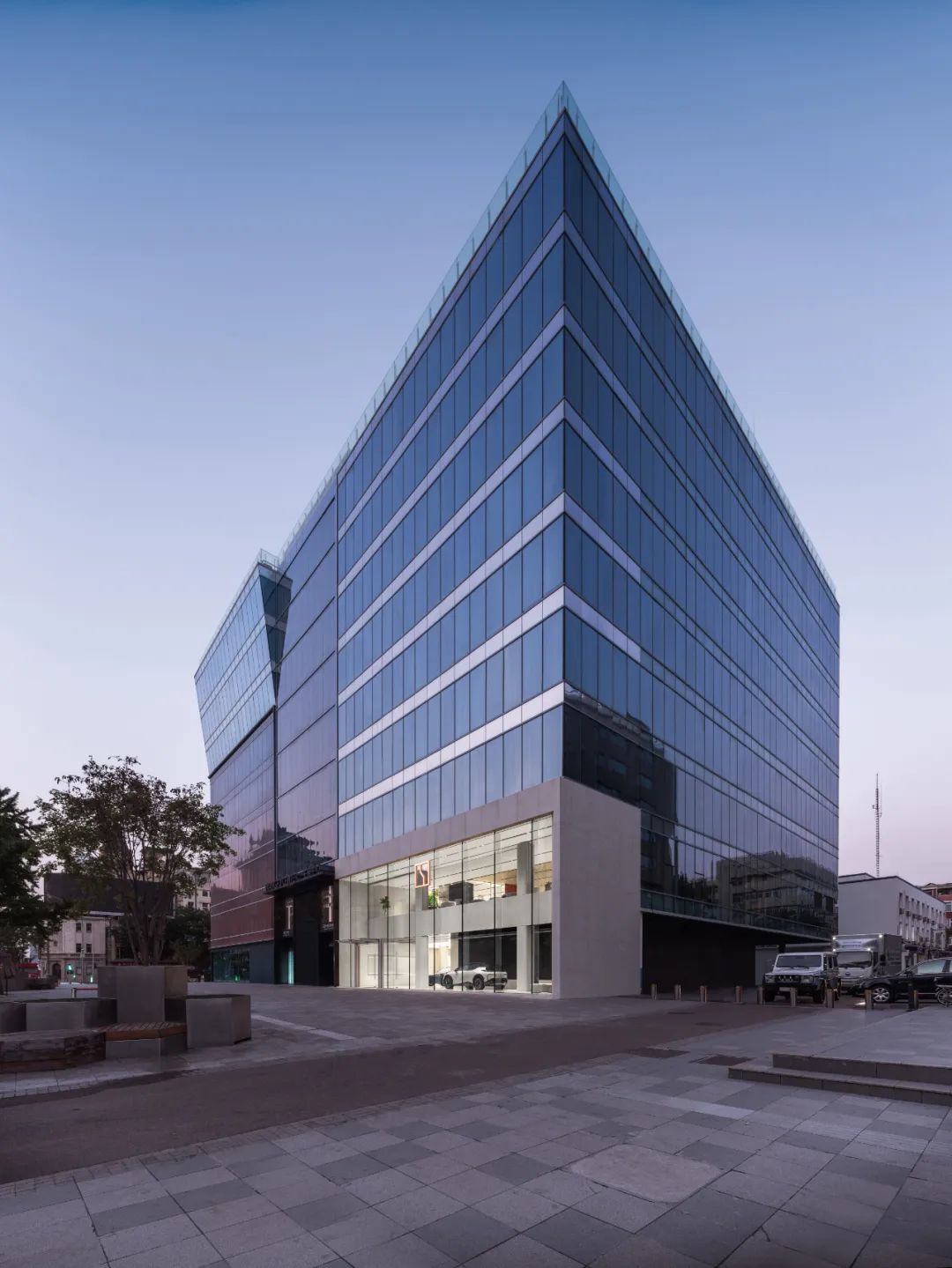
▲从街区看向项目
View of the project from the street block.
MOC 在项目设计中探索在地性文化与潮流科技的结合,旨在为用户提供独特而令人难忘的体验。设计师力求通过空间布局和设计元素,融入传统文化并回应在地特色,同时,突出汽车品牌的现代感和科技感。
MOC’s design ethos delves into the fusion of local culture with cutting-edge technology, aiming to provide a distinctive and unforgettable experience for users. The designers skillfully integrate traditional culture into spatial layouts and design elements, harmonizing with local characteristics while accentuating the modern and technological qualities of the automotive brand.
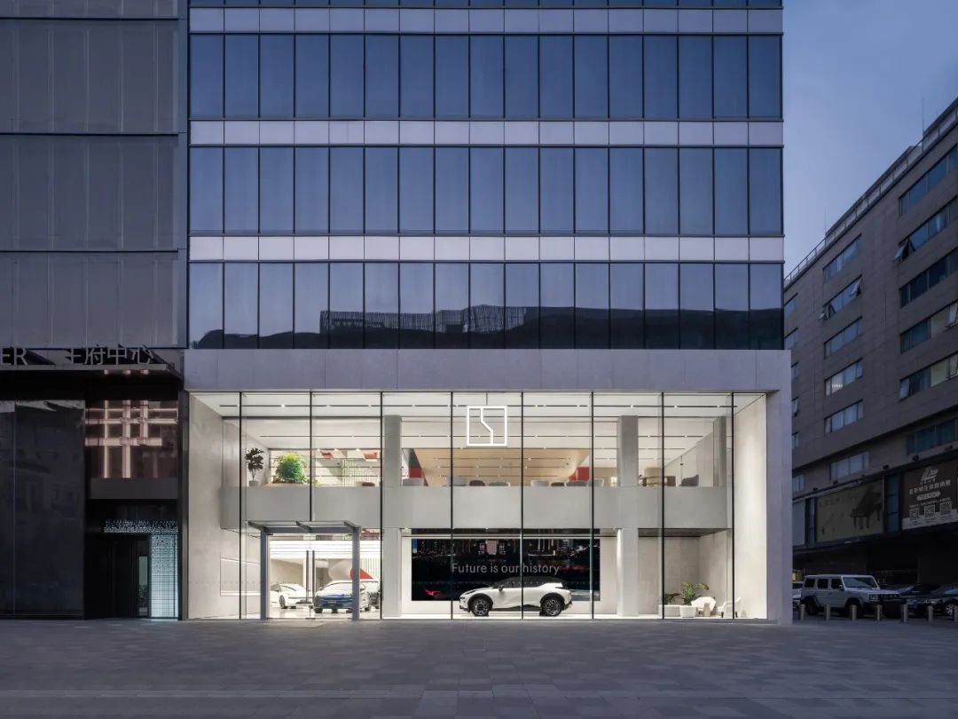
▲通高 10 米的超白玻外立面,体现了无边界的品牌理念的同时融入城市。
The 10-meter tall, ultra-clear glass exterior not only embodies the brand’s boundary-less philosophy but also blends with the urban landscape.
外立面的设计上,MOC 选择的策略是谦逊友好地融入街区。为了实现与街区之间的视野交流,MOC 简化了建筑立面的框架与结构,并对大厅前部进行挑空处理,让空间结构形成序列上的延伸状态,简洁的材料语言强调了外立面的通透感与统一性。
The exterior design embodies a strategy of modest and friendly integration into the neighborhood. To enhance visual engagement with the surroundings, MOC simplifies the architectural façade’s framework and structure. An open space in the front hall creates a sequential extension of the spatial structure, while a minimalist material palette underscores transparency and unity.
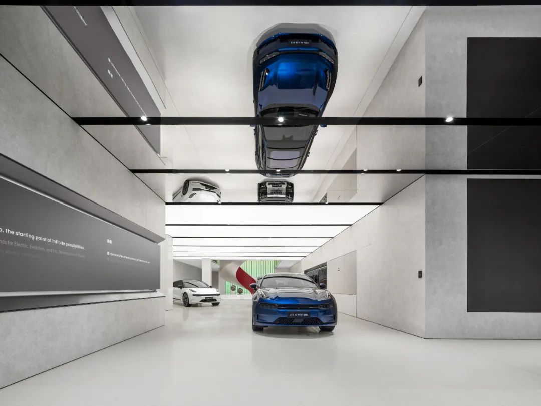
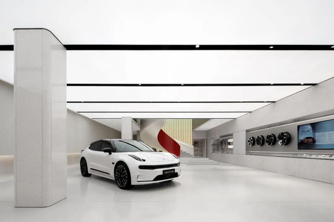
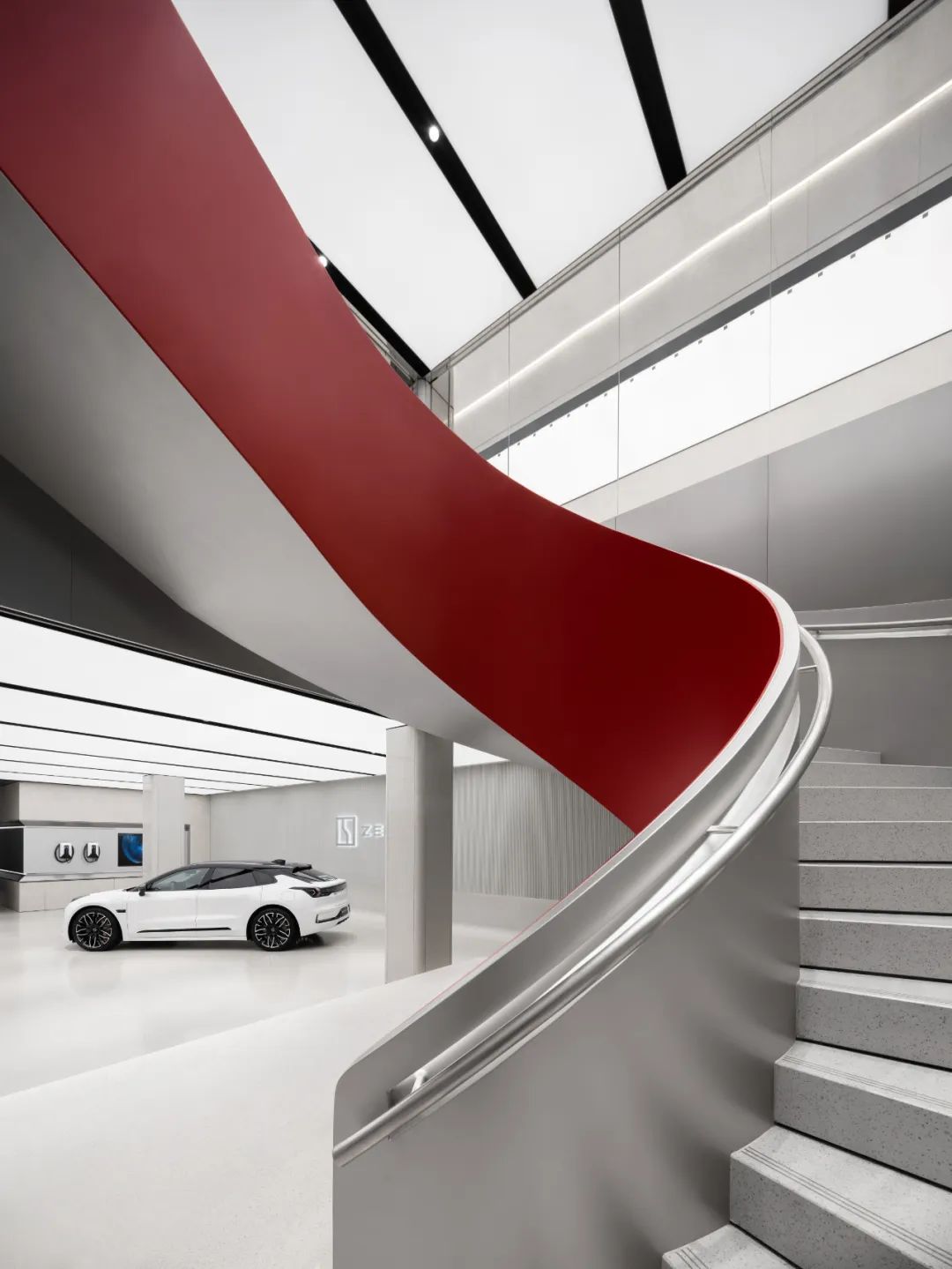
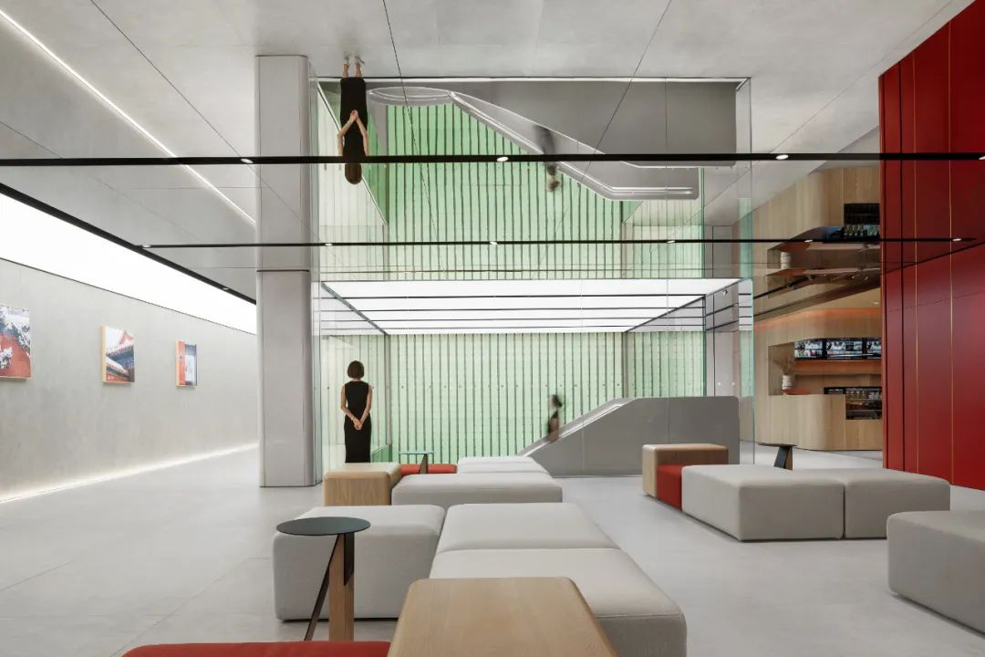
一层作为汽车展厅,整体空间现代简约。大厅前部的镜面天花人为性地纵向扩展空间视觉体量,让步入空间的方式形成延伸、递进的层次变化。
The first floor, functioning as an automotive showroom, radiates a modern and minimalist allure. The mirrored ceiling in the front hall visually amplifies the spatial expanse, fostering a layered progression upon entry.
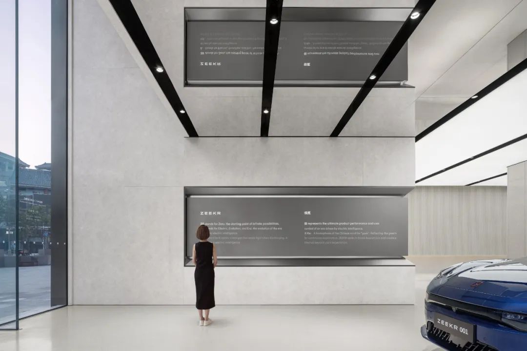
▲ 入口左侧金属板内置品牌介绍,通过感应触发内容自动播放。
On the left side of the entrance, a metal panel houses the brand introduction triggered by motion sensors.
▲ 空间内部的灯膜为车辆提供了均匀的照明。
Internal light films uniformly illuminate the space for showcasing vehicles.
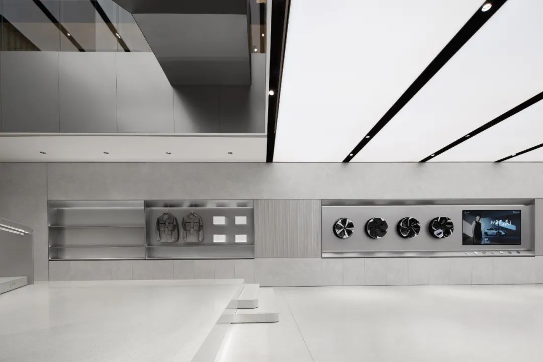
▲ 设计师在整体简洁洗练的基调中,融入了精致的工艺细节。
Within the overall simple and refined tone, the designer has incorporated intricate craftsmanship details.
#02“碧瓦红墙”回应在地特点
“Green Tiles and Red Walls” Responds to Local Essence
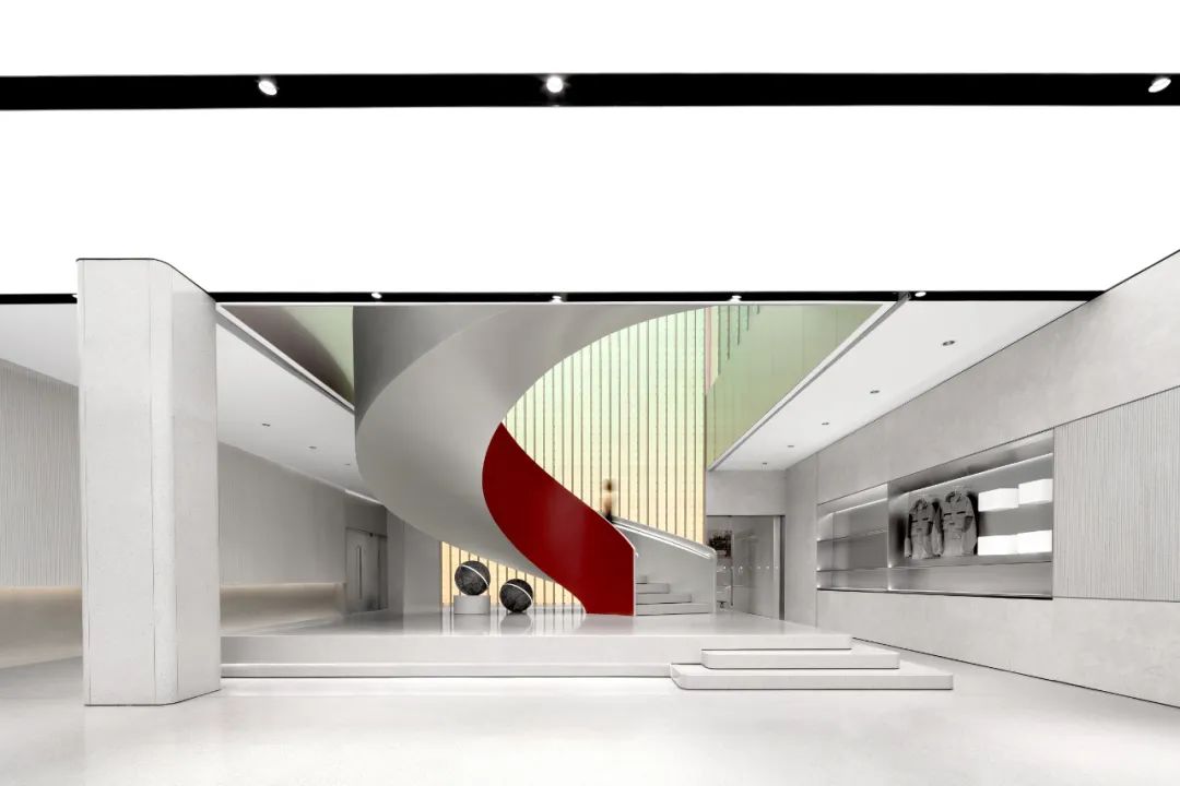
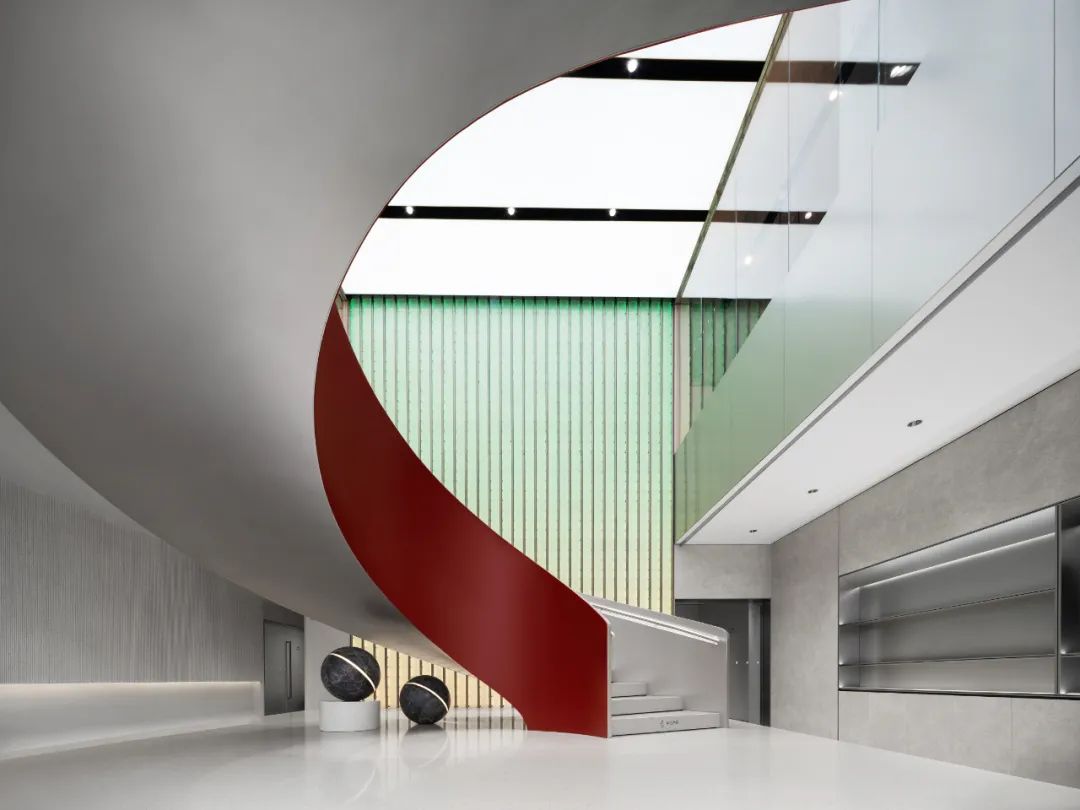
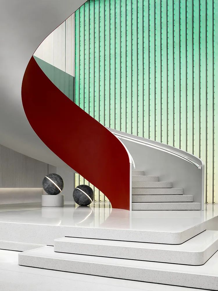
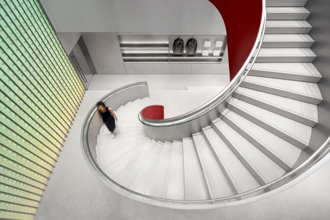
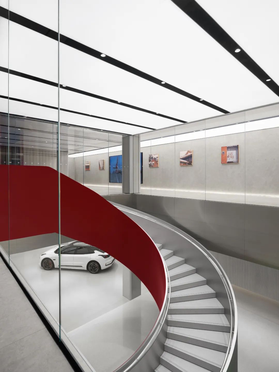
展厅通过一条引人注目的旋转楼梯连通二层。在楼梯后方,一面玻璃制成的瓦片装置墙从一层延伸至二层。
The exhibition hall links to the second floor through a captivating spiral staircase.
Behind the staircase, a wall adorned with glass tiles extends from the first to the second floor.
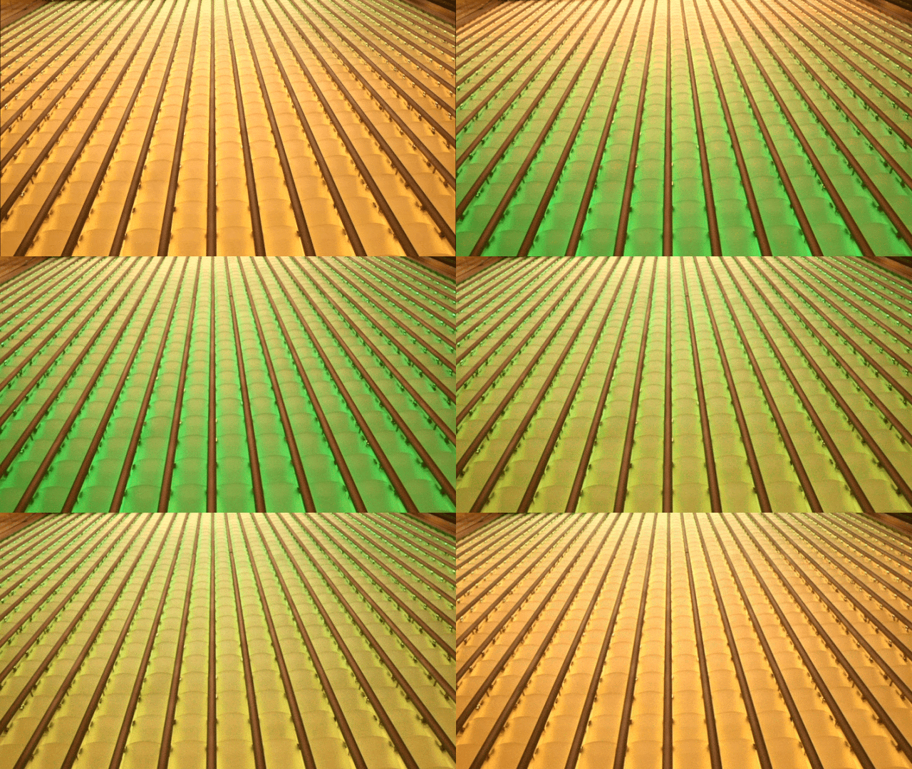
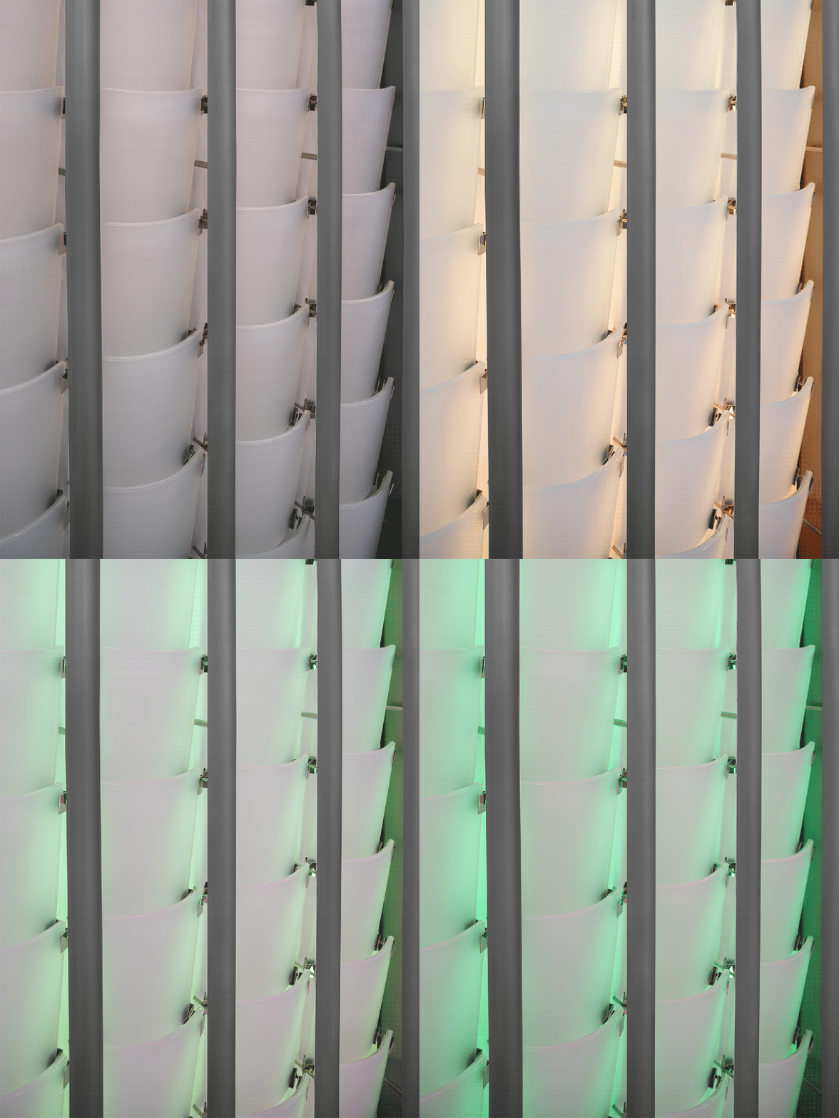
这些瓦片由定制的夹胶玻璃热弯而成,呈现出玉石般的质感,通过隐藏在纵向结构内的灯带,瓦片墙呈现黄绿色的颜色变化。
These tiles, crafted from custom laminated glass and heated to achieve a jade-like texture, undergo a subtle color transformation from yellow to green, thanks to concealed LED strips within the vertical structure.
为了实现最佳效果,设计团队做了多种不同夹胶玻璃测试,并在结构、灯光上攻克了许多难点,让玻璃瓦片呈现出温润细腻的质感。
Striving for the best possible outcome, the design team conducted extensive tests on different laminated glass options. Overcoming various challenges in structure and lighting, we successfully imparted a refined and warm texture to the glass tiles.
这一设计巧妙地将现代科技元素与传统文化特色结合,既为楼梯增添了现代感,又回应了京城古建筑琉璃瓦的流光溢彩。
This ingenious design harmonizes modern technological elements with the rich cultural heritage, not only imparting the staircase with a contemporary flair but also paying homage to the resplendent charm of ancient glazed tiles found in Beijing’s historical architecture.
沿着楼梯拾级而上,空间线索也由现在拉回过往。
As one ascends the staircase, the spatial narrative shifts from the present to the past.
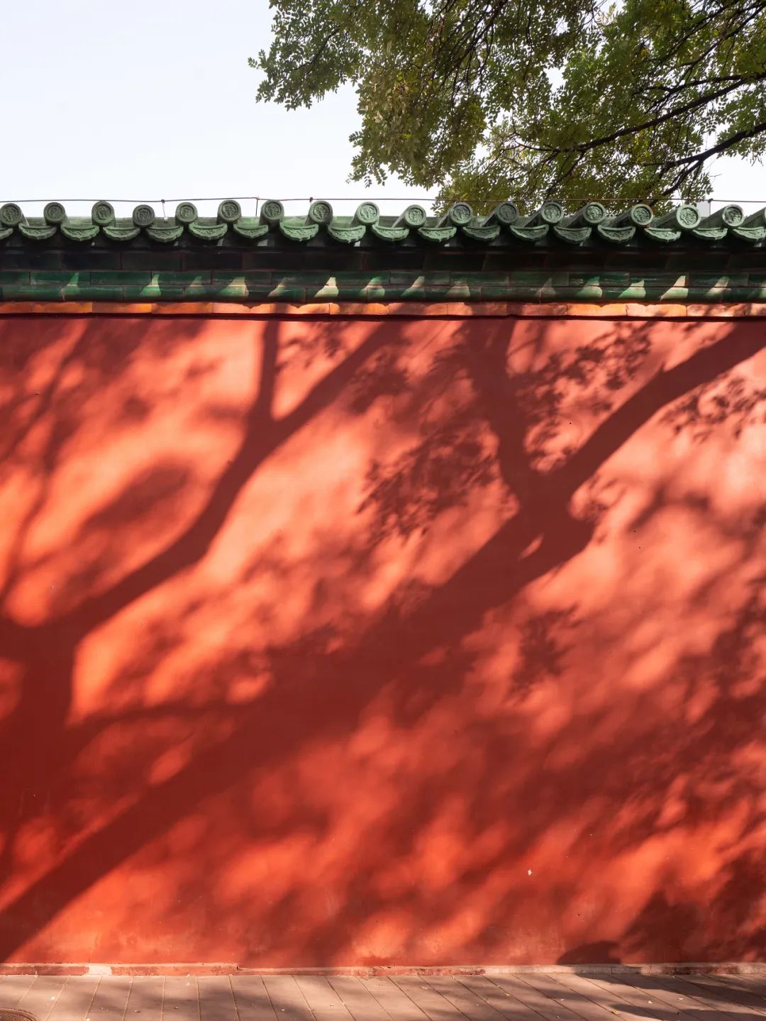
二层空间的红色墙体浸润着古时城市的气息,与黄绿色的琉璃瓦片墙互为映衬,回应“碧瓦红墙”的古都风韵,城市的过去与未来在此相遇。
The second floor emanates the ambiance of the antiquated city with its crimson walls, complemented by the yellow-green glass tile walls, resonating with the charm of “Green Tiles and Red Walls.” In this space, the city’s past and future converge.
▲ 设计师从传统建筑汲取灵感,通过设计手法将在地文化融入空间设计中。
Inspired by traditional architecture, the designer integrates local culture into the spatial design through innovative techniques.
▲ 二层论坛艺廊区紧邻楼梯设置,艺廊的作品吸引人们拾级而上。
The second-floor forum art gallery, strategically located next to the staircase, beckons people to ascend, captivating them with its compelling artwork along the way.
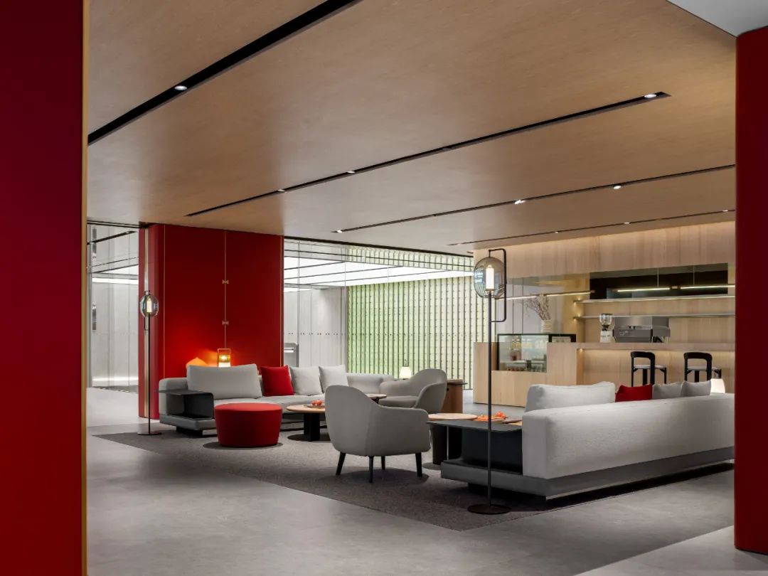
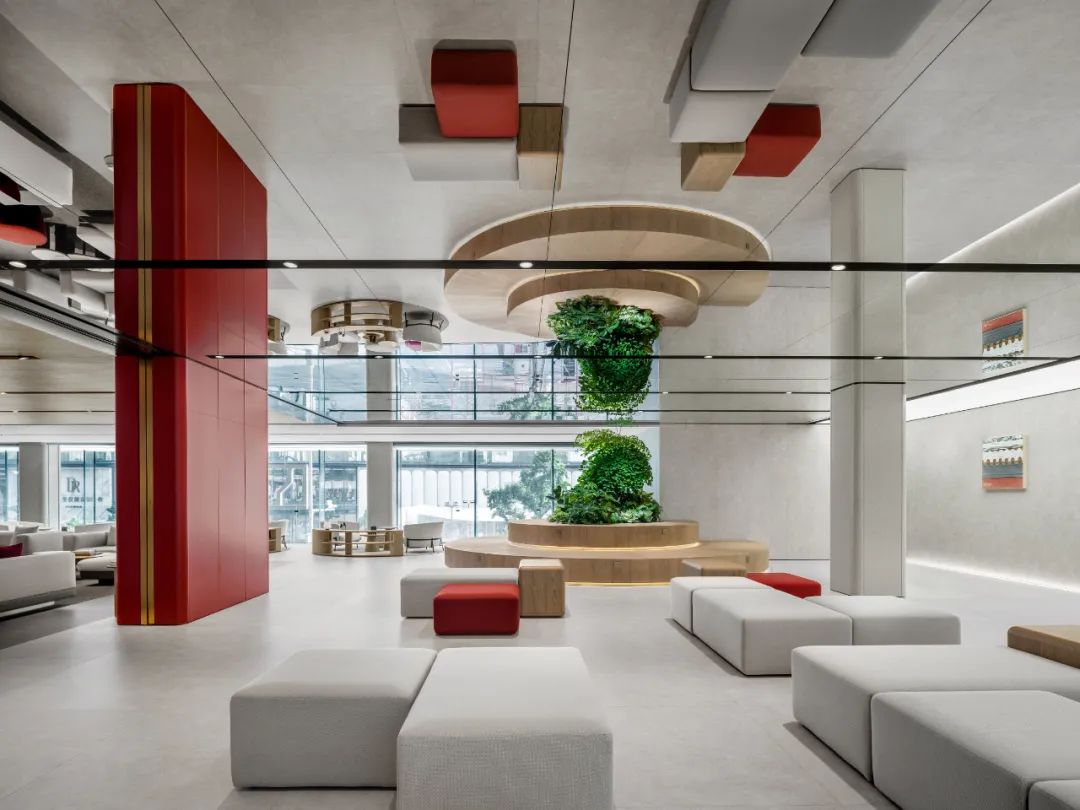
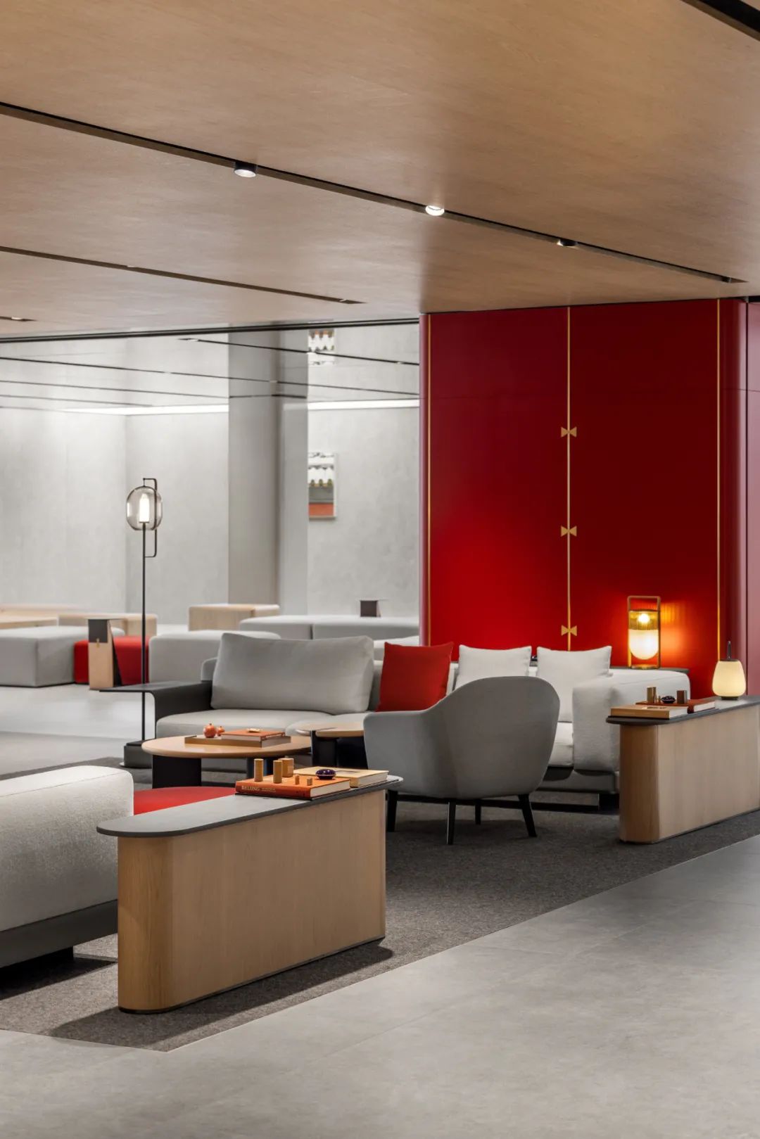
▲ 红色墙体划分出功能区同时丰富了空间的层次。
The use of red walls not only defines functional spaces but also enhances the spatial depth and richness.
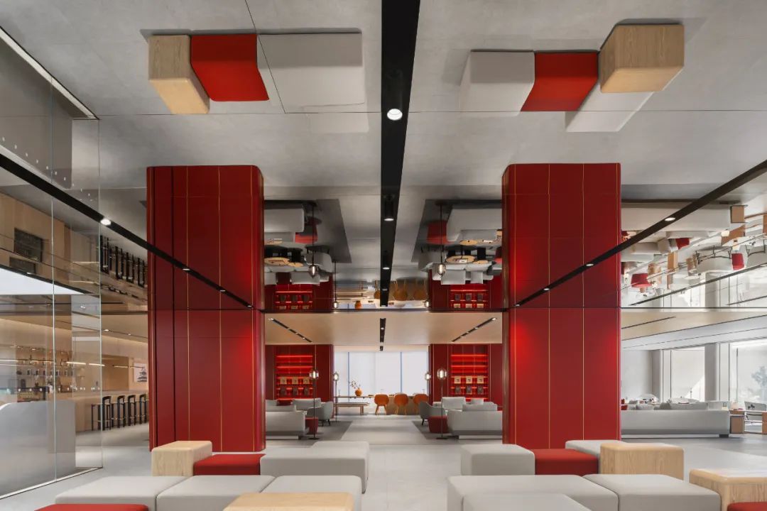
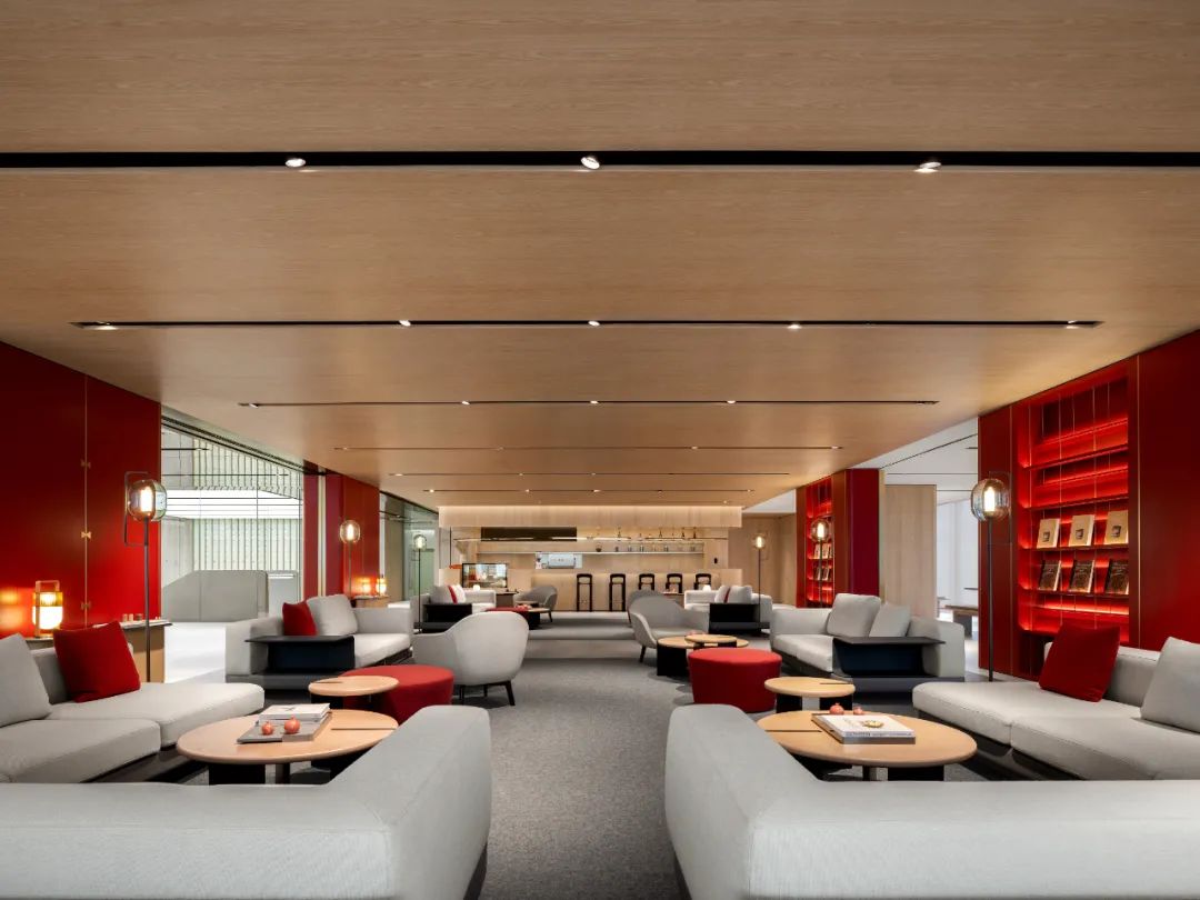
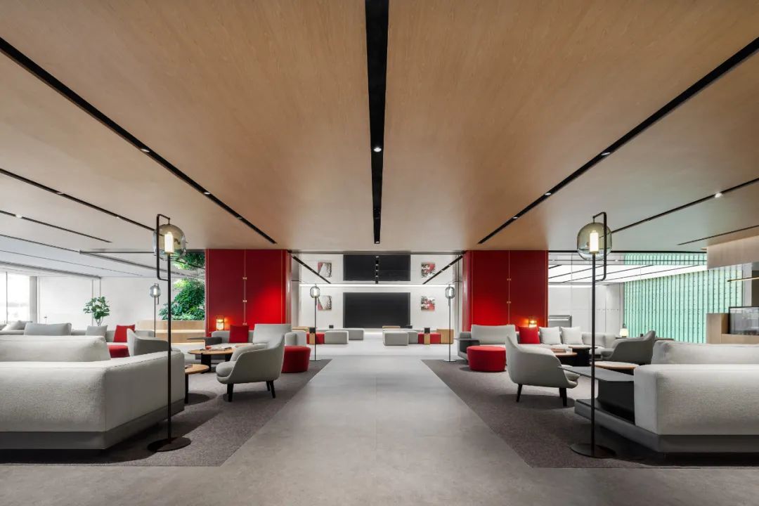
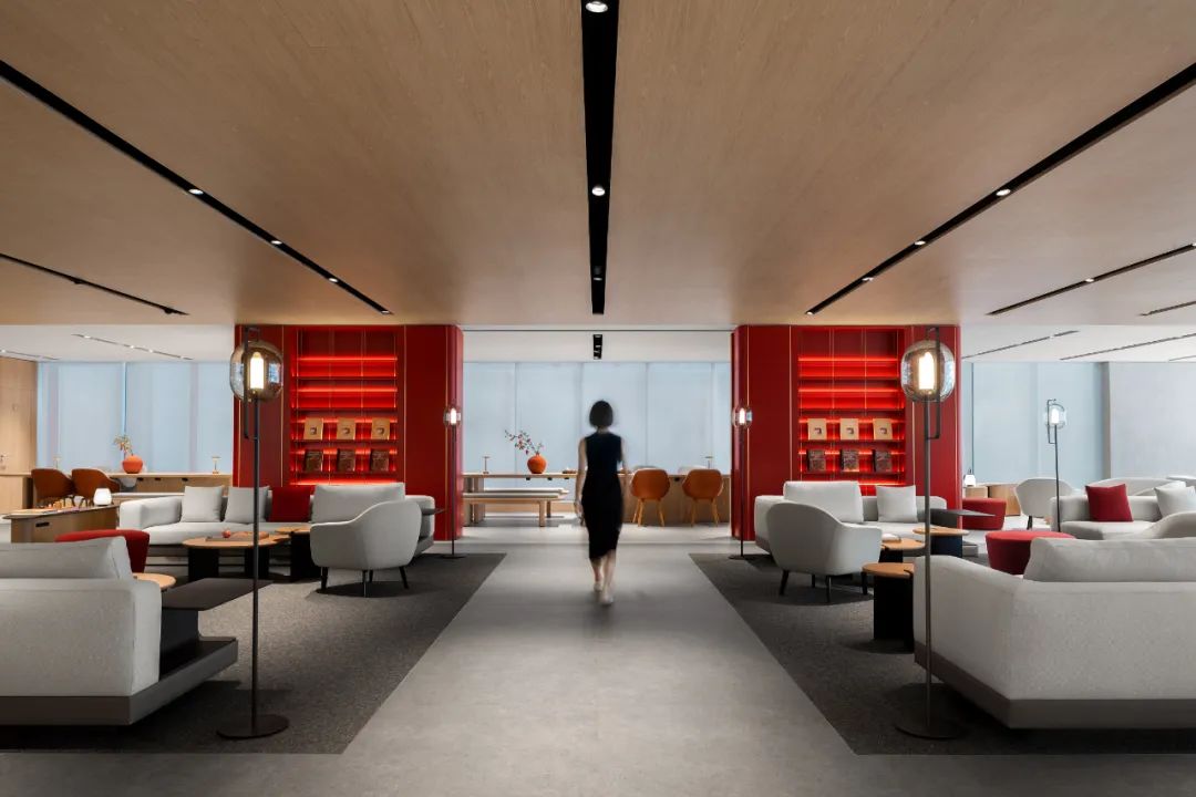
对称的布局下的木顶红墙浓缩了京城的时光,在体验上又回归当下的时代精神与生活方式。
Within the symmetrical layout, the amalgamation of a wooden ceiling and red walls encapsulates the historical essence of Beijing, portraying the city’s timeless moments. Simultaneously, it reflects the contemporary spirit and lifestyle of the present era.
#03 私密性与公共性的平衡
Balancing Privacy and Public Accessibility
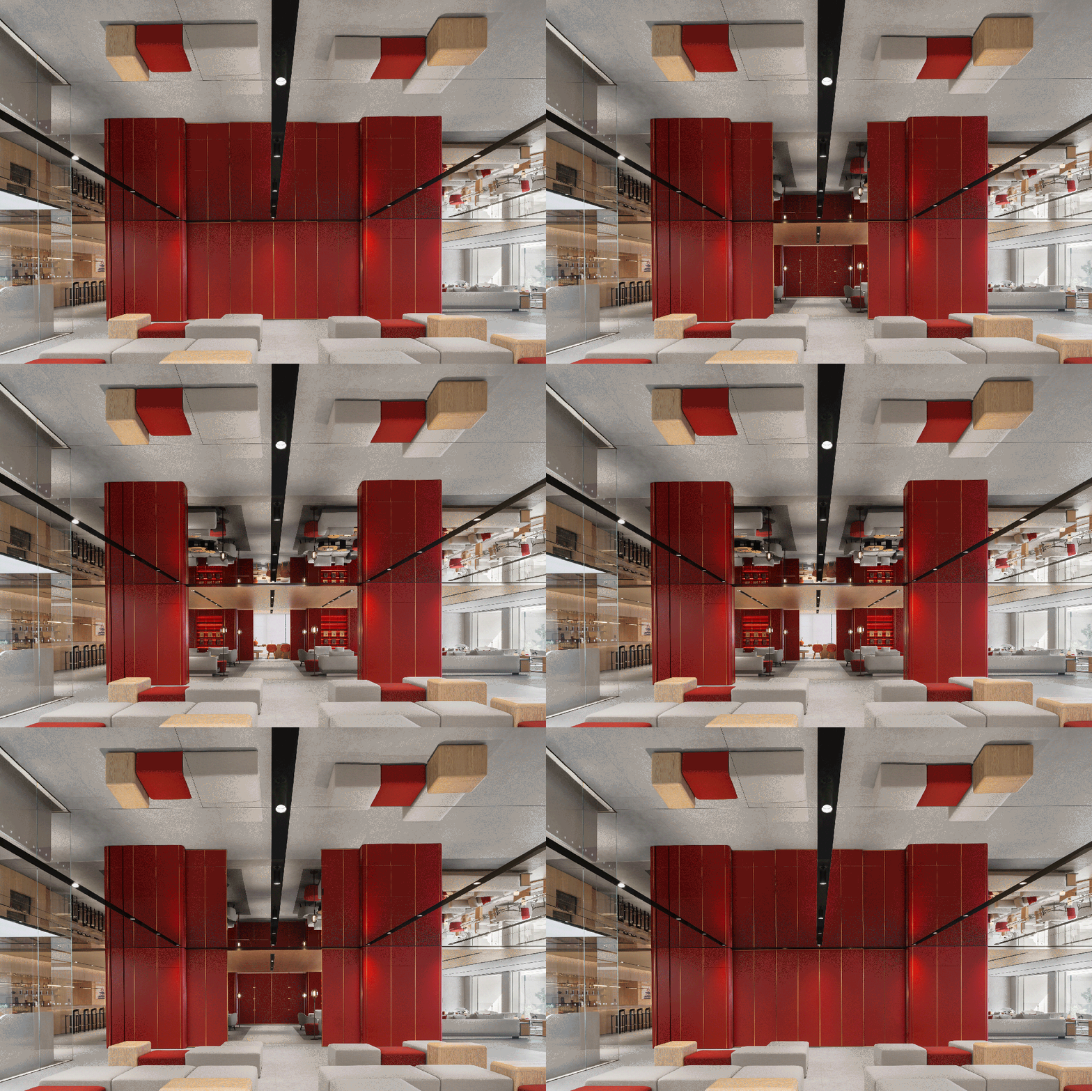
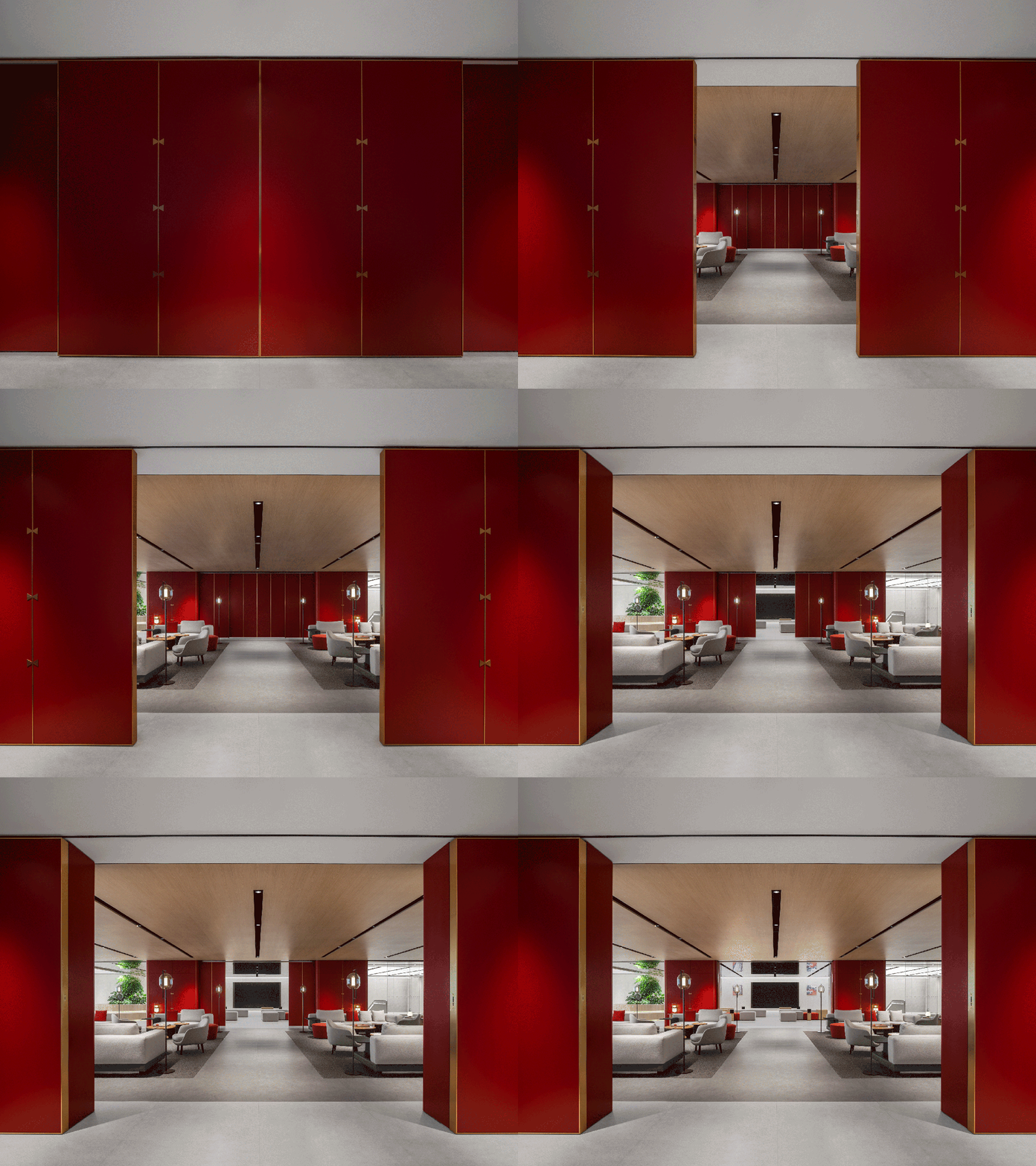
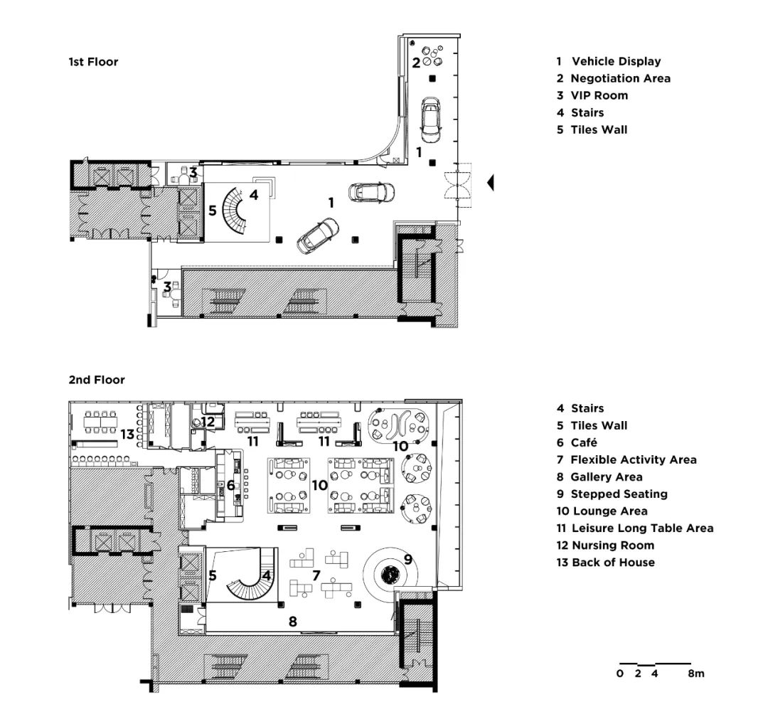
二层包含了咖啡吧、论坛艺廊区、休闲座位区、阶梯休闲区和长桌阅读会议区等。空间的布局遵循对称原则进行设置,多样的使用需求使得建筑的内部空间既非简单的隔断单元,也非单一的大空间——红色墙体内隐藏的推拉门可以根据需求分隔空间。
The second floor comprises the coffee bar, forum & gallery area, casual seating, tiered lounge, and a long-table reading conference area. Adhering to the principle of symmetry, the spatial layout caters to diverse needs, offering more than a simple division of spaces or a singular large area. Ingeniously hidden sliding doors within the red walls provide flexibility, allowing for customizable spatial configurations based on specific requirements.
▲ 隐藏在墙体里的推拉门可灵活的分隔空间
Sliding doors concealed within the walls provide flexible space separation.
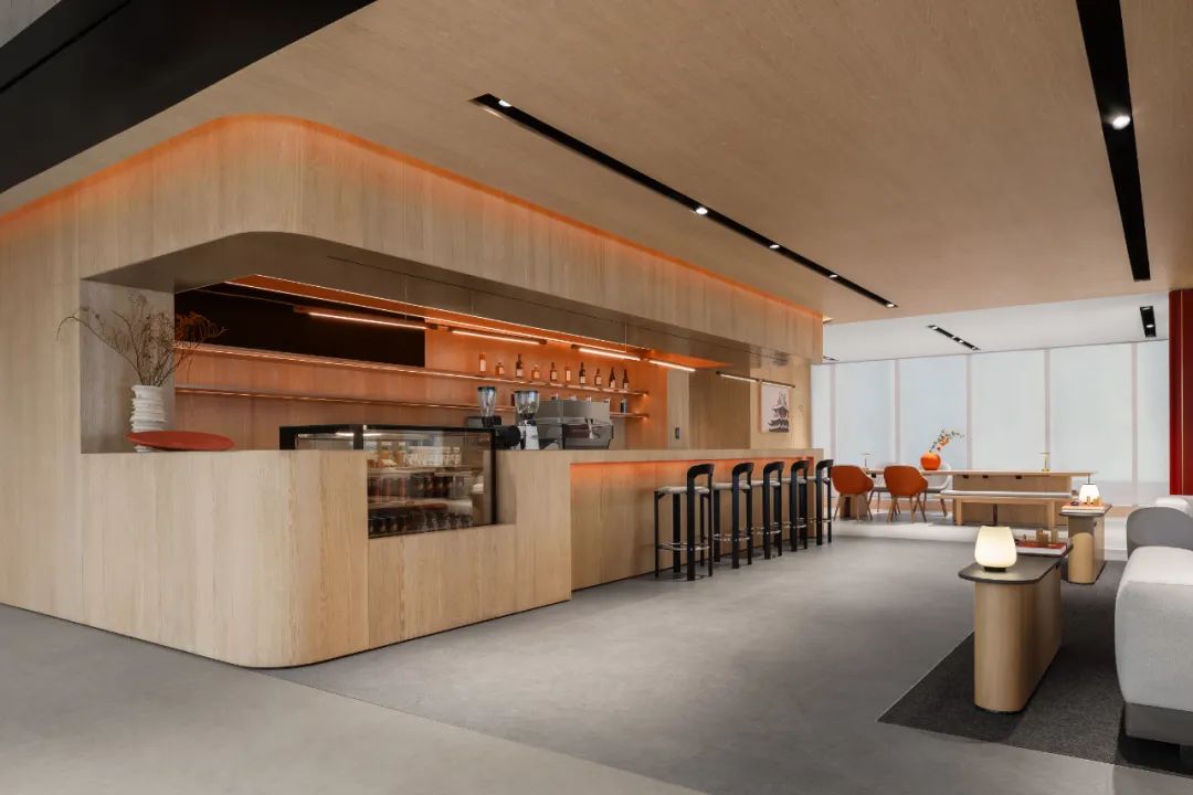
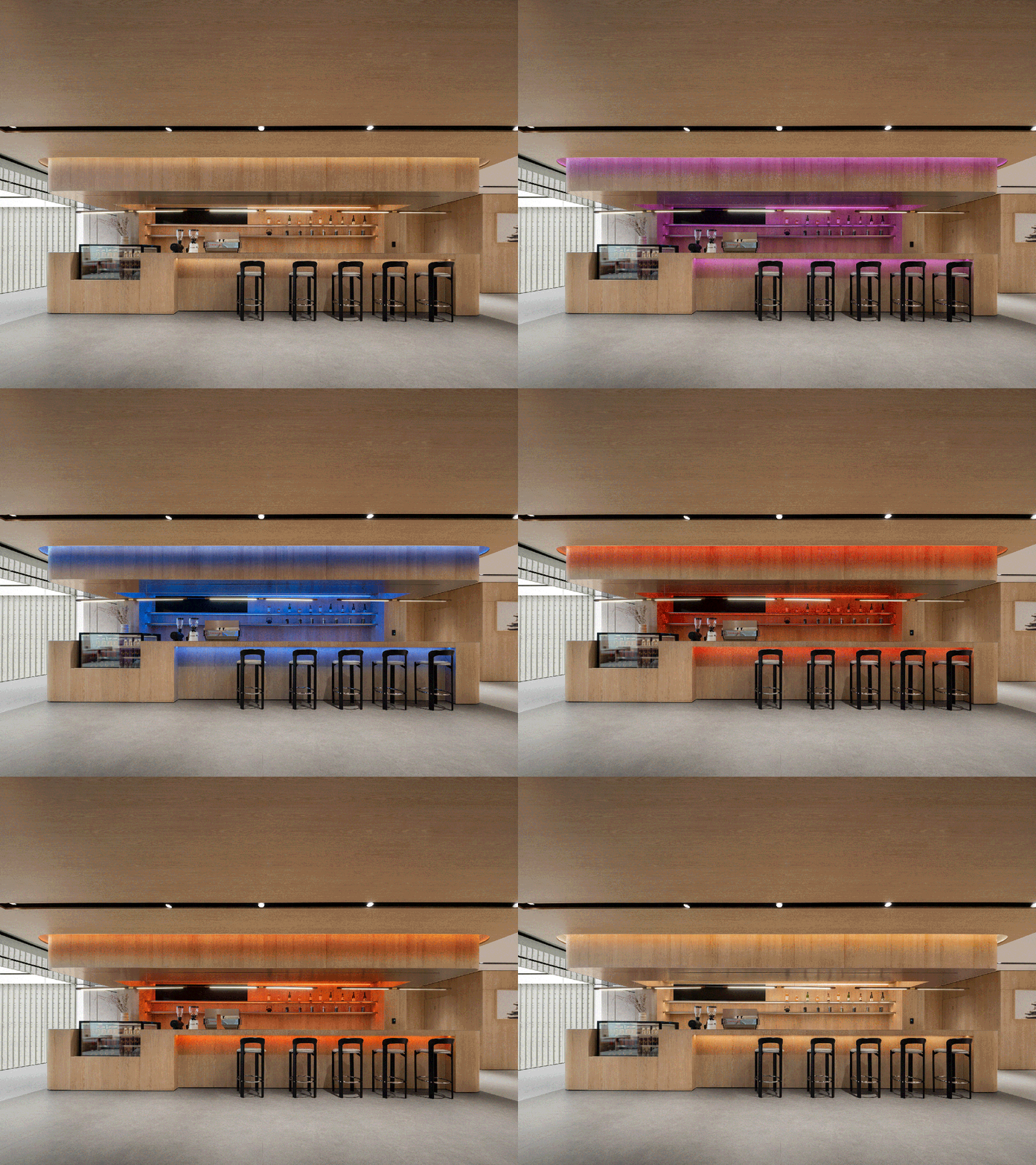
▲ 咖啡吧台通过灯光模式设置,满足在不同的时间和使用场景下打造与之匹配的灯光场景效果。
The coffee bar, configured with various lighting modes, caters to creating matched lighting scenes for different times and usage scenarios.
功能分布沿动线从开放到私密的递进,创造了多样的场景——从开放的可变式论坛艺廊空间,到休闲自在的 lounge,再到安静独立的阅读空间,旨在平衡空间的私密性与公共性。
The distribution of functions follows a thoughtful progression from open to private along the circulation lines, curating a diverse range of scenes. From an open and adaptable forum & gallery space to a leisurely and comfortable lounge, and finally to a tranquil, independent reading area, the aim is to strike a perfect equilibrium between privacy and public accessibility.
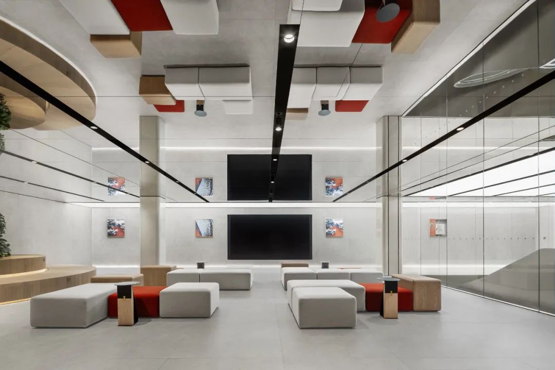
▲ 日常为艺廊休闲区,墙上正在展出极氪社区用户的摄影作品。
During regular days, the art gallery serves as a leisure area, showcasing photography from the Zeekr community users on the walls.
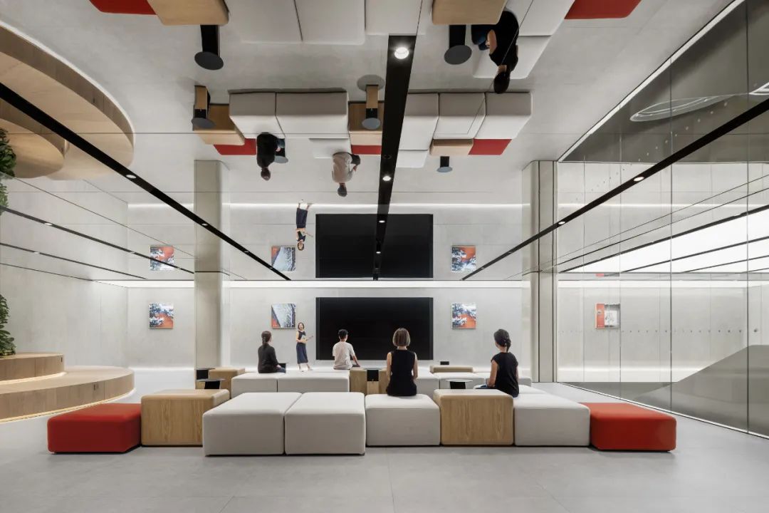
设计师通过灵活的家具设置,便捷的完成从休闲场景到论坛场景的切换。
Through the use of flexible furniture arrangements, the designer transitions from a casual setting to a forum scene.
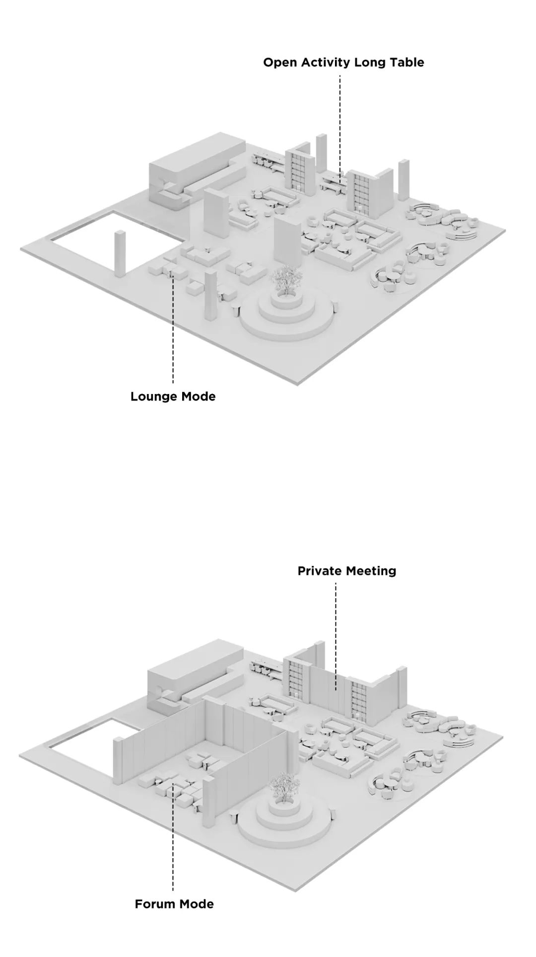
▲ 场景切换示意
Scene transition illustration
▲ 艺廊一侧的休闲阶梯座位区
A laid-back tiered seating area graces one side of the art gallery.
从长桌区看向论坛区。层层递进的功能设置,通过红色的隔断和推拉门平衡了不同使用场景的私密性需求。
Looking from the long table section towards the forum area, the thoughtfully layered functional setup harmonizes privacy requirements for various usage scenarios using red partitions and sliding doors.
▲ 从 Lounge 区域走向独立长桌阅读区
Moving from the lounge zone to the single long-table reading area.
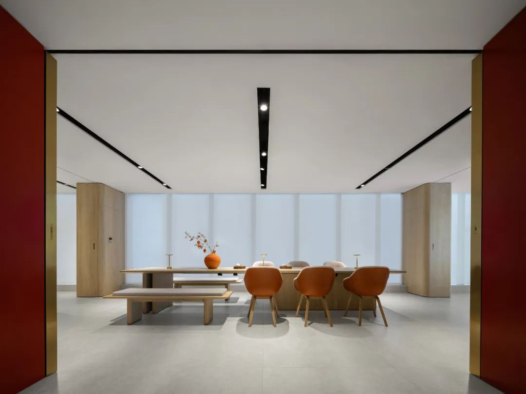
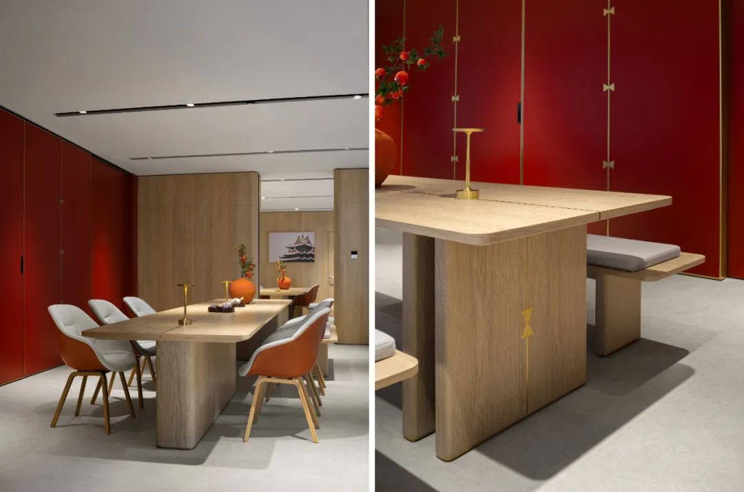
▲ 可分隔为独立房间的阅读长桌区
The reading long-table zone, divisible into independent rooms for added versatility.
#04 隐藏在细节中的文化巧思
Cultural Ingeniuty Woven into the Details
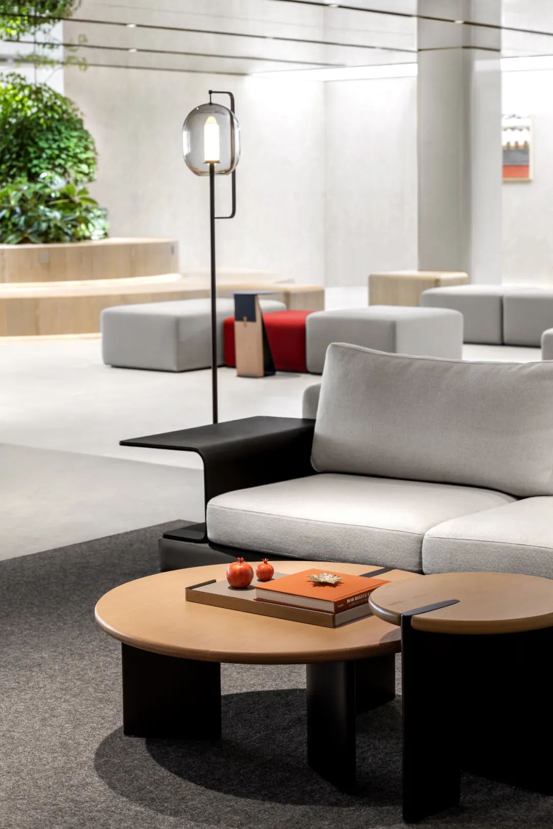
文化的传达不仅只在空间规划,空间内的家具和装饰品细节也回应了在地文化特点。家具和装饰品的选择强调现代与传统元素的融合,如“灯笼”形态的落地灯、仿佛点燃的蜡烛形式的中央灯具,以及边几上的台灯等,都回应了传统文化中的灯笼形式。尽管来自不同品牌,但这些家具都与空间的风格主题融为一体。
The furniture and decor selection emphasizes the fusion of modern and traditional elements, such as the floor lamp resembling a palace lantern, central lighting fixtures reminiscent of lit candles, and table lamps on side tables responding to traditional lantern forms. Despite originating from different brands, these furnishings integrate with the spatial theme.
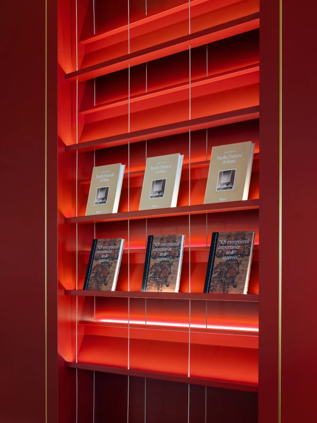
设计师还从传统工艺中汲取灵感——红色墙体上的黄铜榫片来源于传统的榫卯结构工艺:黄铜制的银锭榫嵌在隔断和家具的板与板之间,使拼接牢固防止开裂。
The brass ingot tenons on the red walls take inspiration from traditional mortise and tenon craftsmanship, guaranteeing robust joints and averting cracks between panels and furniture.
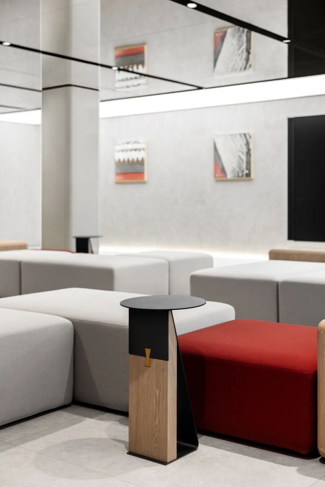
除此之外,设计师还专门为空间定制了带有榫卯嵌片的家具,与红色墙面的黄铜榫片互相呼应。
Additionally, the designer has crafted bespoke furniture embedded with mortise and tenon pieces, echoing the brass ingot tenons on the red walls.
▲ 带有黄铜嵌片的家具
Furniture adorned with brass inlays.
桌面上的石榴摆件源自于中国传统中吉祥寓意的蔬果,设计师巧妙地借此回应“送榴传谊”的典故。这些细节让人无论从空间的整体感受,到身在其中接触使用的产品,都能深刻地体验到品牌与城市文化的积极互动。
The pomegranate ornament on the tabletop derives from the auspicious symbolism of traditional Chinese fruits, cleverly responding to the anecdote of “gifting pomegranates to express friendship.” These meticulous details, whether perceived within the overarching spatial ambiance or during interaction with individual products, profoundly engage observers in the positive synergy between brand essence and urban culture.
通过这一独特而具有深度的设计,MOC 致力于为到访这里的用户提供一个融合现代与传统文化的独特体验场所。
In crafting this unique and carefully planned space, we aspire to provide visitors with an experience that effortlessly blends modern and traditional culture.
▲平面图,Plan
项目名称:极氪中心-北京王府国际中心店
项目面积:1255㎡
设计周期:2022 年 2 月-2022 年 6 月
完成时间:2023 年 7 月
建筑立面/室内/灯光/软装:MOC Design Office
主持设计:杨振钰,梁宁森,吴岫微
设计管理:杨振钰
设计团队:吴锋,古耸宇,吴心鸿
业主:极氪汽车
业主设计团队:徐皓,徐震,郑文嵘,周媛
项目管理:戴德梁行装修工程(北京)有限公司上海分公司
施工图团队:上海康业建筑装饰工程有限公司
施工单位:上海豆源建筑装饰工程有限公司
主材:水磨石,水磨石拉槽预制板,岩板,镜面不锈钢,喷砂不锈钢,超白玻,定制夹胶玻璃,木饰面板,烤漆板,黄铜片,地毯
家具供应商:饰耐铂(上海)贸易有限公司
摄影:聂晓聪
客服
消息
收藏
下载
最近


