查看完整案例


收藏

下载

翻译
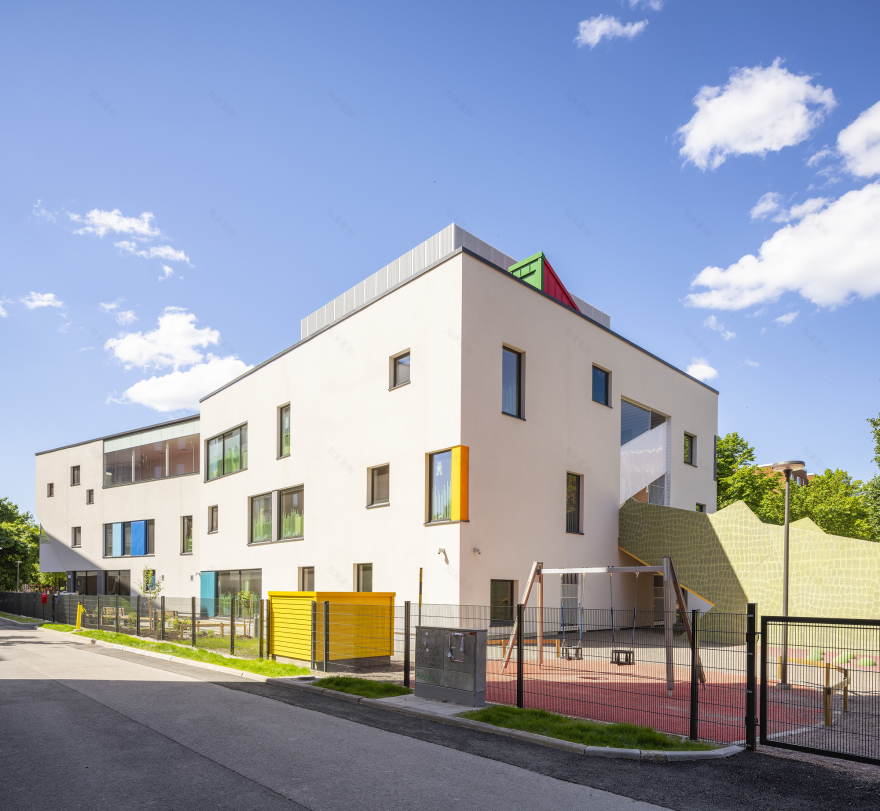
The new Tikkurila daycare centre is located in the heart of Vantaa, Finland, on a small plot amidst densely built residential area. The architecture of the building stands out to indicate public nature in contrast to the surrounding private buildings. With white plastered facades dotted with bright colours it creates refreshing contrast to the surrounding red brick seven storey buildings.
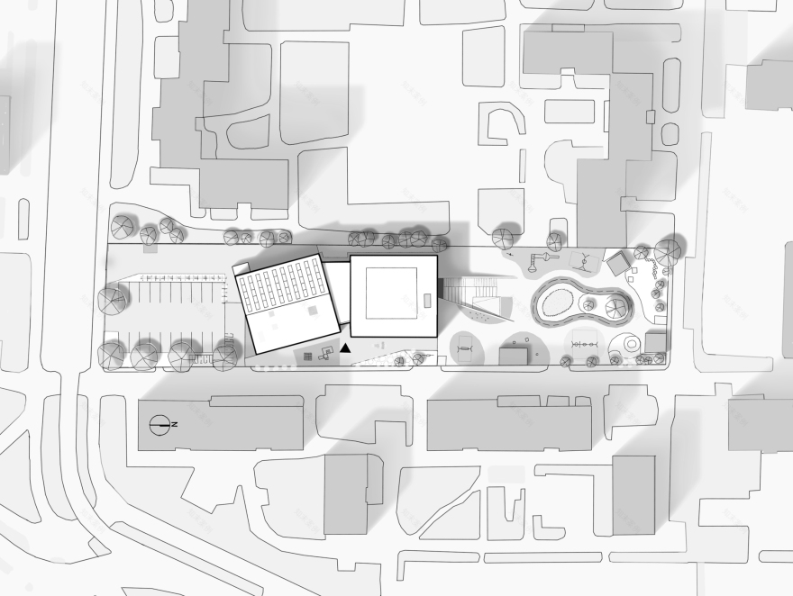
The positioning of this three-storey building has been optimized to give the children all recreational space possible. The building consists of two cubes in identical size connected with a glass joint section, which also includes the main entrance. The building is open to the residents of the area, which is why the appearance of the first floor is more transparent and welcoming. The pedestrians can see what is going on in the building through the large windows facing the Vehkapolku pedestrian street.
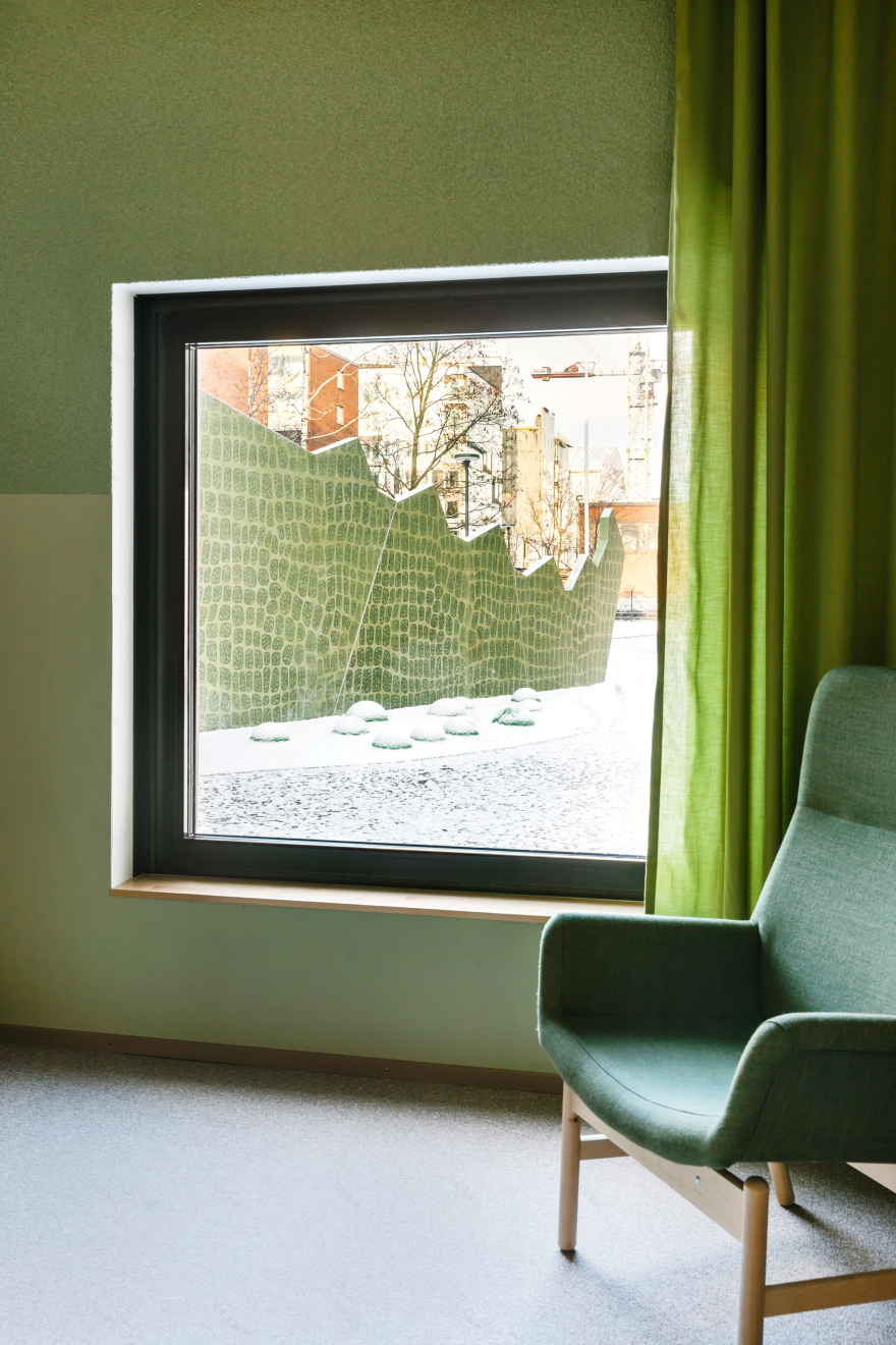
With over 250 children, the day care centre is one of the largest in Finland and the first one built on three floors. The limitations of the plot and the small footprint of the building demanded special attention into the children’s way of movement – it was to be natural, easy, and fun. A giant crocodile made of graphic concrete was designed on the side of the garden so that children could slide out of the building instead of climbing stairs. The mouth of the crocodile serves as a canopy during rainy days and its stomach can accommodate plenty of toys.
Splashes of bright colours enhance the appearance of the building’s light main volume. As the building’s main audience is children, the aim was to give the building a happy and energetic appearance with the means of high-quality architecture. The building is enriched with many small-scale designs for the children to observe from up close, and windowsills are low so that even the smallest toddlers can see outside. The lively colours of the façade are also visible on the garden surfaces and its small buildings, making it easy to perceive the spectrum of the yard from the upper floors of the adjacent residential buildings.
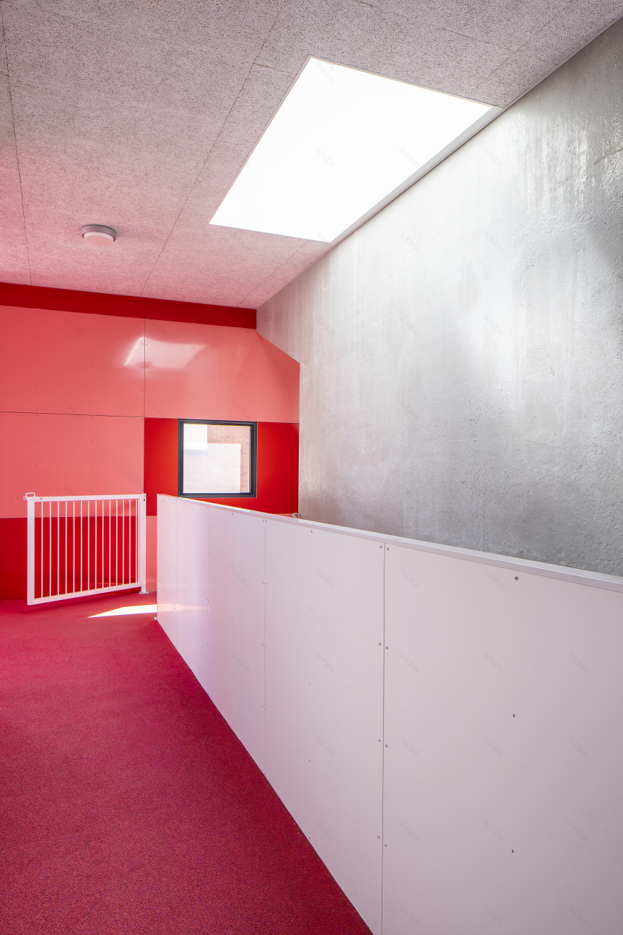
Finnish education principles of an open learning environment have set the guidelines for interior architecture. Acoustics have played a central role in the design resulting in a variety of soft texturing of floors, walls, and furniture. The difference in colour saturation levels of the interior and the exterior play along with the desired energy and sound levels of the children: vibrant and lively outside, more subtle, and cosy inside. The calming colour themes of the interior also help the children orientate and give room for the brighter colours brought by kindergarten life. The first floor is a light mossy green, the second floor is yellow, and the third floor is blue. A handful of carefully placed animal graphics further help the children find their way and bring joy with every encounter.
客服
消息
收藏
下载
最近


