查看完整案例


收藏

下载
[url=]安艺品牌设计有限公司[/url]
项目名称 / 仁和春天购物中心
项目性质 / 名品集合店
设计面积 / 240㎡
项目地点 / 成都
设计公司 / 安艺设计
主案设计 / 胡永安
越来越多的商业店铺设计中
人性化成为一个非常重要的标准
既要保证产品呈现和空间功能性
同时给予观者明快舒适的视觉感受
More and more commercial stores are being designedHumanization has become a very important criterion.To ensure both product presentation and spatial functionalityAt the same time give the viewer a bright and comfortable visual experience.
这两者的结合
The combination of the two.It's also ANYI DESIGN's reasoning for this case.
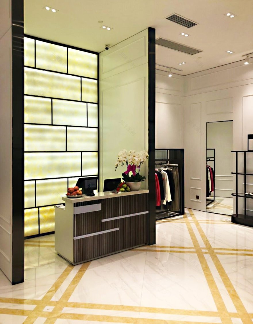
材质由铜、大理石与肌理涂料等构成,
简洁纯粹的面状拼接构成了强烈的现代感。
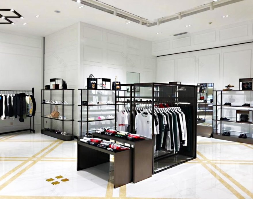
白墙通过连续的金线(金色色金属)作为空间中的要素打造出各个拼接边缘和衣架,彰显出强烈的设计感和不凡的气质。
In this design, the main colors of space are black, white, gray, and gold. The material consists of copper, marble, and texture paint. The simple and pure facial splicing constitutes a strong sense of modernity. The white wall creates various splicing edges and hangers through continuous gold lines(gold metals) as elements in the space, demonstrating a strong sense of design and extraordinary temperament.
纵横交错的几何线条和墙体,
却又仿佛隐藏了许多秘密,
让人忍不住驻足。
The simple, open entrance seemed to make the whole space clear,The crisscross of geometric lines and walls,And it's like you're hiding a lot of secrets,It makes onestop.
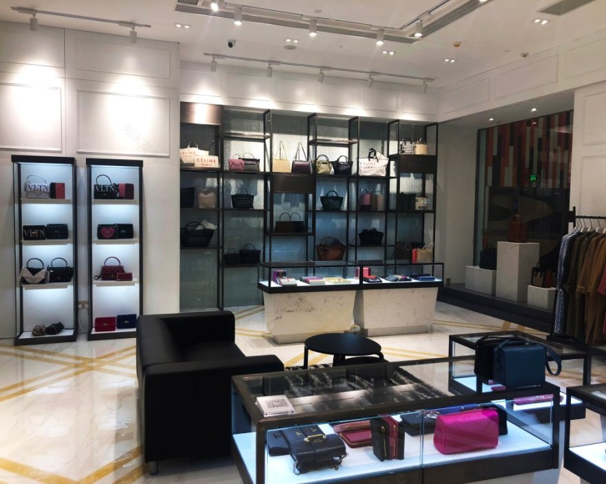
作为一个高级名品的展示空间,
ANYI DESIGN在主色调上也非常注重高级感的呈现。
ANYI整体采用了饱和度高、通透明亮的白色大理石,
As a display space for advanced clothing, ANYI DESIGN also pays great attention to the presentation of advanced sense in the main tone. ANYI as a whole uses white marble with high saturation, transparent and bright, in order to create a display site that is pure and not arrogant.
空间的分割也自动分流了顾客的观赏路线,
人群的分散给予了产品更高的关注度,
让每个人都能更细致地欣赏和了解奢侈品本身的设计美感。
The division of space also automatically diverts the customer's viewing route,The dispersion of the crowd gives the product a higher degree of attention,Allow everyone to appreciate and understand the design beauty of luxury goods in more detail.
简约明亮的色调带来舒适稳定的视觉观感,除去多余的装饰。
采用利落的几何图形和交错的光线分布,
进行空间分割和重点呈现,
细节的设计才是人性化的展现。
Simple and bright colors bring comfortable and stable visual perception, removing excess decoration. Using neat geometry and staggered light distribution, space segmentation and emphasis presentation, the design of details is the display of humanity.
广东省惠州市安艺品牌设计有限公司
Guangdong Huizhou Anyi Brand Design Co., Ltd.
客服
消息
收藏
下载
最近


