查看完整案例

收藏

下载

翻译
Architects:Akio Isshiki Architects
Area:102m²
Year:2023
Photographs:Yosuke Ohtake
Lead Architects:Akio Isshiki
Construction:komt
Gardener:Ryokukou Garden
Program / Use / Building Function:House
Curtain:jyu+
City:Toyonaka
Country:Japan
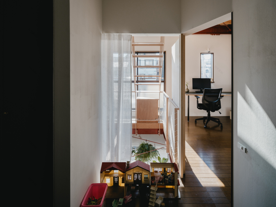
Text description provided by the architects. The way children perceive space may be slightly different from how we adults perceive it. That's what I thought as I casually watched the client's daughters play with toys. Toy furniture could no longer fit inside the red-roofed house, so they gathered up the tables and refrigerators that were sticking out and arranged them on the flooring. Sometimes, it became a dining room under the blue sky or a study room where children came home from school and did their homework together. They also brought Lego blocks and other toys, and the improvised room continued to expand. It was a one-day house for a family drawn by children who cannot read blueprints.
As adults, we have to stare at floor plans with rooms lined up side by side, thinking about how many rooms a family needs, how much space the living room should have, and finding a floor plan that everyone can live in without any inconvenience. The paper floor plan approaches us without any sense of reality, forcing families that have changed and will continue to change to live in a two-dimensional floor plan.
I renovated a 30-year-old ready-built house. The house was located at the end of a row of uniformly constructed ready-built houses. The narrow, repeating façade seemed to have a standardized floor plan attached to the back, which reminded me of a dark and stuffy living space. I wanted to get rid of that image, but considering the budget, I thought it would be better not to make any major changes to the exterior and reuse the interior of the house as much as possible. Therefore, I came up with the idea of inserting a room (or rather, "blank space") with no name or special function into the front of the house, penetrating three levels. In this way, by separating the elevation and floor plan, I thought of creating a residential space that transcends the two-dimensional order.
About 1/3 of the area of the house was used for the blank space. The air that penetrates the atrium is overflowing with light that falls between the plants hanging from the steel frame and the latticework on the floor, gently enveloping the family. The boundaries between the blank space and each room are separated by something as ambiguous and transparent as possible, such as lace-covered shoji screens, curtains, glass, and a diagonal wooden door that opens fully. This allows the family's life to overflow into the blank space, in line with daily changes and the differences in the feelings of each family member. Outside the house, I created a space vaguely enclosed by a bicycle parking area covered with translucent canvas and a small garden. In this way, the blank space extends to the outside of the house, transcending the limitations of elevation and plan. I hope that this reborn house will create a free space for the family that cannot be envisioned in two-dimensional blueprints.
Project gallery
客服
消息
收藏
下载
最近


