查看完整案例


收藏

下载

翻译
Architects:Eldridge Anderson Architects
Area:280m²
Year:2023
Photographs:Ben Hosking
Lead Architects:Scott Eldridge, Jeremy Anderson
Structural Engineering:Yttrup and Asscoiates
Landscape Designer:Simon Taylor Landscape Design
Builder:Murphy James Builders
City:Brown Hill
Country:Australia
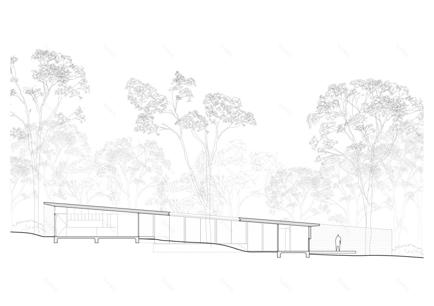
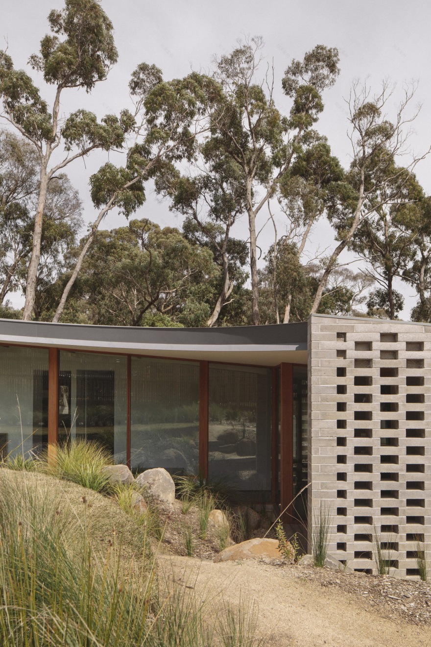
Text description provided by the architects. Brown Hill House has been envisaged as a simple, robust form that reflects the natural fall of its site. Accommodating stepped floor plates delineating family zones, the design shapes a generous central courtyard cut from the form to allow natural light to penetrate. The central open space was designed around the tall gum trees scattered across the site, allowing the built environment to integrate with the existing natural one. A curved roofline is a further mediation, bending graciously around the treed landscape and inclining in sync with the slope of the site. Bunkering farther into the landscape as it falls from back to front, Brown Hill House is composed of a robust material selection arranged in clean volumes, leavening the elemental qualities of the surrounding landscape while finding an accord with them through a complimentary palette of soft greys and warm browns. Concrete brick walls provide weight and clarity, defining the perimeter of the building and allowing the roofline to extend gracefully above. The courtyard, which has been designed as a visual extension of the house, is constantly present through generous glazing and ensures a further sense of visual connection between rooms.
Our clients approached us after seeing our work on social media, in particular, a project we completed in Ballarat a number of years ago. Our clients are a young family with 3 boys and an active lifestyle. They have lived in the Ballarat area for a number of years and were drawn to the idea of living on a larger site where their children could explore the surrounding bushland. They are a social family, often entertaining friends or family from interstate and the house was required to be able to host larger gatherings whilst retaining the feeling of an intimate family home. Our clients were particularly interested in creating a house that allowed them to keep a passive watch over the children whilst maintaining privacy and spaces to retreat.
The brief focused on the idea of a reasonably robust and cost-efficient family house that would age gracefully and sit comfortably on the sloping site. It seemed important to provide a clear overall space that was well connected and also had breakout spaces for different activities, entertaining, and kids play. When we first visited the site, we saw a series of very tall trees with minimal foliage at the lower levels. Our interest was to maintain the existing trees where possible as well as to work with the natural contour of the land falling in two directions. Following an arborist assessment, we felt that a building that maintained a singular presence and shifted around the existing features would be the most suitable approach. The circular courtyard eave began to emerge in the early stages of the design, allowing us to develop a scheme that was inwards facing with a strong connection to the landscape. The courtyard also began to provide some separation to the family gathering spaces from the more private zones of the house whilst retaining the visual connection. The glazing steps around the edge provide articulated corners and allow the sun to warm the concrete in cooler months and protection in summer.
The natural slope of the site fell in two directions and prompted a series of levels and a sloping roofline that reflected the gentle fall over the site. The footprint and arched roof edge were intended to provide sun protection to the glazing while allowing light and visual connection between zones of the house. The arch was also offset from an original tree that proved too unstable to retain and eventually provided a nice central space for the pool and lawn terrace. Our approach was driven by an efficient response to the brief and site, in particular, the existing trees, the slope of the site, and its orientation. The courtyard space was developed as the key design driver and orienting device that connected the house and provided a central sheltered focal point. The courtyard was located to take advantage of the northern aspect, and the internal spaces were laid out around the courtyard. As the sun moves throughout the day, the light that is allowed to enter or excluded depending on the depth of the curved folded steel eave creates a dramatic sense of time and enclosure.
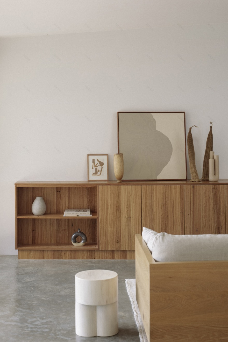
We utilized masonry walls for the perimeter of the house, which is an economical material we have been interested in for many of our early projects. In this case, we explored a concrete brick that dissolved into a hit-and-miss brick screen at the courtyard wing walls. The durability and robustness of the brick skin enclose a warmer internal material palette. The grey external colorings sit well with the bushland and gently patinas to make it feel as though it’s been sitting comfortably on site for many years. The courtyard is predominantly glazed with hardwood timber frames that carry through into the exposed timber roof structure through the hallway space. We limited the interior palette to reflect the light, emphasizing the focus on external space as a dynamic and evolving experience. The bathrooms are slightly darker, providing a subtle sense of privacy, and include wide slot windows viewing the adjacent bushland from the shower.
The most significant custom item in the house is the curved steel eave, which forms the perimeter of the courtyard. This was designed in collaboration with a local fabricator, which required careful detailing. The folded steel curves and rotates in multiple planes to frame the edge of the courtyard roof.
The success of the project really relies on the quality of space that the courtyard has allowed for. It has been humbling to hear how much our clients enjoy living in the space and noticing subtle changes in the quality of light through the day and seasons. The way that the building engages with the site and nestles into the landscape, maintaining a modest profile from the street, is something that we have enjoyed upon returning to visit our clients over many visits since the building was completed.
Project gallery
客服
消息
收藏
下载
最近


