

创作上传
VIP
收藏下载
登录 | 注册有礼
查看完整案例

收藏

下载

分享
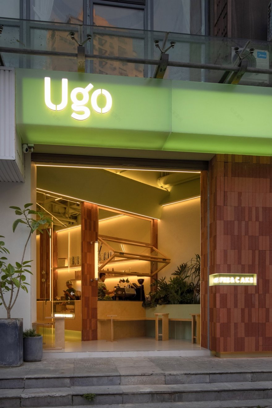


UGO咖啡活泼的色彩和鲜明的个性,在店铺林立的老城区中,让路人过目不忘,成为街上的一道风景。我们以UGO咖啡的Logo及招牌产品——牛油果特调果咖为设计指引,用对比强烈的果绿及砖红色来强化视觉色彩、突出具象口感。双层透绿亚克力灯箱光线柔和,同时呈现了甜品的Q弹感,十分契合咖啡甜品店的调性。
The lively color and distinct characteristic of UGO Café makes it leave a deep impression on the passersby in the old town where there are many stores, and become a scene on the street. We take the Logo of UGO Café and its signature product——Avocado Blended Coffee as the design guide. We use the strong contrast of fruit green and brick red to enhance the vision and highlight the concrete taste. Double transparent green acrylic light box makes the light soft and presents the al dente taste of the dessert, which very fits the style of a coffee and dessert store.
空间布局上,针对斜角T形店铺的格局,做了内退回正的设计处理,将入口斜角处设计为半户外的开放区,搭配绿植后,形成视觉的层叠错落。互通内外的吧台方便咖啡师与顾客的互动,而室内灵活的卡座区则可以任意搭配顾客的居座数量。全新的空间设计,UGO咖啡呈现了年轻、潮流的视觉观感及甜蜜、丰厚的味觉想象。
In terms of space layout, for the store's bevel T-shaped pattern, the design process of internal setback and straightening is conducted. The bevel of the entrance is designed as a semi-outdoor open area, which is matched with green plants to form visual overlapping and scattering. The bar that connects the inside and outside facilitates the interaction between baristas and customers, while the flexible interior booth area can match the number of customers. The new space design makes UGO Café present young and fashionable visual appearance, and sweet and rich taste imagination.
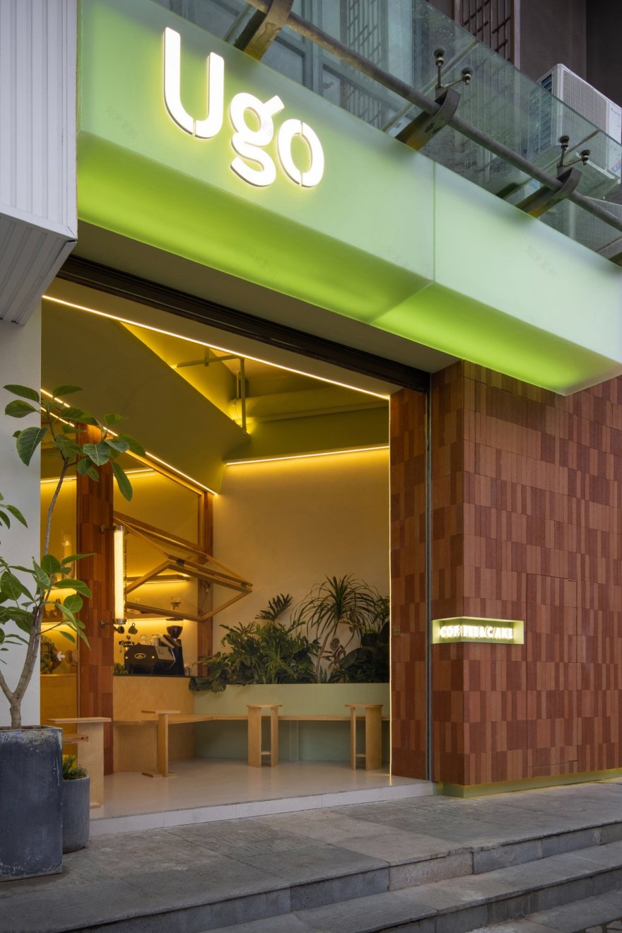
果绿与砖红的传递味觉。绿色亚克力店带来果冻般的内透效果,与红陶砖表面的粗糙磨砺质感,形成了色彩和材质的反差碰撞。“退 一 步” 带来的空间自由。大堂内退,留出了一个开放式卡座区域,背后的绿植让空间的层次感呈现。上翻的木叠窗,保持内外开放和自然舒适。
Taste transmission of fruit green and brick red。The green acrylic shop brings jelly like inner penetration effect, which forms a contrast and collision with the rough and polished texture of the red pottery brick surface. Space freedom brought by "step back". The lobby retreats, leaving an open card seat area. The green plants behind make the space layered. The wooden folding windows turn up to keep the inside and outside open and natural and comfortable.
运用暖色的海洋板和奶茶色墙漆,在跳脱的色彩中又注入了温馨画面。原木与绿都是自然的本色,带来舒适松弛的感受体验。推开绿色的橱窗,新鲜出炉的甜品传送而至。红陶砖的穿插,让色彩的对比更为活跃。上墙的心情盒子则是店主的一处小巧思,你在这里可以随意抒发自己此刻的心情感悟。
The warm ocean board and milk tea color wall paint are used to inject warm pictures into the jumping colors. Both logs and green are natural colors, bringing you comfortable and relaxed experience. Open the green window, and fresh desserts are delivered. The interpenetration of red pottery bricks makes the contrast of colors more active. The mood box on the wall is a small ingenuity of the shopkeeper, where you can freely express your feelings at the moment.
看似随意的一个角落,但通过空间材质、色彩的巧妙搭配,无不透露出了UGO的甜蜜气息。 流露随意的消遣场景,是UGO所提倡的生活态度。
It looks like a casual corner, but through the clever collocation of space materials and colors, it reveals the sweet flavor of UGO. Showing casual recreation scenes is the life attitude advocated by UGO.
Interiors:缪茹设计
Photos:吴昌乐
Words:缪茹设计
南京喵熊网络科技有限公司 苏ICP备18050492号-4知末 © 2018—2020 . All photos and trademark graphics are copyrighted by their owners.增值电信业务经营许可证(ICP)苏B2-20201444 苏公网安备 32011302321234号
苏公网安备 32011302321234号客服
消息
收藏
下载
最近