查看完整案例

收藏

下载

翻译
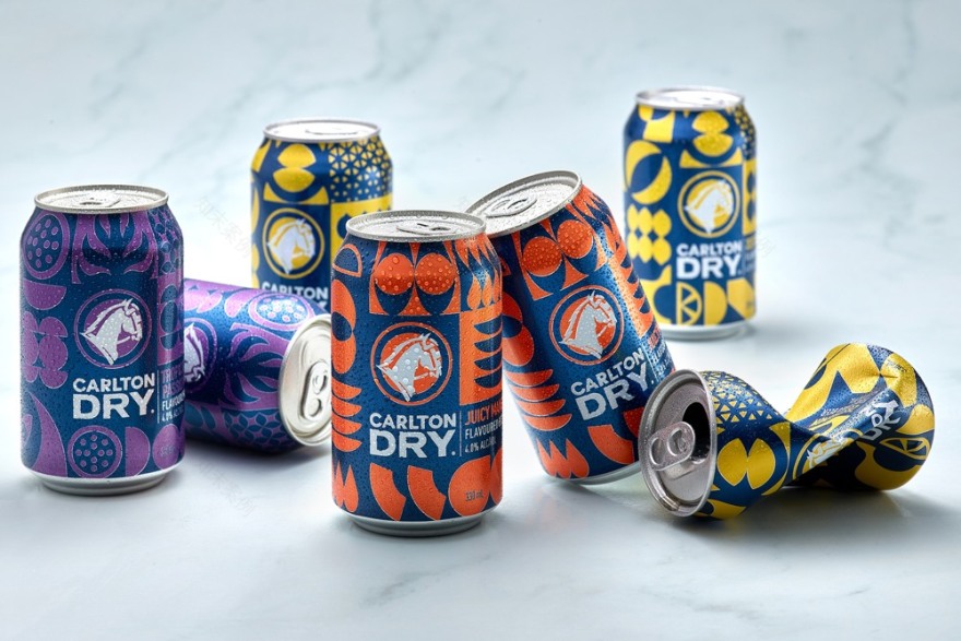
Carlton Dry, Australia’s leading low-carb, full-strength beer, has been a firm favourite on home shores with drinkers for nearly a decade. However, over the last few years, consumers’ tastes have changed — moving from traditional classic beers and wines to new offers such as Seltzers and pre-mixed RTDs. Carlton & United Breweries wanted to bring new news and interest to Carlton Dry with the launch of a range of easier drinking, less bitter and fruitier tasting beers to connect with consumers looking for something a bit different.
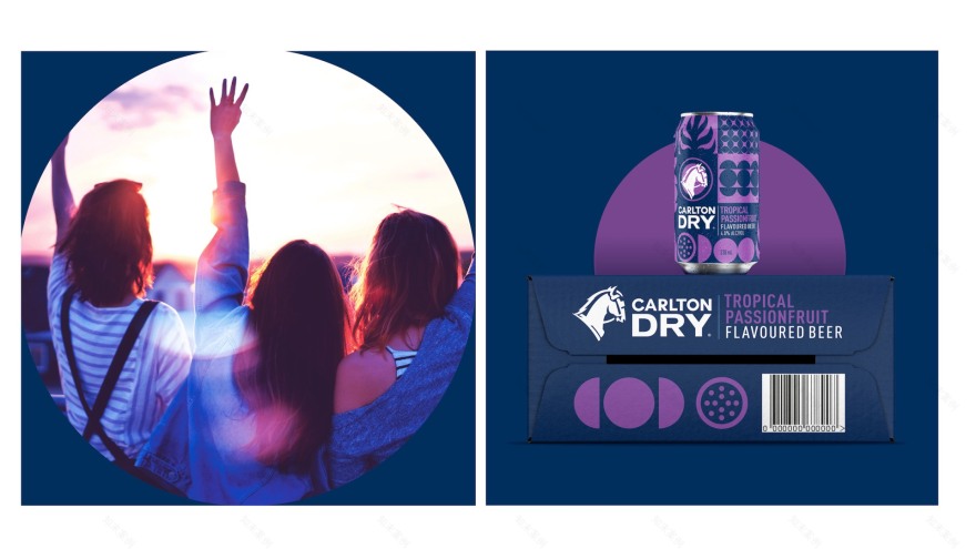
With the new range, it was important to create a brand expression that felt modern and dynamic. Clean geometric flavour abstractions were used to create a new graphic language to help move the brand forward into a new space. Each flavour in the collection features a different pattern/design structure that delivers an impactful and contemporary appeal to a new drinker.
The range of three flavours is now available throughout Australia.
Designed by :
WhatCameNext_
客服
消息
收藏
下载
最近


