查看完整案例

收藏

下载

翻译
DYM
YEAR: 2020
LOCATION: ROSTOV ON DON
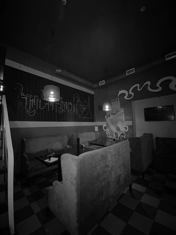
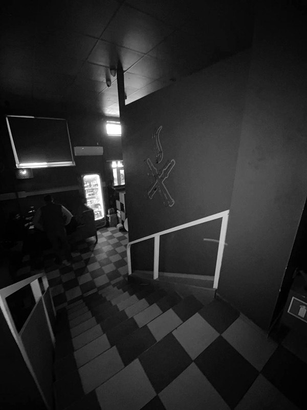
beforE
CONCEPT
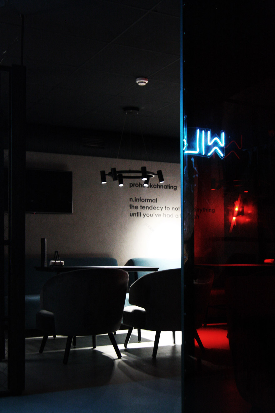
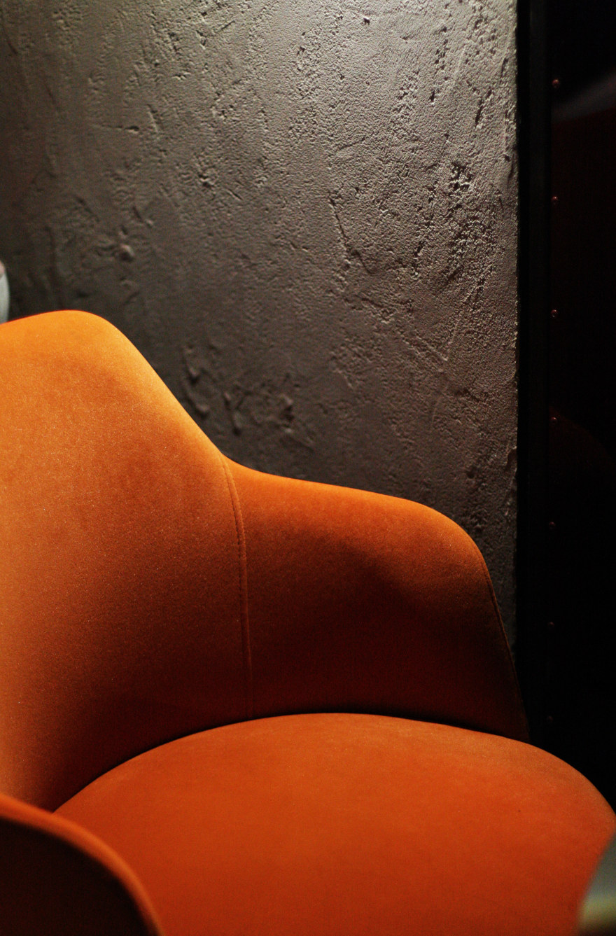
The customers of this project came with a request to make the space relevant, but at the same time, it was necessary to integrate some of the old furniture and preserve the recognizable features of the brand.
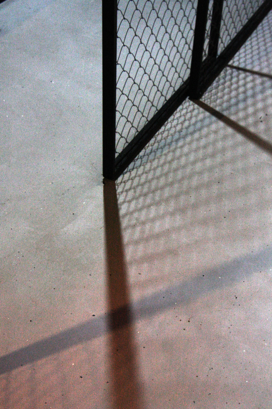
Partitions made of metal, mesh and colored polycarbonate were designed for comfortable zoning. So we managed to diversify the seating options for guests, while the number of seats remained the same.
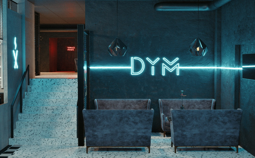
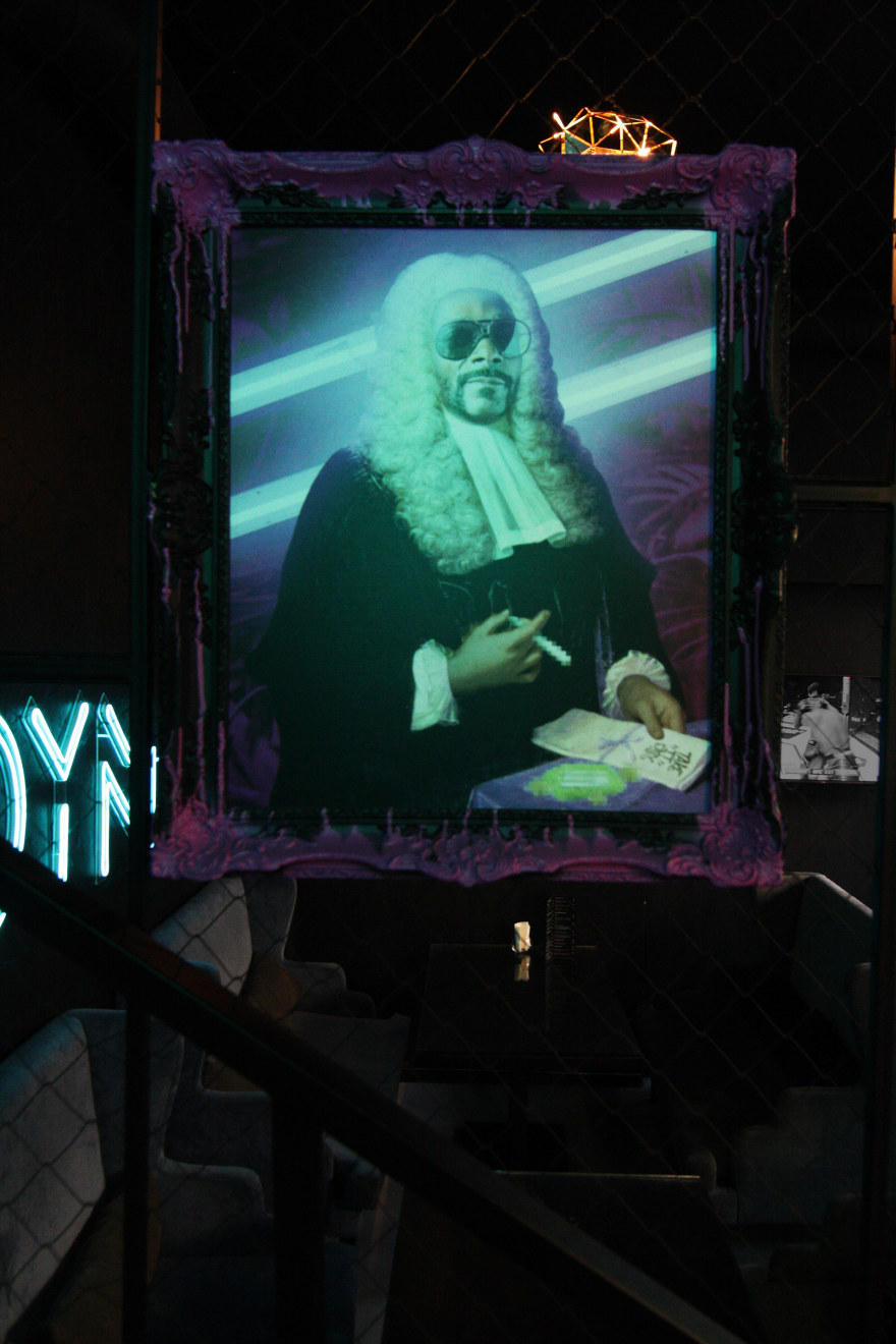
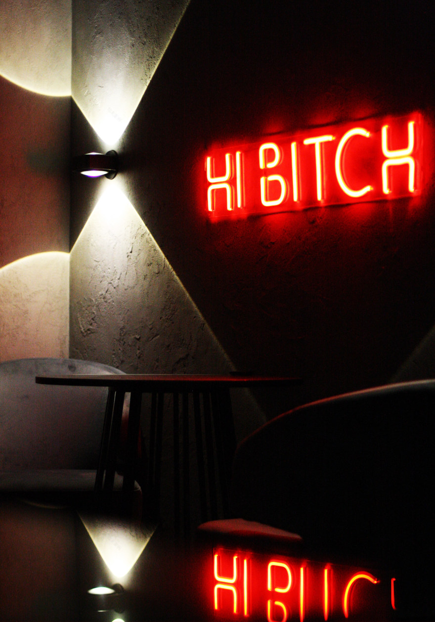
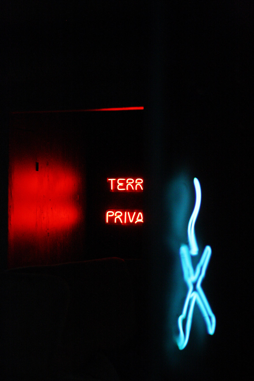
The concept of the first hall has retained the same brand identity. The main color is blue - the color of the logo.Contrast red was chosen for the second hall. Using various lighting scenarios, it turned out to create a visual effect of color transitions and many new photo zones.
Before the reconstruction, private rooms were divided into 4 cramped boxes, separated by a narrow corridor.Now it is a transformable space that can be divided into two rooms or combined into one using a partition with a folding mechanism.
PROCESS
NOW
Thanks for watching!
客服
消息
收藏
下载
最近


