查看完整案例

收藏

下载

翻译
Architects:COTA760
Area:100m²
Year:2022
Photographs:Cris Farhat
Manufacturers:Labluz,REKA
Lead Architects:Luis Rossi, Nicolas Le Roux, Paula Lemos
Project Team:Daniel Carvalho, Pedro Valenzuela
Woodwork:Rutra
Metalwork:Atelier Edição Limitada
Construction Company:Papel Concreto
City:Perdizes
Country:Brazil
Text description provided by the architects. When the client came to us to help him with the renovation of his apartment, his main wish was to have a wide and spacious living room where he could fit his books, music equipment, and projector and at the same time gather his friends comfortably. As he was very fond of cooking, he also wanted a comfortable kitchen that could fit the equipment and have more space to cook. Since the apartment was old but had already undergone a complete renovation, we focused on these main spaces and the second bedroom, which became an office and guest room.
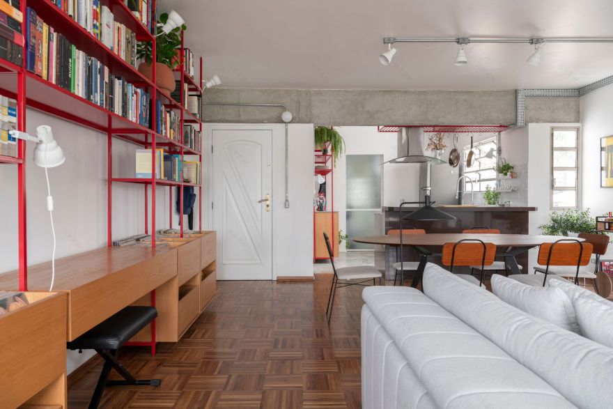
To make the transformation possible, the main intervention we carried out was to remove the third bedroom of the apartment. It occupied a large space in the room and ended up making it L-shaped. With its removal, the living room gained a more rectangular shape and became fully integrated.
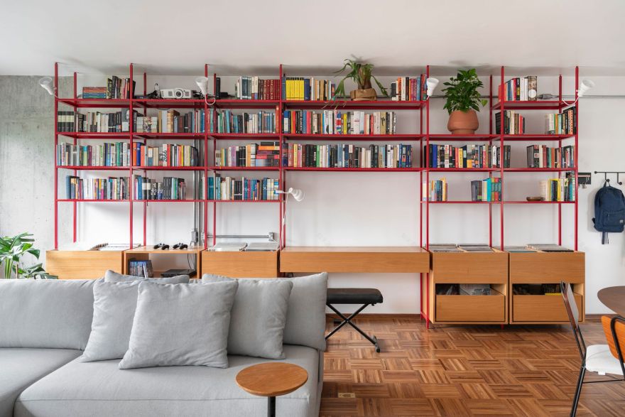
To bring more unity to the space and meet the client's needs, we proposed a large red metallic shelving that took up the entire wall of the room. In it, it was possible to accommodate the collection of books, records, sound systems, a projector, and even the electronic piano. The red painting highlighted this element and brought color to the environment, which in general remained more neutral.
The wooden floor in the living room, which was one of the coolest pre-existing elements in the apartment, was complemented at the points of demolition and restored. On the walls, we stripped some pillars and the concrete beam between the living room and the kitchen, so that this material that was hidden under the plaster would become part of the composition of the environment.
We used the metallic shelving to also light the apartment, hanging directional spotlights pointing to the ceiling to create indirect lighting for the room. We completed this lighting with wall sconces and floor and table lamps. On the dining table, we placed some ceiling spots, avoiding hanging lights for greater visual integration of the space.
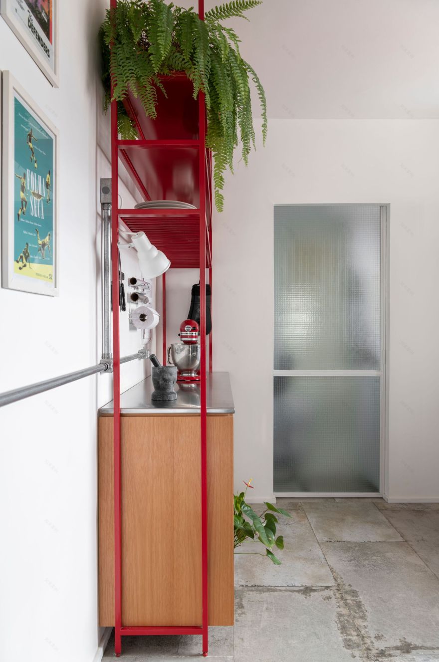
In the kitchen, we preserved the existing countertops and flooring but changed the joinery so it would better communicate with the intervention in the living room. By changing the position of the laundry room door, we were able to add a new countertop that was made in the same style as the metallic shelving in the living room. We've also created a metal shelf over the cooktop to provide extra more relaxed storage space.
In the office, we used the same logic from the joinery in the living room, creating a metallic structure with wooden elements. On the other hand, we made the metal structure white in this environment, creating a lighter ambiance for the work area.
Project gallery
Project location
Address:Perdizes, São Paulo - SP, Brazil
客服
消息
收藏
下载
最近


