查看完整案例

收藏

下载
黑色是一种有态度的颜色,他分明在说:我不烦你,你也别来烦我。
——山本耀司
Black is a color with strong attitude, which is evidently saying: I do not bother you, and please do not bother me, either.
——Yohji Yamamoto
项目信息
项目名称 | 英国买手店
Project Name | British Buyer’s shop
项目面积 | 300 平方米
Project Area | 300m²
设计公司 | 上海仓石设计有限公司
Designed by | Shanghai Cangshi Design Co., Ltd.
主创设计 | 邵龙
Master designer | Long Shao (Leo)
参与设计 | 林柯群
Participate Designer | Kequn Lin
项目类型 | 商业空间
Project Type | Business Space
灯光设计 | 第壹舍灯光设计
Light Design | DiYiShe Light Design
摄影 | 金选民
Photographer | Xuanmin, Jin
英国买手店 / British Buyer’s Shop
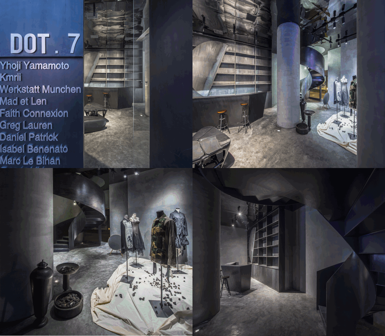
由邵龙主笔设计的这家英国买手店中国分店,位于江苏省常州市中心。甲方希望在有限的门店面积内,设计出能够让人过目不忘的空间感觉。项目采用传统材料叠加,大面积黑色切割,通过空间设计无形界定了空间节奏,给人以强烈、粗狂、夹杂柔软、神秘的空间感受。
Designed by Long Shao (Leo), this British buyer’s shop in China is located in the center of Changzhou city, Jiangsu Province. Party A would like to design a remarkable and impressive space in a limited area. By superimposed with traditional materials and taking advantage of large-scale black cutting, space designer invisibly defines the space rhythm, giving people a strong, rough, but mixed with soft, mysterious space experience.
入口 / Entrance
空间原本为两个独立楼层,设计师建议增加改变楼梯将其打通,在拉动上下楼商业动态的同时楼梯亦可当作展示艺术使用。一楼作为接待、休息、展示最新产品使用,二楼则作为买手店使用。在这个魔方空间中,顺着轴线与材质的引导,空间的体验者借由移动、视觉、猜想,与空间产生互动体验。
The space was originally two separate floors. The designer suggested adding a stair to connect and expand it. One the one hand, it improves the business dynamics of the upper and lower buildings; on the other hand, the stair could also be used as an art to display. The first floor is used as a space for reception, rest, and display of the latest products, and the second floor is used as a buyer’s shop. In this Rubik’s Cube space, along with the guidance of the axis and the material, people in the space creates an interactive experience through movement, vision, and conjecture.
玻璃橱窗 / Glass window
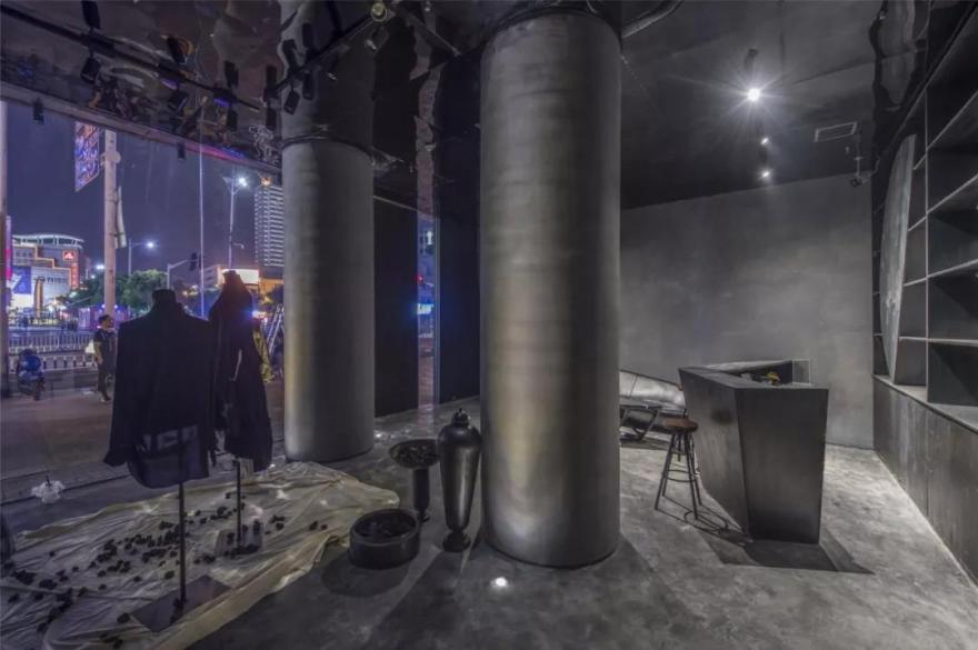
此项目位于商业街道的转角处,拥有着落地玻璃幕墙展示面。考虑到作为买手店的特殊属性,设计师选择在结构上将橱窗语言最大化融入在设计中,使橱窗也成为室内空间的亮点。
镜像空间的设计依赖于结构,但不受结构限制,而是从中产生,演绎出极简主义的精髓。
This project is located at the corner of the commercial street and has floor-to-ceiling glass wall for display. Considering the special characteristic of the shop, the designer chooses to maximize the window feature in the design, making the shop window become the indoor space highlights.
The design of the mirror space depends on the structure, but is not limited by the structure; it is generated from structure and deducts the essence of minimalism.
店门头 / Shopfront 大面积利用玻璃和金属等透光反光的材质来化解建筑内外的界限。
Large-scale use of light-reflecting materials such as glass and metal to resolve the boundaries inside and outside of the building.
空间分割 / Spatial Segmentation
入口空间利用巧妙的几何分割和材质变化,确保了整体开阔性的同时构建了室内外的和谐关系。从入口处看,一楼左右分为两部分,处于入口位置的座位相对更私密,且坐拥着最好的观赏面。而右半部分的展示区则能同时观看到外部与室内的景观,感官上更微妙,且不会阻挡视线。
从外看,整个空间由左往右至楼梯蔓延,空间充满张力且有层次感,拉动人们的行走路线;增加空间趣味性的同时,利用了空间本身的高度以及结构突破了空间的使用限制。
The entrance space takes full advantage of ingenious geometric segmentation and material changes to ensure the overall broadness and establishes a harmonious relationship between indoor and outdoor. From the perspective of the entrance, the first floor is divided into two parts. The seats at the entrance are relatively private and have best viewing. While, the display area in the right half can simultaneously view the exterior and indoor landscape, which is more subtle in sense and does not block the line of sight.
展示墙 / Display Wall
去除不必要的元素,展示墙与服务台没有任何多余的装饰,没有繁复的摆设,只用大面积的留白和最简洁有力的线条表达了结构主义的核心。
此外,设计师邵龙在这个项目中希望通过阶梯式的空间语言在满足设计委托方功能要求的同时,亦能使空间设计具备独特的个性。
Excluding unnecessary elements, there is no any extra decoration and no complicated accessories between display wall and the service counter, only the large area of white space and the most concise and powerful lines express the core of structuralism. In addition, the designer, Leo hopes that the space design could have a unique personality while satisfying the functional requirements through the stepped spatial language.
阶梯艺术 / Stepped Art
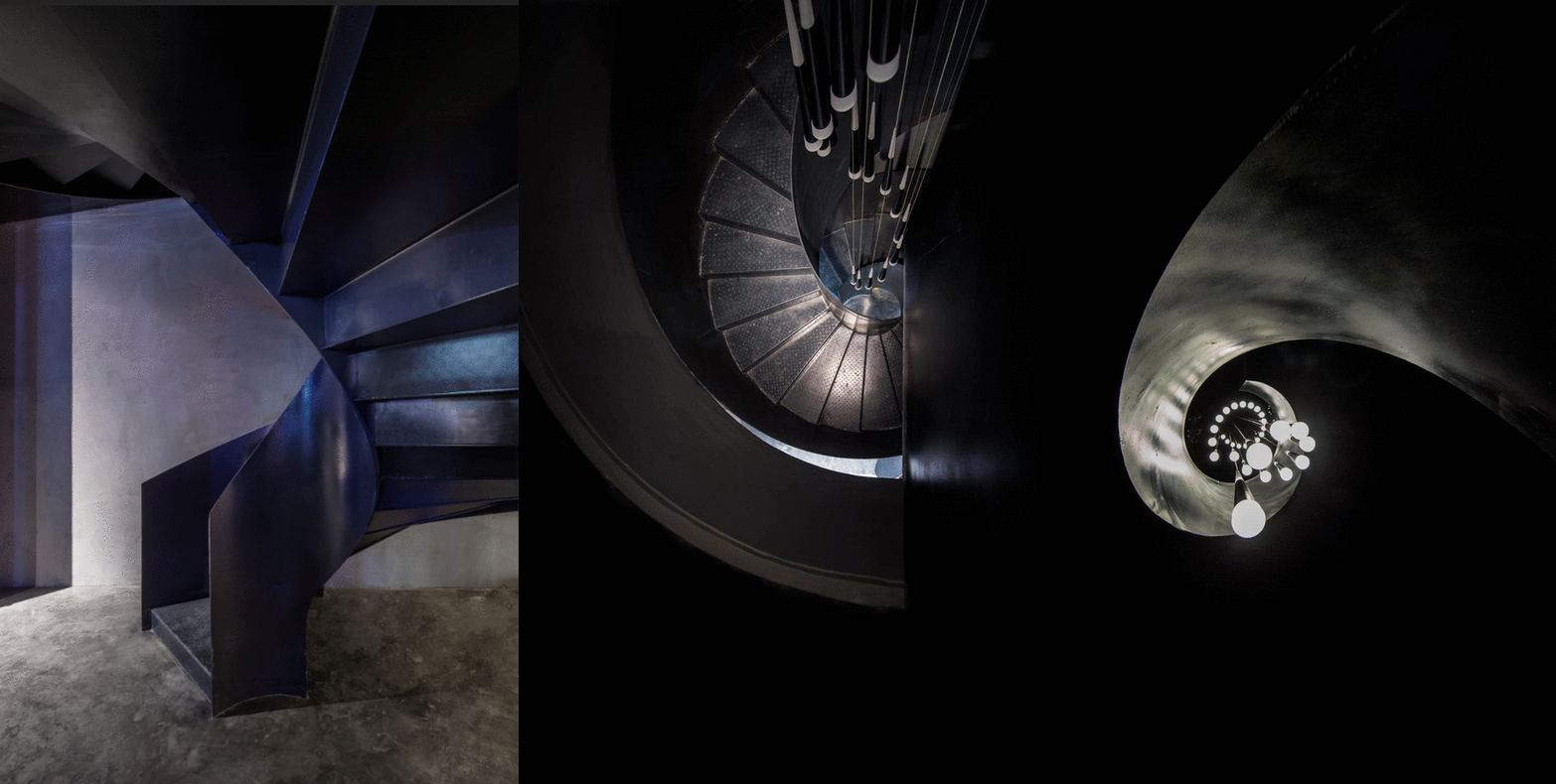
富有层次感的结构,让人们身处不同的位置欣赏到的景观以及体验到的空间感也会随之变化-沿梯而上,风景各异。阶梯式的语言将所有空间感受最大化展示,递进式的动线引导客人在行走往上的过程中接触到更多的产品。
The hierarchical structure makes landscape and the senses of space vary along with different locations – go up along the ladder, enjoy different view. Stepped design maximizes all spatial experience, and progressive movements guide the guests into more products as they walk up.
空间陈列 / Space display
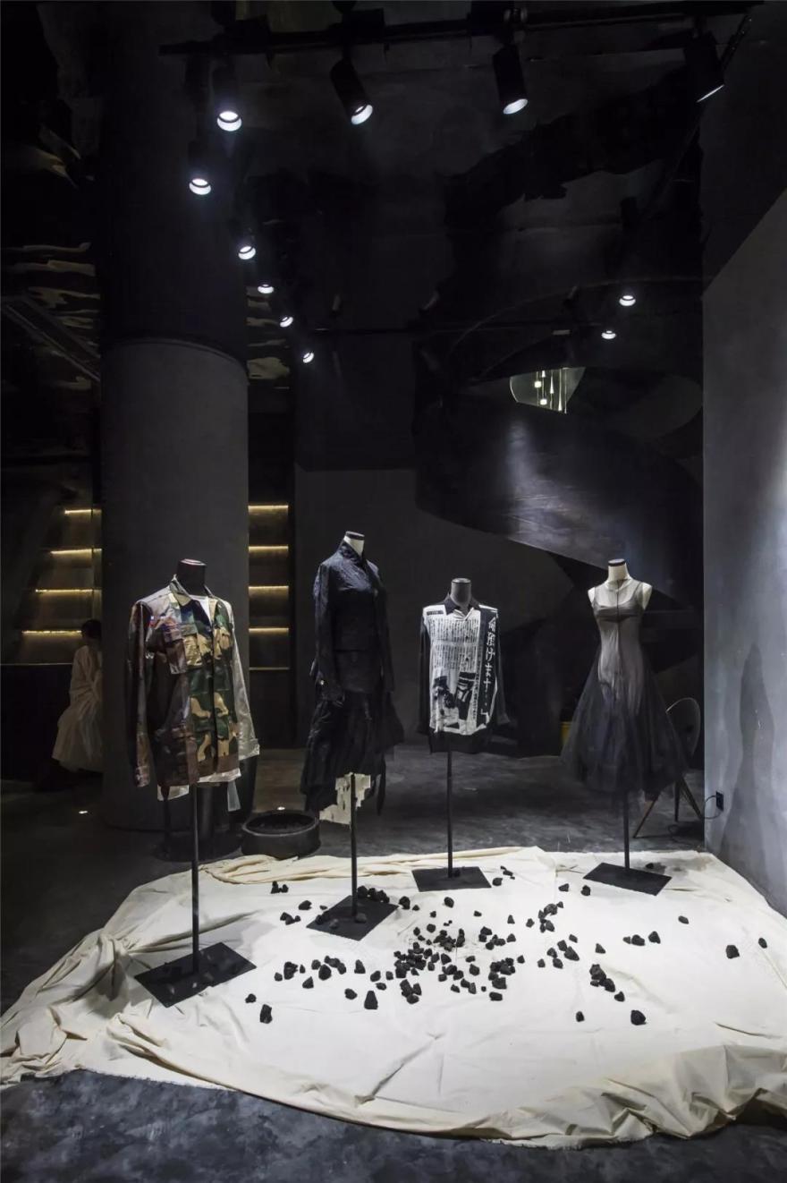
在同一个空间内,虽没有明显隔断,但设计师通过几何模块与线条的巧妙组合,自然地分割了空间功能,局部与整体的分离效果既是独立的,又是一个整体。
In the same space, although there is no obvious partition, the designer naturally divides the spatial function through the ingenious combination of geometric modules and lines. The space is partial and independent but also as a whole.
黑裙 / Black dress
香奈儿说每个女人都需要一条小黑裙。“黑色”,这个极度深刻的颜色,被无数人奉为经典。黑色强调事物的根本,是设计的本源,是思考的本质,它是直白有力、独立专注、坚定不妥协的象征,有着强大的包容性和质感,它经久不衰且历久弥新。
Chanel said that every woman needs a little black dress. "Black", this extremely profound color, has been regarded as a classic by countless people. It emphasizes the fundamental of things; it is the origin of design and the essence of thinking. It symbolizes straightforward and powerful, independent and focus, firm and uncompromising. With strong inclusiveness and texture, it’s everlasting and unfading.
品牌创始人 / 邵龙
Founder / Long Shao (Leo)
殊荣 | Award
2019-最佳设计 BEST100 大奖
2019-IAI 全球设计大奖-商业空间优秀奖
2018 年 APDC 亚太室内设计精英邀请赛 会所大奖
2018 年 IDS 商业空间第一名 优胜奖
2018 年香港 APDC 亚太室内设计师大赛会所最高奖 至尊奖
2018 年华鼎奖商业空间最高奖 金钻奖
2018 年红棉奖 商业空间大奖
2018 年金堂奖 休闲娱乐 优秀奖
2018 年艾特奖 南京赛区 优秀奖
2018 年《新设榜》50*50 年度创新设计师
作品刊登《发现设计》,上海《精品家居》等媒体平台
资质 | Qualifications
亚洲装饰协会注册会员
中国建筑装饰协会高级室内建筑师
以上作品版权归仓石国际所有,我们乐于分享所有精彩创意,同时敬请您于我们一同保护知识产权。
上海:上海市/徐汇区/钦州北路/1089 号/52 号楼/203 室
Room 203, Building 52, 1089 Qinzhou North Road, Xuhui District, Shanghai
常州:常州市/新北区/晋陵北路/天誉城市花园 25/2809
2809,Tianyu City Garden25, Jinling North Road, Xinbei District, Changzhou City
客服
消息
收藏
下载
最近


