查看完整案例

收藏

下载

翻译
Architects:Kenta Nagai Studio
Area:23m²
Year:2022
Photographs:Kenta Hasegawa
Lead Architect:Kenta Nagai
Country:Japan
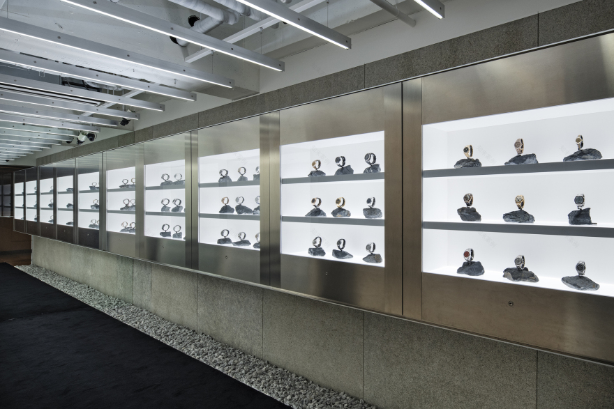
Text description provided by the architects. Interior design for a second store specializing in luxury watches from around the world. The site is part of “Nakano Broadway”, a commercial facility known as a mecca for subcultures, with a high density of various products and small stores. In recent years, it has also become known as a mecca for luxury watches, with many watch stores lining the streets. Since the store is in a unique commercial facility, it was necessary to follow the brand image created by the main store, but also to reconstruct it in consideration of the different environment and relationship with the clientele.
We noticed that the main store's characteristic lighting scheme, which eliminates ceiling lighting and uses only fixtures to create a sense of the unusual, is a technique that is often seen in this facility. Therefore, it was necessary to differentiate the store from the many other stores in the same building and to create a facade that would be acceptable to the clientele who visit the facility. Therefore, it was decided to erect colored glass between the common area and the interior of the store. While following the brand image of inorganic light, the light was converted into an elegant amber look through the colored glass to create an elegant façade that differentiates the store from many other stores in the same building and attracts the interest of customers of other stores.
The interior of the store follows the concept of the brand and is designed with high contrasts to create a sense of the relationship between time and space, while also taking advantage of the characteristics of each finishing material, such as stone, plastic, and aluminum, and arranging them in the space. Since it was not possible to create a design incorporating a rough structure on this site, we wanted to visualize the material's unique weight and the accumulation of time by applying stone to some of the walls.
The front wall of the long and narrow cylindrical storefront is mirrored to create depth in the limited storage space, eliminating the sense of oppression and the difficulty of entering the store when confronted with the counter. We created a store that embodies the brand concept, while also attracting new fans, and that takes into consideration the environment and the clientele who visit the store to make it a store worthy of a mecca for watches.
Project gallery
Project location
Address:Tokyo, Japan
客服
消息
收藏
下载
最近


