查看完整案例

收藏

下载

翻译
Architects:OPEN ARCHITECTES
Area:10000m²
Year:2020
Photographs:Utku PEKLI
Stability:ECM Engineering
Design Architects:Open architectes
Conception:Sebastien Causin, Bertrand Noel
EPB:D2 Solutions
Execution Architects:DDM architectes
City:Charleroi
Country:Belgium
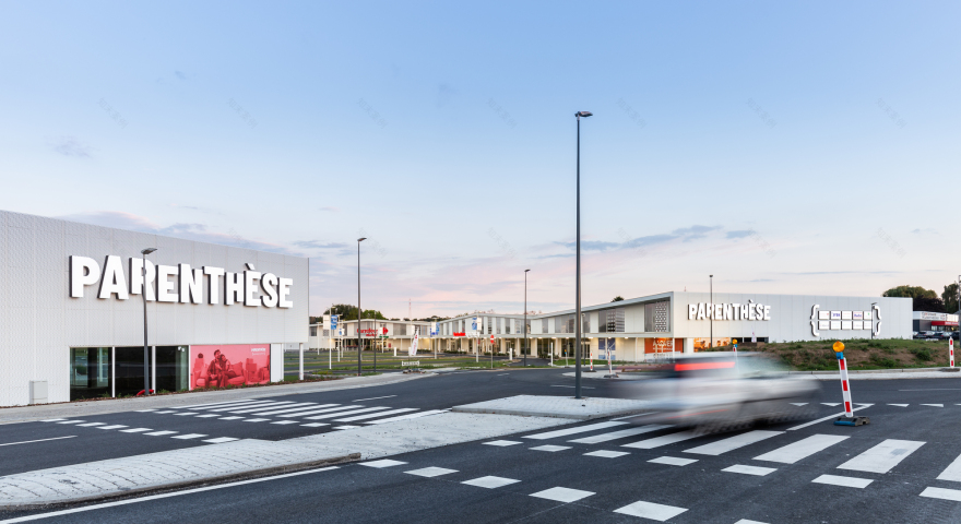
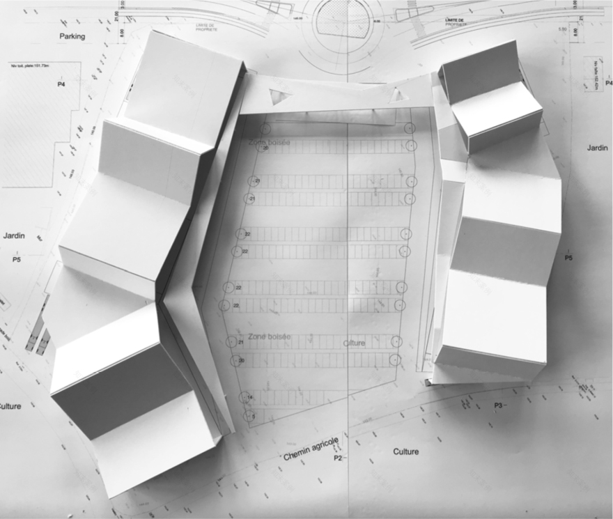
Text description provided by the architects. With a surface area of approximately 10,000 m², the complex, located on a plot of land along the National Road 5, is divided into two buildings set at right angles to the national road, thus delimiting a space for receiving the public while maintaining a visual breakthrough towards the agricultural landscape in the background. The unitary architecture, the volumetry, the materials, and the proposed colours highlight the landscape which, thanks to the planted layout of the central space, seems to have been drawn right up to the main road.
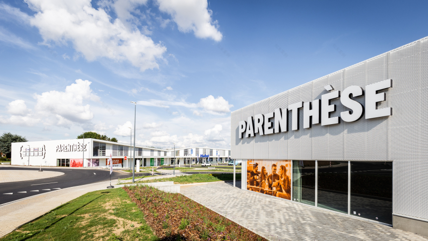
The fold in the plan of the two buildings provides a generous space for pedestrian movement along the facades of the buildings. The spirit of conviviality is also reinforced by the canopy that originates at the ends of the volumes and gradually expands towards the fold, allowing pedestrians to circulate in a covered but not closed space. The broken line of the roofs, oscillating from the N5 road towards the back of the plot, makes the two longitudinal facades more dynamic and breaks the monotony that could arise from the imposing length of the buildings. These façades are treated like a bar code, alternating solids (white perforated metal) and voids (glazing). This project breaks the codes of the peri-urban shopping centre by offering an ambitious architecture and a convivial setting to its users.
Out-of-the-box approach. Contrary to the classic "one sign = one box" scheme applied in many shopping centres of comparable size, our first proposal consisted of grouping the signs under a large continuous roof, giving the buildings a real presence on this large 27,000 m² site. The enhancement of the rural landscape at the bottom of the plot, creating a strong link with the landscape context, was the second driver of our thinking. This was a daring challenge because it required turning the shop windows and signs perpendicular to the road to maintain a view of the landscape in the background. The landscaping of the car park, with its planted spaces, further enhances this desire to highlight the landscape in the background.
Materials and techniques. Budget control was also one of the main challenges of the project: to ensure a reasonable cost overrun compared to the cost of industrial boxes common for this type of program and to compensate for this cost overrun with a real added value for the clients and users of the site. The structural approach and the choice of materials are the results of this reflection. The prefabricated concrete columns and glulam beams allow large spans to be bridged at a low cost, while industrial sandwich panels cover the roofs and rear façades of the buildings.
The two large façades bordering the central space are largely glazed over a double-height. A mesh of expanded metal covers the unglazed parts, giving the whole a neat character. The whole is treated in white, constituting one of the vectors of unification of the place. The white colour provides a bubble of air in the middle of the road and a reading background that highlights the green landscape in the background.
Sustainable project. The buildings are designed in a "free plan" and the signs are grouped under two large unitary roofs, allowing great flexibility of use. The regular structure and continuous glazing of the two main facades allow the division of the commercial cells to be adapted to demand. The layout of the buildings makes it possible to separate the flows between delivery vehicles and public access, which gives the whole site an evolving character and enhanced conviviality. Particular attention has been paid to soft modes of transport (bicycles/pedestrians), by integrating cycle paths and parking, along with comfortable pavements into the treatment of the roads between the National 5 and the project site. The sustainable character of the project is completed by careful management of rainwater. A large part of the central space is percolating (parking spaces, hedges and planted areas, pedestrian esplanades), and a retention basin under the car park makes it possible to manage the discharge of rainwater from the roofs and roads into the public network.
Project gallery
Project location
Address:Gosselies, Charleroi, Belgium
客服
消息
收藏
下载
最近


