查看完整案例

收藏

下载

翻译
Architects:Waechter + Waechter Architekten
Area:3153m²
Year:2018
Photographs:Thilo Ross Fotografie
Lead Architects:Prof. Felix Waechter und Sibylle Waechter
Design Team:Karina Gruber, Katharina Bell, Kristine Schnatwinkel, Lisa Matzdorff, Anita Majowski
City:Neuwied
Country:Germany
Text description provided by the architects. The Assessment and Support Centre helps prepare many people for their future. This is why it is essential to formulate an inspiring, motivating architectural environment for these people while they undergo diagnosis, support, practical experience, and job application training. This requirement needs to be met in both the external appearance and the quality of the ambiance inside.
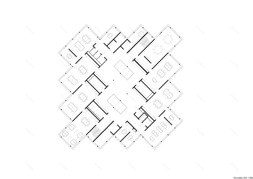
With the layout structure set at an angle to the adjacent buildings, an architectural focal point has been created consisting of a series of steps or recesses and projections, making it highly identifiable and recognizable amidst the rather faceless surroundings, between a supermarket and a car repair shop. This structuralist approach delivers the desired sense of vibrancy with no front or rear to the building as such. Small in scale, the two-story structure fits perfectly into the heterogeneous context with the different scales in the neighboring buildings in the urban landscape.
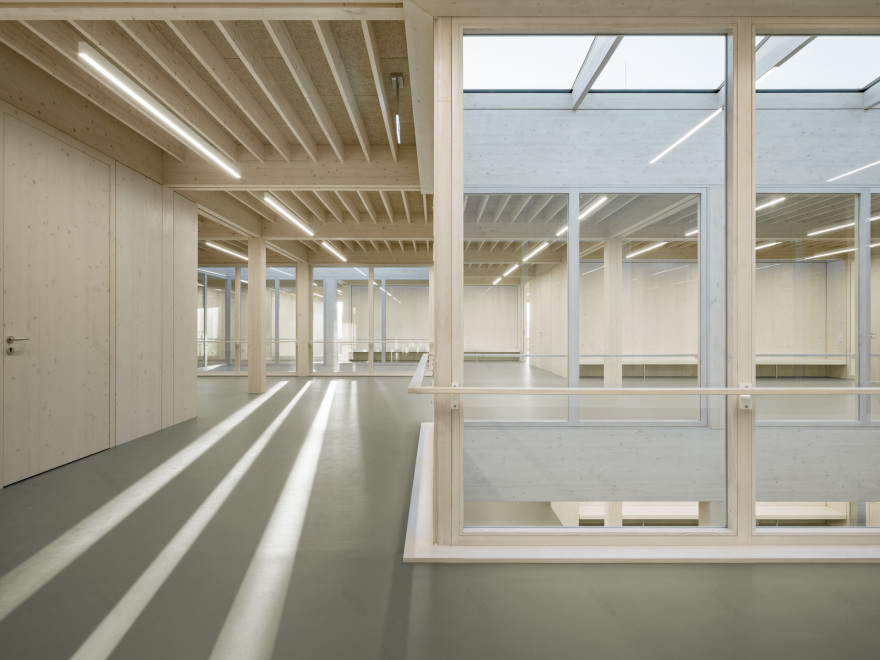
With their curiosity aroused by the exterior, visitors are wowed after passing through the vestibule – an interior hall varied in shape and with two openings in the ceiling, through which daylight streams from the upper floor. Its use as a cafeteria means the hall can be ample in size. This also makes it lively and appealing, thus lowering the inhibition threshold for people seeking counseling. Within the cafeteria, different seating areas, both high and low, form an integral part of the space, which can be further separated into quiet zones using room dividers. The whole space can also be used for sizeable events.
The floor plan is divided into two areas each with the workrooms located centrally. Adjacent to these is the special rooms with the PC room and the
craft room on the upper floor and the training kitchen on the ground floor. The diagnosis room and the internal office areas are located at the side, where they are more protected. All training rooms can be interconnected, allowing exchange between groups and synergies in care and support. There is no series of doors or dark corridors. Instead, bright and consequently varied communication areas open up the different spaces, thus ensuring clear and simple orientation.
Appropriate for the building’s purpose, the reserved architectural language stands on its own and in dialogue with its surroundings. Inside, a protective yet cheerful, friendly atmosphere of openness and communication suffused with light is achieved as an ideal environment for providing support and learning in a relaxed setting. The intended materiality enhances the existing quality in the spatial composition with bright oiled wooden flooring and wood-colored window profiles. Colored curtains allow frequently alternating room moods to match specific uses with varying degrees of transparency to the outdoor space and to the communal areas.
Project gallery
Project location
Address:Januarius-Zick-Straße 12, 56566 Neuwied, Germany
客服
消息
收藏
下载
最近


