查看完整案例

收藏

下载

翻译
Architects:art+zen architects
Area:400m²
Year:2019
Photographs:Mingming Fan
Lighting Consultant:Qingdao Hong Tu Lighting Design Co.Ltd.,Qingdao Hong Tu Lighting Design Co.Ltd
Interior Design:Qingdao Yi Jin Interior Design Co.Ltd.,Qingdao Yi Jin Interior Design Co.Ltd
Architect In Charge:Zhiqiang Yang
Design Team:Zhiqiang Yang, Weidi Wan, Lin Wang, Jingwei Lv
Client:Rongcheng Landscape Service Co. Ltd, Rongcheng Landscape Service Co. Ltd
Facade Consultant:Beijing Hao Jie Sheng Shi Façade Design Co.Ltd
City:Rongcheng
Country:China
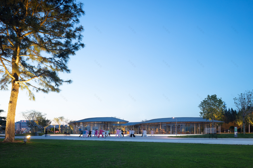
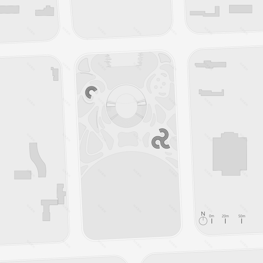
Text description provided by the architects. Rongcheng City Hall Square can be considered as a typical Chinese administrative square – ceremonial/memorial dimensions and space.Site for readers pavilion is located on the southeast corner of the square, a triangle shape surrounded by irregular landscape.
Two driven force are set to start the design with: 1. How to pass on the publicity and openness from City Hall Square to the building? 2. How to make transition from open square dimensions to human dimensions more naturally by setting up architectural space? Infiltration and concealment are applied as design strategies.
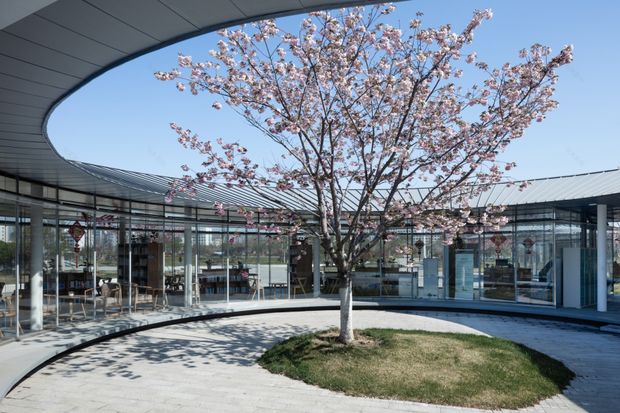
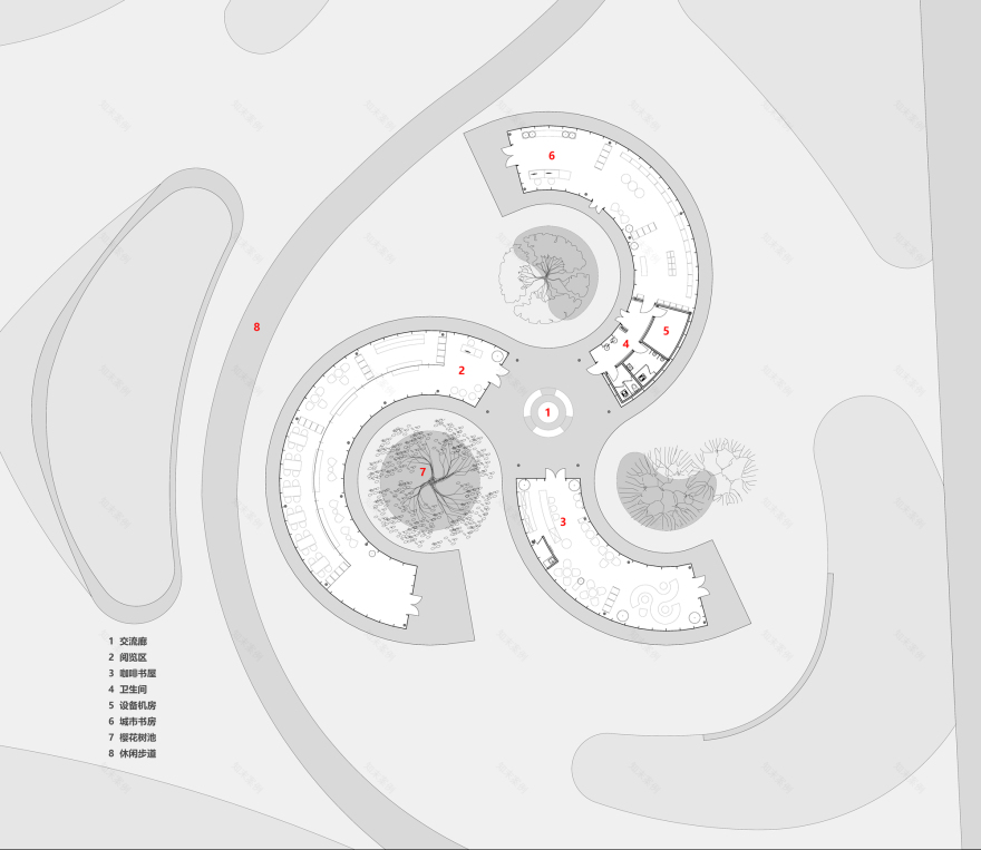
As an extension of the square space sequence, the pavilion needs to be accessible from multiple directions. Following the boundaries of site, building is originally shaped in to three pairs of homocentric circles, which open up to three different directions as entrances, creating three C-shape units, applying to different functions as reading, kid recreation and café. Intersection among three function units forms an open space, so that people can infiltrate through the pavilion from every direction, maintaining the same openness as the square.
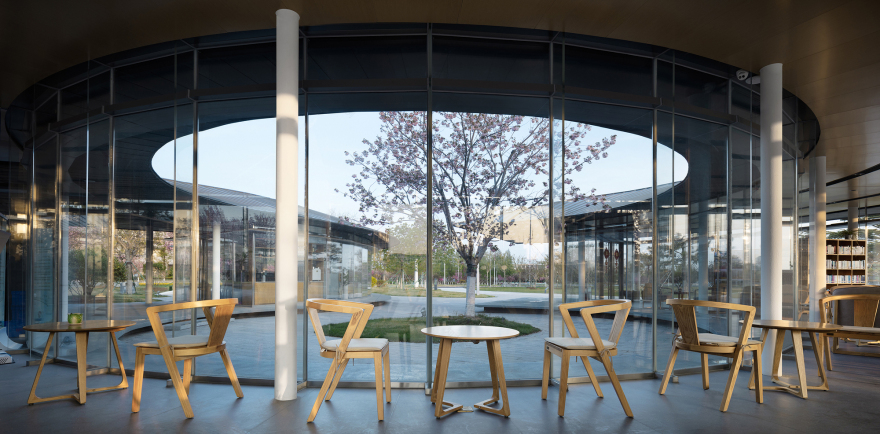
Each unit concludes both indoor and outdoor space, looking similar to Tai Chi symbol. This similarity also reflects from its complexity of space, façade, circulation and experience, joining or separating from each other. Layers of space coated with the reflection and refraction from glass façade are adding up on each other, dressing out the dramatic visual stimulation, triggering curiosity of exploration.
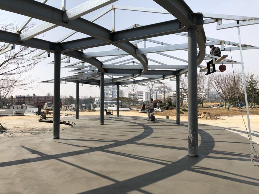
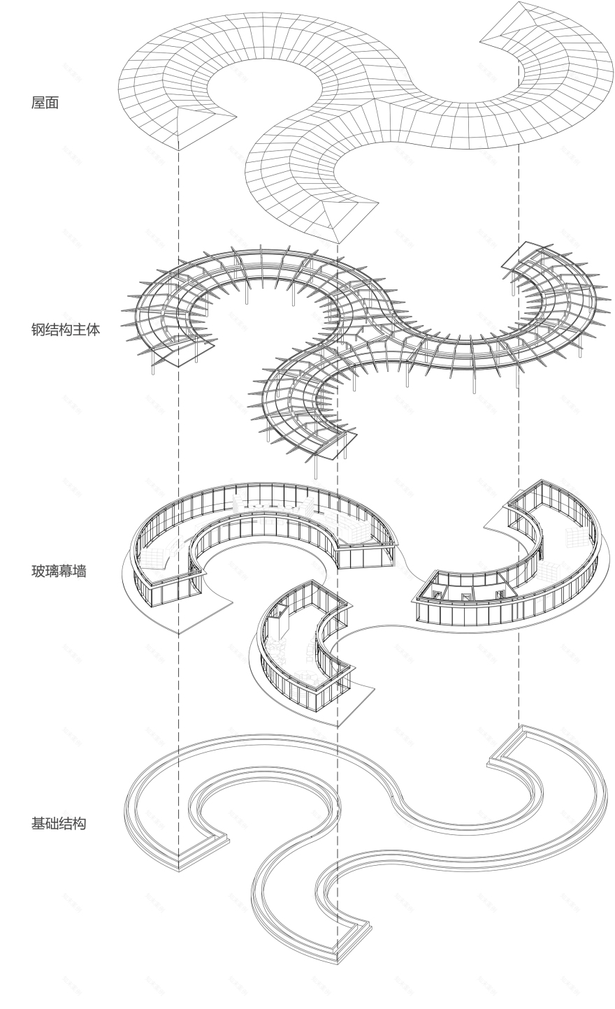
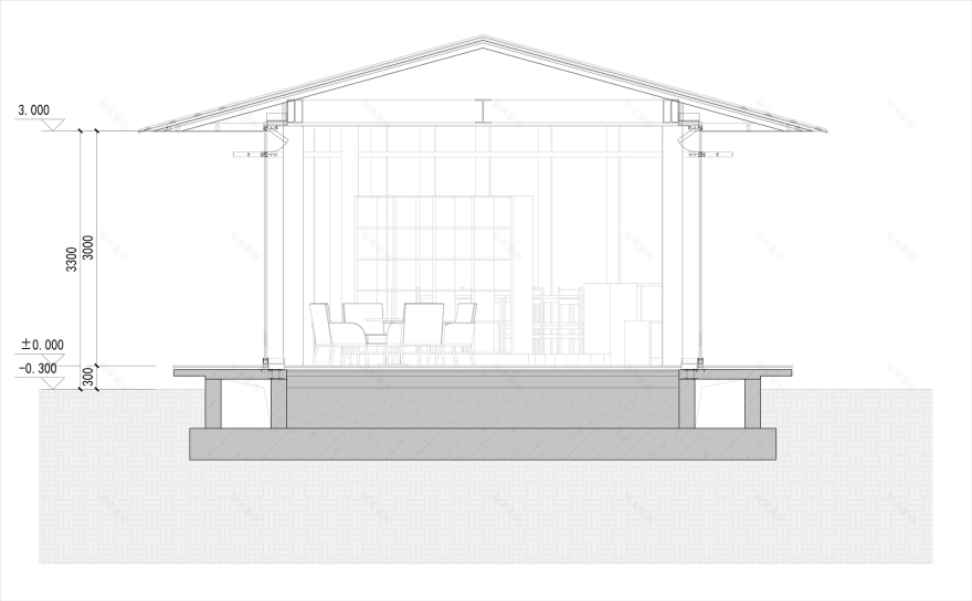
As for floor plan layout, every pair of homocentric circles is divided by 5 degrees, which applies as a fundamental module to structure grid, façade, floor tiling design, etc... The steel structure helps roof extend 1.5m further out, creating continuous corridor space by joining even further extended roof above entrances together, which works not only as shading system, but also as concealment of the building volume, making transition of dimensions more naturally and gradually.
Readers Pavilion provides another design solution to projects located in memorial space. Instead of exaggerating its own personalities, building is more focus on different relationships between individuals, and between individuals and environment, to create complexity in a more subtle way with combinations of similar units which, however, are slightly different from each other in shapes and functions.
Project gallery
Project location
Address:Rongcheng, Shandong, China
客服
消息
收藏
下载
最近


