查看完整案例

收藏

下载

翻译
Architects:Kode Architects
Area:2490m²
Year:2023
Photographs:GUUIJIN
Lead Architect:Min-Ho Kim
City:Hwaseong-si
Country:South Korea
Prologue: New Downtown Church - We believe that there is another landscape created when a new building blends into the existing landscape, so we consider it very important to read and understand the context and landscape around the site in the design process. However, Banwol-dong, Hwaseong-si, where the subject site of this project is located, is a neighborhood that is shaping a new downtown through urban development projects. Therefore, there were two main points we focused on in this project. First, "What should the church look like in the new landscape being created, not the existing landscape?" Second, "What should the church look like in the urban landscape?". Although most buildings have a long lifespan, churches, especially, are places that connect religion and people, so they repair old buildings and expand them when space is lacking, always standing in the same place. Since we fully understood this, designing the church, which will stand here for a long time in the future, was a very careful and cautious task. Moreover, since the surrounding landscape was in the transitional phase of being created, we did not know how it would turn out, but we thought it should be made to match the future completed landscape. Fortunately, the site was being developed through an urban development project, and it was clear that the building would be located in an urban landscape in the future. In conclusion, we came up with a simple and calm church that would naturally blend into the urban landscape and match whatever the surrounding landscape would look like.
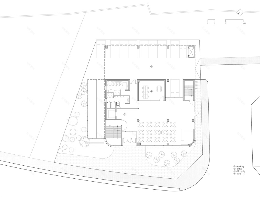
Site Analysis - The site is located at a crossroads in a concrete forest of apartments and large shopping centers and is a flat area with little difference in level, making it easy to access on foot and by car. The front of the site faces northwest, with an empty site that is currently under construction and is planned to be a knowledge industry center in the future and an already established park. On the right side, there is an elementary school building adjacent to it, and on the left side, there is a neighborhood living facility building separated by an 8m road, and the rear is adjacent to an apartment building. Since it is located at a crossroads and the surrounding environment surrounding the site is different from parks, knowledge industry centers, schools, neighborhood living facilities, and apartments, we thought it was necessary to carefully read the urban context and reflect it in the design. Fortunately, there was no problem with sunlight because the apartment located on the south side was a small three-story building, not a high-rise building like other apartment buildings in the area, but since the size of the apartment building was small, we considered that the church might be felt as an imposing building by the apartment residents, and we also wanted to reflect the architectural device to solve this in the design.
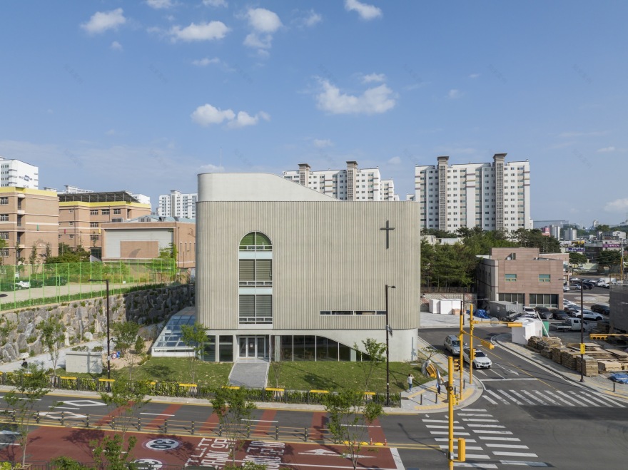
Concept: 1. concrete that depicts the movement of light: Without knowing how the surrounding landscape would be completed in the future, we planned a very simple form of mass to respond to the complex urban landscape and create a building that is not burdensome to our neighbors. When choosing the material of the building, just like when planning the shape of the building, our goal was to harmonize with the surrounding landscape. Concrete, which is simple in form and is already familiar to us living in the city, was a material that could melt well into the urban landscape. Among them, 'rib concrete' had a three-dimensional effect, unlike general concrete, so it was possible to express not only the texture of concrete but also the depth of light and shadow on the surface. Because the building was in a very simple shape, it was intended to add a depth of light to the surface through rib concrete and to complete the building in a more three-dimensional shape, giving it symbolism and presence as a religious building.
However, because the same rib concrete feels completely different depending on the shape and spacing of the design, elevation studies were conducted in various shapes and intervals at the design stage. As a result, we chose the rectangular rib concrete with the most clear contrast between light and shadow as well as better workability than the semicircular shape. Later, in the formwork stage, various forms were tested in the wood-up to fully realize the delicate contrast between light and shadow, and a modular metal plate formwork was produced and constructed to minimize construction errors and use a reasonable budget. From morning to evening. And from spring to winter. As time and season change, light moves and portrays a new appearance of the church. The face of the building, which melds into the surrounding landscape and expresses its own light, seems to project the religious character of the church, which always works in a low-key position. Through this honest and frugal concrete property, the symbolic meaning of religious buildings was concisely expressed, and the elevation design that can highlight the building's presence by contrasting light and shadow was completed. Rib concrete, which depicts the movement of light that changes over time, was one of the design elements and architectural devices that could quietly and reliably reveal its presence and symbolism in a very simple four-story building among high-rise buildings.
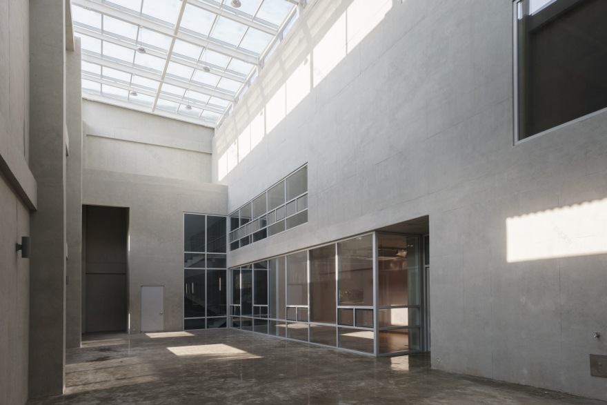
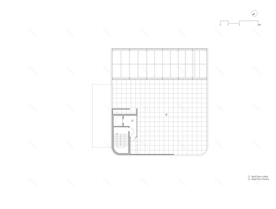
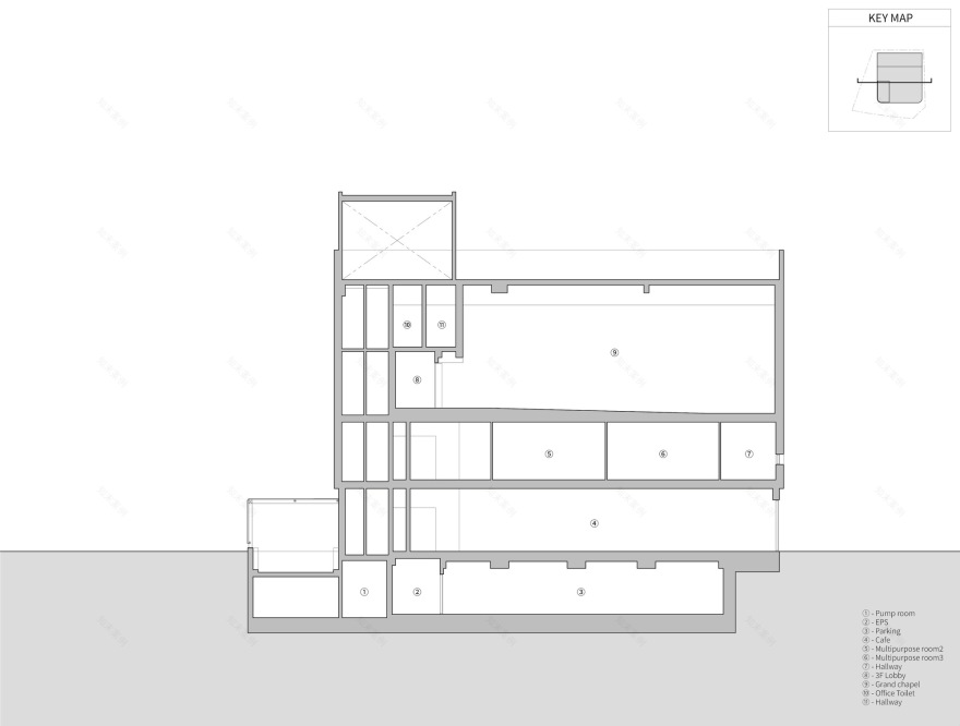
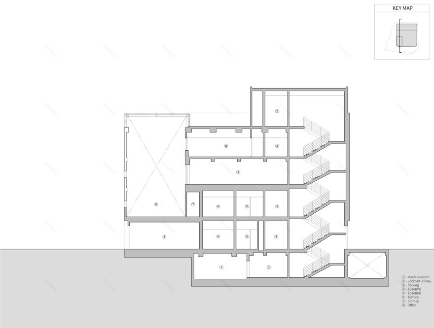
02. Empty space, filled space: We are more familiar with filled spaces than empty spaces. This is due to the fact that in dense cities, there are far more filled spaces than empty spaces for efficient space use. Although there are spaces that have been emptied out due to functional needs, such as concert halls and sports stadiums, this is not a space we frequently encounter in our daily lives. However, both empty and filled spaces coexist in this extremely daily place where members of the church gather every weekend. A small space that supports the church's religious activities is a small space, and a large space that supports church events and events is a large space that supports the church's events. In this way, the building's empty space, like other empty spaces in the city, seems to have been planned only for functional needs, but there is another reason why there is an empty space in this building. According to the overall zoning plan of the building, the filled space is placed at the front, and the empty space is placed at the rear, which is functionally more frequently used, at the front, to enable smooth lighting, while the empty space is placed at the rear, so that it can be used as a buffer space between high-rise apartments and buildings located on the south side of the land. In addition, by drawing light into the interior through the skylight of the empty space, it was intended to introduce natural light as much as possible into the rear space, which is relatively less skylight than the front. The space emptied in this building is an essential space both functionally and in the context around the land.
03. an easy-to-considerate architecture: For religious people, the church is a friendly and familiar space. However, if the color becomes too strong, it will naturally feel burdensome because it is an unknown space that is unfamiliar to non-religious people. Even if it is not a particularly tall building compared to its surroundings, it can be burdensome for non-religious people due to the nature of religious architecture that is built in reality and reproduces religious values. This building has one basement floor and four floors above the ground, and it was not a tall building compared to its surroundings, but as mentioned earlier, if religious symbolism was overemphasized, there was a possibility that it could become a burdensome building, so we tried to avoid it as much as possible. This is because he thought that a building that only pursues his beliefs without caring for its neighbors contradicted the church's teachings that talk about equality and love for everyone, regardless of whether they are religious or non-religious. In order to realize the religious value of Christianity, which equally talks about love to everyone, I thought it should be a space where all citizens felt welcome. Therefore, the first floor of the building, exposed to pedestrian eyes, is open with transparent glass to induce a natural inflow of people, and the second and third floors are planned with solid rib concrete in contrast to complete the church's face with a simple yet frugal appearance so that it can be approached in a way that is not burdensome to neighboring neighbors.
Epilogue: Silently Settled Church - In the urban landscape surrounded by high-rise apartments, this project had to reveal its symbolism and presence as the only religious building near the target site. It was not difficult to give symbolism to religious structures, but it was a very demanding task to give them symbolism and to make them naturally blend into the surrounding landscape. The church also had to be simplified in order to approach the neighbors in an effortless way. We were concerned that the more colorful and diverse the materials used for the elevation, the more colorful they would look, so we minimized the diversity of materials to express the frugal attitudes and postures of religion architecturally. The material chosen in this way was also made of transparent glass and solid concrete so that the elevation could be read simpler and simpler. The simplicity and simplicity of discrete elevation, which changes with the movement of light, highlights the church's symbolism and presence in the cityscape. Despite being a church building, it was designed with a very simple mass and elevation, a material called concrete that can naturally dissolve in the city despite being a church building, and through the empty space, it creates an appropriate sense of distance between the residents of existing apartments and the newly established church members in the city. All of these were architectural gestures intended to settle quietly in the city center for harmony and to overcome the differences in the characteristics of disparate spaces such as residential and religious facilities. Through these designs, we attempted to complete a design that respects the urban context while realizing religious values.
Project gallery
Project location
Address:39 Banwol-dong, Hwaseong-si, Gyeonggi-do, South Korea
客服
消息
收藏
下载
最近


