

创作上传
VIP
收藏下载
登录 | 注册有礼
查看完整案例

收藏

下载

分享
翻译
Location:10 Bayfront Avenue, Singapore; | ;View Map
Project Year:2021
Category:Shops;Showrooms
The inspiration comes from taking a page out of the books from old European libraries and underground cellars; with a historical sensibility. We took this opportunity to reinvent impressions of a bottle shop and relook the browsing experience. Using fins and arches, symmetry and proportions, we created a unique and dynamic arc shape that subtly divides the areas, wine on shelves spreading upward all the way, just like a super city wall built with historical (wine) culture.

With this shop at Marina Bay Sands being its flagship store, the clients wanted an elevated retail experience from all their other outlets. Taking the opportunity to also design a more efficient storage and display system that would be able to showcase the wide range of bottles that they have.
The inspiration comes from taking a page out of the books from old European libraries and underground cellars; with a historical sensibility. We took this opportunity to reinvent impressions of a bottle shop and relook the browsing experience. Using fins and arches, symmetry and proportions, we created a unique and dynamic arc shape that subtly divides the areas, wine on shelves spreading upward all the way, like a super city wall built with historical (wine) culture.

Shopfront:
The site is a typical storefront within a shopping mall, being located near the main mall entrance. The sunlight is reflected strongly on the shopfront which resulted in harsh reflections from the sun and affecting visibility to the public passing by.
Display: Given the large number of varietals for display, we had to think of a new way of showcasing them without compromising on functionality.

Shopfront:
Unlike most retail stores, we removed the window display and kept the shopfront completely unobstructed for a full view of what we’ve created within. Allowing the natural light to filter into the store and also vice versa have the store’s illumination filter outwards. With this we hope to encourage regular patrons and new guests alike to step through the portal and lose themselves in the world of wine discovery.
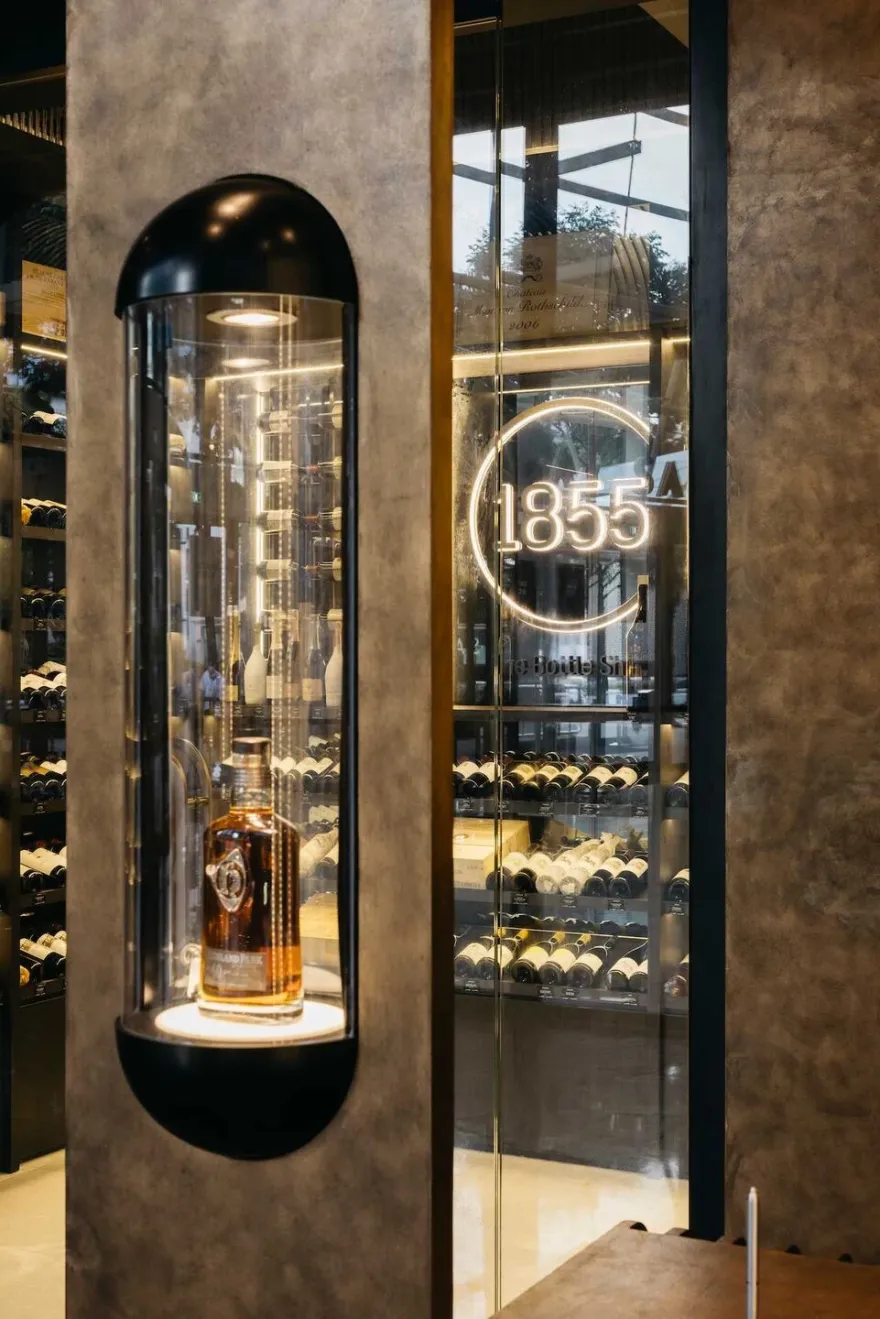
Display:
Instead of a conventional, modular shelving system, we adopted undulating and radial shelvings. Bottles are artistically arranged both horizontally and vertically, from floor to ceiling with display and storage seamlessly integrated as one. Certain selections are suspended on brass racks and sit atop pedestals, while standalone cylindrical capsules showcase special items. Just like rare collections in a library or museum, we wanted to confer the bottles the same status.

The carefully chosen materials magnify the experiential qualities of their store; drawing upon the similarities between wine and patina— how they both get better with age— we applied a rust-like patina texture to the fins and arches. This aged texture is complemented by notes of black from the black granite flooring and cellar room. Orinoco Granite was used for the flooring alluding to antique cellars and mirrors are used in the private walk in chiller to generate amplitude and an atmospheric world of reflections, visually expanding spatial impressions creating an open and high feeling. We also customized paint to mimic corten steel / aged steel effect.

Interior Designer: Shu LAANK
Photography: Studio Periphery

▼项目更多图片


南京喵熊网络科技有限公司 苏ICP备18050492号-4知末 © 2018—2020 . All photos and trademark graphics are copyrighted by their owners.增值电信业务经营许可证(ICP)苏B2-20201444 苏公网安备 32011302321234号
苏公网安备 32011302321234号客服
消息
收藏
下载
最近