查看完整案例

收藏

下载

翻译
Muse
Dubai | 2023 | 90 sq.m.
Architects: Egor Bogomolov, Polina Onischuk, Alexandra Zemtcova, Leonid Sobolev, Angelina Gorelova
Visualization: Antonia Polevaya, Tatiana Kurochkina
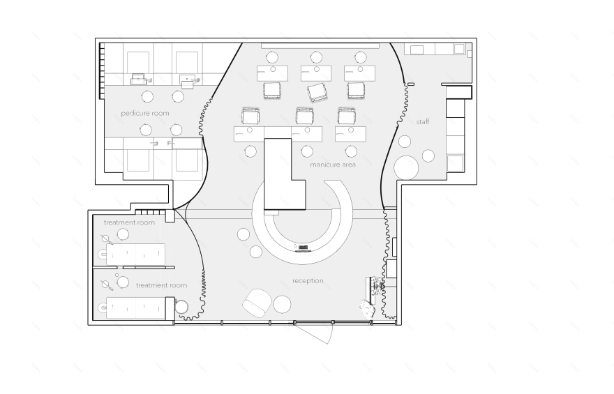
plan
"Real beauty is always hidden inside, and our mission is to help everyone to reveal it to the outside world".
The slogan that the creators of Muse came to us with ended up being the basis not only for the business, but also for the interior. Mia, the studio's owner, approached us with an already established, clear brand concept, and a vision for its unique mission. This greatly simplified the design process for us - but in no way made it any less interesting.
For an architect, the real beauty that lies within is the natural, raw materials, each with its own texture and texture, the small details that most people don't notice the first time, the ergonomics, and the engineering of the space. In this project, we have tried to reveal all these aspects to the outside world - and we seem to have succeeded.
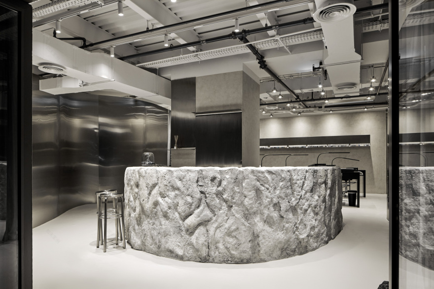
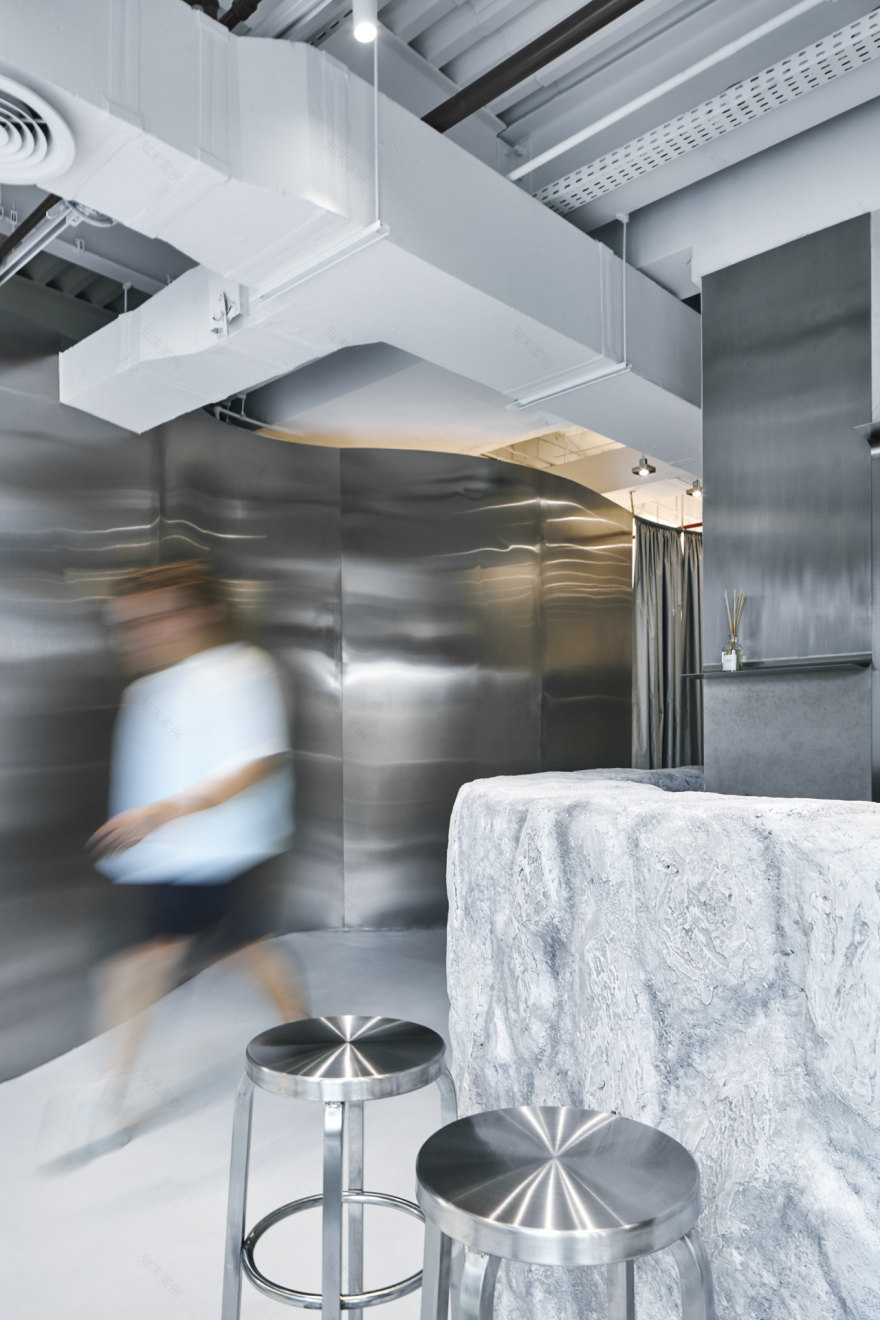
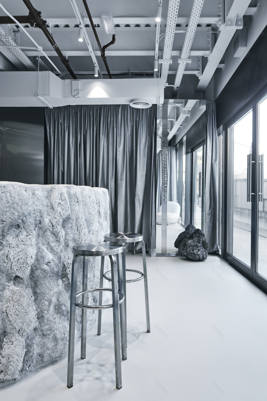
To form the basis of the interior, we used three materials - rough textured plaster similar to stone, a more neutral variation with a concrete effect, and stainless steel. By using the materials in different combinations and creating contrasts between them, we were able to bring out the beauty of each of them individually. A closer look reveals the details - metal sheets slightly curving downwards create comfortable narrow shelves, while the stone reception desk has a visual rhyme in the area near the mirror - natural dark gray cobblestone. The mirror is also complemented by the motto of the salon - "Be your own muse". Frankly speaking, it is still hard for us to imagine a more suitable replica for the element that gives an opportunity to admire yourself!
axonometry
Successful contrasts were created not only between the finishing materials, but also between the engineering and architectural components of the project. The graceful curved walls, completely covered with brushed stainless steel, became a visual counterbalance to the massive utilities - it was decided not to cover them with a false ceiling in order not to reduce the already small height of the room.
Lighting design in this context was also a challenge - in order to provide sufficient light without cluttering the space above our heads, we used a grid of lightweight compact rectangular luminaires, each mounted on its own vertical cable.
In a space with many scenarios, it was important to pay attention to the ergonomics of the layout and furniture - and as a result, almost everything that makes up the interior was made to order according to our sketches and drawings. Even the manicure tables, which are usually purchased ready-made, were designed by us from scratch - we managed with a lot of technical nuances and conveniently placed all the built-in equipment.
curved shelf ↓
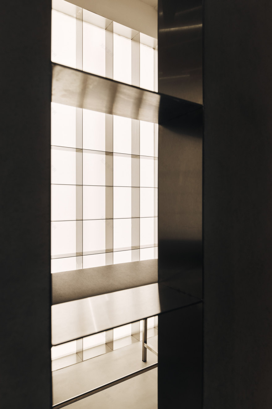
↑ steel rack integrated in the backlit wall
pedicure area ↓
↑ manicure zone
We also provided accents unique for each functional zone - in the pedicure room, this role is played by bright tables made of lettuce plexiglass (this is one of the corporate colors according to the brandbook) and a large lightbox wall illuminating a light stainless steel shelving unit installed right on top of it. The two massage rooms are united by one common feature - a bronze-colored ribbed glass window, through which you can watch the play of silhouettes.
that's rock! ↓
This is how we managed to create a comfortable and neutral, but unique, full of details and accents, but not provocative interior, which is ready to reveal its real beauty and help everyone who finds himself in it to reveal his own.
entrance area ↓
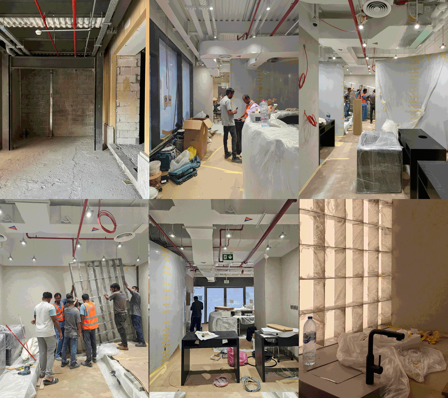
↑ process
project team ↓
just be kidz
follow instagram
客服
消息
收藏
下载
最近


