查看完整案例

收藏

下载

翻译
Gymnasium | Sport centre
Dubai Downtown | 400 sq.m.
Architects: Egor Bogomolov, Catherina Tarasova, Valeria Dzhigil, Sonya Plusnina, Ivan Gorbunov
Visualization: Tatiana Kurochkina
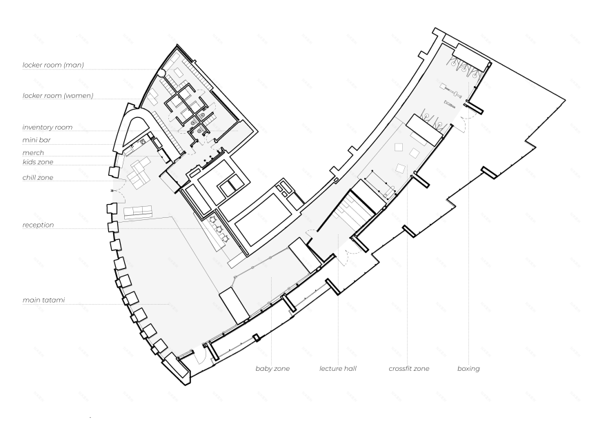
plan
GYMNASIUM is an ecosystem of modern sports clubs built around Brazilian Jiu-Jitsu. Thanks to a unique teaching methodology, children through sports develop the entire range of “soft skills” necessary for self-realization. The chain's clubs are located all over the world, and we had the opportunity to design the flagship in Dubai.
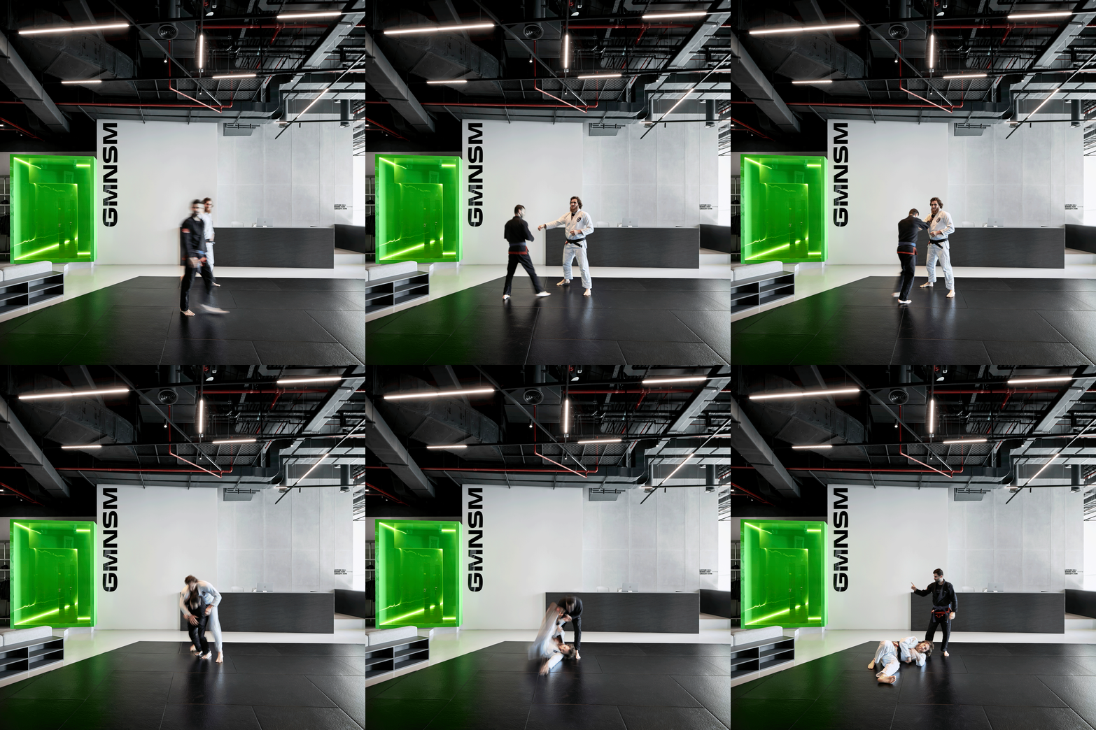
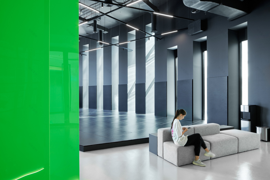
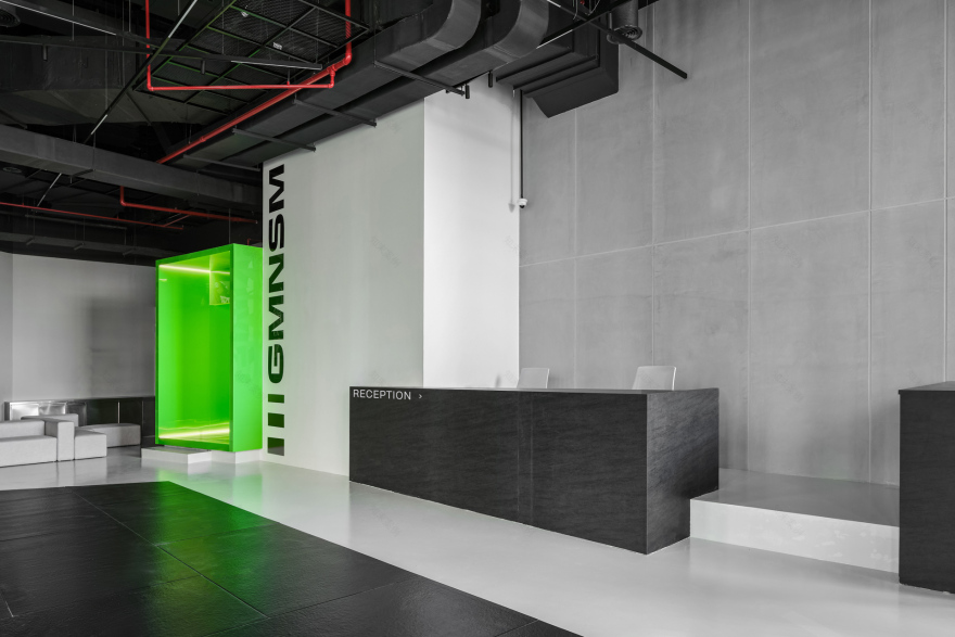
The interior of the new club is built in accordance with the character of the GYMNASIUM brand and its type of activity: a neutral gray background with brutal elements in the form of perforated mesh and stainless steel are a sports component that reflects the spirit of martial arts. And bright colors and graphics in navigation add dynamics, lightness and naivety. Since the club's audience consists of visitors of all ages, it was important to make the interior not too childish, but not too serious and brutal.
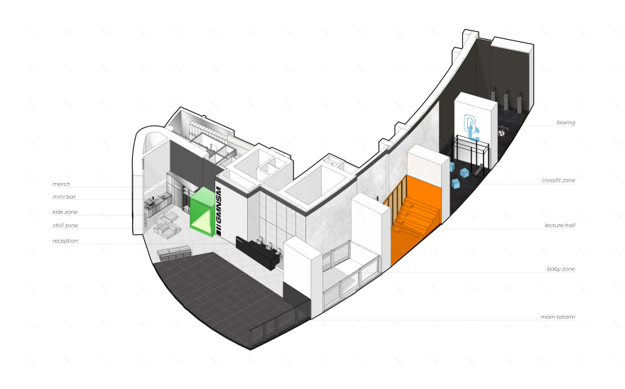
One of the primary tasks when designing a new club in Dubai was the correct organization of zoning in a room with a complex configuration. The nonlinear geometry of the original space set the main direction for the planning solution. The boundaries of functional zones (lecture hall, area for children, crossfit), chaotically multidirectional, reinforce the overall asymmetry of the room.
The design features many subtle details inspired by the jujutsu aesthetic. Modular sofas with an uneven layout borrow their morphology from the tatami - an integral part of any wrestling competition. The lighting design adds graphics and detail to the clean space - long, thin lines cut through the air throughout the club area, contrasting with solid blocks of color. Track lights located on these lines in a strictly defined order highlight the main directions of the planning solution with bright light accents.
axonometry
The zones themselves are divided into color blocks - different functional zones are assigned their own bright accent colors from the brand book. The locker room area, not adjacent to the main space, is highlighted by a bright entrance portal. Over time, this element became the hallmark of the new club - it is clearly visible from afar, and it attracts people passing by.
light in the corner ↓
↑ entrance to men locker room
lecture zone (wall detail) ↓
↑ lecture zone (view from the hall)
view on Burj Khalifa tower from the terrace ↓
Thanks to the design and placement of the reception desk, it was possible to quietly raise the floor for all the necessary communications - the counter, lined with black porcelain stoneware, consisting of two blocks of different sizes, hides a high podium in which all the engineering is hidden.
view to the hall from the locker rooms↓
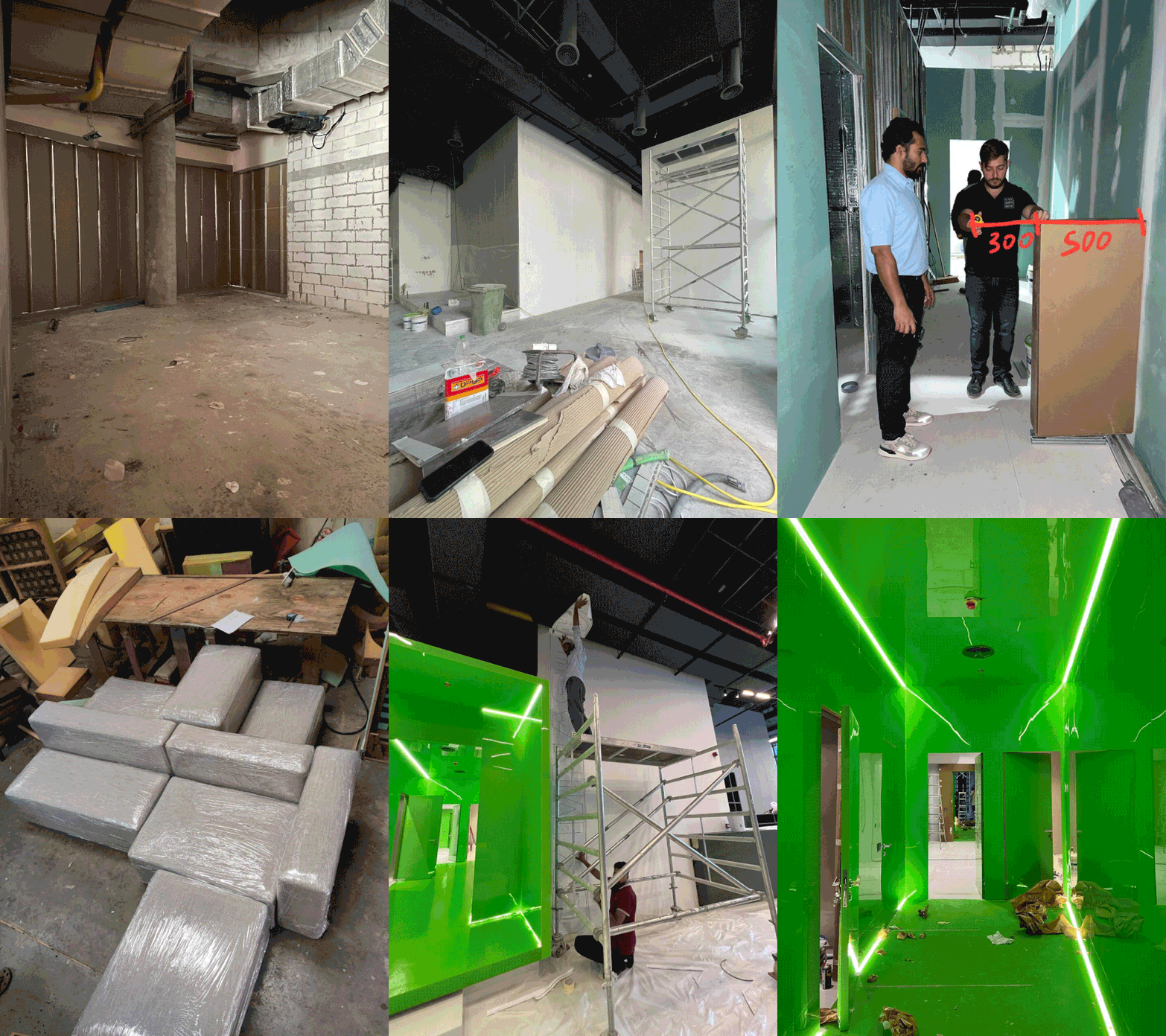
↑ before & after
project team ↓
just be kidz
follow instagram
客服
消息
收藏
下载
最近


