查看完整案例

收藏

下载

翻译
Drinkit | Coffee shop
Design for worldwide chains
Architects: Egor Bogomolov, Catherina Tarasova, Ivan Gorbunov, Julia Tsuglenok, Sonya Plusnina
Visualization: Tatiana Kurochkina
Ten ten ten studios
(brand consulting, visual communication, art-direction, graphic design, type design)
Rodion Serebrennikov
Artem Rulev
Drinkit is a young chain of coffee shops with an ambitious goal to reinvent the experience of interaction of the guest with such a long-familiar drink as coffee
our task was to develop not so much the interior of a particular cafe, but to transfer the principles and values of the product into the principles of space formation - the foundation we have laid is now successfully replicated to new drinkit cafes, supplemented with new details
The principle of “drinkit” is to take good coffee as a basis and make it even better with features and details that the guest can customize himself. for the interior, the image of a “workshop” was thus born, where each guest becomes more the author and “master” of his experience than a passive recipient of the same drink for everyone
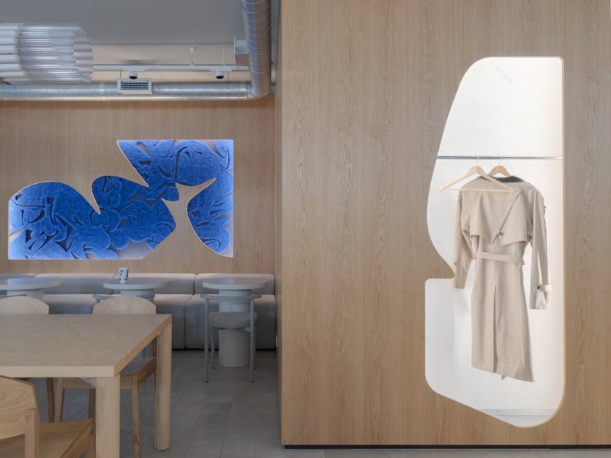
the interior is constructed from familiar, visually and tactilely pleasing materials - loose plaster, tiles with a stone texture, wood and textiles. «master’s hand» becomes noticeable only in the details - the accent is the changed layout of the tiles, or the figured cutout in the wooden wall, or the different direction of the seams on the cushions of the bench, which are identical at first glance
in general, all furniture consists of simple, comfortable and functional forms and materials, without unnecessary bends - even the fabric for pillows is a heavy-duty practical "oxford", from which tents are usually sewn
digitalization plays a big role in the user experience of the drinkit, and this feature is also reflected in the interior - we harmoniously fit a large number of screens with different functions so that they are always in sight, but only when needed.
the central element - the cashier counter with order and pick-up functions - has become an homage to the workbench, behind which the «master» usually creates his magic. a rack for merch and souvenirs stands next to the "workbench", exactly as shelves for finished products would stand in a real workshop.
as a result, we have created a cozy and functional space that conveys the values and uniqueness of the product, using long-familiar forms and materials, leaving all the novelty only in the details.
just like with drinkit coffee, we didn’t have to invent our own type of coffee bean or brewing method – we just chose the right temperature, syrups and toppings.
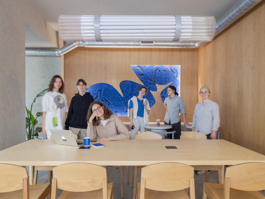
big drinkit and kidz team ↓
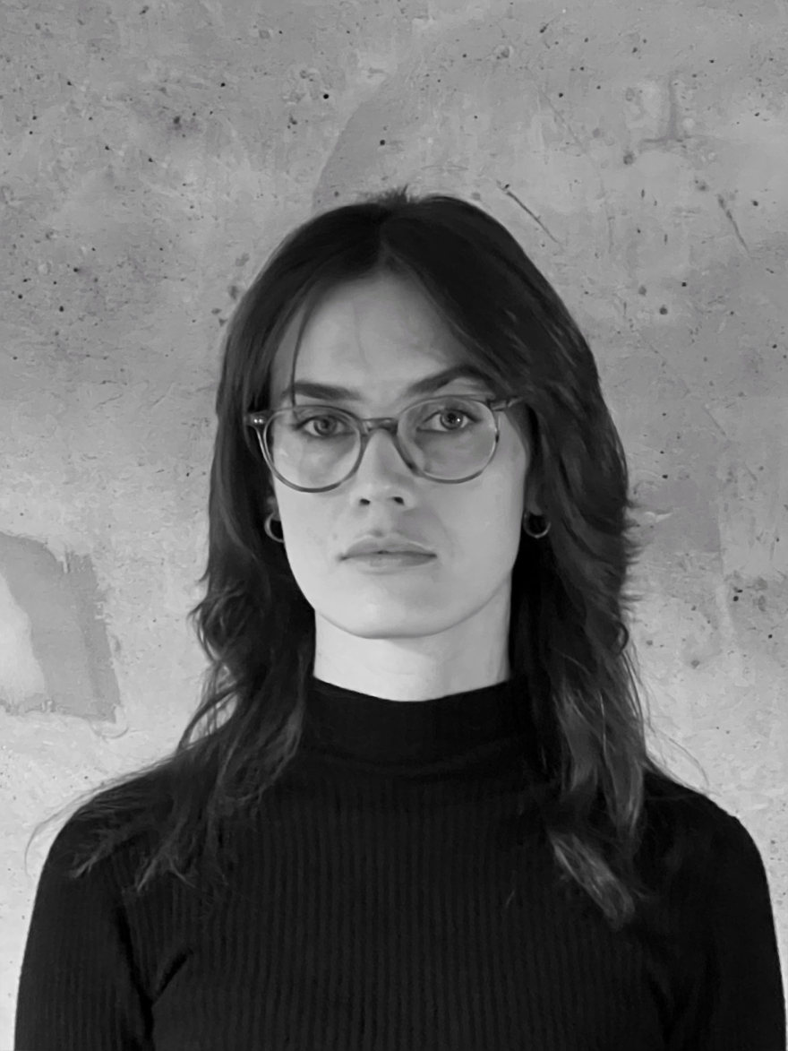
project team ↓
just be kidz
follow instagram
客服
消息
收藏
下载
最近


