查看完整案例

收藏

下载

附件

翻译
Architect:MVSA Architects
Location:Liguster 202, 2262 AC Leidschendam, Netherlands; | ;View Map
Project Year:2021
Category:Shopping Centres
Stories By:MVSA Architects;Concrete Valley;Kriskadecor
The brief called for the transformation of a dated, run-of-the-mill shopping centre into an all-round contemporary urban leisure destination. Specifically, it involved the expansionof the existingshopping centre in Leidschendam from 70,000m
to 200,000m
– making it the Netherlands’ largest mall. An important requirement was that the centrally located buildingshould remain open and functional while the refurbishment was taking place. The renovated centre would incorporate several new functions and services – from a museum and cinema,to a car wash and ‘dog hotel’ –as well as extending and upgrading its existing core functions (shopping, eating and drinking). Above all, the new mallwould offer a unique experience, becoming a stylish leisure attraction and taking shopping to the next level. To increase its allure as a destination, the new building needed to have the‘wow factor’.
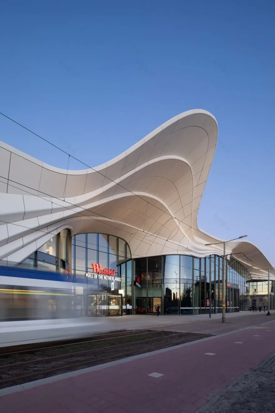
A key aim of the design was to unify the sprawling building and give it – both old and new parts and all the different functions – one strong identity, which had been lacking in the old shopping centre. The motif of a silk scarf suggested itself as a way totie all these diverse elements together in a fluid, dynamic and stylish way. The white scarf pulls the building together, here and there opening with a flourish to allow visitors to enter and exit the mall. The fluidity of the scarf was key to the concept of the interior too, where a flowing figure of eight loops through the building, carrying visitors along on an exciting journey of discovery.
The client was impressed by the design, which offered a spectacular solution to thecomplex project requirements and provided the desired ‘wow factor’. They liked that it was ‘real architecture’, with refined forms, materials, and details, and that it tells the same consistent story – based on the idea of the flowing white scarf – from concept to detailing. Above they were impressed by the high level of ambition, the international design approach and standard, and by MVSA’s “amazing team” who were a great match for their goals.
The site is located in the heart of the city, bordering a park. The new mall needed to be beautifully embedded in its location, yet at the same time make an architectural statement as a stand-out attraction.
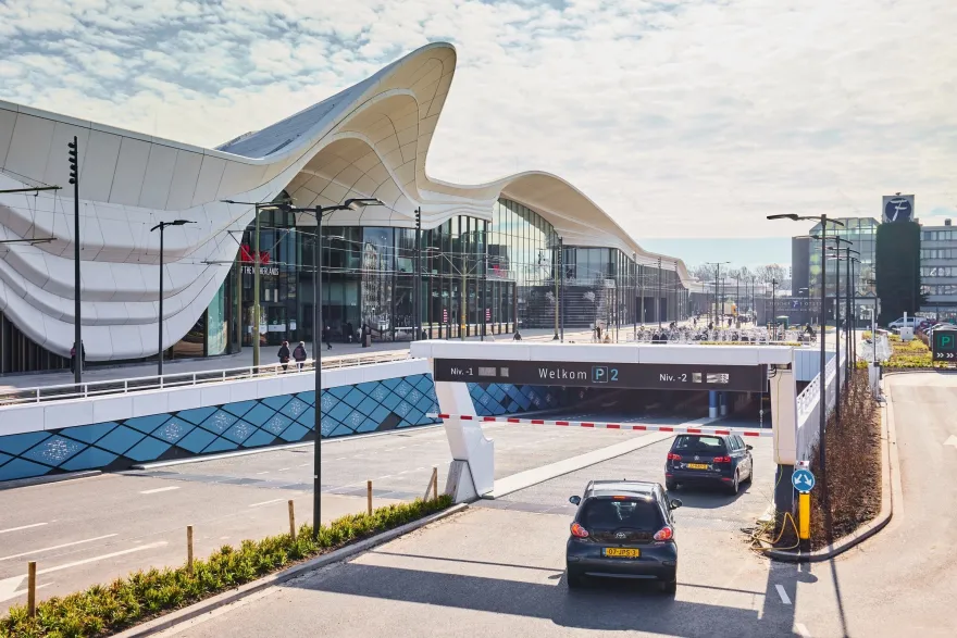
The concept of the scarf was a design solution that allowed the building to be unified by a single architectural gesture while giving it a unique and iconic identity. The ‘scarf’ opens up here and there, connecting the complex to its surroundings through a number of entrances that flow into the city. For example, there are strong new connections with the neighbouring park (the Zijdepark), and three subtle divisions on the side of the BurgermeesterBanninglaanrespond to the three neighbouring residential blocks opposite the mall. The strong connection with the park in particular boosts the attractiveness of the shopping centre as a leisure destination.
Key areas in the building’s exterior are the multiple entrances, which range from exuberant to more modest in approach depending on context.The entrance to the Dining Plaza is particularly spectacular:flanked by black marble ‘sawas’ (terraces) with lush greenery, it makes a strong visual statement and invites visitors inside. In the interior, a curving figure-of-eight route leads visitors to the key spaces, including the Central Plaza, the Dining Plaza with cinema entrance, and the market (Fresh). Along the way, there are a number of smaller key spaces – every few metres, the customer journey is punctuated by a play area, a bench with phone charging points, or an ‘island’ store for example.
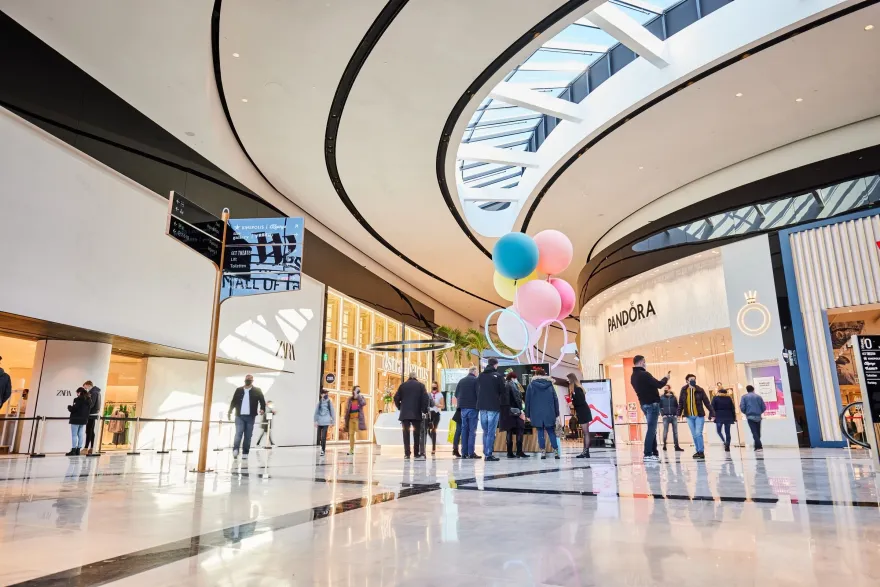
Throughout the development, space flows into space, leading visitors on an exciting journey with something new around every corner. Curved lines accentuate the fluidity. A simple palette of white marble with flowing black lines for the shopping galleries – accented by more spectacular materials for key areas – enhances the unbroken spatial quality.
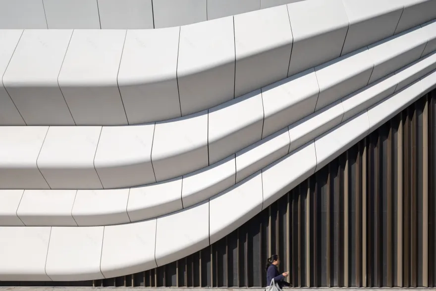
The customer journey is epic by Dutch standards, with an enormous range of attractions, stores, services, sensory input (colour, sights, scents, sounds) and things to discover. New for the Netherlands is the imposing height of the shopfronts: a lofty 7.5m. The interior height of the mall itself is similarly unprecedented: 10 to 12 metres. In floor area too, the mall is the biggest in the country, and its exterior canopy – the white ‘scarf’ – is 25 metres high. This façade displays a highly innovative use of concrete (in super thin sections, thanks to advanced milling techniques) that makes the most of its monumental dimensions.
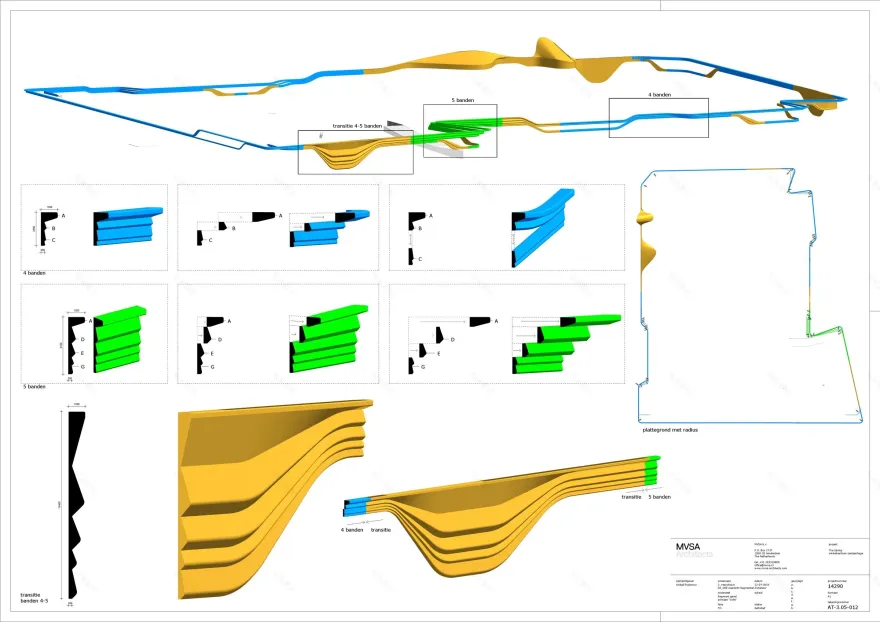
The layered façade design features an unusually expressive and sculptural use of an everyday material: concrete. The glassfibre-reinforced micro concrete is used in super-thin moulded panels in soft waving forms – a fresh and unexpected use for the familiar material. The surface is polished, smooth and tactile. It catches the light beautifully and has a warm, friendly appearance. The concrete scarf contrasts with the expanses of glass window below and with the rippling vertical aluminium louvres in tones of bronze that cover the closed areas between windows. The contrast of horizontal concrete waves and these vertical extruded aluminium profiles adds dynamism and interest to the façade.
The decision to reuse the existing shopping centre structure, rather than demolishing it, was a crucial factor in making the new Westfield Mall of the Netherlands a sustainable project. In addition, the complex saves energy thanks to an aquifer thermal energy storage system (ATES) and LED lighting. Excess heat from the shops is reused, while the sawtooth roofs minimise direct sunlight and reduce heat. Indoor unloading of stock means less heat loss in winter.
The use of glass-fibre reinforced concrete allowed the building’s façade to be unusually thin, and therefore saves materials.
BREEAM-NL New Construction and Renovation is the hallmark in the Netherlands for assessing new construction projects and large-scale renovations on sustainability performance. Buildings are assessed on nine different sustainability topics, including energy, water, materials and waste. BREEAM stands for Building Research Establishment Environmental Assessment Method and was originally developed and introduced by the Building Research Establishment (BRE), an English research organization similar to the Dutch TNO. Westfield Mall of the Netherlands is awarded with the score “Very Good” for New Construction and “Excellent” for Renovation.
The brief called for the transformation of a dated, run-of-the-mill shopping centre into an all-round contemporary urban leisure destination. Specifically, it involved the expansion of the existing shopping centre in Leidschendam from 70,000m
to 200,000m
– making it the Netherlands’ largest mall. An important requirement was that the centrally located building should remain open and functional while the refurbishment was taking place. The renovated centre would incorporate several new functions and services – from a museum and cinema, to a car wash and ‘dog hotel’ – as well as extending and upgrading its existing core functions (shopping, eating and drinking). Above all, the new mall would offer a unique experience, becoming a stylish leisure attraction and taking shopping to the next level. To increase its allure as a destination, the new building needed to have the ‘wow factor’.
The main feature of the completed interior design is its combination of luxurious yet understated shopping galleries, which allow the different retail brands to shine, and an assortment of dramatic focal points in the four key destinations: the Dining Plaza, Central Plaza, Designers Gallery and Fresh Food Market.
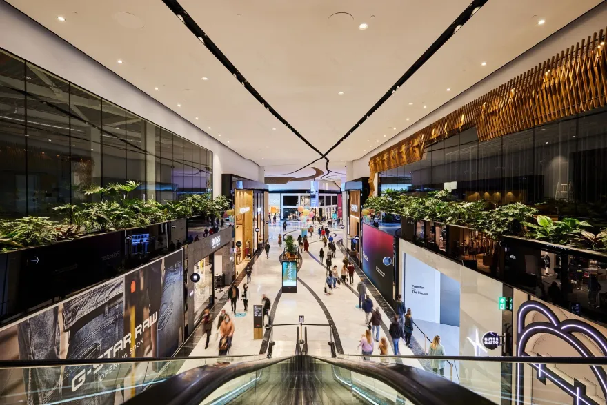
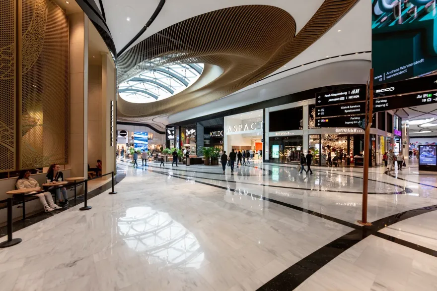
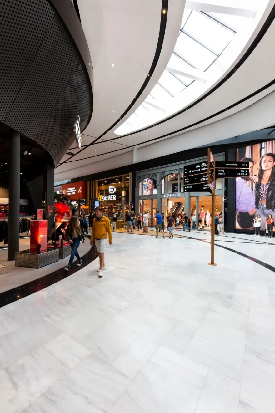
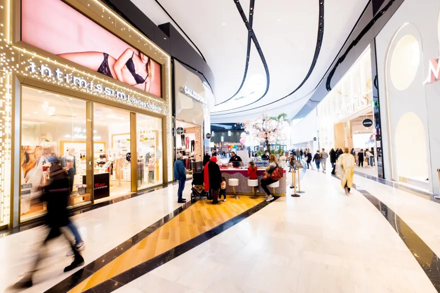
The shopping galleries are realized in a luxurious but neutral palette of white, black and grey marble, with mainly white spaces enlivened by flowing black lines on the ceiling that encourage visitors to move easily through the shopping centre. Against this neutral backdrop, the retail brands various store designs are beautifully showcased and highlighted.
Throughout, the interior design helps visitors to read the building and navigate through it.
The Figure-of-Eight Loop is the path through the shopping centre: an exciting 1.8 km shopfront journey of discovery. This curving pathway ensures that visitors are kept wondering what’s around the next corner.
The general look and feel and the materials palette is restrained, allowing the different brands to shine. The effect is calming rather than monotonous. The sophisticated design iscontinuous and fluid, gently guiding visitors along with its flowing curves and graphic lines. By playing with the lines (in the same way as in the façade), opening them up and letting them cross, different ‘islands’ are created, making space for seating areas, kiosks and other features.
The accent lines in the ceiling also integrate all the technical components in a single element. All the lines converge beautifully at the Central Plaza.
Central Plaza occupies the crossing-point of the figure-of-eight loop that runs through the shopping centre. This central space forms the heart of the redesign. Here all the lines that run through the galleries converge, forming a spectacular elliptical ceiling. The spiralling pattern is formed from 700 individual wooden ribs that weave around the central skylight – turning the space into a unique destination within the mall. The elegant design was precisely created and crafted with the help of 3D modelling software.
This central area is one of the Westfield Mall of the Netherlands’ prime destinations and it functions as a fully equipped event space.
On the upper floor of the shopping centre, above the Designers Gallery, is the
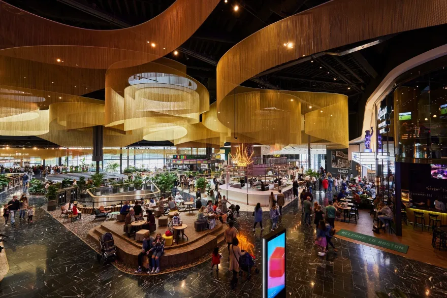
. Directly connected to the main outdoor parking area and with its own dramatic entrance, the Dining Plaza is a stand-out attraction in itself. When entering from the street, the white façade folds in on itself and black natural stone terraced ‘sawas’(terraces) with their lush greenery draw you in. Approached from inside, the fluid movement of the golden chains triggersthe senses.
The curving chain curtains suspended from the ceiling mimic the movement of air flowing in different directions and create a sophisticated sense of space. The delicate yet dramatic design warmly embraces the visitor and reinforces the human scale in the huge space of the upper level. The colour of the lighting scheme can be changed, so the mood can be adapted to the time of day of year, creating a range of possible atmospheres.
The curtains descend to the different food kiosks, marking their spot and giving them definition. Except for the lavishgold-chain ceiling, the Dining Plaza uses subdued materials in keeping with the restrained design of Westfield Mall of the Netherlands and the philosophy of providing a neutral backdrop for retailers.
Fresh, the (covered) food market, combines an industrial, local feeling with the subdued and open style of the rest of the interior. As well as a market, Fresh functions as a stage for cookery demonstrations and other food-related events.
A new interpretation of the traditional Dutch shopping street, the Designers Gallery is a showcase for young designers in the Netherlands. Located beneath the dining plaza, the gallery’s neutral and elegant design provides the perfect setting for a wide range of talents.
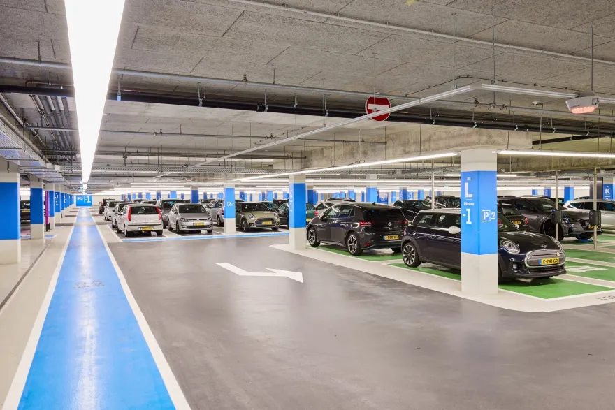
Westfield Mall of the Netherlands was designed as an experience destination, not as a standard shopping centre. The experience starts with the parking area which has space for 4000 cars.
When you enter this area, you are greeted by rhombus-shaped elements which guide you in. Each parking bayhas a different colour for optimal orientation. The parking lobbies are designed as reflections of the mall and gradually invite you in via their open structure, leading you towards the shopping centre.
Beautiful, restful, multifunctional (with make-up mirrors, changing stations and so on) and – unusually in the Netherlands – free of charge, the luxurious bathrooms indicate the shopping centre’s ambition to provide an optimal experience on every level.
mbX produced 10.000 m2 unique double-curved precast façade elements for the largest and most impressive shopping mall in the Netherlands.
Client: Unibail Rodamco Westfield
Architect: MVSA Architecten
Contractor: Ballast Nedam
Facade specialist: TGM
The recently opened Westfield Mall of the Netherlands, located between the cities of The Hague and Leiden, is the largest shopping centre in the Netherlands. With its 117,000 m2 of surface, it has up to 280 places in which to buy, eat, drink, relax and have endless fun.
Given that the existing shopping centre consisted of several blocks with different identities, one of the challenges for MVSA Architects, the firm in charge of remodelling the entire complex, was to seamlessly unite the old with the new. In this context, the delicate design of the ceiling of the Dining Plaza was born, which includes the sinuous panels of Kriskadecor. A total of 30 curved pieces in satin gold and brilliant brown make it a unique space that will trigger the senses of all and sundry.
In fact, the aluminium chains imitate the movement of the air that flows in all directions, giving warmth and embracing the visitor. According to Thijs van de Straat from MVSA Architects, "We were able to create a space where you could sit back, relax and feel comfortable and happy, as the curtains create that kind of atmosphere."
Another key strength is that "they allow to unify the high and low areas of the ceiling, making the design much more consistent". The chain panelssurround the different food kiosks, marking their spot, and giving them definition. And, by using different lighting colours, the environment can be adjusted to any time of the year, giving it a highly versatile atmosphere.
▼项目更多图片
客服
消息
收藏
下载
最近


