查看完整案例

收藏

下载

翻译
Architect:IDOM
Location:Miñano, Spain; | ;View Map
Project Year:2008
Category:Factories;Research Facilities
Epsilon Euskadi is a Motor Racing Innovation and Technology Research Centre that integrates three activities: 1) Design: R&D&I and production of state-of-the-art racing cars; 2) Racing team management: team competitors in the Le Mans 24 Hours, World Series by Renault, Formula Renault 3.5, Eurocup Formula Renault 2.0, Megane, Karting; and aiming for the 2011 Formula 1; 3) Advanced education: offering a Master’s Degree in Motorsport Engineering.
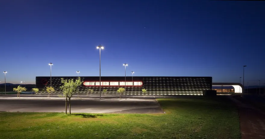
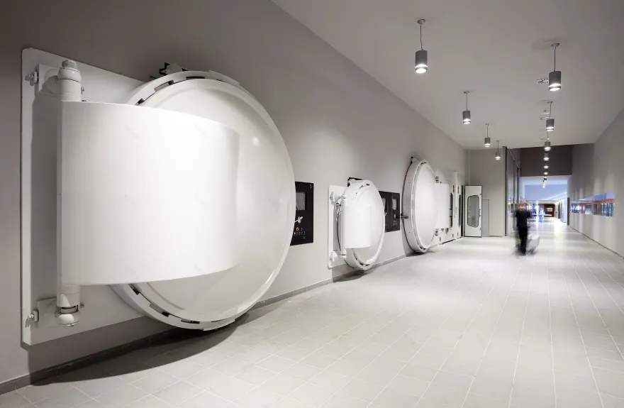
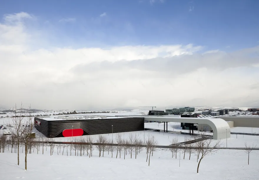
A rolling-road wind tunnel to test car models at a 50-60% scale, different types of laboratories, paint cabins, clean rooms to manufacture carbon fibre bodywork, autoclaves for curing bodywork, maintenance workshops, administration and management offices, master’s classrooms and up to five types of circulation areas (manufacture, maintenance, education, development and visits) are defined within a building of compact design, meant to provide functional proximity and an interior transparency to facilitate visual communication among different areas. The areas for vehicle production and maintenance are located on the ground floor. Research, education, design and management areas are located on the first floor. Two large interior patios, one above the manufacturing site and the other above the race car maintenance workshop, allow for interior visual communication as well as providing a large amount of natural light to the inside of the building. The abundance of natural light inside contrasts with the solidity, the almost blinded appearance, that the building presents to the outside, and that protects the confidentiality of the work going on inside.
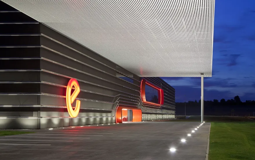
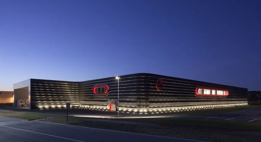
The facade was designed of prefabricated concrete panels. A glass textile (Texturglas-type) covering in black was attached to the concrete panels, with the intention of establishing a formal analogy with one of the materials most used by the client: carbon fibre. Various materials were used for the interior coverings: on the ground level, mostly ceramic tiles on the walls and floors; on the first storey, carpet on the floors and painted plasterboard on the walls. The ceiling roofs are sheets of aluminium or painted plasterboard, depending on the zone. The use of aerodynamic forms inspired by the vehicles designed by the client is a constant throughout all of the building’s design. On the facade, the few windows present are boxes with rounded corners, made with composite panels. Surrounding each window are stainless steel tubes that simulate airflow lines similar to those produced by computational fluid dynamics (CFD) simulations; the tubes also serve to help dissipate the solar radiation on the facade, since the stability of the inside temperature is very important in many of the processes that take place in the building. The rectangular form with curved edges is also used for the design of the interior windows, the door frames and even the designs of the lights used in offices and hallways.
The equipment is thus very accessible for maintenance and the roof is kept mostly clear. On the outside, the building’s volume is amplified with a porch area for the racing car team trucks and a large canopy that covers the visitor access areas, both the entrance and the car park. To highlight the three building entrances – visitor, personnel and service – red boxes with rounded corners are again used.
Three types of exterior illumination have been designed: A) perimeter lighting, partly with fluorescent tubes, that highlights the steel tubes and leaves the black facade in the background; combined with LED strips that outline the red boxes on the facade; B) in the car park, metallic halogen lights, avoiding a homogenous look in favour of a chiaroscuro effect, concentrating the light on the trees; and C) for the canopy and truck porch, also metallic halogen lights, illuminated with lights built-in to the floor, thus highlighting the lines of the roof. The access road to the port is 15 metres wide and paved in asphalt, the only way it could be done. The colour chart used – red, white, black, silvers and grey – is based on the client’s corporate colours.
▼项目更多图片
客服
消息
收藏
下载
最近


