查看完整案例

收藏

下载

翻译
Architect:ZJA
Location:Rotterdam, Netherlands; | ;View Map
Project Year:1997
Category:Subway Stations;Tunnels
In the early nineties of the previous century the city of Rotterdam developed what is known by the locals as the “Kop van Zuid”. The monumental Erasmus Bridge was an eye-catching element of that plan. The Wilhelmina Quay, on the southern bank of the river Maas, was the first area where large buildings were erected. Like the office of the Tax Authorities, the Court, office towers, the new Luxor theatre and the Nederlands Fotomuseum. The existing subway line had stops at Leuvehaven on the north bank and Rijnhaven on the south bank. An extra station was required, to bring all users and visitors to this new urban hotspot by means of public transport.
The architectural studio ZJA provided the design of the new subway station, one of the first commissions for this brand new firm at that time. Building the subway station at Wilhelminaplein confronted the architects with a very complex design conundrum. Buried in the slushy soil, right next to the river, and surrounded by the huge foundations of the high rise, a subway station had to be built at 16 meters depth (a Dutch record), while during the building process the trains kept running every two minutes through a concrete tunnel at the centre. This meant that whatever happened the concrete tunnel tube was not allowed to move more than one millimetre.
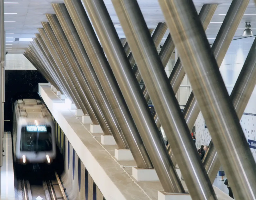
In order to prevent the ground water from pushing the tunnel tube upwards during the excavations and the building of the station, walls were inserted into the soil on both sides, to support a heavy concrete roof. This weight kept the tunnel in its place during the construction of the platforms and the erection of the V-shaped support structure, used to anchor everything. When all that was done the walls of the tunnel were opened. That is how the hall of the station as we know it today came to be. The required weight of the roof and its enormous strength enabled the architects to design a hall with a wide span, creating an open space where few columns hinder the view. All this was made possible by an inventive and unorthodox method of construction: all the work was done in reverse order. This enabled the architects to master the technical obstacles and realize an open and spacious design.
Being so close to the riverbank, where the train ascend from a maximum depth to the surface, the station inevitably has sloping platforms. A slight tilt in the design prevents baby strollers and wheelchairs to move towards the tracks on their own. To put the traveller at ease, the black-grey-white pixel pattern in the tiles on the walls signal this unique characteristic of the station in a casual, subliminal way, much like a visual form of ambient music.
This choice for casualness is a characteristic design feature. It can be found in other aspects as well, such as the flowing forms of the railing, the circular cut outs with acoustic material, the reflecting surfaces around the escalators and the general lay out of the space. They all install the right qualities without ever drawing attention to themselves. They remain inconspicuous and appear as purely functional. Another fine example of this way of thinking is that during the approach of a train the intensity of the lighting goes up slightly, to gently alert the travellers. Because of all this, Station Wilhelminaplein can still, twenty-five years after its opening, be experienced as a bright and contemporary subway station.
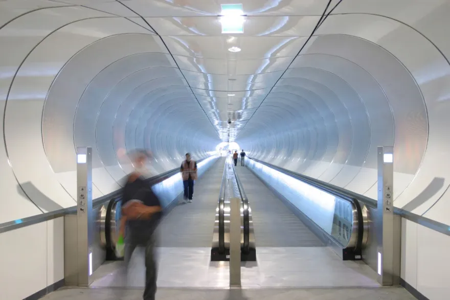
Besides the exit of Station Wilhelminaplein leading to the courtyard in between the towers, there is a second one. One reaches this exit in front of the Luxor theatre by way of a 140 meters long pedestrian tunnel. Usually tunnels are spaces that make people feel uncomfortable or even unsafe, but this design by ZJA presents a playful and ingenious way to prevent this and turn the travel through it into an attractive and even fun experience.
For a moment the curved ceilings and perforated enamel panels on the walls give the sensation of walking around at a futuristic airport, especially with the moving sidewalks, that speed up the travel through the tunnel. Behind the panels, that also hide the acoustic padding, there are images made up of dot patterns. Can we make them out in passing? Was that a child’s face? A computer system adjusts the LED lighting to the stream of pedestrians. All necessary equipment and installations are out of sight, offering the pedestrians an unobstructed view of this special space. Here one can recognize the design style of using smart and ambient ways to make a space functional and attractive. Without turning into a spectacle, the movement through the tunnel becomes a visually stimulating experience.
Architect: ZJA
Client: RET Rotterdam
Metro station Wilhelminaplein:
Year: 1997
Awards
Nomination: Dutch Steel Award 1998, A.M. Schreuderprijs 1999
Honorable mention: Dutch Concrete Award 1997
Pedestrian tunnel:
Year: 2005
Awards
Winnaar: Dutch Steel Award 2006, Job Dura Prijs Veilige Ruimte 2006, Dutch Design Award 2005
Nomination: Dutch Building of the Year 2006
▼项目更多图片
客服
消息
收藏
下载
最近


