查看完整案例

收藏

下载

翻译
Architects:Estudio Galera
Area:182m²
Year:2023
Photographs:Diego Medina
Lead Architects:Ariel Galera, Cesar Amarante, Francisco Villamil, Luisina Noya
Design Team:Ariel Galera, Cesar Amarante, Francisco Villamil, Luisina Noya, Pablo Ahumada
Technical Team:Verónica Coleman
Engineering & Consulting > Structural:Juan Pablo Busti
Landscape Architecture:Lorena Allemanni
City:Ostende
Country:Argentina
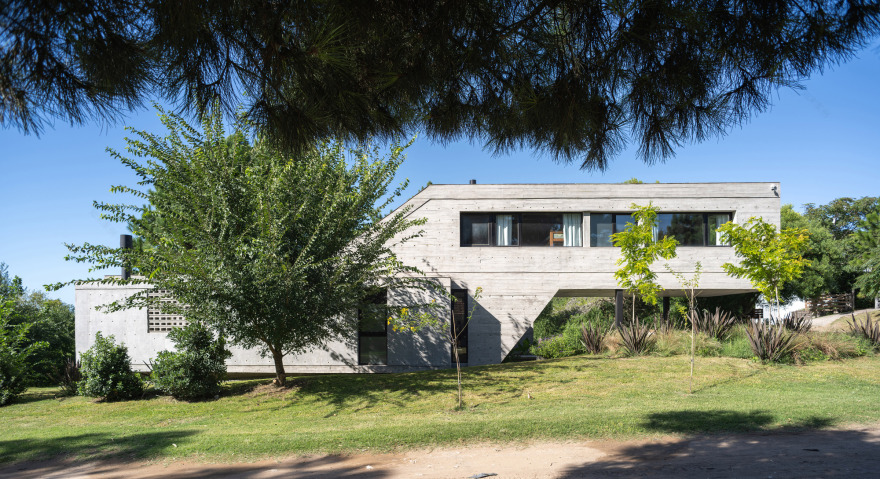
Text description provided by the architects. House Three is part of a larger complex that has gradually been built for the same family over time. It is the third of a total of six residences planned in 2016 through a master plan that encompasses not only housing but also amenities and green spaces at the center of the complex.
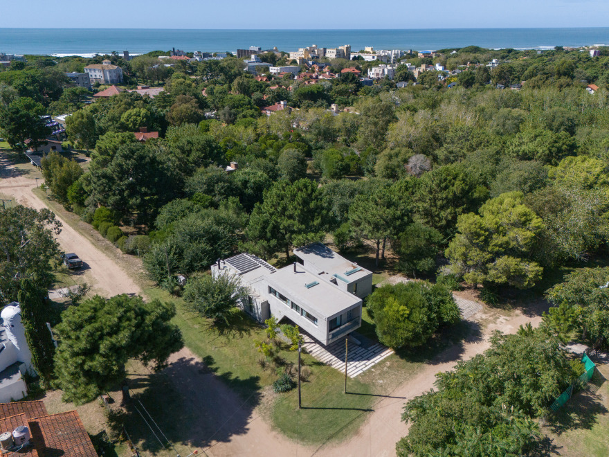
Set in a block near the sea, the dwelling rests on the blurred boundary between Ostende–the most densely populated area of the city and mostly occupied by the working class- and Mar de Ostende, a tourist area that acts as a bellows between the sea and the city itself. A border or edge condition among these two areas is generated not only in terms of the perception of security and privacy but also in the clash between the ‘rushed life’ of workers and the ‘slow world’ of those who are on vacation.
From a topographic perspective, the lot features a slope of 3.00 more from the street at the front and the rear section of the lot; a conditioning factor that adds to the ‘self-restriction’ of the Master plan, where the center of the block is designated as an expansion space. Therefore, closing off to the streets and opening up to the green space entails closing the house to the West, which means losing sunlight inside the dwelling but recovering it in outdoor uses in a park that multiplies sixfold.
Since this is a rental property, House Three has to be versatile enough to host a different generic user every week and designed in a way that can be segmented and divided into two to accommodate a family and a couple simultaneously. In this sense, ambiguity and flexibility are key.
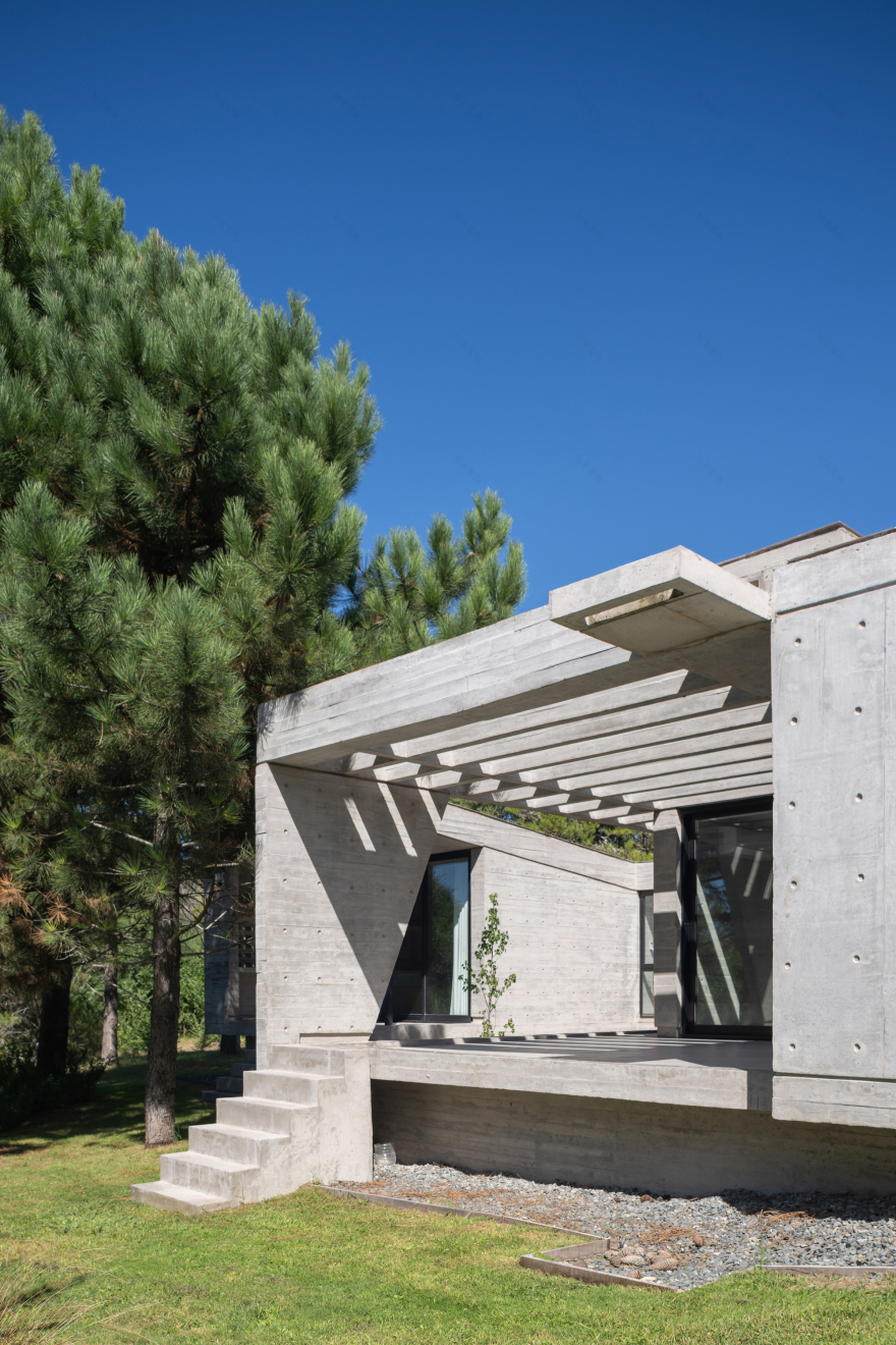
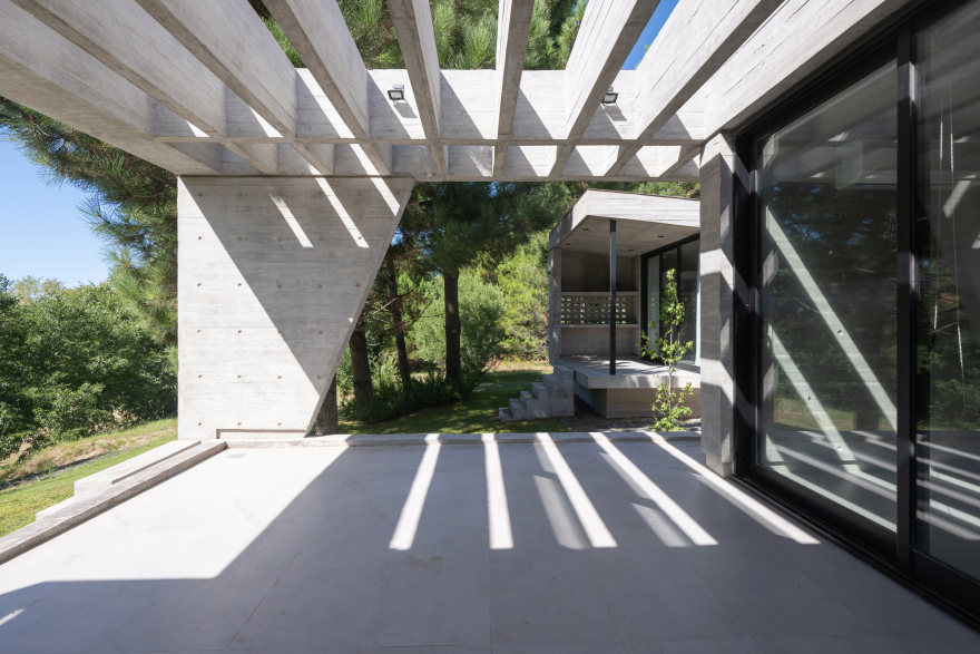
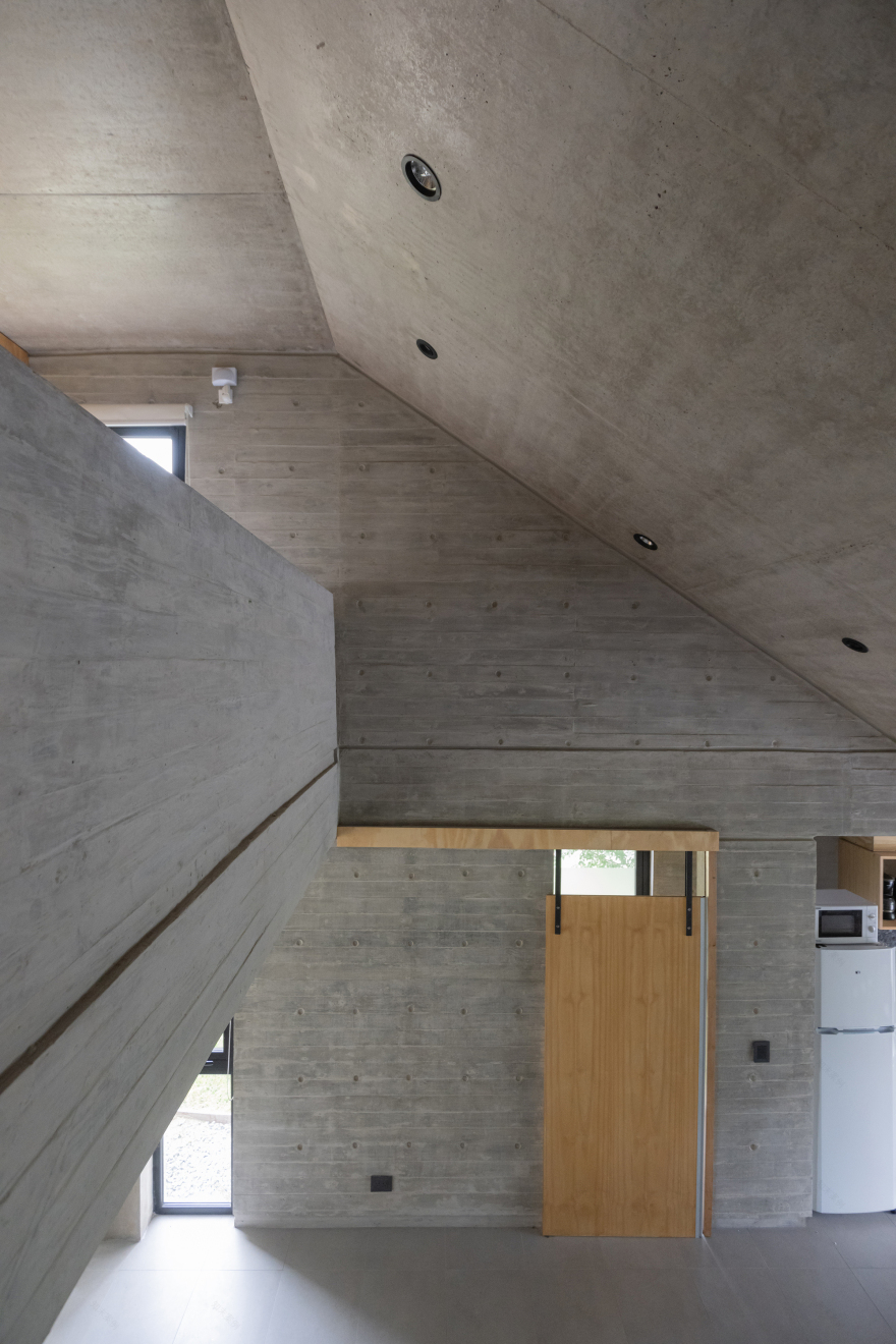
This third house is projected as a succession of the previous ones, following the same construction logic such as the use of noble materials and replacing the common brick used in the first two units with exposed concrete. This third version of the extended program is consistent with the conceptual lines that originated the ensemble: simple execution with local labor and minimal maintenance.
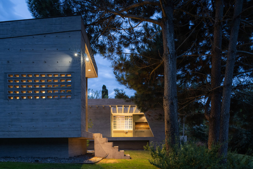
By sharing spatial explorations and dimensional relationships with the pre-existing houses, a dialectic connection is established, in which they are all assimilated in formal terms but contrasted in their materiality. House Three, like the previous ones, is designed using a scarce catalog of materials: reinforced concrete, glass bricks, aluminum, glass, and cement blocks stacked horizontally to serve as visual filters rather than load-bearing elements.
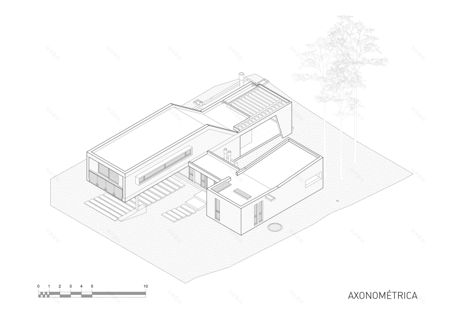
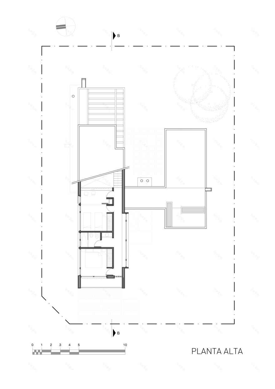
The floor plan is divided into two inhabitable units that can function either as a single dwelling or be divided into two according to demand. This ‘bi-nuclear’ floor allows for the separation of the master bedroom on the ground floor to create an independent single-room unit or be part of the rest of the house alongside the main volume which nests the public uses on the ground floor and two bedrooms and a studio that overlooks the living-room on the upper floor. This generates unique spatial relationships not present in the other houses of the complex.
Project gallery
客服
消息
收藏
下载
最近


