查看完整案例

收藏

下载

翻译
Architects:Ampuero Yutronic
Area:240m²
Year:2023
Photographs:Felipe Fontecilla
Lead Architects :Ampuero Yutronic: Andy Wakefield, Catalina Yutronic, Javier Ampuero
City:London
Country:United Kingdom
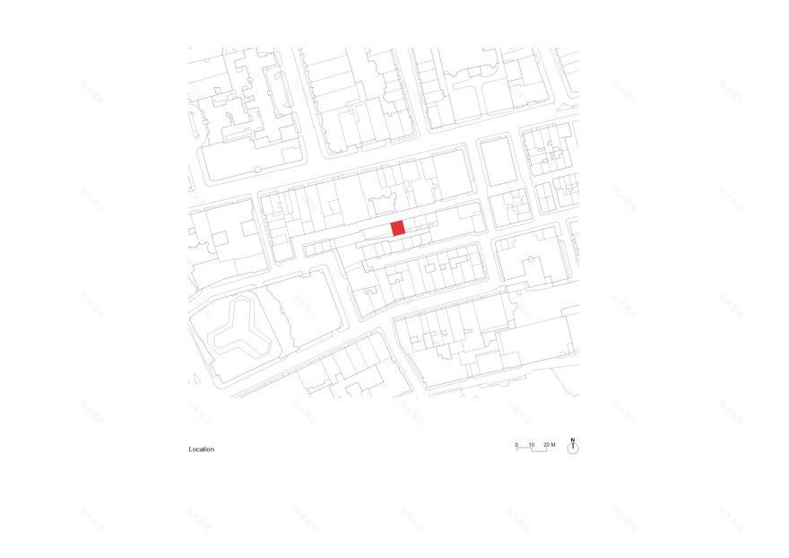
Text description provided by the architects. This new residence is located in the center of London. It replaces a typical post-war building located on a modest cobbled street within a local conservation area dominated by luxurious terraced houses along picturesque passages and streets, reflecting the rich history of English residential architecture from the 18th to the 20th century. The client sought a quiet place away from the hustle and bustle of the local area in the heart of Mayfair and the city in general.
The residence was designed for a couple with an extensive family. As a result, it was necessary to think of the spaces in a way that they feel comfortable and function well, whether living as a couple or hosting family and friends. The condition of the existing house and the client's spatial requirements required the house to be largely rebuilt. However, the design uses the existing party walls of the surrounding properties that form the immediate boundary on three sides. As such, the street elevation is the main visible expression of the new house.
This new north-facing facade integrates gently with the surrounding properties, drawing inspiration from the historic residential typologies of central London, but creating a distinctive identity/appearance through minimalist details and the delicate use of materials. The elevation consists of three distinct sections; "base", "middle" and "upper".
The entrance to the ground floor of the house is constructed with large format panels in "reconstituted limestone" to create a visually distinct "base", recognizing the predominant use of this traditional material in many of the historic buildings in the area. This material was also used in the sills, planters, and in the upper finish of the parapet. The windows, with white steel frames, correspond to the window style typically seen in nearby residential buildings.
The "middle" upper floors are built with "Roman" style bricks of limestone color and lime mortar. A nod to the vernacular language of brick. This material allowed for deep windows on the first floor, accommodating large planters in "reconstituted limestone" at sill level, offering a visually more robust solution to this approach with planters, prominent in the area to provide vegetation and color to the upper floors of the houses.
The "upper" part is formed by a more traditional sloping roof and moved away from the main parapet line, reducing the overall volume visible at street level.
At the rear of the house, a new two-story volume emerges from the constraints of the party walls towards the lower floors. Built in brick with varied colors, this new addition is a response to the eclectic mix of volumes and materials of the surrounding properties on Market Mews and Shepherd Street. Aligning with the facades of the adjacent houses, this new insertion seeks to bring more harmony to the currently disparate arrangement of the overall elevation.
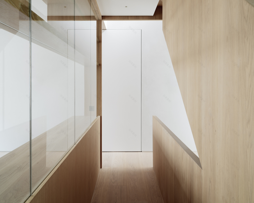
The house is arranged both according to specific functional requirements and the conditions created by the insular nature of the site, which forms a relatively restricted plan. The need to "stack" the use programs meant opportunities to explore vertical circulation, adjacency of functions, and the use of natural light, which were paramount considerations. The constraints of the party walls on three sides also restricted the possibility of using windows to bring natural light into the house. Through careful floor layout, large light wells were formed in the internal volumes, using skylights and south-facing windows, directing natural light to the lower floors of the house.
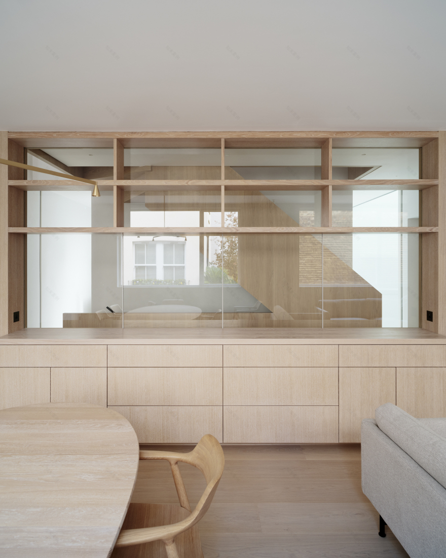
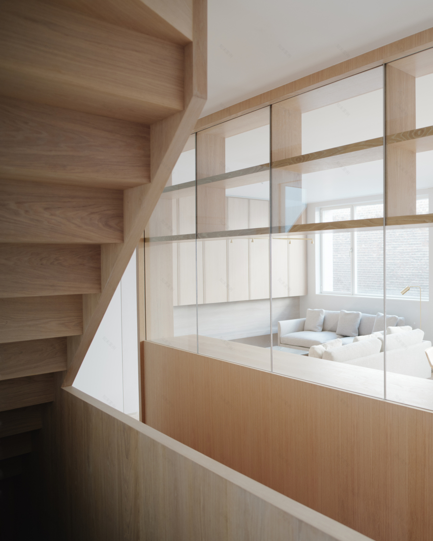
A recessed portico at the entrance accentuates the arrival experience and forms the transition between the street and the reception hall. From this central hall, there is a direct connection to the library/studio, with natural light descending into this space from a three-story light well at the rear of the house. With a higher floor-to-ceiling height and containing the main open-plan living and dining space, the upper floor is conceived very similarly to the traditional 'piano nobile', serving as the heart of the house. Custom-made, a large display cabinet acts as a veil allowing views and natural light to penetrate the stairs and the kitchen. This galley-style kitchen is naturally illuminated by a large skylight combined with views of the main light well at the rear.
The sculptural nature of the wooden staircase is fully revealed on this floor and is combined with another central light well that floods the heart of the house with natural light. This staircase leads to the master bedroom en suite on the second floor, with a dressing room and a spacious bathroom with a separate stone bathtub. At the rear, the light well illuminates a gallery space with the staircase continuing to the guest bedrooms and a bathroom on the top floor. Back in the ground floor reception room, a staircase attached to an exposed concrete wall leads to the basement housing a small cinema and a multipurpose room with natural light flowing from the rear light well.
From the outset, a key goal for the client was to live in a calm environment that felt clean, bright, and spacious but also sturdy enough in its qualities of family housing. This has been achieved through meticulous space planning, maximizing natural light everywhere, and through a carefully selected palette of natural materials. The predominant use of wood, stone, and polished marble plaster, combined with simple details, contributed to achieving these spaces through reserved elegance.
Project gallery
客服
消息
收藏
下载
最近


