

创作上传
VIP
收藏下载
登录 | 注册有礼
查看完整案例

收藏

下载

分享
翻译
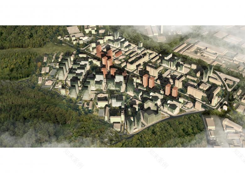
General masterplan
可视化 © C+S Architects

The boulevard
可视化 © C+S Architects
Public space
可视化 © Citizenstudio

Public space
可视化 © Citizenstudio

The towers facing the park
可视化 © C+S Architects
Site plan
可视化 © C+S Architects

Facade research
图片 © C+S Architects + Citizenstudio

Urban analysis
图片 © C+S Architects

Urban proposal
图片 © C+S Architects
Urban proposal
图片 © C+S Architects

Diagrams of color for the facades
图片 © C+S Architects

Facade proposal
图片 © C+S Architects

Detail of the facade 图片 © C+S Architects

Facades and public spaces
图片 © C+S Architects
Facade detail
图片 © C+S Architects

Facade detail
© C+S Architects
建筑师:C+S Architects
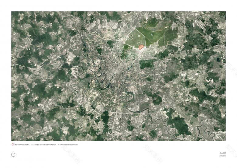
位置:Metrogorodok, 100000 Moscow, Russia
年份:2021
客户:Moscow City Government
团队:C+S Architects, Carlo Cappai, Maria Alessandra Segantini, Citizenstudio
Metrogorodok urban interior
C+S Architects, in collaboration with Citizenstudio, has won the Face of Renovation international competition organized by the government of Moscow, Russia for the development of the architectural, spatial and stylistic concepts of the facades of public spaces residences as part of the renovation program of the real estate assets. The overall plan includes 52 lots.
C+S Architects and Citizenstudio will design the Metrogorodok area (lot no. 13), for a total building area of 1,366,000.79 m2.
The main objectives of the design are:
- overcome the current repetition of the facades to generate a new identity for the area;
-highlight the quality of the context and reinforce the identity of the citizens;
- identify points of aggregation and public spaces capable of becoming recognizable cornerstones;
-create a hierarchy of public and semi-public spaces, to broaden the variability of urban life scenarios and create a livable and sustainable city.
"As Italian architects, we are used to looking at our cities as ’urban interiors’. For us the squares are not voids, but rather ‘urban interiors’ in continuity with the facades of the buildings or the greenery that overlook them. We exported this simple and beautiful concept to Moscow and, by studying the evolution of the housing tipology of the city of Moscow, with the help of our Russian friends of Citizenstudio, we have combined the materiality and plasticity of the facades with the design of the public space. The project almost magically creates a grid of colors and materiality that determines the new identity for the citizens of Metrogorodok with the ambition that they can recognize it and call it "home."- state Cappai and segantini, C+S.
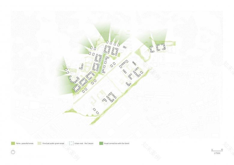
There are two main elements, which constitute the backbone of the Metrogorodok site: the Losiny Ostro National Park (the largest green area in Moscow) on the northern border and the existing urban axis of Otkrytoye Shosse Boulevard.
The project interacts with the forest both on a physical level (manipulating the typologies, making the facades plastic and turning them towards the forest) and on a conceptual-material level (thanks to the study of materiality and color that become a guide to identify public spaces and the facades and their relations with the forest.
The second cornerstone, the urban axis of Otkrytoye Shosse Boulevard is, on the other hand, the backbone of the entire neighborhood, a mineral element into which the various enclaves of the area are grafted.
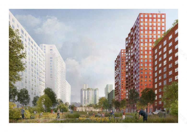
The materiality, the plasticity of the facades, the use of color, as well as the nature of the pavement of public squares and community spaces give shape to a system of spatial coordinates where, each type of space is assigned its own color - green for the spaces falling within the gravity zone of the Bosco, red for spaces falling within the gravity zone the Boulevard and its urban character.
The transition spaces between the two poles, are intermediate spaces: they have a more neutral shade - white and light gray, which characterizes the living environment in the heart of the neighborhood without major influences from either of the two main gravity zones, but are instead enriched with colorful paved play areas and common grounds.
Plasticity of the facades
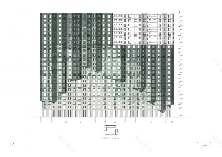
The towers overlooking Otkrytoye Shosse Boulevard have a decidedly monumental and iconic character. The only visual element that determines the physical design of the facade is the gradient of increasing the size of the openings upwards - from the small ones in the lower level,facing a part of the city which is more noisy and active, to the large ones in the upper part of the towers, which also offer the best views.
The lateral facades of the towers begin to fall into the gravity zone of the forest. As a result, the linearity of the facade is broken, in order to increase the percentage of forest views. The side facades are carved out of loggias, designed as greenhouses to enhance the beneficial gain of the winter sun and therefore the sustainability of the project.
The most common type, the urban blocks, due to their median location, are subject to different areas of influence. The sides facing the inner boulevard of the district are more sober.
While towards the boulevard the towers have a calm nature, the facades of the towers overlooking the wood are characterized by a more generous plasticity that increases as one moves towards the upper floors, also producing an increase in the floor area as well as an increase the percentage of forest views on the upper floors and revealing a new class of the most prestigious apartments.
Solutions for facades
The image of future buildings is inextricably linked to the context in the area of influence in which each specific typology falls and belongs. The variability and variety of development scenarios is achieved through the use of two main tools: the plasticity of the facade and the gradation of the color tone, linked to its materiality.
Color solutions for facades
The palette of color shades of the facades directly depends on the area of influence of which magnet falls this or that part of the building.
The facades overlooking the Boulevard Otkrytoye are made in a deliberately homogeneous mass of colors: a red terracotta shade, which is a reaction to the public nature of the space and which is designed in continuity with the external flooring.
The lateral facades of the towers, turning towards the quiet internal park of the district, change their tonality towards lighter tones, signaling a character that becomes more and more private.
The main material for the facades of the towers and urban blocks is made of fiber-reinforced concrete slabs in shades of terracotta red and green. The facades overlooking the Canyon and the internal park are also made of white and light gray fiber-cement panels, with the insertion of individual ceramic elements with a smooth and glossy surface. Special brick solutions are inserted in those buildings on the corners which have a role of geteway between two different systems.
The ground floors of the buildings are lined with glazed ceramic tiles in appropriate shades, connecting the facade solutions with the landscape.
The link between the public space on the ground and the building is expressed through the different character of materiality, which determines the hierarchy of spaces.
The dense mineral pavement of the city boulevard along Otkrytoye boulevard is eroded by grass grafting as we approach the inner district park. On the avenue side, the pavement has a color similar to the facades - terracotta red, which softly turns to light gray on the side of the city park, to reinforce the idea that the facades and soil give rise to a precious ’urban interior’.
The paving of the courtyards is colored, welcoming the play and sports areas of children / teenagers with the inclusion of islands of vegetation.
南京喵熊网络科技有限公司 苏ICP备18050492号-4知末 © 2018—2020 . All photos and trademark graphics are copyrighted by their owners.增值电信业务经营许可证(ICP)苏B2-20201444 苏公网安备 32011302321234号
苏公网安备 32011302321234号客服
消息
收藏
下载
最近