

创作上传
VIP
收藏下载
登录 | 注册有礼
查看完整案例

收藏

下载

分享


原型品牌被可视化为一个简化的透视图像。透视是我们身边无处不在的日常现象之一,它对空间的感知有着巨大的影响。我们在室内保持了视角,同时代表了品牌的发展和目标。游客主要关注的是在不同平面和不同照明角度下的全尺寸陶瓷样品,因此地板和几乎所有的墙壁都是由大尺寸的瓷器制成的。因此,室内的主要元素是来自新系列的物品,因此主要的颜色范围是黑色和白色。

The ARCHETYPE brand is visualized as a simplified perspective image. Perspective is one of the everyday phenomena that surrounds us everywhere and has a huge impact on the perception of space. We maintained the perspective in the interior, representing the development and goals of the brand at the same time. The primary emphasis for the visitor is on full-sized samples of ceramics in different planes and at different lighting angles, so the floors and almost all walls are made of large-format porcelain stoneware. Herewith, the main elements of the interior are items from new collections, thus the main range of colors is black and white.


△材料展示装置

△空间透视图
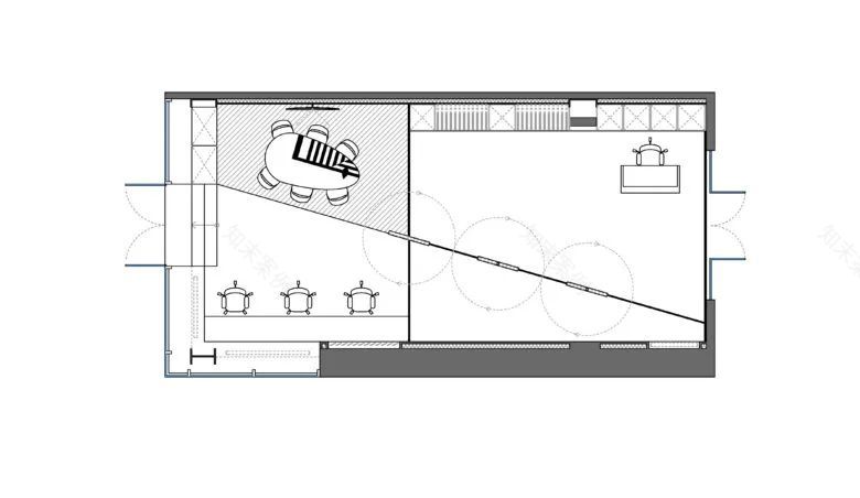
△平面布置图


△
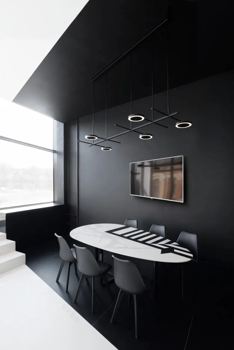
空间设计细节


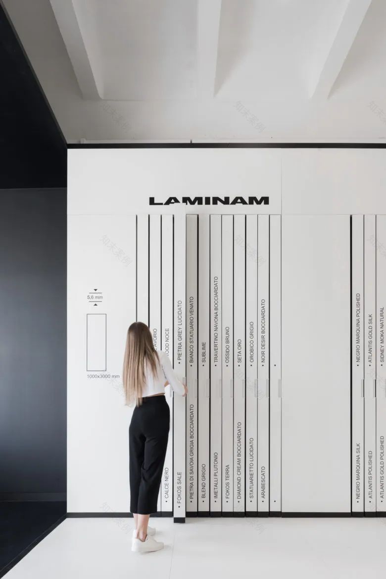
△材料样板展示

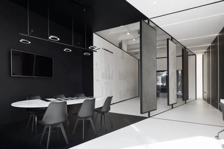
△空间展示区、洽谈区图
南京喵熊网络科技有限公司 苏ICP备18050492号-4知末 © 2018—2020 . All photos and trademark graphics are copyrighted by their owners.增值电信业务经营许可证(ICP)苏B2-20201444 苏公网安备 32011302321234号
苏公网安备 32011302321234号客服
消息
收藏
下载
最近