查看完整案例


收藏

下载
今年2月,Wutopia Lab为万科中西部区域设计的“有空”客厅在成都 go mall落成。经过房地产黄金白银的20年发展,全中国的城市居民都住进了类似的房型和小区。我觉得小区这个名称很合适,因为根本没有形成社区。全国小区大多类似,只提供规范要求的配套和为提高卖价的景观,住户所需要的社区社交场所基本为零。居室和城市之间的小区本来是一个重要的过渡领地,也是社区生活邻里感情得以建立的场所。不过实际是名存实亡只剩下安保的边界,等外卖快递大行其道直接穿越进入住户之后,这道边界也是岌岌可危,居室直接暴露在城市前,漂亮的小区景观却成了生活的荒漠,
居住小区生活升级要先从配套创新开始。“有空”客厅就是针对当前居住需求发生新变化而诞生的新产品,设计师把快递,外卖,超市,会客,家教,阅读,聚会这些社区功能复合其中,形成小区内步行15分钟可达的共享客厅,而不需要求诸城市。这也是逐渐稳定下来的居民需要建立长期熟悉的社区生活和邻里感情的需求。Wutopia Lab完成“有空”客厅的研究后希望有个实体项目落成能来展示和验证,最后项目落地选在成都第五城社区商业go mall里面。如果社区客厅藏在陈词滥调的商业里面之后,就失去了示范作用。 有空客厅的立面就是一个打开的盒子,高4米的半开门是穿孔铝板制作的,形成了Wutopia Lab标志性的半透明界面。你能从这里隐隐约约的窥看到,温暖的灯光,明亮的蓝色,和孩子的笑声。
▼有空客厅的立面是一个打开的盒子,高4米的半开门使用穿孔铝板,the four-meter high semi open entrance is made of perforated aluminum panels,
In February this year, The Youkong Living Room designed by Wutopia for Vanke Midwest finished its construction in Chengdu’s Go Mall.After a 20-year development of real estate, almost every Chinese citizen now lives in “Xiao Qu”, the Chinese name for closed residential district. With highly similar space layouts, “Xiao Qu” creates nearly zero communal space for residents that it’s hard to create a community in such circumstance. As a buffering zone between home and urban space, “Xiao Qu” was supposed to be place of communication, where residents can hang out, relax and build relationships. This buffering zone now exists only as a guarding boundary that is not even able to serve in a good manner, which directly exposes home space to the external world.
By bringing different community services such as mailing, package delivery, meeting, reading, meet-up, etc., together into Xiao Qu space, a shared community living room can be created with a 15-minute walkability that residents can easily reach to and this is what Youkong Living Room is trying to achieve in order to update the services of Xiao Qu. Eventually Wutopia Lab chose the Fifth Community Go Mall in Chengdu as the site to showcase this experimental community living room project.This community living room would be just a cliché and lose its function of demonstration if it was hidden inside of a commercial space. Youkong Living Room is more like an opening box on its façade. The four-meter high semi open entrance is made of perforated aluminum panels, which is a representational move of Wutopia Lab that from there you can see warm and gentle lightings, bright blue colors and kid’s laughter.
▼从这里可以隐隐约约地窥看到温暖的灯光、明亮的蓝色和孩子的笑声,from there you can see warm and gentle lightings, bright blue colors and kid’s laughter
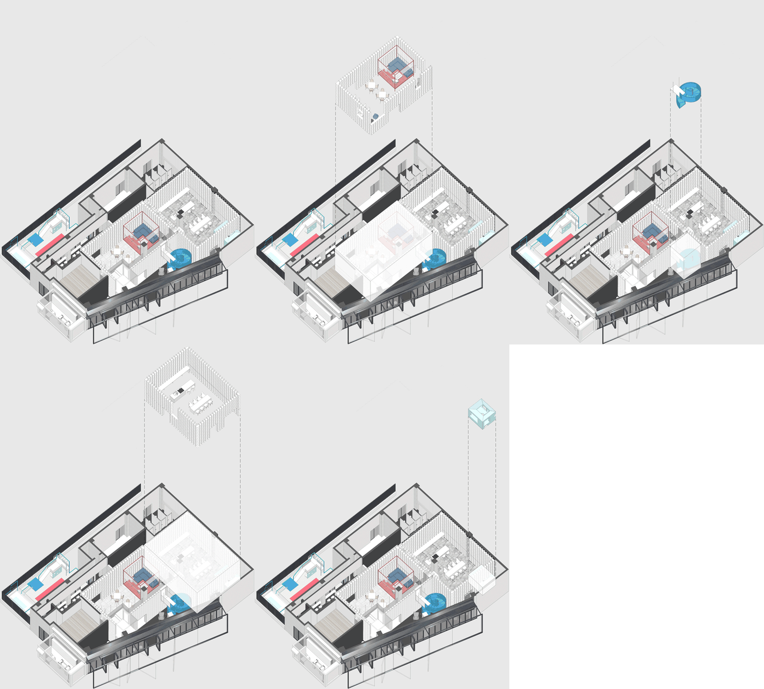
现场是个不规则的平面,如果排除未来可复制性,就着形状设计并无不可,但这就缺乏了示范性意义。我按照客厅研究成果,在这个不规则平面最大极限设置了三个盒子,一个是功能性的,一个是社交性的,一个是女性的。如果把不规则的场地看成是一座城,这三个盒子就是内城,而他们之间不规则的剩余空间可以自由定义的场所。功能盒子是用于快递收发,社交盒子是客厅+阅读,女性盒子是厨房+儿童天地。各个盒子相对独立,动静分离。社交盒子在策划中被重视,而我觉得女性盒子才是实际运行中的核心,毕竟社区的主力是女性和孩童,厨房区域不仅可以用来做厨艺课程,居民也可以预定厨房区域作为聚会的场所。女性盒子才是真正意义上的社交盒子,而原来的社交盒子是日常休息和女性盒子功能的延续。
▼(从左至右)功能盒子是用于快递收发、社交盒子是客厅+阅读、女性盒子是厨房+儿童天地,(from left to right)the Service Box is for package delivery; the Social Box works as a living room and reading space; the Female Box is kitchen and kid’s area
The site has an irregular planar space and in order to keep the reproductivity of Youkong Living Room, we chose to place three rectangular box space into the site that the first one is service box, the second is social box, and the third is box for female. Three boxes create an inner city within the site and the residual becomes free space. The Service Box is for package delivery; The Social Box works as a living room and reading space; The Female Box is kitchen and kid’s area. Each box is relatively independent and still connected in some way. We think the Female Box is the core of Youkong Living room since the majority group of residents in community is female and children, the Female Box can not only provide kitchen space, but also work as a party space for residents, which make it the Social Box an extension of Female Box.
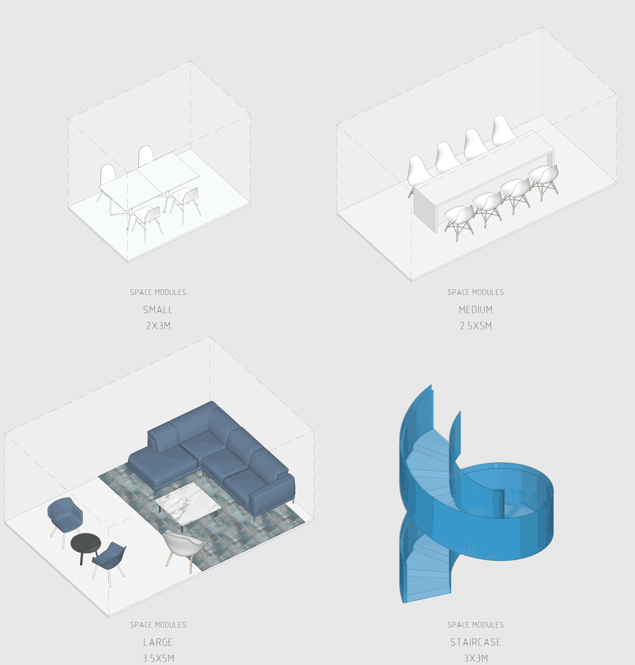
▼空间模块,space modules
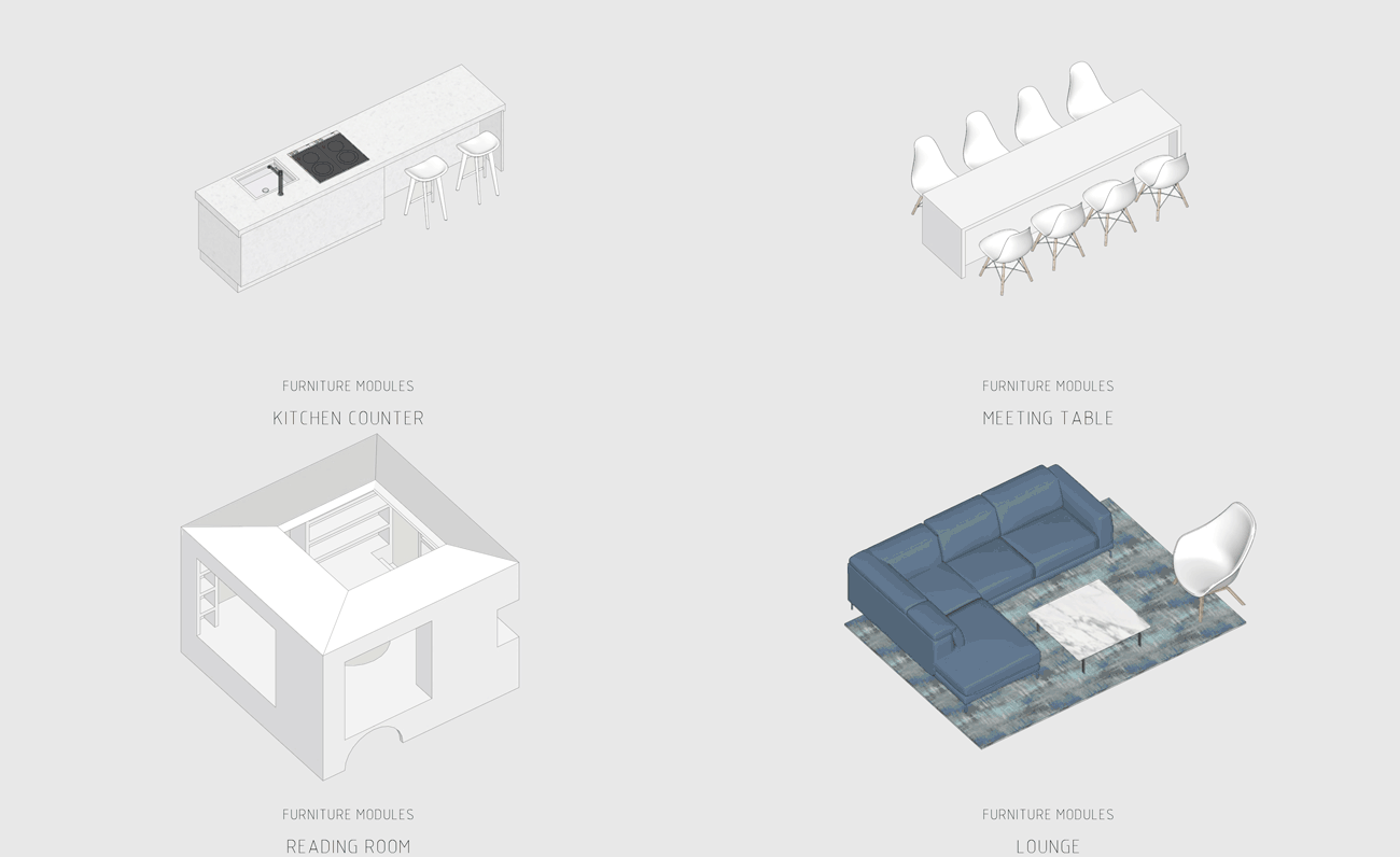
▼家具,furniture
我们遇到的最大抗性是来自非设计部门的质疑,她们要求空间开放,场所要一目了然。这是个多么粗暴而不成都的想法,房地产的这种简单毫无生活性的共识已经重塑了中国大小城市的居住和展示,这才是我所痛恨的,其实没有人愿意在众目睽睽之下和人交流,客厅的开放是针对熟人的,这才是社区生活和邻里感情建立的基础。所以我坚持盒子在空间上的封闭,而在视觉上的半开放,我要在这345平米的小空间里形成层层叠叠的层次和曲折丰富的空间,每个熟人都可以心安理得。
The biggest questioning from non-design side is that we are asked to open up the space to create a wide-open view. We think this outdated recognition of domestic space is exactly the problems in currently real estate development in China. No one would like to be seen in their living room or kitchen, these spaces are for friends and acquaintances. This should be the foundation of creating a community with relationships and we insist on a closeness in spatial condition and a semi-openness visual condition. A space of layering and rich spatial conditions is what we would like to create in Youkong Living Room.
▼入口空间-盒子在空间上封闭,在视觉上半开放,entrance area-a closeness in spatial condition and a semi-openness visual condition
▼小空间里形成层层叠叠的层次和曲折丰富的空间,a space of layering and rich spatial conditions is what the architect would like to create in Youkong Living Room
我用蒂芬妮蓝阅读屋作为女性盒子的中心,与此呼应的是入口可见的卡莱茵蓝螺旋楼梯,以及盒子背面室外的明黄色儿童活动场地。他们精致地镶嵌在有些迷离模糊的空间中成为点睛之笔。
We make the reading room with Tiffany Blue as the core of the Female Box in response to the spiral staircase with Klein Blue at the entry, as well as the external kid’s area with bright yellow color at the back of the box.
▼蒂芬妮蓝阅读屋作为女性盒子的中心,与此呼应的是入口可见的卡莱茵蓝螺旋楼梯,the architect makes the reading room with Tiffany Blue as the core of the Female Box in response to the spiral staircase with Klein Blue at the entry
▼楼梯细节,stairs detail
▼蒂芬妮蓝阅读屋,reading room with Tiffany Blue
▼女性盒子中的厨房空间,kitchen in the Female Box
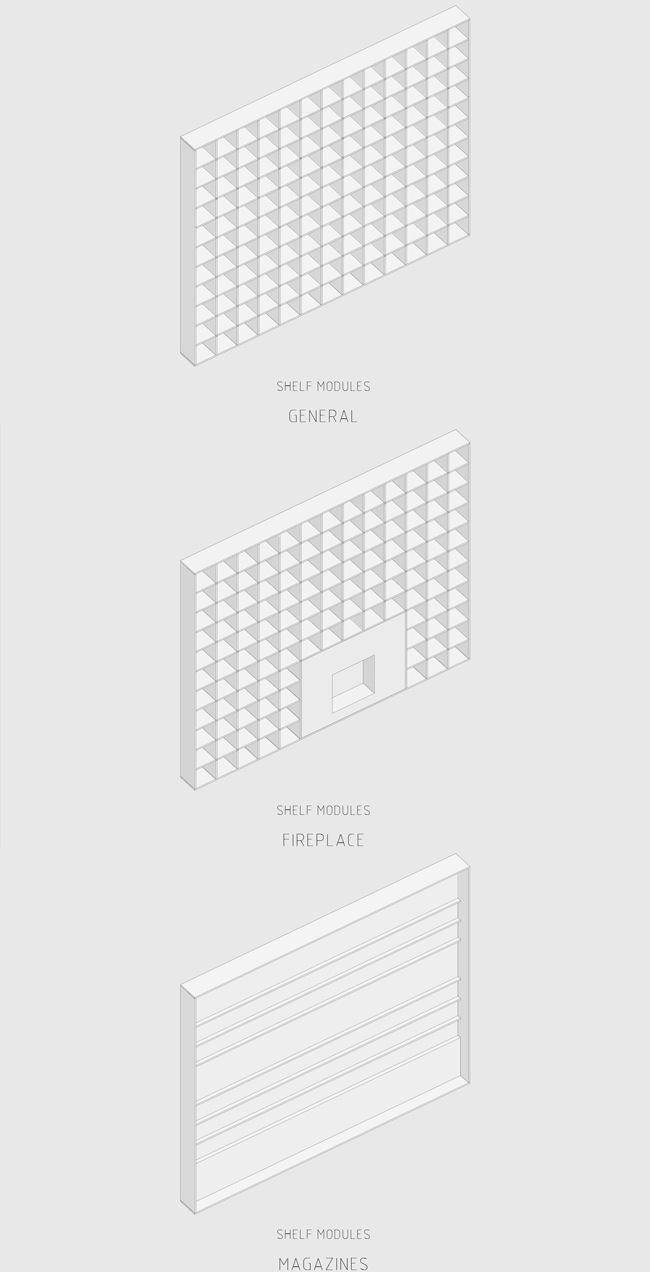
盒子是用书架围合的,书架可以放书也可以放其他摆件。书架就是盒子的界面,仿佛屏风,形成了似透非透的效果以及丰富的影子,为室内创造了一种迷离不确定的气氛。
Boxes are surrounded by book shelves to hold books and objects that becomes the interface of boxes, which create an effect of translucencies.
▼书架是盒子的界面,形成了似透非透的效果以及丰富的影子,boxes are surrounded by book shelves which create an effect of translucencies
▼书架围合的社交盒子-客厅+阅读,Social Box-a living room and reading space is enclosed by book shelves
我们设计了一个夹层走廊隐藏在书架上.在课题研究中如何利用层高一直是房产商关心的,以我的实际经验,净高2.1米仍然具有一定舒适度。在本案中,原本悬在社交盒子上的麻将房因为一楼层高过低无法成立,于是我们直接切断,形成一个小阳台作为暗示。
We also designed a mezzanine space hidden above those bookshelves because maximizing the usage of space is important in real estate. However, in this case in order to provide a comfortable for the first level of the box, we have to cut out the cut off the mezzanine and only leave a small balcony for implicational purpose.
▼楼梯通向上层空间,stairs towards the upper floor
▼一个夹层走廊隐藏在书架上,净高2.1米, a mezzanine space with a net hight of 2.1 metre is hidden above those bookshelves
客厅是分享的地点,这些分享不仅仅是货物或者食品的分享,它还是话语的分享,欲望的分享,记录的分享,经验的分享和美好回忆的分享。客厅的大门在美好生活的图景里关上打开,它是藏在成都这个幸运城市里的骄傲。
People come and go with their expectation of life, the living room becomes a place of sharing, sharing of objects and food, as well as good memories and unique experiences, we hope this living room can be a little pride hidden in the city of Chengdu.
▼一层平面,first floor plan
▼二层平面,second floor plan
▼剖面图,sections
设计公司: Wutopia Lab 主持建筑师: 俞挺 项目建筑师: 孙丽然 设计团队:李昊阳(实习生) 业主:成都万科 深化设计:VGC韦高成设计 陈卓 软装设计:千墨室内设计 曾寶墨 灯光顾问:张晨露 位置:成都,中国 面积:345㎡ 建成时间: 2019年2月 摄影: CreatAR Images Design company: Wutopia Lab Principle architect: YU Ting Project architect: Liran SUN Design team: LI Haoyang (intern student) Owner: Chengdu Vanke Light counselor: Chloe ZHANG Detailed Design:VGC Weigaocheng Design (CHEN Zhuo) Decoration Design:Qianmo Interior Design (ZENG Baomo) Location: Chengdu, China Area:345m^2 Build time: February 2019 Photography: CreatAR Images
客服
消息
收藏
下载
最近


