查看完整案例

收藏

下载
从捕捉起始的意念与初心,品牌的命名、调性、到整体的空间规划,是一组紧密相连的过程。唯有体现连贯、立体的品牌内涵,才可能在繁嚣的市场中以同频的情绪,像朋友般融入人们的生活。
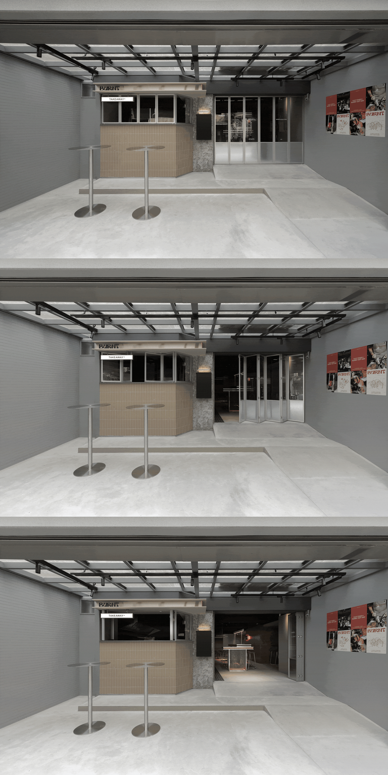
▼门头,Entrance ©Alfie Hsieh
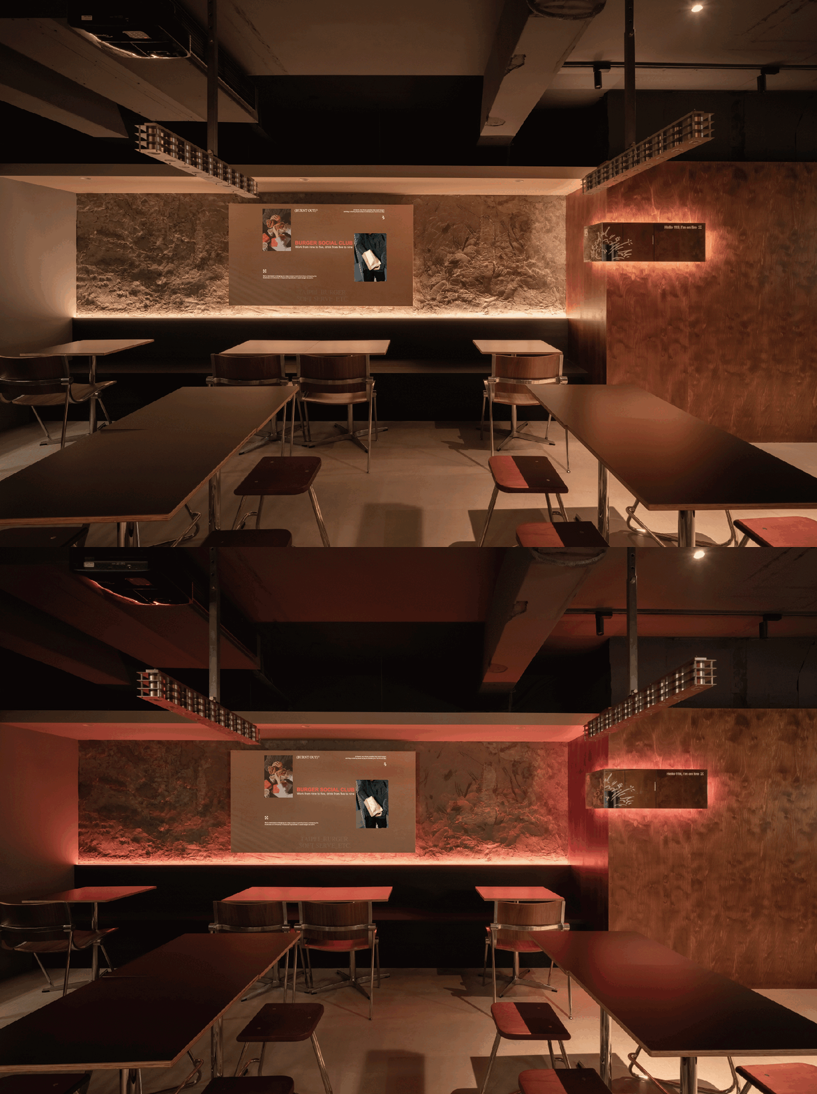
▼室内,The interior ©Alfie Hsieh
The design journey started with capturing the initial concept and the original resolution; the branding process, tone-setting, and overall spatial planning are closely interlinked. Only by embodying a consistent and comprehensive brand essence can a brand resonate with people’s lives in the bustling market with the same frequency, like a friend integrating into their lives.
▼精心搭配,Delicate collocation ©Alfie Hsieh
三个年轻人,低调,内敛, 对烹饪热爱,对生活真诚,对「通识」的质疑与重组; 相信松弛与活力,精品与休闲, 即时与品质的关系并不相悖,而是需要创意搭配。
▼空间概览,Overview of the spaces ©艾区博室内设计
‘Burnt’ is not just a brand; it’s a unique blend of modesty, introspection, and a passion for cooking. It’s a sincere approach to life from three young individuals who challenge and reimagine conventional wisdom. They believe in the synergy between relaxation and vitality, premium quality and leisure. They understand that the relationship between immediacy and quality isn’t contradictory but requires creative blending.
▼丰富的质感,Abundant textures ©Alfie Hsieh
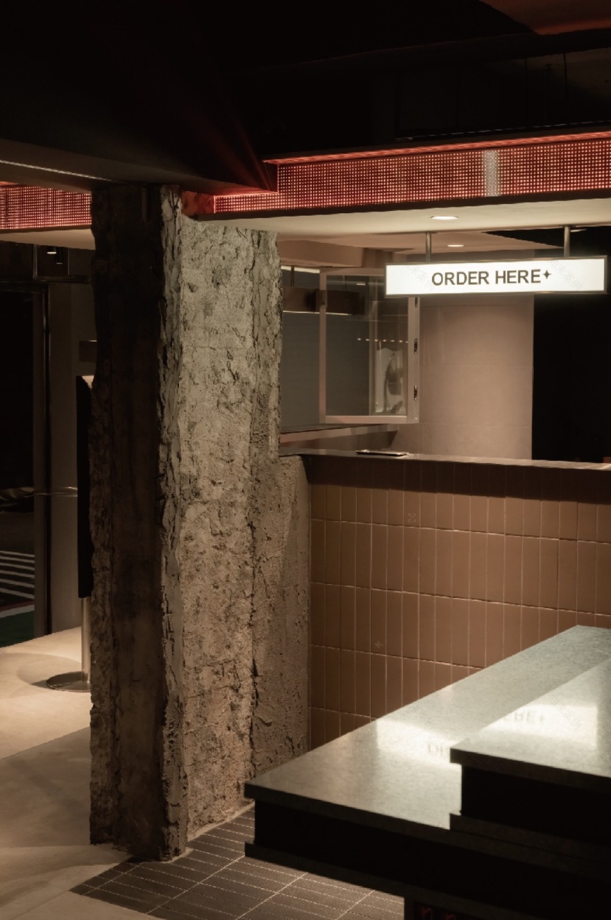
然而,「低调对比」却是BURNT 的空间语汇。炭灰与大地色系的砖面稳静烘托火烤的炙红。镀锌钢板与不锈钢的冷练遇见桦木的温厚。真诚,是对于精挑原材、新鲜现烤、低钠健康的坚持, 是折叠门的全然开放,是轻松的率性,是环绕的质朴与亲和。
▼多样的材质肌理,Various textures ©Alfie Hsieh
Our spatial vocabulary at ‘Burnt’ is defined by a ‘subtle contrast’. We use charcoal grey and earthy brick tones to provide a stable backdrop, accentuating the grill’s fiery red. The juxtaposition of galvanised steel and stainless steel against the warmth of birch wood creates a unique visual appeal. Sincerity is the commitment to carefully selected ingredients, handcrafted techniques, freshly baked goods, and low-sodium healthiness. It’s the complete openness of the folding doors, the relaxed spontaneity, and the surrounding simplicity and warmth.
▼入口特写,Close-up of the entrance ©Alfie Hsieh
▼座位区,Seating areas ©Alfie Hsieh
根据都会节奏,Burnt 除了固定餐饮, 也以「休憩点」与「转运站」的 概念复合经营,其空间也像一人多面;午间高效提供能量补给,夜晚则交替以浓烈松弛的调性。设计师结合门面视觉,仪式触及,品牌形象传达,多元品牌样貌和社交互动等多重元素,配比建构出主轴明确又高度机动的空间策略。
▼多元而明确,Multielement and clear design ©Alfie Hsieh
▼柔和的光线,Soft lights ©Alfie Hsieh
According to the urban rhythm, Burnt offers fixed dining and operates on the concept of a ‘rest stop’ and ‘transit hub,’ making its space multifaceted. It efficiently replenishes energy during the day and alternates between intense and relaxed tones at night. The designer combines storefront visuals, ceremonial touches, brand image conveyance, diverse brand appearances, and social interaction elements to construct a space strategy with a clear focus and high flexibility.
▼细部,Details ©Alfie Hsieh
我们相信每一个人的内心都有一座休眠的火山,等待一个真诚的引信,唤醒深潜的能量。
We believe that everyone has a dormant volcano within them, waiting for a sincere spark to awaken its hidden energy.
名称:BURNT漢堡店
标语: Flip your burnout day !
年份:2024
类型:商空
地点:台北市
面积:253m2
作品概念:低调对比,悖论重组
作品启发:唤醒休眠的火山
Name: BURNT
Tagline: Flip Your Burntout Day!
Year: 2024
Type: Commercial
Location: Xinyi Dist, Taipei City
Size:253m2
Concept: Subtle Contrast, Paradoxical Reconfiguration
Inspiration(: Awakening a Dormant Volcano.
客服
消息
收藏
下载
最近


