查看完整案例

收藏

下载

翻译
Architect:dongqi Design
Location:888 Changle Road, Shanghai, China; | ;View Map
Project Year:2023
Category:Exhibition Centres;Shopping Centres
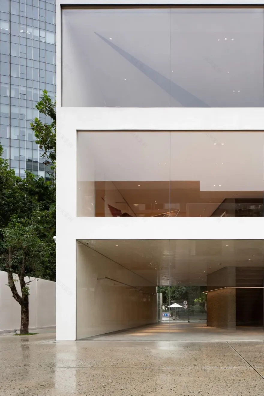
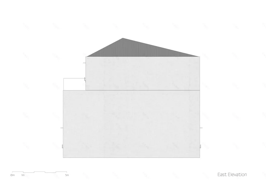
The 3-story exhibition and retail building - YEARLY PLAN Shanghai, designed by dongqi Design, is located on Changle Road, which represents typical historical center of Shanghai. The architect wants the project to comply with the original texture of the city, so the massing of the old building is maintained.
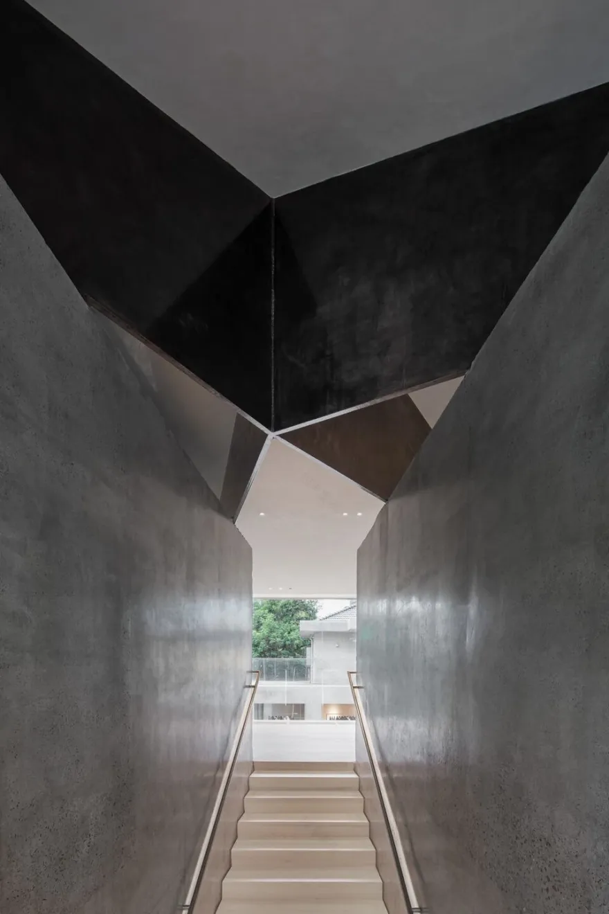
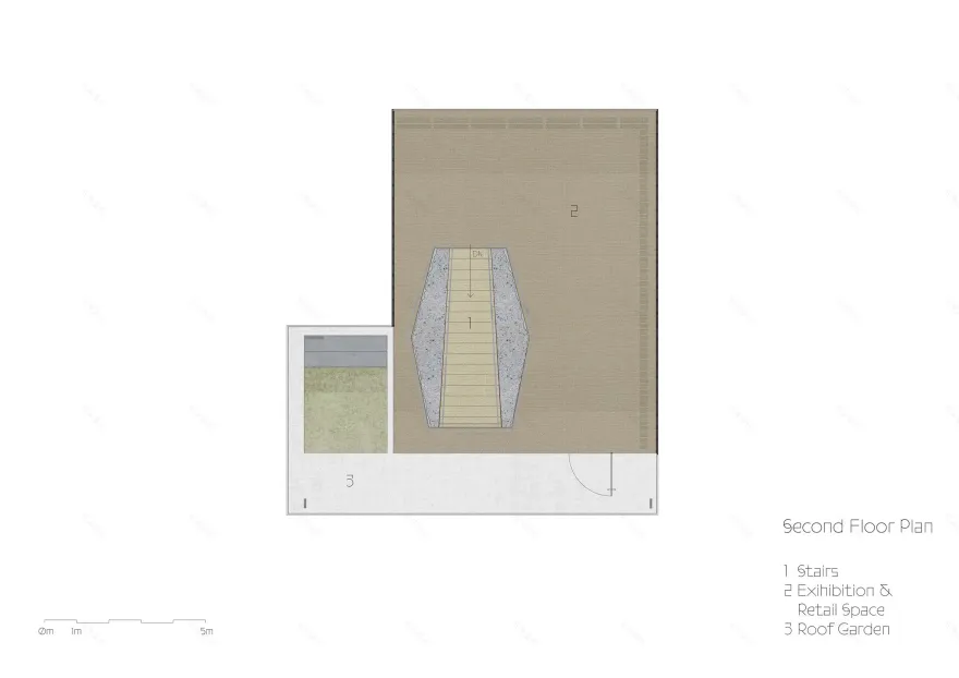
The vertical piers in the building consists of two concrete special-shaped piers on both sides and stairs sandwiched in between. It is the only vertical structure inside the space. The outer walls on the third floor is not load-bearing, with large glass curtain walls and some nonbearing walls. The large non-frame glass curtain walls and pillarless space allow people to overlook Building 2 on the side of the courtyard from the inside, or enjoy the street view on the side of Changle Road. The roof is borne by four 40mm thick steel plates that meet each other at different angles and are connected to the concrete piers finally.
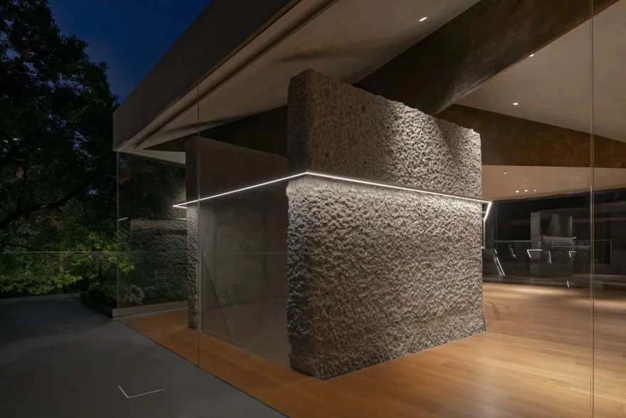
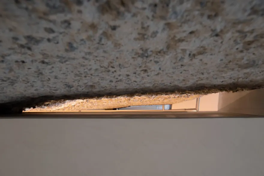
The cross-sectional height of the steel plates gradually decreases from the center to the outside due to the shape of the slope roof. The overall structure is an asymmetrical eccentric structural system. Each steel plate has its unique shape and different cantilever distance, up to 7 meters. The roof looks like a paper airplane or a handmade kite that gently falls on the piers. The seemingly random shapes, angles and positions of the steel plates are based on a large number of deliberations and calculations by dongqi Design and structural engineers. The concrete piers look like rough rocks from the outside. The “rock” seems to have been split by a knife in order to embed in the stairs. The two "split" piers are not parallel to each other but slightly inclined, which brings the oppressive feeling strengthened when walking upward and the perspective feeling dissolved when walking down.
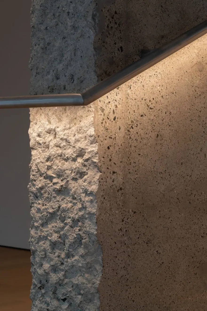
One of the concepts is to explore the possibilities in the texture of ordinary building materials by using different surface treatments. The concrete piers are hand- chiseled on the outside, while are polished several times manually on the inside by the stairs. It shows totally different textures of concrete. Likewise, the concrete floor of indoor and outdoor on the first floor are polished to different degrees. There are also different white textures in the building. The surfaces of ceilings and walls on the first and third floor are reflective, while those on the second floor and the facade are matte textures, which are different effects brought by craftsmen using different treatments. Different wooden floor is selected for the third floor in order to create a more home-like atmosphere.
MEP systems are set up in the structure layers of the building, which is the result of the cooperation of mechanical engineers and structural engineers. The materials of the air conditioning covers are chosen according to the flooring materials. Stainless steel covers are used on the first floor which is harmony with the temperament of the concrete floor. Wooden covers are applied on the second and third floor, the color of which is exactly the same as the wooden flooring of the level. The perforated pattern of all cover plates is a uniform style customized. The MEP layer is combined into the building structure, which, on the one hand, releases the floor height to the greatest extent, and on the other hand, makes the lightings to be the only design element on the ceilings. Frameless lamps are carefully chosen and the points of which are set corresponding to the specific positions of the display and relaxing areas.
The disengagement of vertical concrete piers and horizontal floors strengthens the vertical penetration of the core cylinder. The ceilings, walls and floors are detached with each other with narrow slits. The frameless door of the dressing room is high up to the ceiling and maintains the same slit width as the other slits. The glass rise from the floor up to the ceiling with hidden and customized stainless steel frames. The invisible stainless steel frames are folded out narrow edges to serve as windowsills on the facade for rain drainage, which connected to the stainless steel awning above the entrance door to form a whole.
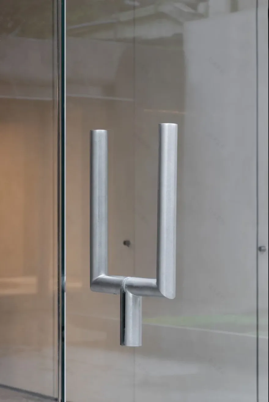
The design languages of details and fixtures are unified with those of the space. The stair handrail is a whole stainless steel round rod that goes between the floors with beginning connecting to the end. It becomes a handrail at the staircases while serves as a clothing hanging rod in the display area. It also undertakes the function of space lighting. The Y-shaped door handle, the customized dressing mirrors and the clothes hangers use the same stainless steel rod and junction details. Some of the display fixtures are made of cast-in-place concrete applied with the same polishing treatment just like the concrete piers. The long table is a combination of wood and stainless steel.
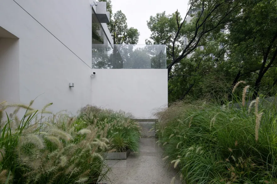
The roof drainage design is integrated with the design of facade and landscape. The height of rain gutters is carefully determined to consistent with the proportions of the floors on the facade. Looking from the ground level, the height of rain gutters just covers the slope roof, maintaining the pure sense of the geometry of the building. The gutters on four sides of the roof converge above the corner glass walls, and one can see the water curtain from inside on rainy days. The rainwater pours into the customized stainless steel flower pool of the terrace, irrigating the landscape and creating the natural atmosphere at the same time.
The proportions of facades have also been carefully scrutinized. The facade of the building by the courtyard is like three horizontal scrolls. The paintings reflect the surrounding scenery during the day while reveal the interior mood at night. There is a subtle difference in length and width between the three paintings. The proportion of glass and solid walls on the façade by Changle Rd. has balanced the design effect and the needs of indoor space layout. The corner glass and seemingly illogical wall thickness on the third floor attract people to stop and explore its structural system. Simple but warm and textured, is not only the design concept of the space, but the spirit of the brand as well.
Team:
Client: YEARLY PLAN
Architecture, interior, fixture design: dongqi Design
Design Director: JIANG Nan
Team: Weijing He, Huiyi Wu, Ning Wang, Karen Wang, Jing Xu, Danyi Zhang, Xiaoyu Ma, Chloe Wang
Structural Engineer: XinY Structural Consultants
MEP Engineer: Environment-friendly Solution to Bld.
Lighting Consultant: HUAH
Plant Consultant: ABSOLUTE
Project Management & General Contractor: Beijing Dragon Decoration
Photography: Yasu Kojima & dongqi Design
Material Used:
1. Lighting: flos
2. Furniture: Fritz Hansen
3. Fixture: Beijing Dragon Decoration
▼项目更多图片
客服
消息
收藏
下载
最近


