查看完整案例

收藏

下载

翻译
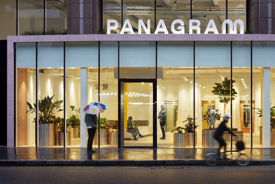
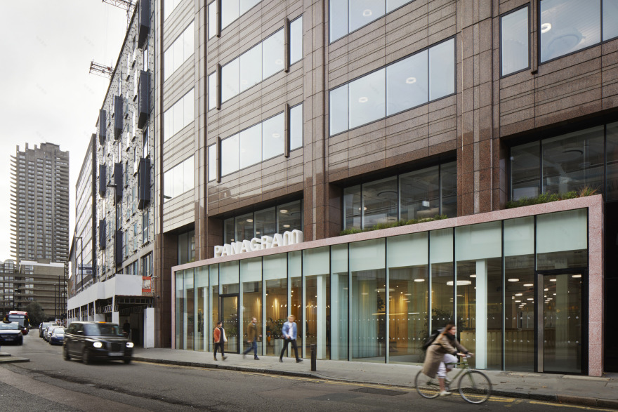
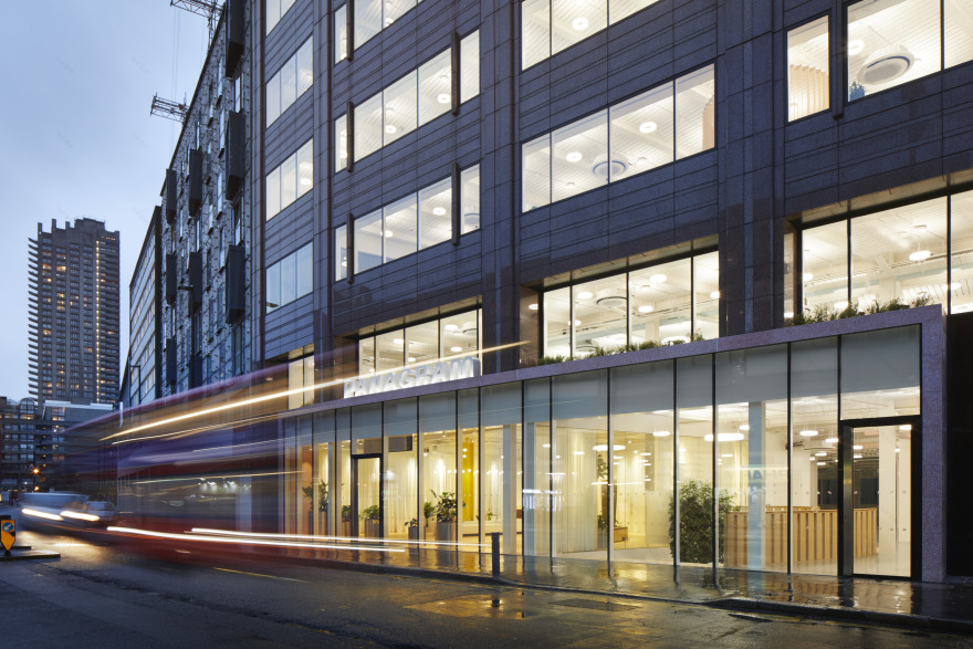
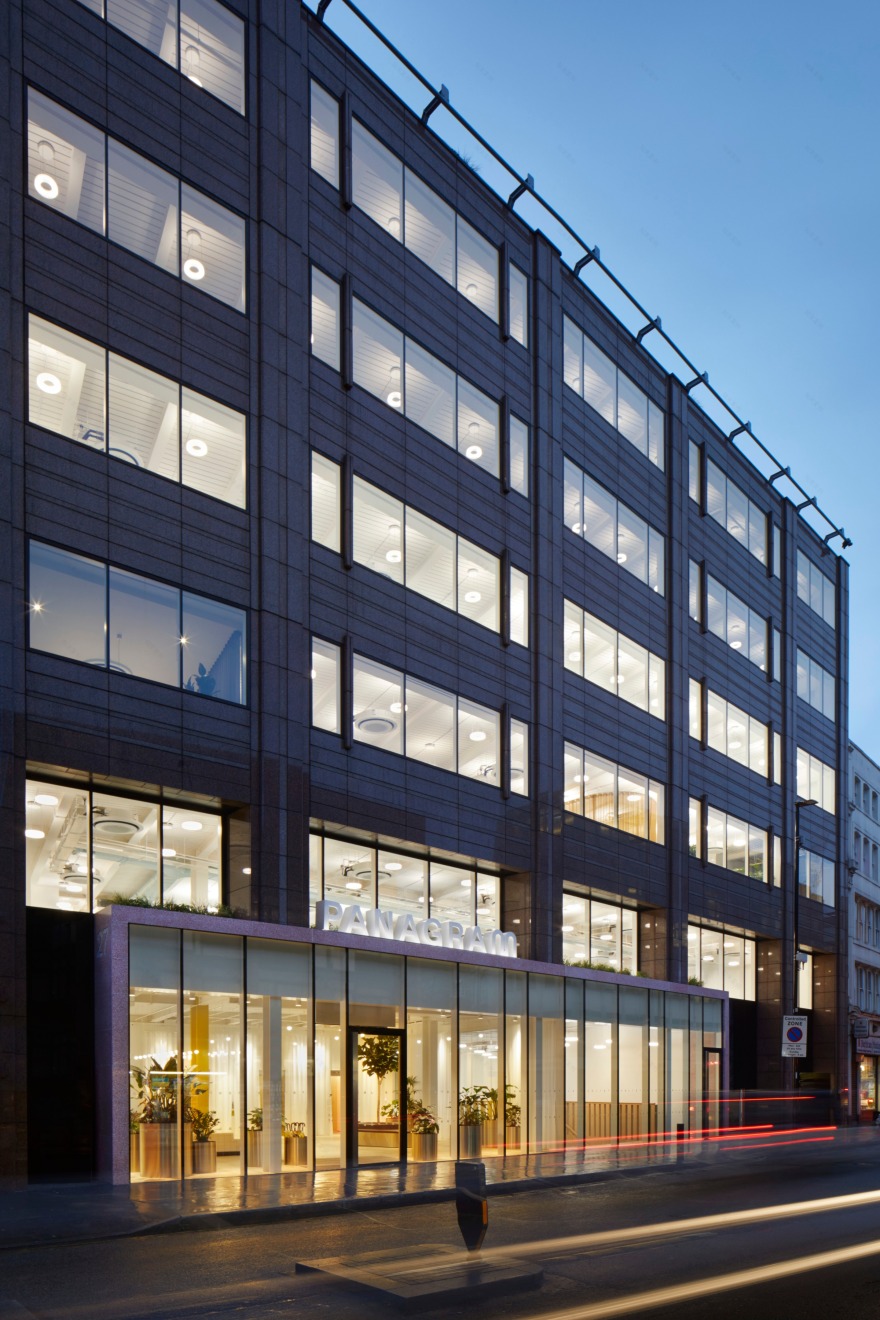
Already clad in pink granite, the designers decided to keep some of the original features of the existing building and use them to inspire a new identity for Panagram. A similar hue of terrazzo is used to wrap around a new entrance to the building, which creates an entirely glazed ground-floor level and reveals the activity within. This extra-wide portal provides a unified appearance along the street and a much more inviting experience.
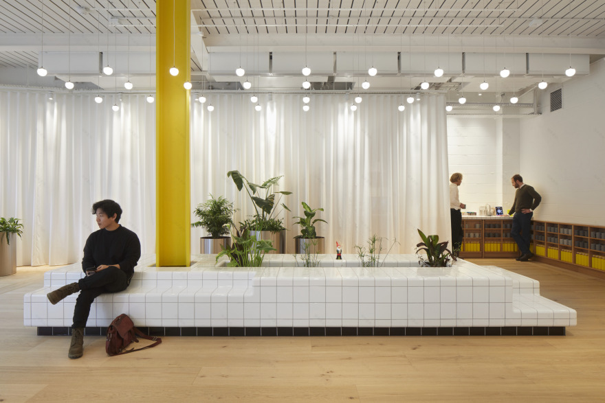
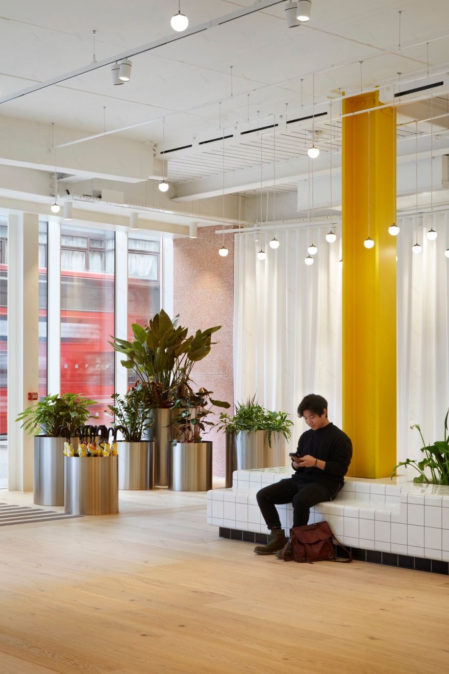
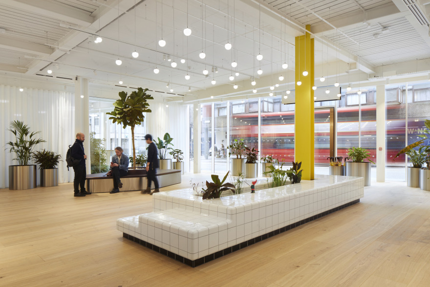
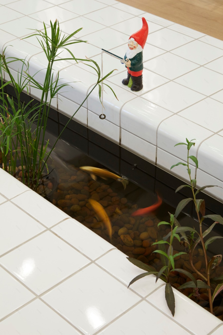
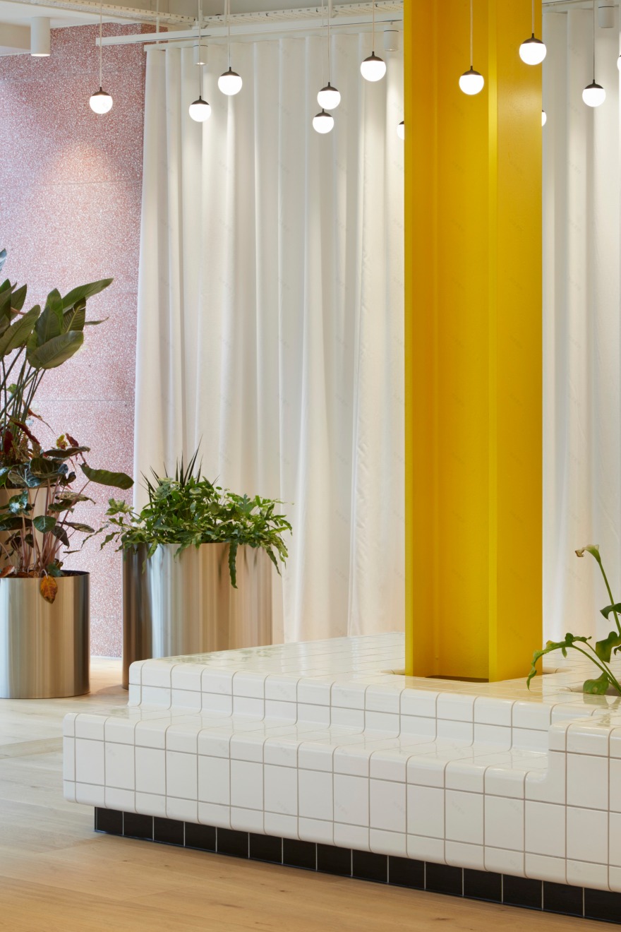
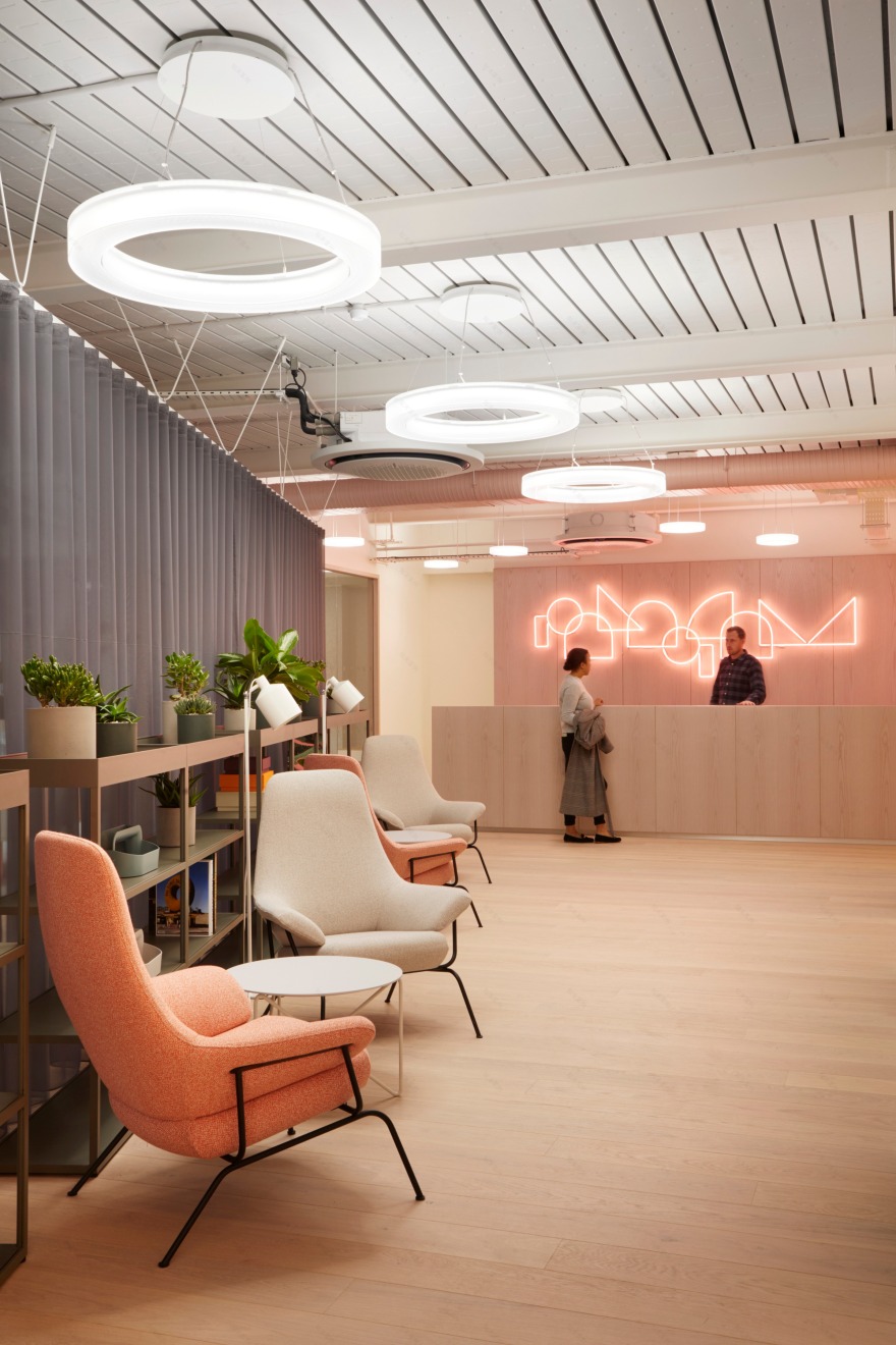
Once inside, an unusual free-flowing 1,560 sqft reception is noticeable by its lack of traditional desk and a series of unique seating elements, including a white-tiled plinth with koi carp swimming through its centre, and a sculptural leather bench wrapping a Ficus tree. Visitors are greeted by a host who will emerge from behind a translucent curtain, promoting a relaxed and informal atmosphere. A single yellow steel girder is positioned in the middle of the room to reveal the structure of the building and transform it into a striking decorative element.
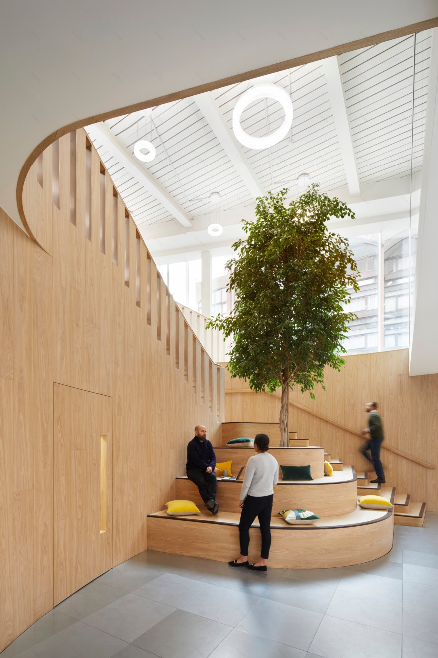
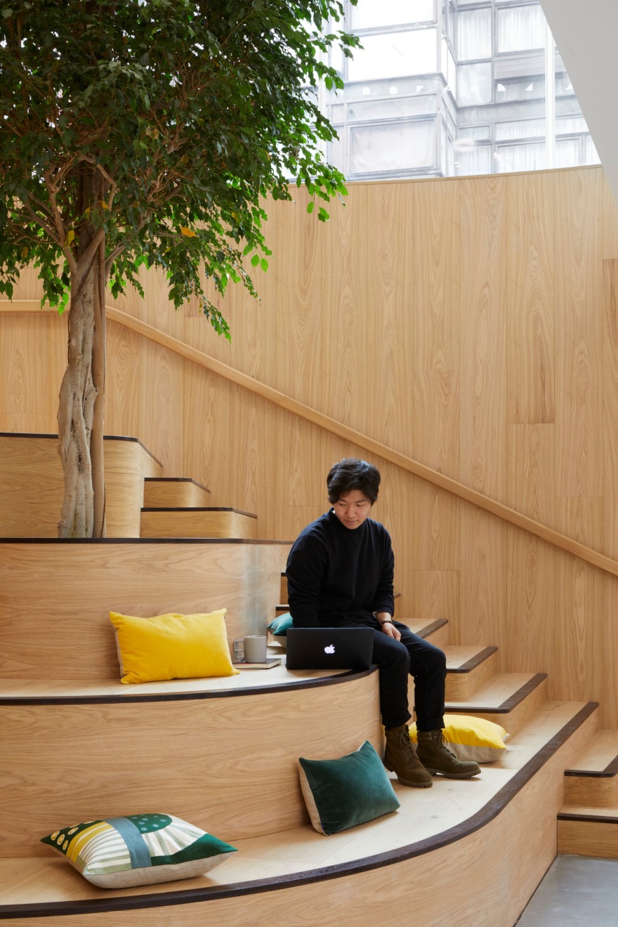
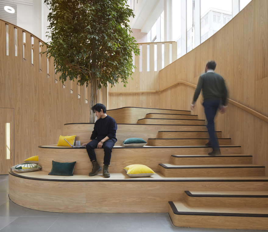
Visible through a glass wall in reception, a dramatic grand timber staircase leads from the ground floor office space down to the garden level floor. The stair incorporates a larger Ficus tree growing from its centre and a series of extra-large steps that can be used either as a place to sit and relax or as an auditorium. The aim was to create a series of multi-use spaces that the occupants could adapt to their needs.
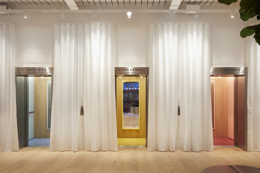
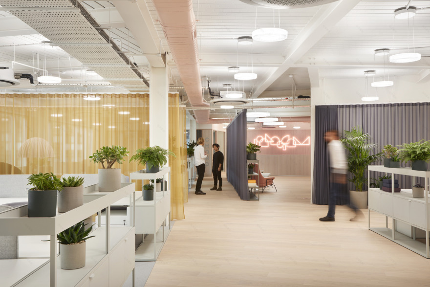
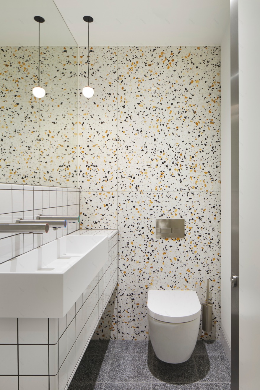
Colourful lifts continue the sense of playfulness as they transport people up through the building, while loos are given their own bright identities; featuring huge sliding doors that turn the WCs into a feature on each level. Colour Is prevalent throughout with the fresh air ductwork painted Parisian pink and Duck Egg Blue on alternate office floors.
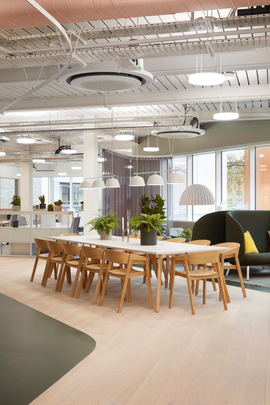
The entire remodelled 52,000 sqft building is flooded with natural light thanks to generous floor-to-ceiling heights that range from 3.3m to 3.8m. The planted terraces offer views out to the City of London and beyond, reminding the occupants that they are situated in the heart of the thriving capital.
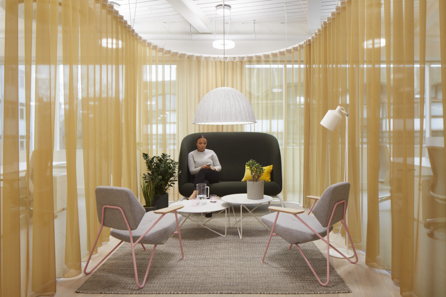
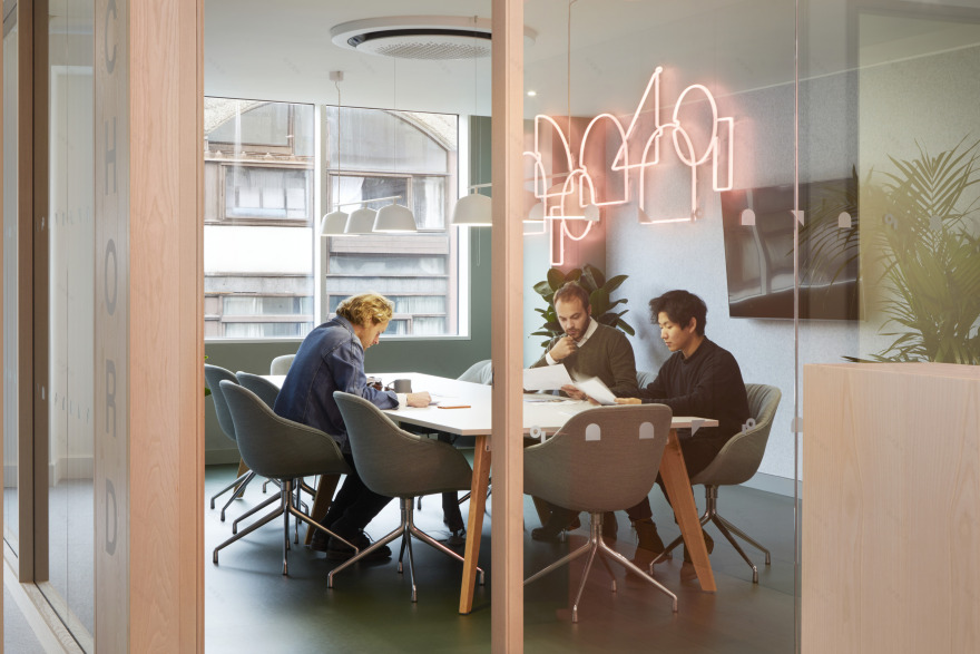
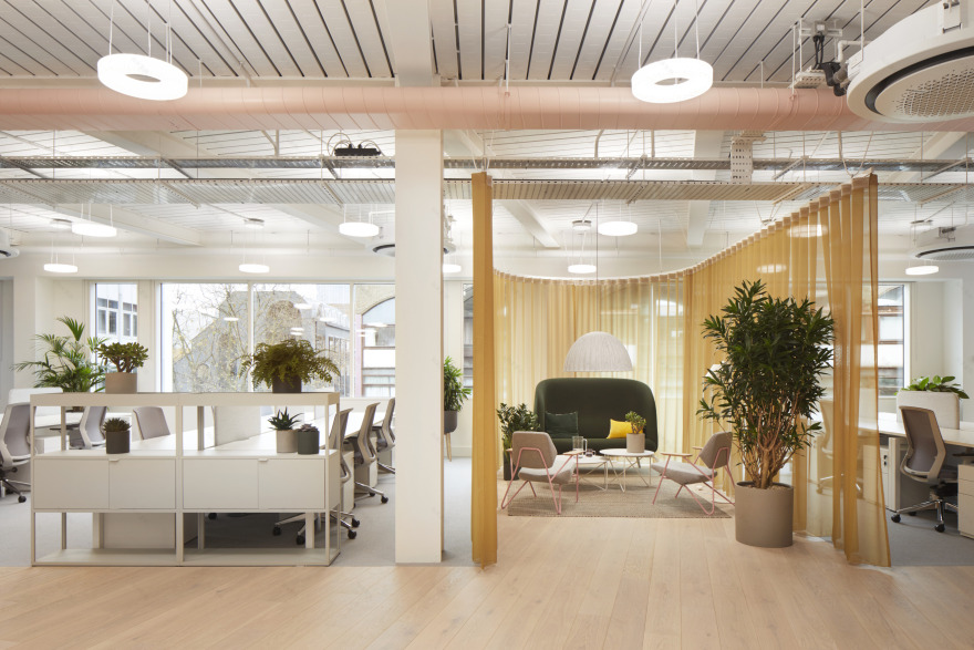
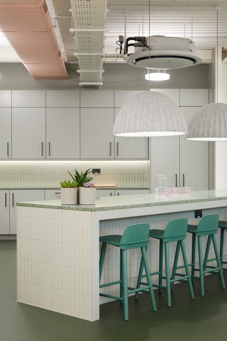
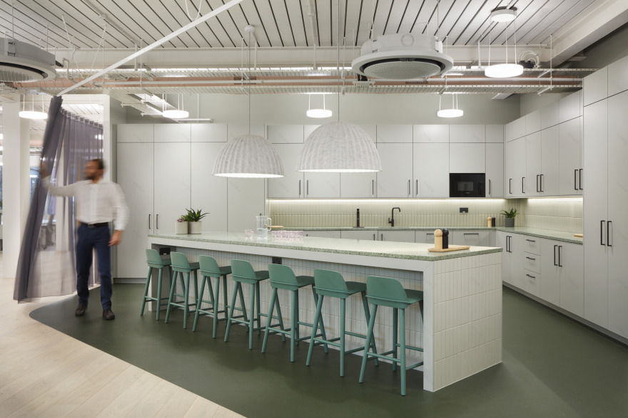
On the second floor, Buckley Gray Yeoman has created a fully fitted-out office that further demonstrates how colour and materials can be used to suggest zones of activity, such as a green kitchen sitting within the open-plan setting and a breakout meeting room that is delicately enclosed by a yellow translucent curtain. Small meeting rooms are lined with felt to improve acoustics and create an intimate atmosphere inside.
Oliver Bayliss, Director, Buckley Gray Yeoman:
“It’s easy to look at a building like this and assume you have to start again. We saw an opportunity to create something really different and highly sustainable. Panagram has great volume and therefore great natural light, which in turn allows the building to be extremely desirable and flexible.
There is a bold interplay of the use of the ground floor – from inside and out – to create a multifunctional, ambiguous reception space. We have tried to create an almost gallery type space upon entry; with a series of beautiful objects set amongst planting and trees. These accents continue throughout the building and provide moments of joy that will hopefully lift the spirits of the people who pass through.”
Andrew Giblin, Director, Dorrington:
“It is amazing to see this building transformed into Panagram, offering fabulous space, light, amenities and service. We look forward to welcoming occupiers into their new Buckley Gray Yeoman designed workspaces that promise to be bold, flexible and with a focus on health and wellbeing.”
TEAM Client: Dorrington Architect: Buckley Gray Yeoman Contractor: Open Contracts Project manager: Blackburn & Co Structural engineers: Heyne Tillett Steel Planning consultant: JLL Landscape architect: Spacehub Branding and design agency: Everything In Between M&E consultant: Peter Deer and Associates Quantity surveyor: Exigere Lighting Designer: Pritchard Themis Fire engineer: MLM Rights of Light/Party Wall surveyor: Point2Surveyors Building control: MLM Building app: Smart Spaces IT consultants: DP Systems Agents: Colliers, Allsop, Richard Susskind & Company Building managers: Workman
客服
消息
收藏
下载
最近


