查看完整案例

收藏

下载

翻译
PODVIG
Type: Public buildings / Architecture
Location: Minsk, Belarus
Timeline: 2018
Project Team: Katerina Kovaliova, Kirill Skorynin, Ilya Polonski, Dmitry Sergienya, Mikhail Naumov, Vlad Chabai, Veranika Zanouskaya, Aliaksei Zanouski (LEVEL80 | architects)
In 2014, an architectural monument, the Museum of the History of the Great Patriotic War, was demolished in the central square of Minsk. Our primary task was to offer an alternative to the existing building project designed in its place.
Our team conducted historical and urban planning analyses. After that, we designed three alternative concepts for the square development on the site of the Great Patriotic War Museum building.
It is not a good idea to consider the museum site separately from the area and the surrounding buildings.
The neat and careful interweaving of a new object into the fabric of the city and square was our primary task. It was not only about the architectural image but also about the urban planning situation, the ability to liven up the square public space, bringing it closer to human-being proportion.
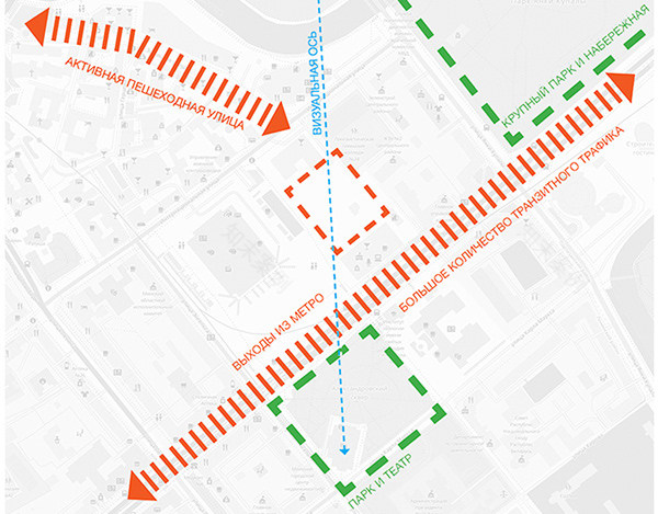
A large amount of pedestrian transit traffic falls on Oktyabrskaya Square in the city center. Although, there are many public buildings on the square itself and next to it. All of them are designed only for specific events at certain times of the day. There is no public space on the square with free access where you can relax or hide from bad weather.
The planning of Oktyabrskaya Square was close to a certain symmetry. The volumes of the buildings that framed it balanced each other and closed the square. A kind of compositional failure was formed after the Museum of the History of the Great Patriotic War was demolished. The spacious area began to seem even bigger. The Palace of the Republic ceased to be the center of the composition, despite its symmetrical facades.
1+2 concept
The first and second concepts have one space-planning solution in common: a rectangular building divided diagonally into two triangular volumes. Using this axis, we visually connect the cultural symbols of Minsk — the Opera House and the Yanka Kupala Theater.
The axis is also a shopping street and public space with access to the river Svisloch and Zybitskaya pedestrian street. While the volume facing the square is the same height as the former museum, the one closer to the House of Trade Unions has two additional glass floors.
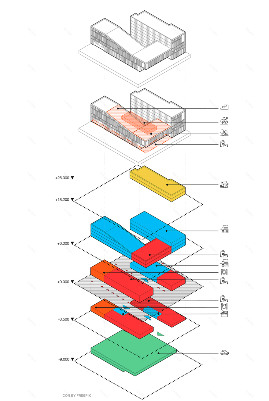
A garage occupies the two lower levels. Above it, there is a story with some shops and a cafe with a patio above it. At the ground level there are the main entrances with spacious lobbies. Around the perimeter there are restaurants and shops with direct access to the square or shopping street. Atop designed is office space, and apartments — in the highest part. On the roof of the building, our team proposed to install recreation areas and an observation deck.
The first option has an austere façade with elements of constructivism. Its proportions are externally similar to the façade of the museum in this place, as well as to the Beltelecom building on the opposite side of the square.
Outside we created a neutral layer that contrasts with the glass facades inside — the ones that bound the shopping street.
Creating a conservative version of the facade solution, we set ourselves a goal — to fit the new volume into the fabric of the area and avenue as much as possible. We revealed a specific rhythm of the facade, proportions, and techniques to do this — the ones peculiar for the avenue and the demolished museum.
The second option is less strict but we also based it on even proportions. The volume and decoration of the building harmoniously fit it into the current architectural environment. At first glance, the location of the windows seems chaotic, but it follows a complex algorithm. This idea enhances the uniqueness of the facade.
Concept 3
This option has a different spatial solution. Here we allowed ourselves maximum freedom. But we did not forget our regulations on facade solutions. We designed a complex outline of the building with a variable number of stories of the facade facing the square.
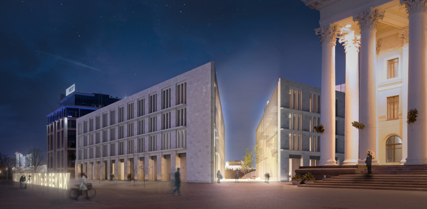
The highest part of the building is commensurate with the Velcom office building, and the lowest one is commensurate with the Palace of Culture of Trade Unions. We connected this height difference with a pitched roof, which repeats the corner of the pediment of the palace.
For the facade plastics of this variant to seamlessly join the context of the square, we borrowed and adapted the hallmark of surrounding buildings — the verticals of the facades of the Palace of the Republic and the former Museum of the Great Patriotic War.
We revised this technique in a modern manner: we made vertical division with inconsistent dimensions and placement of windows. It makes the facade more dynamic. This option emphasizes the three-dimensional solution of the facade.
We were focused on urban planning and architectural analysis during the concept design. These ideas helped us to create an architecture corresponding to the place and time. Although the new buildings have modern facades, they pay tribute to the previous ones and continue to tell their story.
The project received great press reviews. Moreover, Minsk residents supported it. Unfortunately, this was not enough to convince the developer to revise the earlier proposed project.
Read more
客服
消息
收藏
下载
最近


