查看完整案例

收藏

下载

翻译
The Cordiez supermarket is a staple of the grocery scene in the central Argentinian city of Córdoba. But even longtime favorites sometimes need rethinking, which is why the company brought in to refresh the Mixo Coriez location from soup to nuts. Or, rather, from façade to cashwrap.
“We not only worked on the interior design, but also did a complete rebranding, name, logo, and graphic design,” says lead architect Marco Ferrari. “We had to achieve a total rebranding that was fresh and new, but at the same time, could stand the test of time.” To that end, they reimagined the storefront, changing the glazing and emblazoning the supermarket’s new visual identity across vinyl film. “In addition, a canopy was designed on the façade,” he says, “creating an effect of movement and a focal point. It’s an identification code.” Vibrant orange and red panels catch the eye. “It’s the most vibrant and entertaining part of the project,” he says. “As a call, as an object, as a morphological composition, it is our favorite detail.”
A new canopy and glazed panels with automatic entrance door fundamentally refresh the façade.
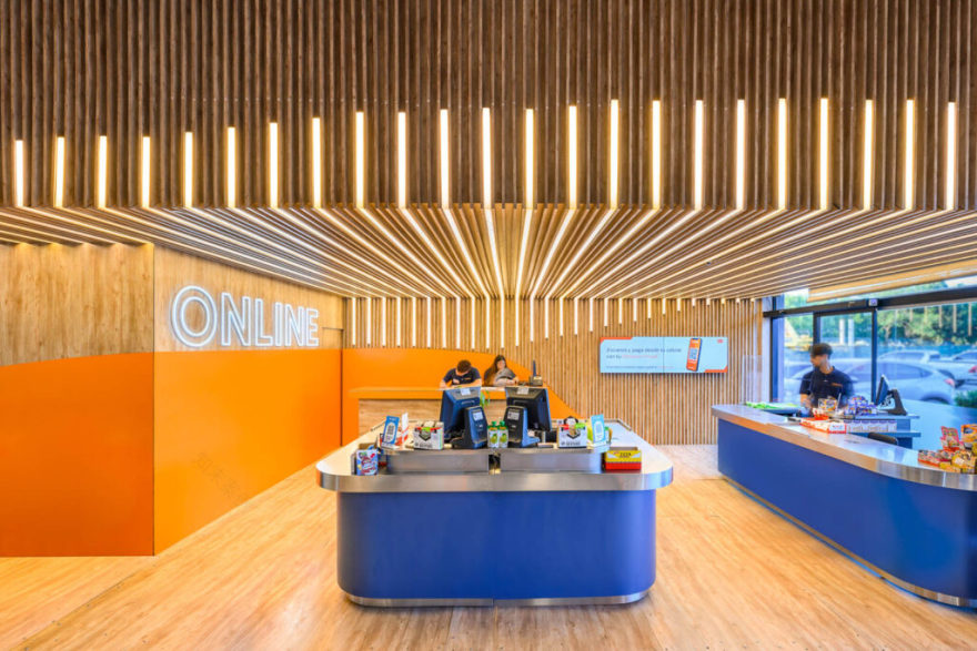
Inside, a cold wall travels the length of the 4,300-square-foot space, with “gondolas” of display units moving shoppers towards a window overlooking the street, where they find the bakery, butcher, and fishmonger. Checkout counters for in-person shopping become visible in the brand’s signature blue and orange; a neon light signals the area for picking up customers’ online purchases. “This is essential to connect with the shopping habits and with the internal flows of the staff,” he says.
Lighting forms wayfinding, from squiggles of LEDs mimicking a wander through the aisles, to geometric formations designating the areas to checkout. “We decided to use lighting as a way to interact with the public in a playful way,” Ferrari explains. “Geometries, colors and textures were chosen that combined to generate a strong visual impact.” The end result is a hit, he says: “Working with an important brand in our hometown is a great responsibility for us. And customers have expressed their satisfaction with this new chapter of the traditional supermarket.”
High traffic vinyl flooring in a faux bois similar to LA Europea grounds the bustling cashier’s area.
Light fixtures across the ceiling serve as wayfinding, directing guests towards the cashiers.
The team utilized Karikal panels in Kompak Wooden Pine Ponderosa 5012 for the display units.
Ceilings in blue and orange, and display units in the same orange, reinforce the brand identity.
Powdercoated Karikal aluminum panels brighten up the façade.
Alternating Indigo Lumiers LEDs and strips of kiri define the cashwrap ceiling.
Graphic vinyl film covers acrylic signage throughout the shopping areas.
客服
消息
收藏
下载
最近


