

创作上传
VIP
收藏下载
登录 | 注册有礼
查看完整案例

收藏

下载

分享
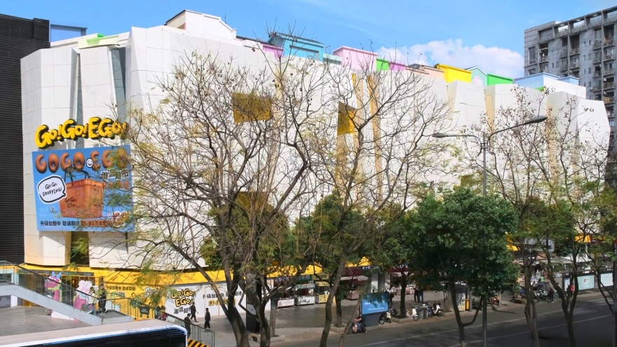
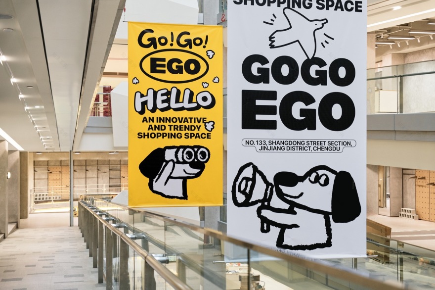
与 COSMO 共享同一业主方的 GOGOEGO,其前身可追溯至 2009 年潮流地标 EGO(壹购潮流广场)。历经十四余载的沉淀,业主方决定对其进行旧改,从建筑立面的重塑,到精准聚焦新兴消费客群,与 Z 世代建立用户连接,再到全面焕新的品牌 VI 系统,最终孕育出 GOGOEGO 这一潮流新宠。GOGOEGO 继承了 EGO 的潮流基因,成为继 COSMO 之后,又一个引领潮流风尚的地标。
The predecessor of GOGOEGO, which shares the same owner as COSMO, can be traced back to the 2009 trend landmark EGO (EGO Trend Plaza). After more than fourteen years of accumulation, the owner decided to undertake old renovations, from reshaping the building facade to precisely focusing on the emerging consumer groups, establishing user connections with Generation Z, and then to the comprehensively refreshed brand VI system, ultimately giving birth to GOGOEGO, this new trend favorite. GOGOEGO inherits EGO’s trend genes and becomes another trendsetting landmark after COSMO.
▼项目外观,exterior view © Ray

随着电子商务的蓬勃兴起,购物模式的深刻变革不仅重塑了消费格局,也直接对传统老式商场构成了严峻挑战,客流量下滑与销售额缩减成为普遍现象。在此背景下,消费者对于价格敏感度日益增强,他们愈发倾向于追求性价比与购物体验的双重满足。同时,新兴零售业态如雨后春笋般涌现,搭配灵活多变的营销策略,进一步加剧了市场竞争的激烈程度,导致如 EGO(壹购潮流广场)等传统商场面临转型困境。
With the vigorous rise of e-commerce, profound changes in shopping patterns have not only reshaped the consumption landscape but also posed severe challenges to traditional old malls, with declining customer traffic and sales becoming common phenomena. In this context, consumers are increasingly price-sensitive and more inclined to pursue the dual satisfaction of cost-effectiveness and shopping experience. At the same time, emerging retail formats are springing up, coupled with flexible and diverse marketing strategies, further intensifying market competition and causing traditional malls such as EGO (EGO Trend Plaza) to face transformation dilemmas.
▼改造前后,before/after renovation © Ray(上)& 言隅纳信(下)


正是在这股变革的洪流中,成功打造了成都 COSMO 标杆门店 OO 与 KANGOL 的永创设计团队,再次操刀 EGO(壹购潮流广场)的改造。区别于对传统巨型商场的革新与重塑,GOGOEGO 颠覆了以往模式化的商业体验框架,转变为自营业商业模式,将其重新定义为「潮流超市」。“潮流”的定位来源于风格属性更适合 Z 世代,“超市”的定位希望在人货场的场景上更加符合沉浸式消费,潮流风格的单品琳琅满目,可以像宜家一样沉浸式的打卡、体验、种草。
It is in this wave of change that the YongChuang design team, which successfully created the benchmark stores of Chengdu COSMO, OO, and KANGOL, once again took on the renovation of EGO (EGO Trend Plaza). Distinct from innovating and reshaping traditional mega-malls, GOGOEGO changed its business mode into “Trend Market”,self- management business mode. The positioning of “trend” stems from a style attribute more suitable for Generation Z, while the positioning of “supermarket” aims to better align with immersive consumption in the context of people, goods, and venues. Trendy style items are abundant, allowing for immersive check-ins, experiences, and grass-planting like IKEA.
▼店铺入口,store entrance© Ray

01 连接 COHERENCE & CONNECTION
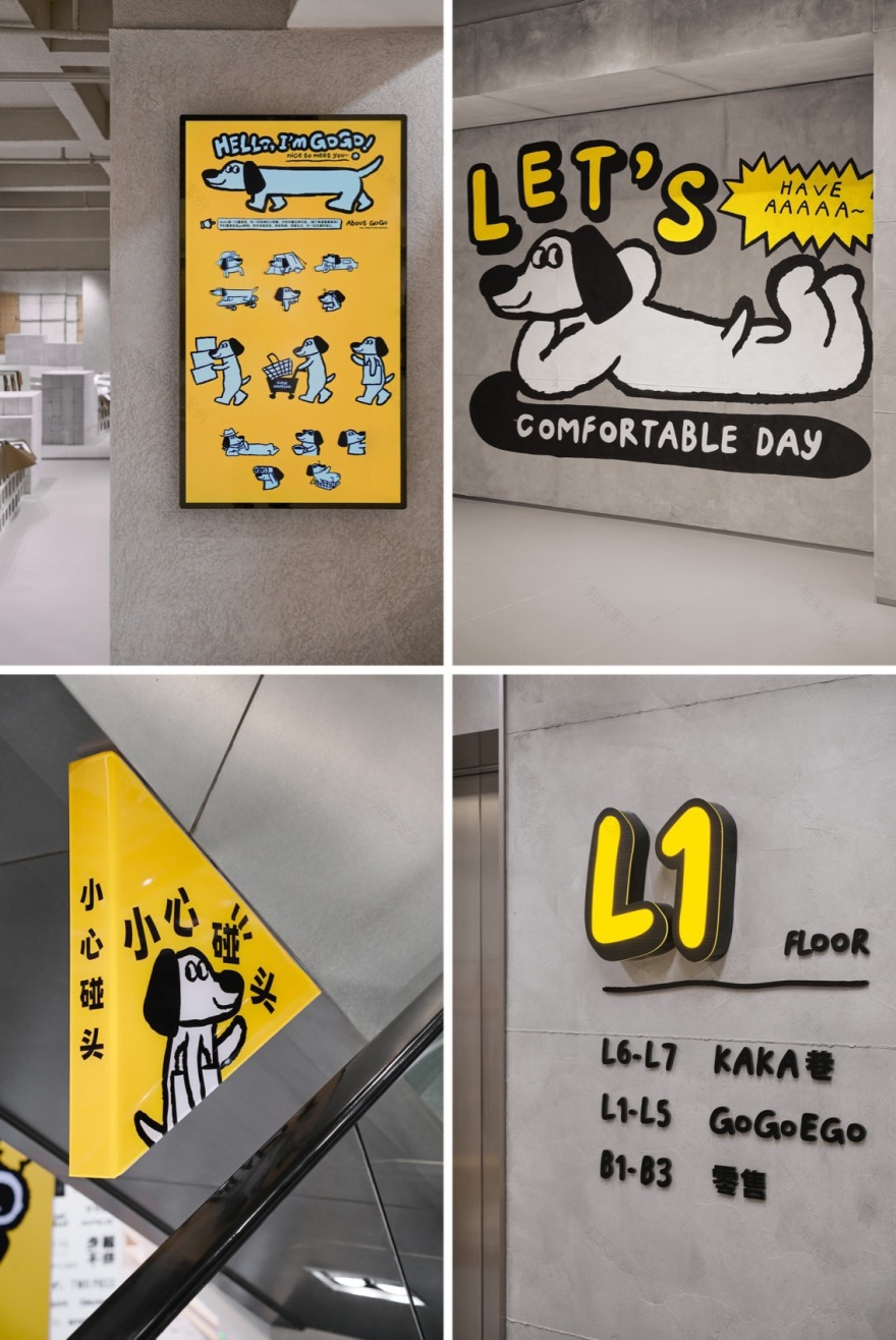
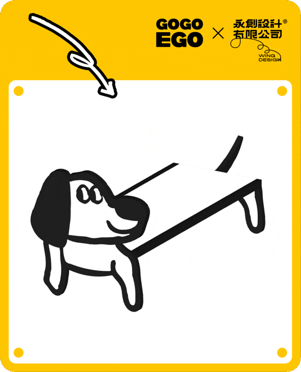
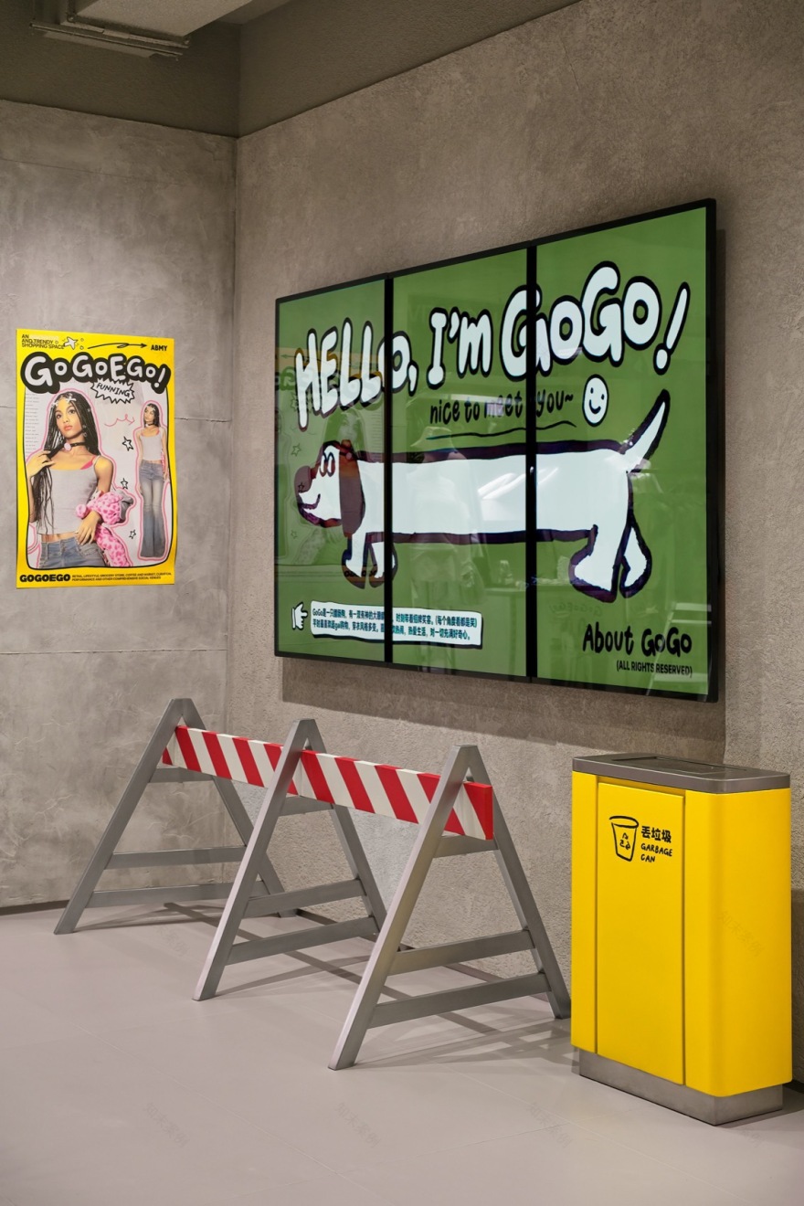
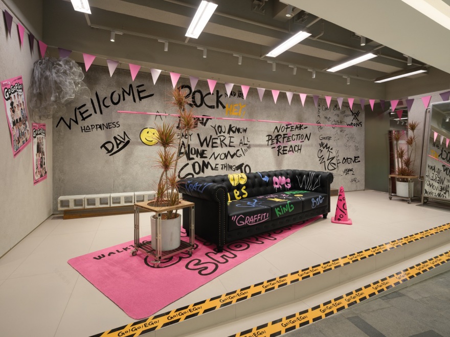
Z 世代,作为数字时代的原住民,随着情绪压力的增加,他们更加追求亲切可爱、无负担的表达。因此,设计团队紧密围绕 Z 世代的审美偏好与情感需求,选用了腊肠犬「狗狗」作为品牌形象的核心元素,构建了一条强有力的情感纽带。这一决策体现了其战略考量与创意巧思,更在多个层面发挥了重要作用。首先,从品牌视觉识别系统的角度看,腊肠狗的形象为商场提供了一个统一、易于识别的标志,广泛应用于商场内外,从标志设计到导视系统,再到各类宣传物料,确保了品牌形象的一致性和规范性,有效提升了消费者对商场品牌的识别度与记忆点,为 GOGOEGO 在竞争激烈的市场中构建了鲜明的身份标签。
As digital-era natives, Gen-Z, with increasing emotional stress, pursues a more cordial, cute, and burden-free expression. Therefore, the design team closely revolves around the aesthetic preferences and emotional needs of Generation Z, selecting the Dachshund “dog” as the core element of the brand image to build a strong emotional bond. This decision reflects its strategic considerations and creative ingenuity, playing a significant role on multiple levels. First, from the perspective of the brand’s visual recognition system, the image of the Dachshund provides a unified and easily recognizable logo for the mall, widely used inside and outside the mall, from logo design to signage systems to various promotional materials, ensuring brand image consistency and standardization. It effectively enhances consumers’ recognition and memory of the mall brand, building a distinct identity label for GOGOEGO in the competitive market.
▼腊肠狗标志,image of the Dachshund© Ray
潮流文化与 Z 世代的深度融合,在成都这座洋溢着“新、包容、潮流”气息的城市中尤为突出,尤其在商场的创意 VI 与情感纽带构建上,展现出了前所未有的活力与魅力。
The deep integration of trend culture and Generation Z is particularly prominent in Chengdu, a city filled with the atmosphere of “novelty, inclusiveness, and trend.” Especially in the mall’s creative VI and emotional bond building, it demonstrates unprecedented vitality and charm.
▼活力与魅力,vitality and charm© Ray


位于成都市中心春熙路的巨型盒子 mall,GOGOEGO 与这个城市更为年轻的客群打成一片。在永创设计的精心策划下,深刻洞察反向消费时代的趋势,以高性价比、个性化与趣味性为核心,打造了一个既潮流又舒适的购物空间。
Located in the giant box mall on Chunxi Road in downtown Chengdu, GOGOEGO connects with the younger crowd in this city. Under the careful planning of Yong Chuang Design, it deeply insights into the reverse consumption era trend, focusing on high cost-effectiveness, personalization, and fun to create a trendy and comfortable shopping space.
▼街道空间,storefront© Ray

一方面,顺应国潮崛起的风潮,集纳了众多新国潮品牌,为年轻消费者提供了既时尚又具品质的购物选择,实现质价比的完美平衡;另一方面,依托本土文化元素与创新体验,通过举办潮流活动、艺术展览等多样化形式,满足了年轻人对新鲜事物的好奇心和探索欲,成功拉近与年轻客群的距离。
On the one hand, following the trend of the rise of domestic fashion, it gathers many new domestic fashion brands, providing young consumers with trendy and quality shopping choices that achieve the perfect balance of quality and price. On the other hand, relying on local cultural elements and innovative experiences, it satisfies young people’s curiosity and desire for exploration through diverse forms such as trendy events and art exhibitions, and connects to younger customers successfully.
▼商场中庭概览,mall atrium© courtesy of GOGOEGO

▼中庭台阶,stepl in the atrium© Ray
腊肠狗自身较长的形态与 GOGOEGO 回廊式的建筑结构相契合,这种建筑特色与品牌形象之间的呼应,不仅增强了商场的空间感,还赋予了商场“年轻化”的视觉感受,进一步加深了与 Z 世代年轻客群的情感连接。
The longer form of the Dachshund aligns well with GOGOEGO’s corridor-style architectural structure. This architectural feature and brand image echo not only enhance the mall’s spatial sense but also give the mall a “youthful” visual experience, further deepening the emotional connection with the young Gen-Z customer group.
▼回廊式的建筑结构,corridor-style architectural structure© Ray
此外,针对具有立面结构缺口及显著高低起伏高差的复杂建筑形态,采取了保留主体结构的策略,通过统一的 VI 系统强化门头设计与组合结构的手段,将原本被视为弱势的结构特征转化为项目的独特亮点与标志性元素。
Additionally, for the complex architectural form with facade structural gaps and significant height differences, the strategy of retaining the main structure is adopted. By strengthening the storefront design and combining structures through a unified VI system, the originally perceived weak structural features are transformed into unique highlights and iconic elements of the project.
▼立面,facade© Ray

02 游&观
ROAMING & EXPLORING
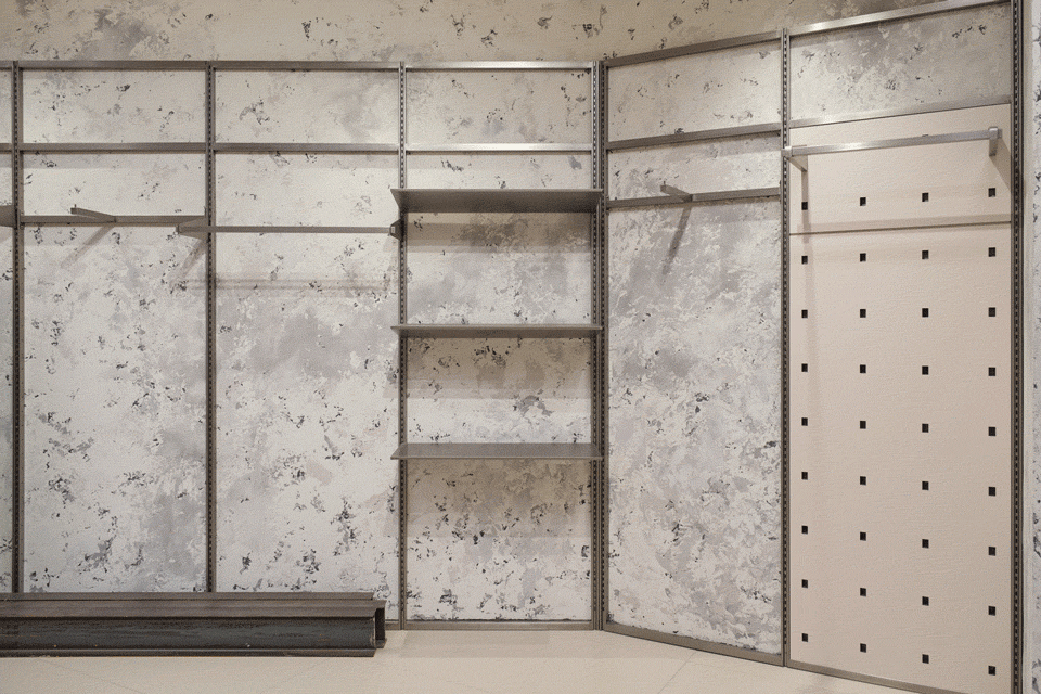
在改造前,通道呈现为紧凑的螺旋上升结构,导致大部分过道均为倾斜设计,加之宽度仅 2.3 米的狭窄通道与密布的格子铺布局,使得空间显得尤为拥挤且视觉杂乱。尤为突出的问题是中央楼层的低矮间距,这成为了项目亟待解决的主要痛点。
▼布局优化,layout optimization © 永创设计
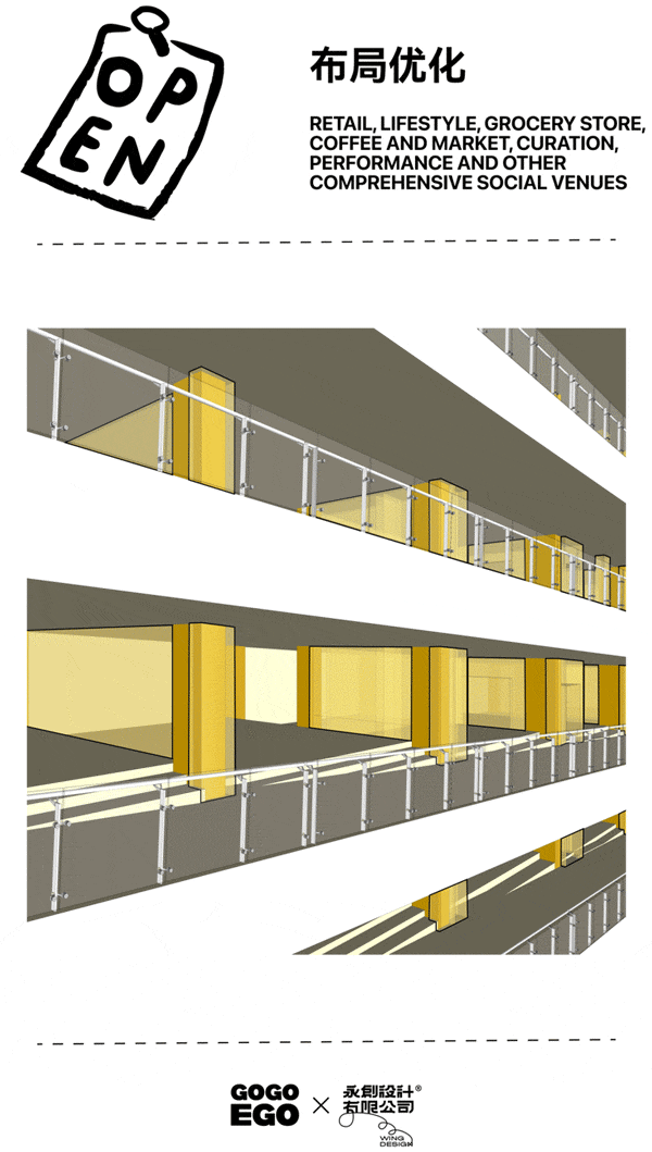
Before the renovation, the passageways presented a compact spiral ascending structure, resulting in mostly inclined corridors. Coupled with narrow 2.3-meter-wide passageways and a dense grid layout of shops, the space appeared particularly crowded and visually cluttered. A particularly prominent issue was the low clearance between central floors, which became a major pain point for the project.
▼优化后的空间,space after optimization © 言隅纳信


设计团队通过纵向优化购物动线布局,不仅缓解了空间压力,还将原本可能被视为局限的螺旋斜坡通道,通过统一的视觉设计改造,转化为项目的独特亮点。
▼动线改造,shopping route layout© 永创设计
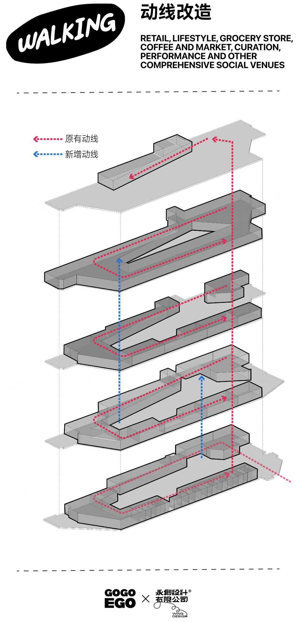
The design team vertically optimized the shopping route layout, not only alleviating spatial pressure but also transforming the originally potentially limiting spiral ramp passageway into a unique highlight of this project.
▼中庭,atrium© Ray

▼概览,overview© Ray


▼GIF© 永创设计
在规划路径时,出于对人性化需求的考量及空间体验感,针对 EGO 原有动线捕捉到潜在的使用体验问题,即传统回廊布局导致的步行疲劳感。设计团队将单一交通功能的走道,融入可停留休憩、打卡拍照的节点,转化为街区式步道布局,既保留建筑特色也优化了空间体验。
In planning the pathways, taking into account human-centric needs and spatial experience, the design team identified potential user experience issues in the original circulation of EGO—namely, the feeling of walking fatigue caused by the traditional corridor layout. The team transformed single-function corridors into street-style pedestrian routes by incorporating nodes for resting, taking photos, and checking in, which not only preserved the architectural features but also optimized the spatial experience.
▼街区式步道布局,street-style pedestrian routes© Ray

▼细部,close-ups© Ray

▼GIF© 永创设计

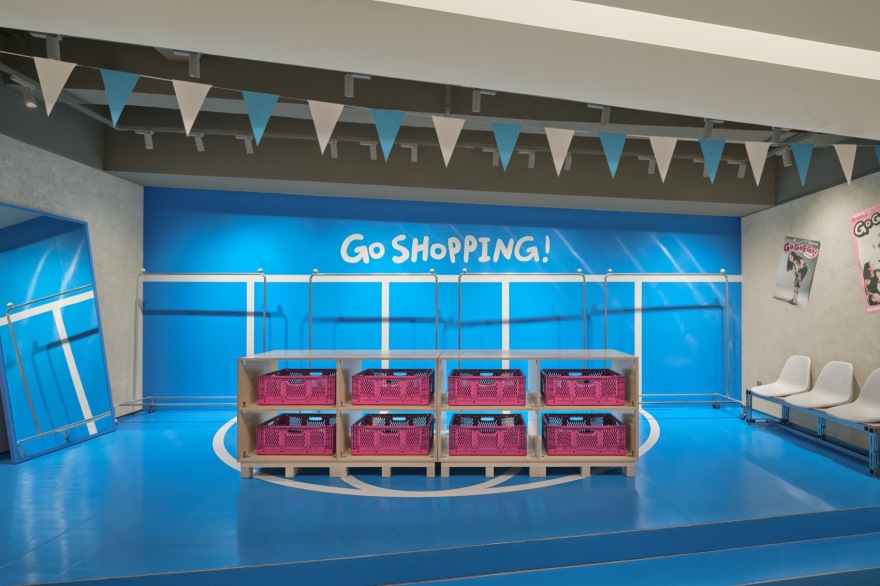
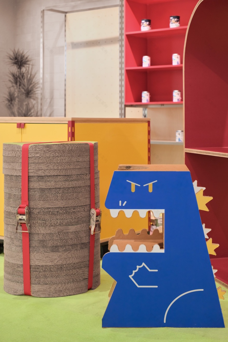
改造后的每一层空间里,布局各类店铺,并穿插其间的休息处与特色打卡点,每一处休憩点又被精心营造出不同的视觉风格,有趣的 IP 定制座椅,街头风格的雪糕筒、户外椅分部其中,营造轻松的“街区氛围”。
▼打卡装置,check-in spots© 永创设计
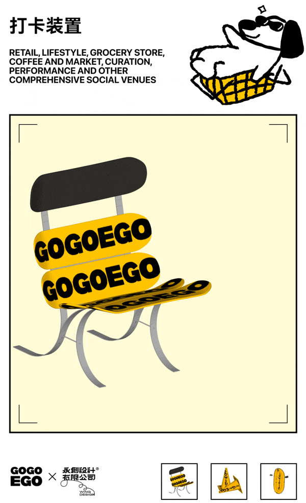
On each remodeled floor, various shops are arranged, interspersed with resting areas and unique check-in spots. Each resting point is carefully designed to exude a different visual style, featuring interesting IP-customized seating, street-style traffic cones, and outdoor chairs, creating a relaxed “Street Relaxing Vibe.”
▼打卡装置,打卡装置,check-in spots© Ray


鼓励人们以更加轻松愉悦的方式“走走停停”,享受漫步的乐趣。这一模式不仅解决了原有动线带来的体力负担,还给予空间新的生命力与互动性,十分契合 Z 世代的社交风尚,他们热衷于在沿途的景致前驻足打卡,并在社交媒体上分享。
This encourages people to “stop and go” in a more relaxed and enjoyable manner, savoring the pleasure of strolling. This model not only resolves the physical burden brought by the original circulation but also gives the space new vitality and interactivity, aligning perfectly with the social fashion of Generation Z who are enthusiastic about stopping to check in at scenic spots along the way and sharing them on social media.
▼“走走停停”,”stop and go”© Ray

▼节点,spot© Ray
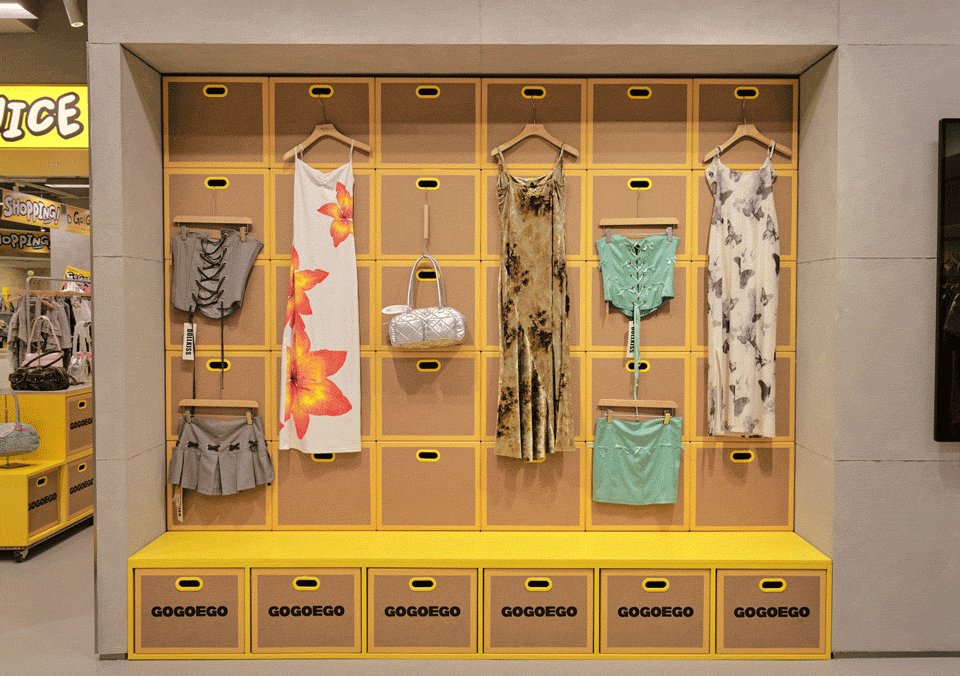
EGO 商场过去诸多中小个体商户,各自为政,没有统一的界面视觉规划,导致商场整体画面零碎,没有辨识度,让人失去游走探索的兴趣,也很难让消费者停留。在原始拥堵的格子铺的基础上,GOGOEGO 融合回廊式路径与多元业态的大型主题集合店,并规划出五种各具特色的空间类型,配以鲜明的主题色以增强品牌识别性。店内共计不同风格、不同类型的品牌 200+,涵盖鞋履、服装、配饰、香氛、宠物等多类生活方式品类,将其定位为「潮流超市」,既能以腊肠狗的 IP 展现回廊式街区的特点,也能通过统一的 VI 囊括品类。
Previously, EGO mall had numerous small and medium-sized individual merchants operating independently without a unified visual interface planning, resulting in a fragmented overall image, lack of recognition, loss of interest in wandering and exploring, and difficulty in retaining consumers. Based on the original congested grid-like shops, GOGOEGO integrates corridor-style paths with large-scale themed collection stores of diverse formats and plans five distinct spatial types, each with a vivid theme color to enhance brand recognition. The store encompasses over 200 brands of different styles and types, covering footwear, apparel, accessories, fragrances, pets, and various lifestyle categories, positioning itself as a “trend supermarket” that not only showcases the characteristics of the corridor-style street with the IP of a dachshund but also encompasses various categories through a unified VI.
▼分区,formats© 永创设计

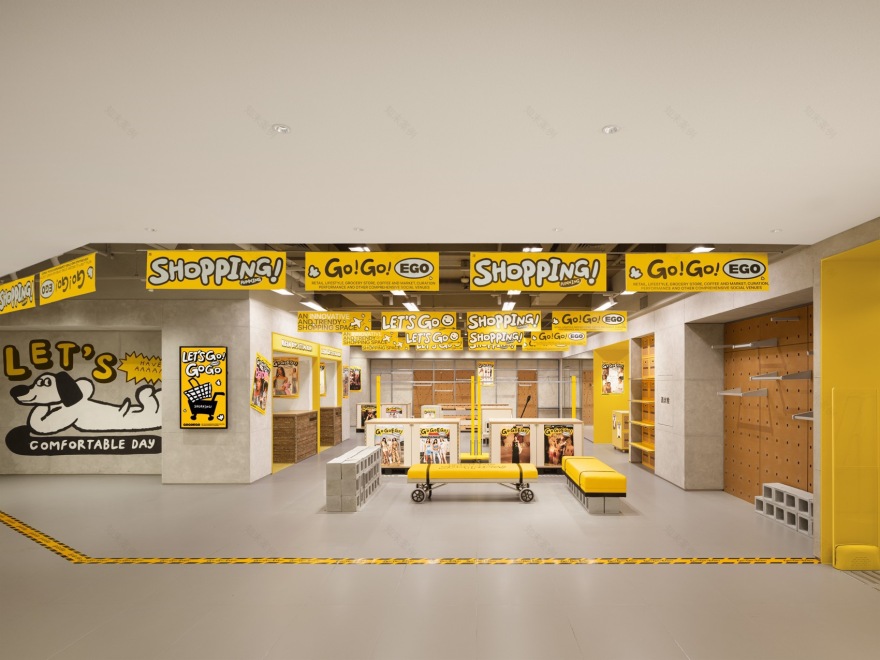
1F 是引领潮流的明黄色调,作为品牌 VI 的核心色彩,不仅彰显着时尚与潮流的前沿姿态,更给顾客留下深刻的印象。这里是「潮牌鞋履与配饰包袋」的聚集地,每一件单品都是个性与风格的完美诠释。
▼一层平面图,1F plan © 永创设计
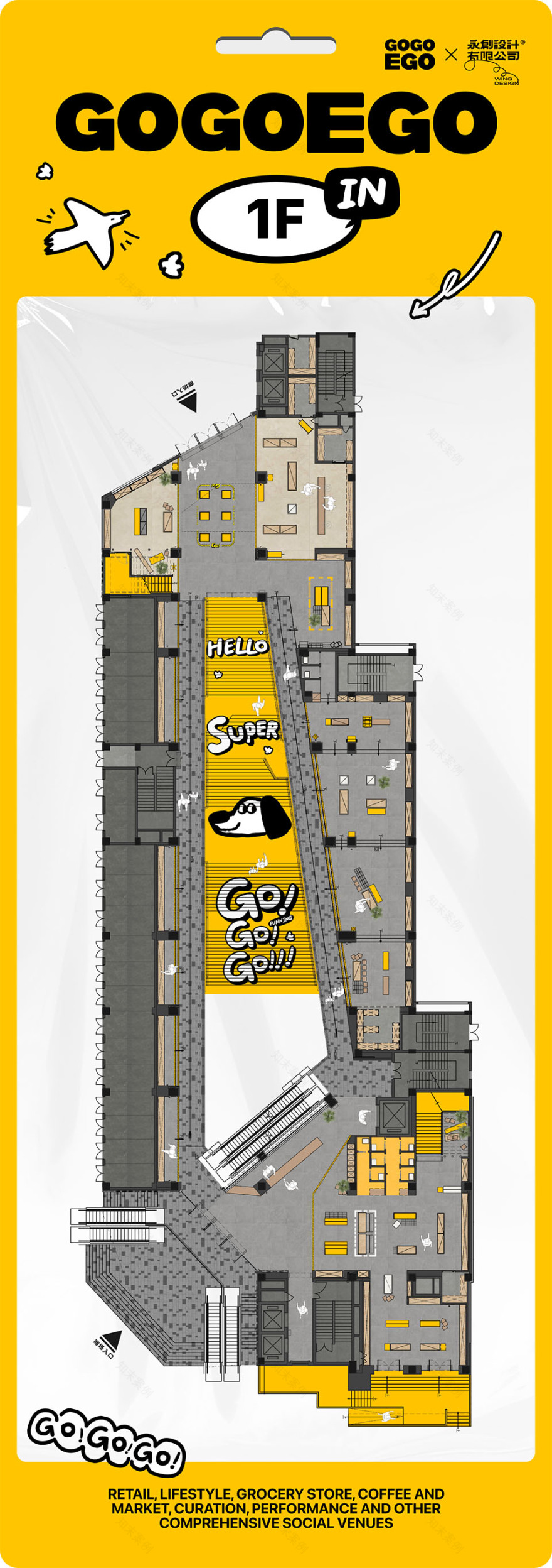
The 1st floor, featuring a trendy bright yellow tone as the core color of the brand’s VI, not only displays a forward-thinking attitude of fashion and trend but also leaves a profound impression on customers. It is a gathering place for “trendy footwear, accessories, bags,” where every item is a perfect interpretation of individuality and style.
▼一层店铺概览,1F store overview © 言隅纳信


2-4 层则根据不同风格主题排布时下年轻人最追捧的不同风格的品牌服饰。2F,一抹清新脱俗的草绿色铺展开来,这里汇聚了「无性别、户外、中性风」的服饰品牌,吸引每一位追求自由与个性的消费者。▼二层平面图,2F plan© 永创设计

The 2nd to 4th floors are arranged according to different style themes, offering brand apparel that is highly sought after by young people.
On the 2nd floor, a refreshing grass green color spreads out, gathering apparel brands of “unisex, outdoor, and neutral styles,” attracting every consumer who pursues freedom and individuality.
▼二层店铺概览,2F store overview© 言隅纳信


▼座椅,seating© Ray
▼座椅,seating© 永创设计
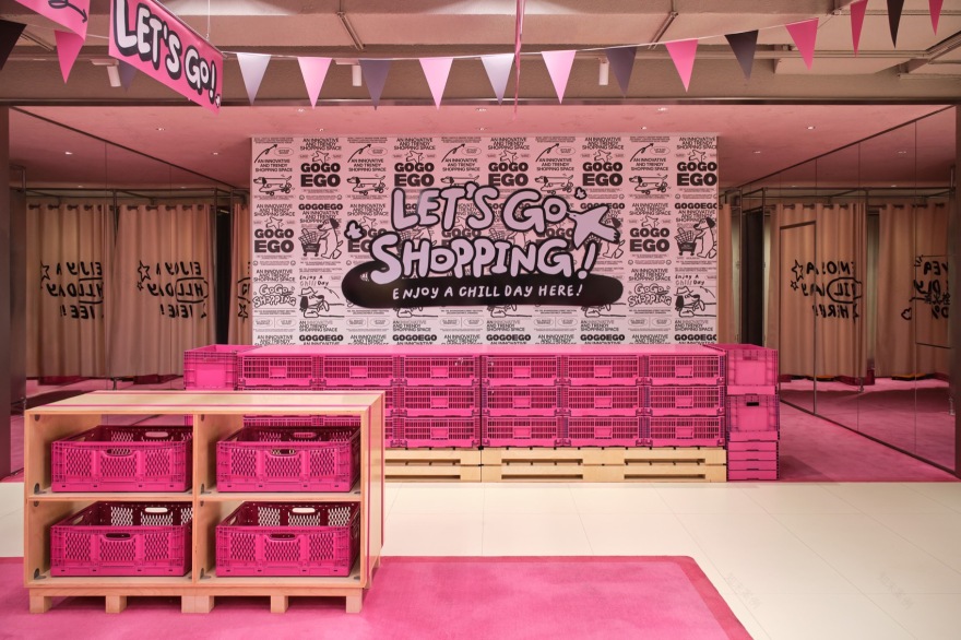
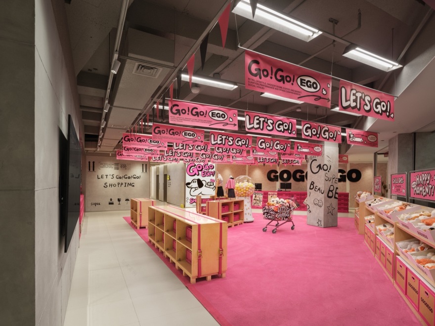
3F,则化身为女性的梦幻仙境,温馨的粉红色调温柔包裹。这里是「辣妹风尚、甜美公主及风格化女装」的殿堂。
▼三层平面图,3F plan© 永创设计

The 3rd floor transforms into a dreamy wonderland for women, gently wrapped in a warm pink tone. It is a sanctuary for “spicy girl fashion, sweet princess, and stylized women’s wear.”
▼温馨的粉红色调,a warm pink tone © Ray
▼三层店铺概览,3F store overview© 言隅纳信

4F,柔和嫩绿色调缓缓流淌。专注于「设计师品牌精选、健康生活方式(包括健身装备)及精致内衣」等,为追求品质生活的消费者打造一个全方位的舒适购物空间。
▼四层平面图,4F plan© 永创设计

On the 4th floor, a soft light green tone flows gently. It focuses on “designer brand selections, healthy lifestyles (including fitness equipment), and exquisite underwear,” creating a comprehensive and comfortable shopping space for consumers pursuing a quality life.
▼四层店铺概览,4F store overview© 言隅纳信


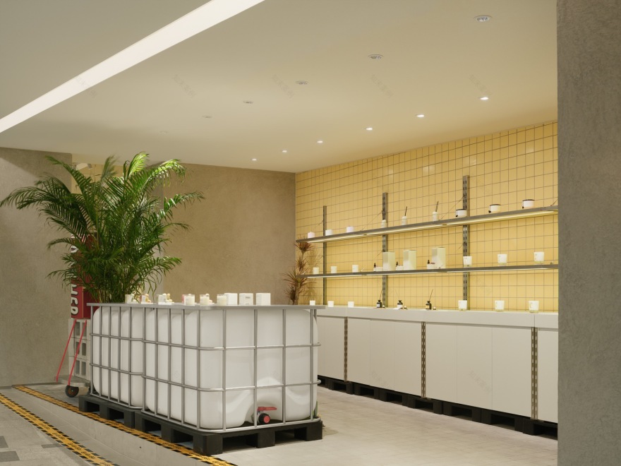
而 5F,则是别具一格的特色区域——露天街区,这里不仅是购物的延伸,更是宠物友好的温馨角落。在这里,「宠物、香氛」等特色店铺等待你的探索。
▼五层平面图,5F plan© 永创设计

The 5th floor is a unique and distinctive area—an open-air street that is not only an extension of shopping but also a pet-friendly cozy corner. Here, specialty shops such as “pets and fragrances” await your exploration.
▼吧台,reception© Ray

▼五层店铺,5F store© 言隅纳信
店铺之间统一的视觉形象与品牌标识,不仅增强了商场的整体品牌形象,更为品牌宣传与活动推广提供了绝佳的平台。
The unified visual image and brand identity among the shops not only enhance the overall brand image of the mall but also provide an excellent platform for brand promotion and event marketing.
▼统一的视觉形象与品牌标识,e unified visual image and brand identity© Ray


更为难能可贵的是,GOGOEGO 的设计并未止步于空间形态与设计美学的探索,而是深入结合了商业品牌的定位与需求,实现业态配比的最优化,增强顾客在商场内的流动性与体验感。在这过程中,GOGOEGO 与品牌的合作如同种子与沃土,彼此滋养,共同构建一个充满创造力的孵化平台和磁力中心,携手推动市场前行。
What is even more commendable is that the design of GOGOEGO does not stop at the exploration of spatial form and design aesthetics but deeply integrates the positioning and needs of commercial brands, achieving the optimization of business format ratio and enhancing customers’ mobility and experience within the mall. In this process, the collaboration between GOGOEGO and the brands is like the relationship between seeds and fertile soil, nourishing each other and jointly building a creative incubation platform and a magnetic center, working together to drive the market forward.
▼一角,corner© 言隅纳信

03 新&旧
EMERGING & ENDURING
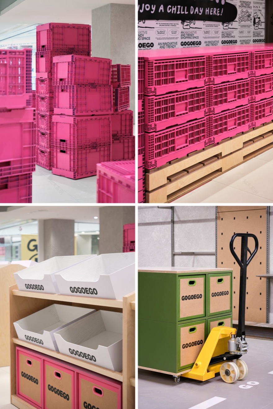
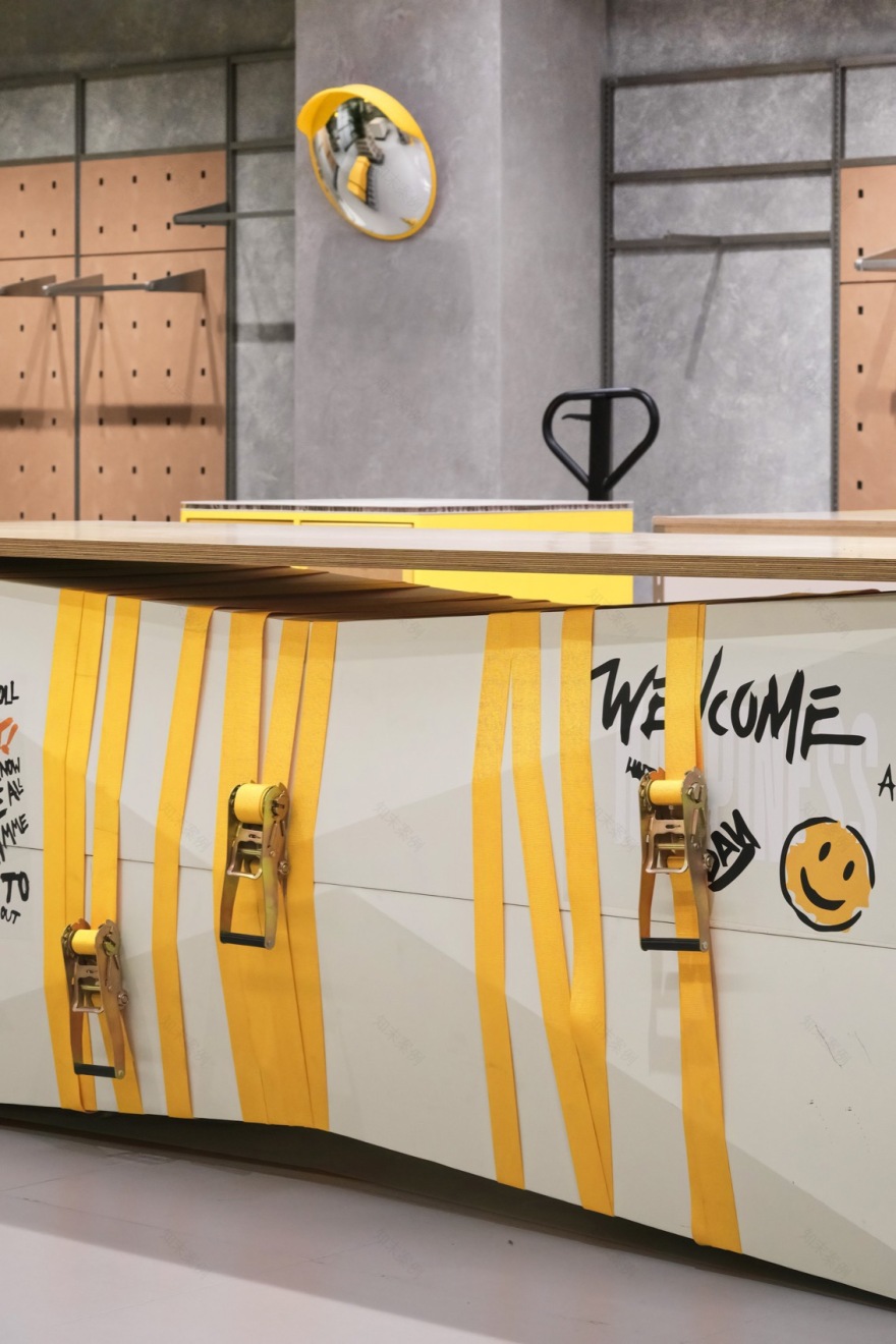
在深入探索旧改项目的复杂性与挑战时,不难发现,「平衡成本预算」尤其是施工成本与因改造而引发的时间延误成本——始终是一大难题。设计团队采用道具轻量化策略,在精细管理预算的同时,也开创了一种与年轻用户群体深度互动的新模式,为旧改项目注入了新的活力与可能性。
When deeply exploring the complexity and challenges of renovation projects, it is not difficult to find that “balancing the cost budget,” especially the construction cost and the time delay cost caused by the renovation, is always a major challenge. The design team adopts a lightweight strategy for props, which not only manages the budget carefully but also creates a new mode of deep interaction with young user groups, injecting new vitality and possibilities into renovation projects.
▼货箱,storage box© Ray

经营性场所的持续运营与改造工程的顺利进行之间,往往存在着微妙的平衡与博弈。更具有挑战性的是,商场改造时 B1-B3 楼层的商户一直处于营业状态,并对施工干扰有强烈反馈。为此,设计团队不得不通过优化施工流程、压缩道具制作周期等方式,力求在最小化对商户日常运营影响的同时,加速推进改造进程。
There is often a delicate balance and trade-off between the continuous operation of commercial spaces and the smooth progress of renovation projects. More challenging is when the B1-B3 floors of the mall are in operation during the renovation, with strong feedback on construction disturbances. Therefore, the design team had to optimize the construction process, shorten the production cycle of props, and strive to minimize the impact on the daily operations of merchants while accelerating the renovation process.
▼施工现场,construction site© 永创设计


▼细部,details © Ray & 永创设计

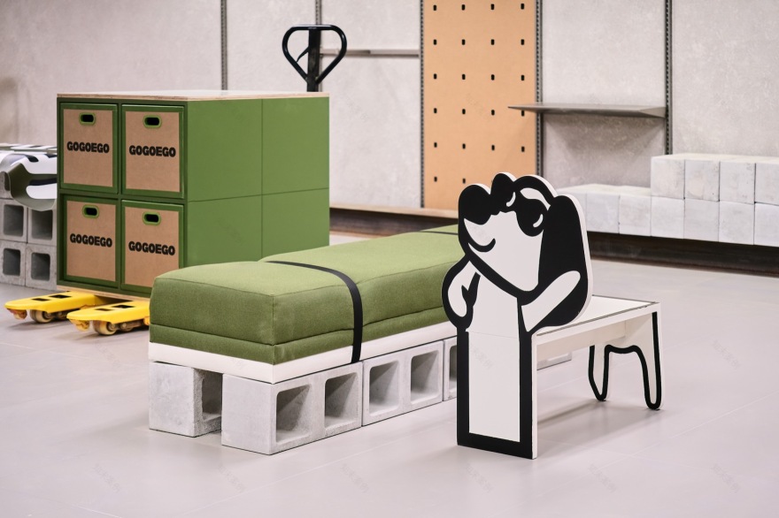
首先在材质的选择上,考虑到“工期快、成本可控”的实际需求,于是采用瓦楞纸、牛皮纸、组合回收等材料,既加快了施工进度又控制了成本,更通过材质本身突出新旧对比与碰撞。
Firstly, in terms of material selection, given the practical requirements of “fast construction period and controllable cost,” corrugated paper, kraft paper, and combined recycled materials were adopted. This not only accelerated the construction progress and controlled costs but also emphasized the contrast and collision between the old and the new through the materials themselves.
▼回收材料,recycled materials© Ray

▼家具细部, furniture details© Ray


同时引入轻量化与可移动性设计,通过灵活的组装与便捷的移动性,能够迅速适应不同场景与需求,实现储存空间的高效利用与个性化布局。
▼模块化货架组合,modular rack© 永创设计

Concurrently, lightweight and mobile design was introduced, enabling rapid adaptation to different scenarios and needs through flexible assembly and convenient mobility. This facilitated efficient utilization of storage space and personalized layouts.
▼模块化货架组合,modular rack© Ray
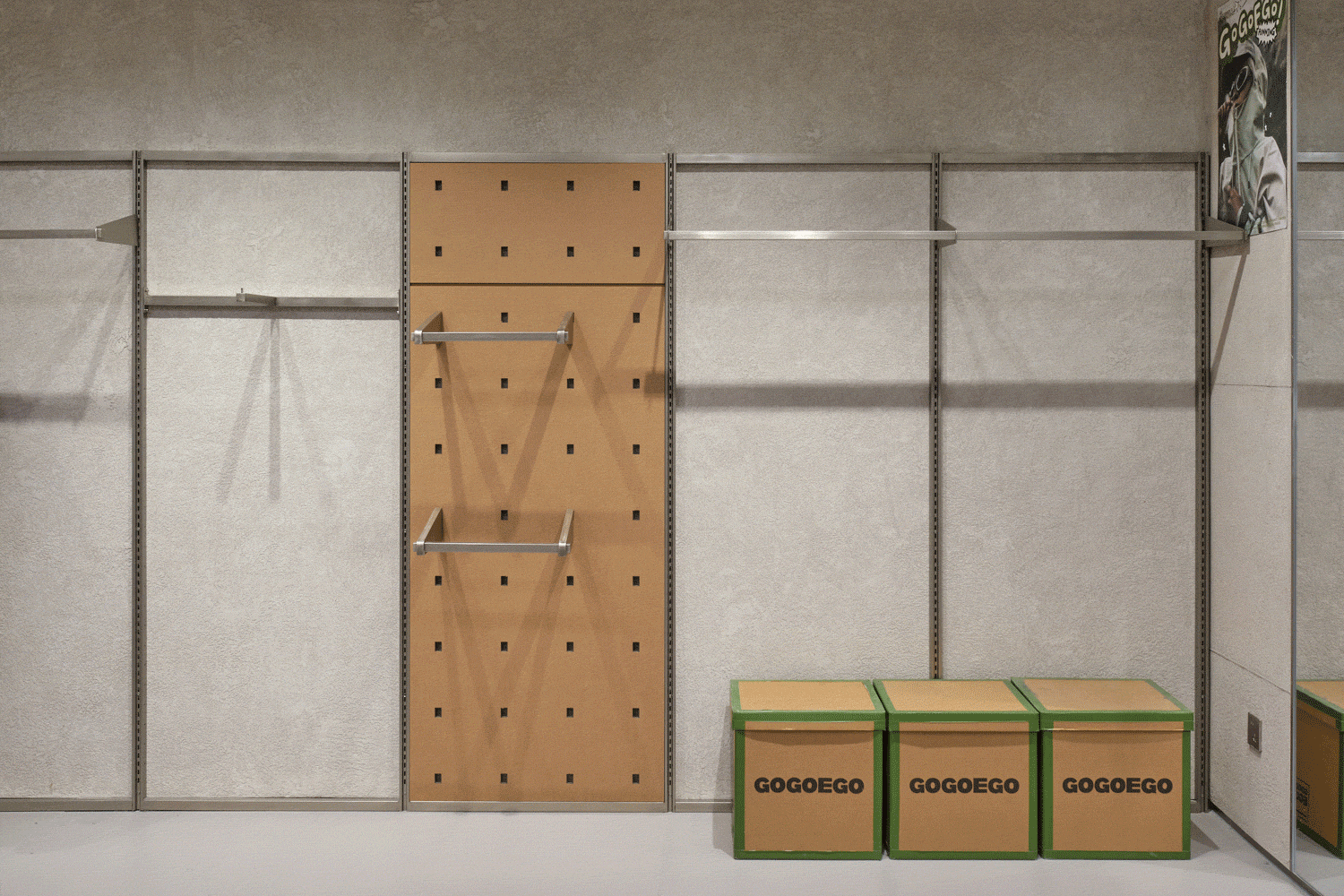
它们不再局限于传统的固定式排列,而是能够根据店铺、仓库或展览空间的实际需求,轻松变换形态与位置,创造出既实用又富有创意的储存与展示空间。此类灵活的设计,帮助商场运营方快速调整不同的展陈与业态品牌内容的组合,为消费者带来持续不断的“常逛常新”的体验,赋予公共空间活力与生命力。
These designs transcended traditional fixed arrangements, easily transforming shapes and positions based on the actual requirements of stores, warehouses, or exhibition spaces, creating both practical and creative storage and display spaces. Such flexibility aided mall operators in swiftly adjusting various exhibition and business format brand content combinations, providing consumers with a consistently “fresh and revisited” experience, thereby endowing public spaces with vitality and life.
▼可移动展示架,movable shelves© Ray
▼细部,details© Ray

GOGOEGO swiftly gained popularity among the Gen-Z, becoming a hot topic and check-in destination on social platforms like Xiaohongshu (China social media like Instagram). For this generation, GOGOEGO is more than just a commercial landmark; it represents their own sense of identity. It symbolizes a daring break from traditional constraints, an infinite yearning for freedom, a relentless pursuit of a relaxed and pleasant living atmosphere, and an affordable enjoyment of quality products.
▼迅速走红,project swiftly gained popularity © courtesy of GOGOEGO


设计团队保留并重塑空间特色,融入休闲交流、创意市集、文化展览及宠物友好区等多元化功能,通过超级 GO 物节、IP 联名、POP-UP 等活动,打造集购物、娱乐、社交于一体的综合平台,鼓励着每一位踏入这个场域的人们,去交流、去探索、去享受那份超越传统购物体验的全新生活方式。GOGOEGO 的旧改,其意义远不止于设计层面的创新,关于巨型品牌集合店,设计需要允许多元的品牌组合进入,在有控制的设计规则中又能让它们呈现自身品牌的文化及态度。
The design team preserved and reinvented spatial characteristics by integrating diverse functions such as casual gatherings, creative markets, cultural exhibitions, and pet-friendly areas. Through events like Super GO Shopping Festival, IP collaborations, and POP-UPs, a comprehensive platform integrating shopping, entertainment, and socializing was created, encouraging everyone who steps into this space to communicate, explore, and savor a new lifestyle transcending traditional shopping experiences.
The renovation of GOGOEGO transcends mere design innovation. For giant brand concept stores, the design necessitates accommodating diverse brand combinations while allowing them to present their respective cultures and attitudes within controlled design rules.
▼顾客,users© courtesy of GOGOEGO


【业主团队】
项目总监|吴军
执行团队|田恺怿 王远航
【设计团队】
设计公司|永创设计
创意总监|黄冠州
品牌策略|高瑜聪
品牌设计|陈芳 陈水彬 唐宁
空间设计|陈玫洁 刘晨亮 吴佰璋 许安琪 林泳君 文南慨 邱冰冰
项目管理|伍圆圆 叶茵文
深化设计|彭雄彬 陈彩姗 张绿如 周小坤
【项目概况】
项目名称|GOGOEGO 潮流超市
项目业主|上普集团
项目面积|6000m2
项目地点|中国 成都 锦江区 春熙路东大街
施工时间|2023.10
完工时间|2024.4
【协同团队】
空间摄影|Ray 言隅纳信
【Owner Team】
Project Director|Jun Wu
Executive Team|Kaiyi Tian, Yuanhang Wang
【Design Team】
Design Firm|WING DESIGN
Creative Director|Eddie Huang
Brand Director|Johnny Gao
Brand Designer|Fang Chen, Shuibin Chen, Ning Tang
Architectural Designer|Meijie Chen, Chenliang Liu, Baizhang Wu, Anqi Xu, Yongjun Lin, Nankai Wen, Bingbing Qiu
Project Management|Miki Wu, Carmen Ye
Assistant Designer|Xiongbin Peng, Caishan Chen, Lvru Zhang, Xiaokun Zhou
【Project Info】
Project Name|GOGOEGO Trend Supermarket
Project Owner|Suntop
Project Area|6000m2
Location|Chunxi Road, Jinjiang District, Chengdu China
Construction Period|2023.10 – 2024.4
【Support Team】
Photographer|Ray, NaXin

南京喵熊网络科技有限公司 苏ICP备18050492号-4知末 © 2018—2020 . All photos and trademark graphics are copyrighted by their owners.增值电信业务经营许可证(ICP)苏B2-20201444 苏公网安备 32011302321234号
苏公网安备 32011302321234号客服
消息
收藏
下载
最近