查看完整案例

收藏

下载
留坝县城坐落在一个山沟里,红砖公厕位于县城老街一侧的辅路上。周边有学校、民房、公交站,环境混杂,人流量也较大。公厕对面是一个留坝游客服务中心,这个位置以后会是一个游客集散地。
©尌林建筑
The red brick public toilet is located on the sideway of the old street in the Liuba County seated in a ravine, surrounded by schools, resident buildings and bus stops, with a complicated environment and many tourists. Opposite the public toilet is a Liuba tourist service center, which will become a tourist distribution center in the future.
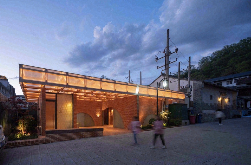
▼傍晚亮灯后看公厕场景,The toilet with light at dusk ©赵奕龙
退让点空间给街道
Space given to the street
公厕所在的街道不是很宽,周边建筑都比较高,公厕被夹在中间。在这样的环境下我们依然希望公厕有比较强的公共性,将更多空间开放给街道。设计上将实体墙内退,留出较多的半室外开放空间,使空间有更多与人交互的可能性。
▼原始场地,Original venue ©尌林建筑
The toilet is trapped in a street not wide between the tall architectures, but we still want to present it as a public one and leave more room for the street. The solid wall is set back to leave more semi-outdoor open space, so there would be more possibilities of interaction with people.
▼鸟瞰公厕与城镇的关系,Bird-eye view of the public toilet and the village ©赵奕龙
▼公厕正俯瞰图,Bird-eye view of the toilet from the front ©赵奕龙
▼公厕傍晚沿街场景 Street view beside the toilet at dust ©赵奕龙
▼还原场地中建筑与环境的互相关系,Restore the relationship between architecture and environment ©赵奕龙
▼居民在公厕坐凳上休憩闲聊,Residents chatting on the benches ©赵奕龙
由于业主希望公厕能满足公交站内乘客、外来游客、居民等多种人群的使用需求,所以我们将这个卫生间设计成双卫生间,达到内侧公交站乘客和外侧街道居民和游客能共用的状态,对外设置了第三卫生间和母婴室,也能满足残障人士使用需求。入口区设置了一排坐凳,可以供居民闲坐休息。
▼手绘草图(陈林)Hand-drawn layout (by CHEN Lin) ©尌林建筑
As the owner wants the toilet to serve not only the bus station passengers but also tourists and residents, we designed a dual-toilet, so that everyone can use it. On the external side, we designed a unisex toilet, a baby care room and a room for disabled people. There are also benches at the entrance for the residents to take a seat.
▼红砖和木构营造的半室外空间,Semi-open space consist of red bricks and wood ©赵奕龙
▼沿街进卫生间的入口,Entrance to the toilet by the street ©赵奕龙
▼公交站一侧卫生间入口,Entrance to the toilet on the bus station’s side ©赵奕龙
编织琐碎,取整合一 Weaved in minutiae, integrated into one
红砖、木条、玻璃砖,基于材料的碎片化形态,设计师用琐碎拼贴的设计方法,使建筑可被层层拆解。红砖材料的选择是源自场地记忆,旁边的民居都是红砖房,我们就很直觉的选择用红砖来做。公厕的墙体和地面都是红砖,墙体就是常见的丁顺砌筑,9 顺 1 丁,地面全顺铺,缝隙宽度一致。砖块作为独立的构件,构建起了墙面和地面。用砖墙做成拱也是一种直觉,砖墙上没有多余的开洞,只有拱。拱洞的填充是玻璃砖,尺寸同红砖,用胶水粘结垒砌,遇到弧形边界进行尺寸切割。在没有屋顶的情况下整体空间关系已经成立,砖墙高度统一在 3 米,无形的边界空间也形成了。如果说不考虑使用功能,不做屋顶也不失为一种好选择。
The designer used collage of fragmented materials including red bricks, wooden strips, glass bricks, so that the architecture can be disassembled layer by layer. The idea of red bricks came intuitively from the surrounding buildings on site of the same material. Both the wall and the floor are made of red bricks, using the most common Dingshun construction with 9 shun bricks and 1 ding brick. The floor is only paved with shun bricks of the same width of gap. The bricks are used as individual components to build up the walls and floors. It was also an intuitive call to make an arch out of the brick wall, with no unnecessary openings. The arch is filled with glass bricks of the same size as the red bricks, glued together and cut for the curved boundary. Without a roof, the overall spatial relationship is already formed, and at the height of 3 meters uniformly, the invisible boundary is also set. If it weren’t for toilet use, it might also be a good idea to leave it open.
▼红砖拱洞看入口灰空间,Grey space at the entrance from the red brick arch ©赵奕龙
▼女厕入口,Entrance to the female toilet ©赵奕龙
▼红砖墙细,Details of the ref bricks ©赵奕龙
最终屋顶的木构架是用小木条,组织成一个桁架,错位夹接,用螺丝串连。阳光板包裹木构的 5 个面,用螺丝固定在木构上,防止木头淋雨。门窗也是一个独立的单元,用钢板构建一个框架,填充在砖墙之间,框架内部再填充半透的瓦楞玻璃门窗和玻璃砖。
Ultimately, the roof is made of a truss consist of small wood strips staggered, clamped, and screwed together. The solar panels are wrapped around the five sides of the timber frame and screwed to it to protect the wood from the rain. The windows and doors are also a separate unit. The steel plates construct a frame between the brick walls, filled with semi-transparent corrugated glass windows, doors and glass.
▼模数化的木结构屋顶桁架,Modular used wooden truss on the roof ©赵奕龙
▼灯光都藏于木构中,见光不见灯,Lights hidden in the wood structure ©赵奕龙
▼定制的钢板门窗体系,Specially designed doors and windows of steel ©赵奕龙
我理解的建筑关系应该是一层一层的,所有细节拆开来看都是琐碎的,以某种秩序组合在一起时,便构建出不一样的整体。每个琐碎的部分都在发力,形成整体感受,就像是绘画,整体和局部是同时被把握的。也许和我研究生毕业论文有关,在做这类建筑的时候不自觉的带入了乡村建造的方法和逻辑,琐碎的材料,可拆分的结构,片段的感受。公厕建筑都是由琐碎单元化的个体组合而成,但是组合到一块又很和谐自然。也许感受力很重要,能将看似零散不相干的碎片整合成一个完整的空间。
▼分析图,Analysis chart ©尌林建筑
The architectural relationship I perceive should be layer by layer. In other words, the details are separate and trivial when taken apart, but when put together in a certain order, they form an entirety. Every trivial part contributes to the entirety, like in painting, the whole and the parts are considered together. I unconsciously brought in the method and logic of rural construction, trivial materials, detachable structure, and fragmented feelings (the inspiration might date back to my graduate thesis). The public toilet is made up of a combination of trivial unitized components, but together they are harmonious and natural. Perhaps sensibility is important to integrate the seemingly fragmented and unrelated pieces into a complete entirety.
▼红砖墙、木构屋顶、钢板门窗建筑要素,Architecture components: red brick walls, wooden roof, steel door and window ©赵奕龙
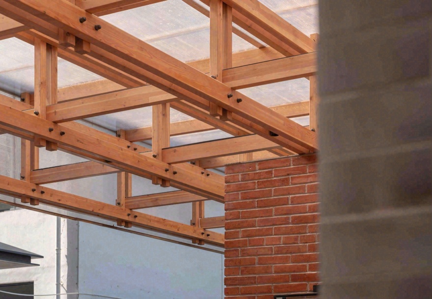
▼木结构细节,Details of the wooden structure ©赵奕龙
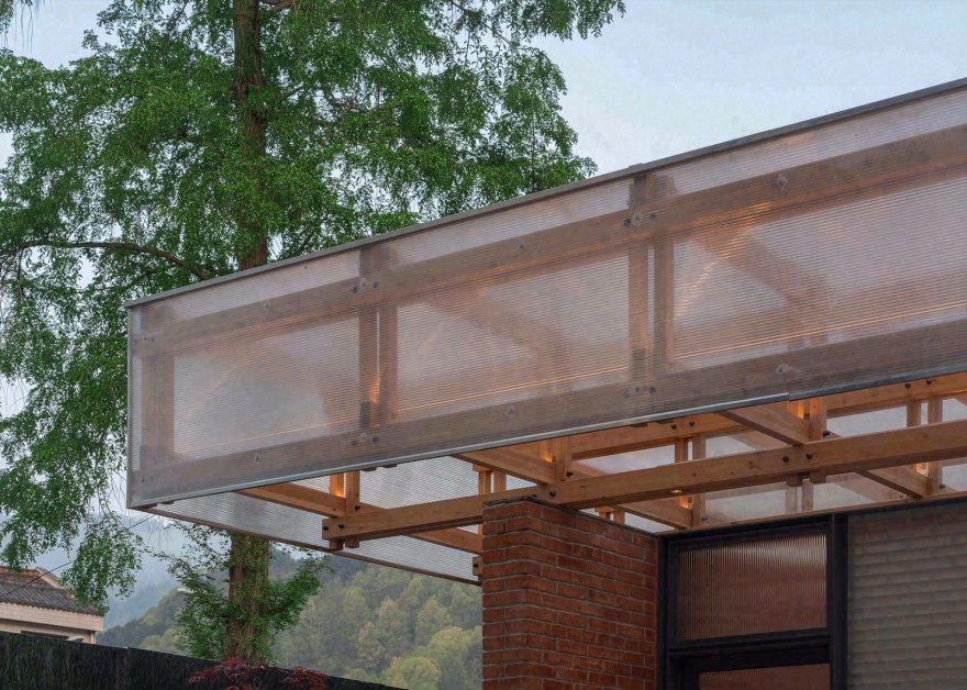
▼出挑 1.2 米的木构屋顶,Wooden roof 1.2 meters outward ©赵奕龙
几片红砖墙 + 细木构屋顶
Several pieces of red brick wall + timber frame roof
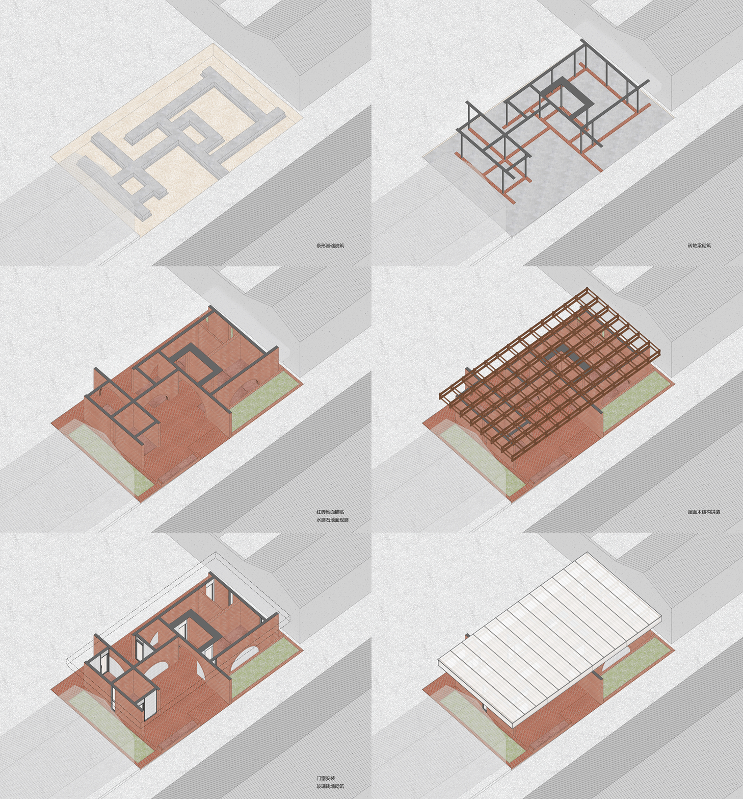
建筑的结构关系很清晰,地面和墙体为红砖,屋顶为一个桁架体系的木构。红砖墙体以片墙的形式呈现,片墙上挖出半圆形拱洞,拱洞作为入口使用,有的填充玻璃砖采光。砖墙顶部高度齐平,墙顶压一片一公分厚钢板,与墙体等宽,钢板与砖墙用钢柱结构连接,形成完整的结构体系。木结构用钢连接件与压顶钢板焊接,砖墙的轴线跟木结构轴线一致,一米二见方,木结构的连接都对应在墙体上固定。为了防止砖墙返碱,砌墙用的是抗碱砂浆,墙体打磨勾缝之后,表面还做了哑光清水漆保护层,能看到一点一点反光,随着时间推移反光会慢慢变弱。
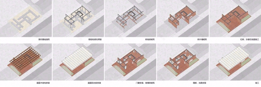
▼方案轴侧拆分图,Side breakdown of the axis ©尌林建筑
The architecture has a very clear structural relationship: the floor and walls are made of red bricks and the roof, of a wooden structure with a truss system. The red brick walls are presented as a sheet wall, with semi-circular arches dug to either serve as the entrance or filled with glass bricks for light. The walls of the same height is sealed by a one-centimeter thick steel plate who has the same width with the wall. The steel plate is connected to the brick wall with steel columns to form a complete structural system. The wood structure is welded with steel connectors to the steel plate on the roof, and the axis of the brick wall is the same as that of a wood structure with the length of 1.2 meters to form a square. Connections of the wood structure are correspondingly fixed on the wall. To prevent the brick wall from alkalization, it is built with anti-alkali mortar, and after the wall is polished and hooked up, the surface is also covered with a matte varnish protective layer whose reflection dims by time.
▼公厕沿街场景,Public toilet by the street ©赵奕龙
▼用红砖重构空间,Reconstructed space by the rebuilt brick ©赵奕龙
▼红砖和玻璃砖组合墙体,Wall composed of the red bricks and glass ©赵奕龙
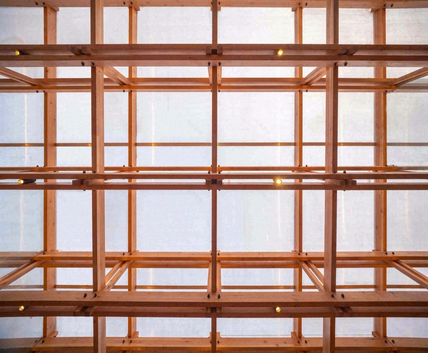
木结构是在工厂加工好运到现场安装的。木结构厂家先做了深化设计,将构件拆分,每根木头的尺寸编号确认后加工,避免出错。木结构构建横截面只有两个尺寸,横杆是 40x100mm,竖杆是 50x50mm,竖杆每一排的高度都不同,整体屋面向一侧找坡,木构的序列性和模数化是我们想表达的,同时施工简单,成本较低,质量可控。这也是保证效果的重要条件。
木构连接螺丝在效果图上对比了黑色和银色,最后选了黑色,结构看起来会更精神。
屋顶的阳光板通过选样比较,最终确定为 2 公分厚度双层网格的款式,屋顶面做了双层,横竖交错铺设,增加屋顶的抗压性和平整度,侧边阳光板横纹铺设只做了一层,这个是在现场判断决定的,做一层的通透度比较好,会呈现比较好的光影效果。
▼建造过程演示,Constructing process ©尌林建筑
The wood structure is processed in the factory and installed at the site. It is first designed by the manufacture, dissembled, and processed with different number on each wood to avoid any mistake. There are only two sizes of the cross-section of the wooden structure, with the horizontal bar 40x100mm and the vertical one 50x50mm at different height for each row. The whole building inclines to one direction to show the sequence and the modularity of the wooden structure. Meanwhile, it is easy to build with lower cost and controllable quality, which is also critical to guarantee we make what we want. We compared black and silver in for the timber frame connecting screws, and chose the former so the structure looks more compact. After comparing different materials, the solar board uses a double-layer grid style 2 centimeter thick, lay horizontally and vertically to increase the resistance and flatness. There is only one horizontal layer of solar board, which was decided on site for a better light and shadow effect.
▼阳光穿过木结构屋顶形成的光影关系,Light and shadow formed by sunshine coming through the roof ©赵奕龙
▼仰看木结构屋顶,Upward view of the wooden roof ©赵奕龙
▼出挑的木结构架在墙体上,Outward wooden structure on the wall ©赵奕龙
不同层次的漫反射光 Different layers of diffuse reflection
建筑上用了三种半透明的材料,一种是阳光板,用在屋顶上;另外两种分别是磨砂玻璃砖和瓦楞玻璃,用在立面填充和门窗上。屋顶顶面用了两层阳光板交错叠铺,形成了是网格状的方格纹理,打下来的光线被层层折射,进到室内变得非常的柔和舒适。磨砂玻璃砖在室内看光线只是把玻璃砖整体打亮了,几乎没有太多的光线形态进入室内。瓦楞玻璃跟阳光板的进光形态是类似的,只是在平整度和精致性上有一些差别,瓦楞玻璃看起来更加笔挺细腻,都有比较相似的朦胧美。通过相近的半透明材料运用,使室内的光影层次变得更加丰富,这是对光影关系的一种探索也是一种试验性的尝试。
Three types of translucent materials are used in the building: solar boards on the roof, and frosted glass tiles and corrugated glass for façade infill and doors and windows. The roof is made of two layers of solar boards, staggered and overlapped to form a grid-like texture, and the light that comes down, refracted by the layers, becomes very soft and delightful when it enters the room. From the inside, the frosted glass tiles only add to the brightness of the space, without many reflections, while the light come through the corrugated glass in the same way as the solar boards, only different in flatness and delicacy. The corrugated glass makes the light more delicate to create hazy beauty. Through the use of similar translucent materials, we enriched the layers of light and shadow, which is another attempt in exploring their relationship.
▼渐变的光影,Gradual change of the light and shadow ©赵奕龙
▼透过瓦楞玻璃照进来的光线,Beam of light through the corrugated glass ©赵奕龙
▼女卫内部空间场景,Inside the female toilet ©赵奕龙
建造过程中的事故与故事
Stories during construction
第一次到现场就是让工人拆掉刚砌好的砖墙。我们去做图纸交底的时候施工队已经进场一段时间了,也没有跟我们设计方沟通就已经把基础做好开始砌砖墙了。我们过去一看,这个砖的颜色和品质达不到我们对效果的要求。因为红砖是直接裸露的,如果砖不对,后面效果肯定好不了,所以我们果断的要求更换新的砖,施工方也进行了积极的配合。
▼施工过程沟通记录,Records of communication during construction ©尌林建筑
The first time I went to the site, I asked the workers to tear down the newly built brick wall. We were there to send the blueprint, but the construction team had been there for a while, and had started to build the brick wall without clear communication about the design. We found that neither the color nor the quality of the bricks met our requirements, and since the red bricks are exposed, the wrong bricks won’t make the right effect. We firmly asked for new bricks, which the team agreed.
▼小鸟瞰,Bird-eye view ©赵奕龙
土建阶段现场的负责人年纪很大了,不太会讲普通话,也不太会用手机,沟通起来非常吃力,对施工流程也没有清晰把握。所以我们建议施工方另派了一个管理员过去,项目才慢慢的走上正轨。有一天这个管理员突然问我一句可爱的话:“如果我们没有按照你们要求自己做上去了会怎样?”我回答说:“会让你拆掉重新做。”他笑了笑。当然说这句话的底气来自业主方对我们设计方的信任和支持,方案通过之后全程无条件相信我们,让我们把控所有的材料和细节,不做任何无意义的干涉,只看最后的成果,在此我要非常感谢我们的业主。
The person in charge of the construction team was old, cannot speak mandarin and barely uses a cellphone. It was difficult to talk to him, let alone asking him to have a clear view on the process. We suggested that the administrator send another administrator to the site, and the project slowly got on the right track. One day he suddenly asked, in an unserious manner: “What if we don’t do it according to your instructions?” I said: “We most certainly will ask you to tear down.” He smiled. We said this because the owner put a lot of belief and support in us, trusting us to manage all the materials and details without any meaningless interference after the plan was proved. Here I’d like to express my gratitude.
▼沿街立面场景(白天),Facade to the street(daytime)©赵奕龙
▼沿街立面场景(傍晚),Facade to the street(evening)©赵奕龙
▼建筑细节,Details of the architecture ©赵奕龙
▼建筑细节,Details of the architecture ©赵奕龙
赤裸建造
Bare construction
像公厕这样的小建筑,我坚持的设计原则是建造可视、材料清晰、错误暴露,造一个不被装饰隐藏的建筑。除了埋在地下的水电线路和砖墙内钢结构,其他都是赤裸的,每一块砖、每一根木头、每一个螺丝、每一个缝隙,都清晰可见。建筑的材料关系不是用室内室外来区分,而是用一种整体的设计语言逻辑去把控,就算房子放大一百倍也同样适用,我认为这样的房子有一种“可读性”。坚持赤裸的建造方式对施工队的要求很高,没有太多机会返工,几乎都只有一次机会,错了要么重来,要么就错了,错误也都看得见,像红砖就是重来了一遍,有缺陷;玻璃砖就是不同位置做法不同,有错误;屋顶的阳光板尺寸没有对齐木结构,有遗憾,但这些都不影响建筑的整体呈现效果,能够容忍一定的缺陷和遗憾也许是建筑师成长过程中的必修课。
For a small architecture like this public toilet, I insisted on the design principles of visibility, clarity of materials, and exposure of mistakes, to create a building that hides nothing with decoration. Except for the utility lines buried in the ground and the steel structure inside the brick wall, everything else is naked, and every brick, every piece of wood, every screw, and every gap is clearly visible. We do not distinguish the inside from the outside, but use the language of designing to control. It applies even if the architecture is 100 times larger. I think such a house has a kind of “readability”. Insisting on the exposed construction method is very demanding for the construction team, as there is little room for changing. If anything goes wrong, they need to do it all over, or leave it there. We started the red brick part from all over, there are defects for the glass brick because they should be piled up differently for different position, and the size of the solar boards on the roof are not aligned with the timber structure. There are mistakes and regrets, but the overall presentation of the building is still successful. I think the tolerance of certain defects and regrets might also be a necessary lesson for the architects.
▼看向留坝老街的鸟瞰图,Bird-eye view towards the Liuba Old Street ©赵奕龙
▼夜晚亮灯后的局部效果场景,Part of the building with lights on at night ©赵奕龙
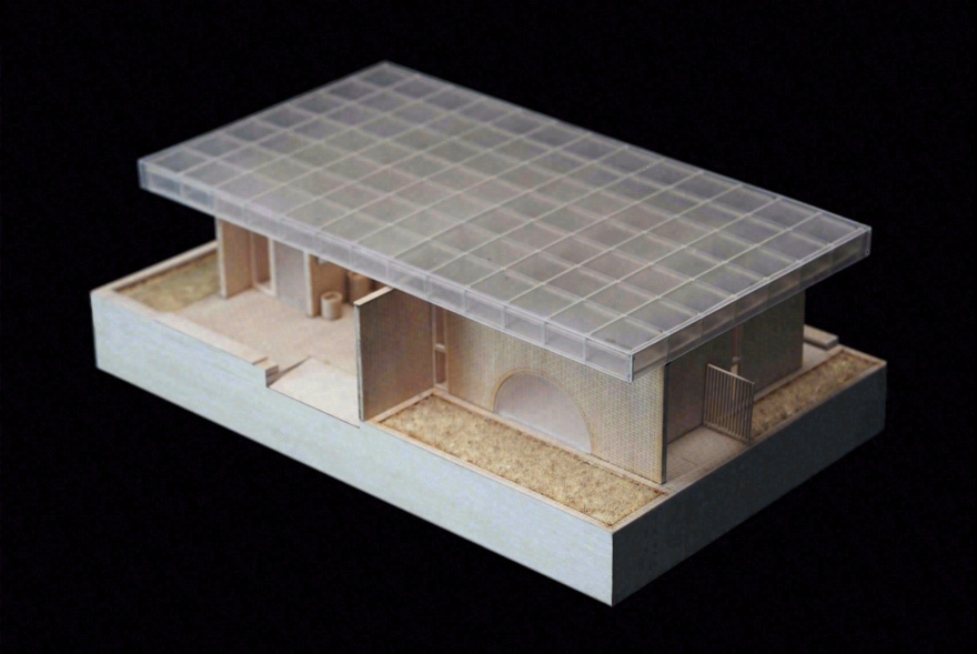
▼模型,Manual model ©尌林建筑
▼总平面图。General layout ©尌林建筑
▼一层平面,First floor layout ©尌林建筑
▼正立面图,Front facade ©尌林建筑
▼侧立面图,Side facade ©尌林建筑
▼剖面 1-1,Section1-1 ©尌林建筑
▼剖面 2-2,Section2-2 ©尌林建筑
▼墙身大样图,Large-scale drawing of the wall ©尌林建筑
项目信息:
项目名称:留坝老街红砖公厕
项目地点:陕西省汉中市留坝县城
项目业主:留坝县住房和城乡建设管理局
施工单位:陕西腾邦建设工程有限公司
项目经理:舒国永
设计单位:尌林建筑设计事务所
主持建筑师:陈林
项目设计师:时伟权、陈松
照明设计师:方晓灵
木构深化施工:江苏千树装配建筑有限公司
项目类型:公厕
设计时间:2023.1-2023.6
建造时间:2023.7-2024.3
建筑面积:110㎡
结构形式:砖木结构
建筑材料:红砖、花旗松胶合木、玻璃砖、钢板、水磨石
建筑摄影:赵奕龙
Video: teiichi studio-DING Yi
客服
消息
收藏
下载
最近


