查看完整案例

收藏

下载

翻译
There’s nothing quite like the local pizza joint. Frequented on a Friday night and supported right through to Sunday by the neighbourhood, all too happy to be saved from a night of cooking and to delight in one of Italy’s greatest gifts to the world (save for the invention of Campari, of course). So one can only imagine the memories embedded within the walls of Buon Gusto, perched on a street corner in Sydney’s inner-city suburb of Darlington. Having served the community as a classic Italian pizzeria for nearly 35 years, the building has now taken on a new identity as artists’ studios, thanks to the talented team at Studio Shand, but not without inheriting the qualities most loved by the locals.
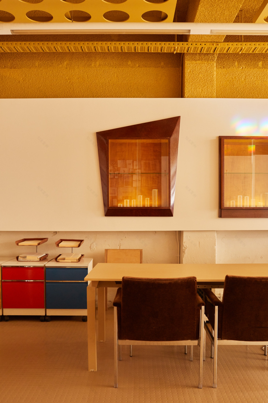
The original building envelope and colour stock remain as was always intended, the muted green tones providing a soft backdrop for the warm glow of lights from within. Once inside, the play on colour does not cease, and what can only be described as ‘classic pizza tones’ feature right through the space.
Muted mustard yellow, balmy beige and a robust rust colour all come together with the inclusion of red chequered curtains, another nod to the classic pizzeria aesthetic and the history of the artists’ studios. A set of clever homages on the Italian architectural landscape come to the fore in the shape of terracotta roof tiles, the maintenance of the building brickwork and arches, as well as a particularly comforting mural that seems to look out to the Mediterranean seaside.
Even though it’s not all out with the old, it is definitely in with the new, as the Studio Shand team worked hard to deliver the project in the most sustainable and cost-effective manner. This is evident in the careful selection of new materials such as marmoleum and cork, specified for their climate-positive attributes, reducing the need for carbon offsetting.
These selections blend seamlessly with the historic textural and tonal palette while simultaneously modernising the space and complementing the rustic aesthetic of the pizzeria with a clever juxtaposition of minimalist shapes and compositions. It’s the perfect blank canvas for any form of artist that might reside within.
The design team did their homework, and the level of rigour applied to analysing the existing building and understanding the community and the heart of the place led to the creation of a space that appears as if it had always been there. The new interiors instil a sense of memory that ties in beautifully with the restoration of the old.
It’s a fine example of adaptive reuse and resurrection, proving that good design does not need to be complex, and you need only look and listen to what is already there to create a little slice of heaven from a little slice of history.
[Images courtesy of Studio Shand. Photography by Traianos Pakioufakis.]
客服
消息
收藏
下载
最近


