查看完整案例

收藏

下载

翻译
Architects:Multiplicity
Area:345m²
Year:2021
Photographs:Trevor Mein
Manufacturers:Unios,Astra Walker,Astro Lighting,Barazza,Caroma,Corsi and Nicolai,Escea,Falmec,Liebherr,Marblo,Muuto,Neff,Roca,car stackers international
Builders:Frank Pty Ltd
Landscape Designers:Andrew Plymin Garden Spaces
Landscapers:Piper Landscape Co.
Associate:Cimone Mcintosh
Director:Tim O’Sullivan
Building Surveyors:Assent Building Code Consultants
City:Melbourne
Country:Australia
Text description provided by the architects. A throw away comment by one half of our clients, a gentleman in his late 70’s and an artist of national if not international standing; that he’d never had a house designed for him, for them, a home... This resonated with us. His excitement and expectation of the possibilities was palpable, as was the gentle understanding that time to experience this home was not open ended. It reinforced the precious opportunity a client gifts their architect.
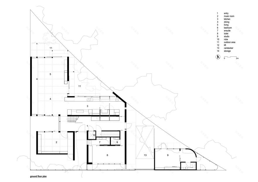
Another inciteful ‘thought out loud’ moment was that the building should be designed such that it could be embraced by the neighborhood. Our explicit role then was to gift the community a beautiful building. Given a triangular site bounded on two sides by pedestrian traffic, this makes for pleasing a lot of people. Then we have a not insubstantial brief for a not insubstantial home including basement, lift, car stacker and separate studio.
This brings us to the very disparate personal tastes of our clients. One likes high volumes, one likes intimate spaces, one is a minimalist, the other a collector of things… natural, textured, patinaed, a love of objects with history, the scratches and bruises of past use. Both wanting an abundance of natural light, while loving the play of shadow, wanting the inside to seamlessly shift to the outside while remaining private to the teams of passerbys.
To display their trophies of a life well lived, the books, the art, the furniture, the collections, the objects, the records, the dog, the visiting family, the pots, the pans, the l can’t throw this away objects, the heirlooms, the trophy trophies...all needing a space, a home. All this on an awkward block… with height restrictions and a flood level for good measure. Backing onto a park filled with substantial gums and rowdy galahs.
Knowing that the site and program expectations were not the greatest of bedfellows, we chose our consultants carefully. A builder who's not afraid of detail, materiality, or tight sites and an engineer who would work closely with us. We discussed the landscaping from the very outset of the project. We measured and cataloged the entire list of the client’s objects…
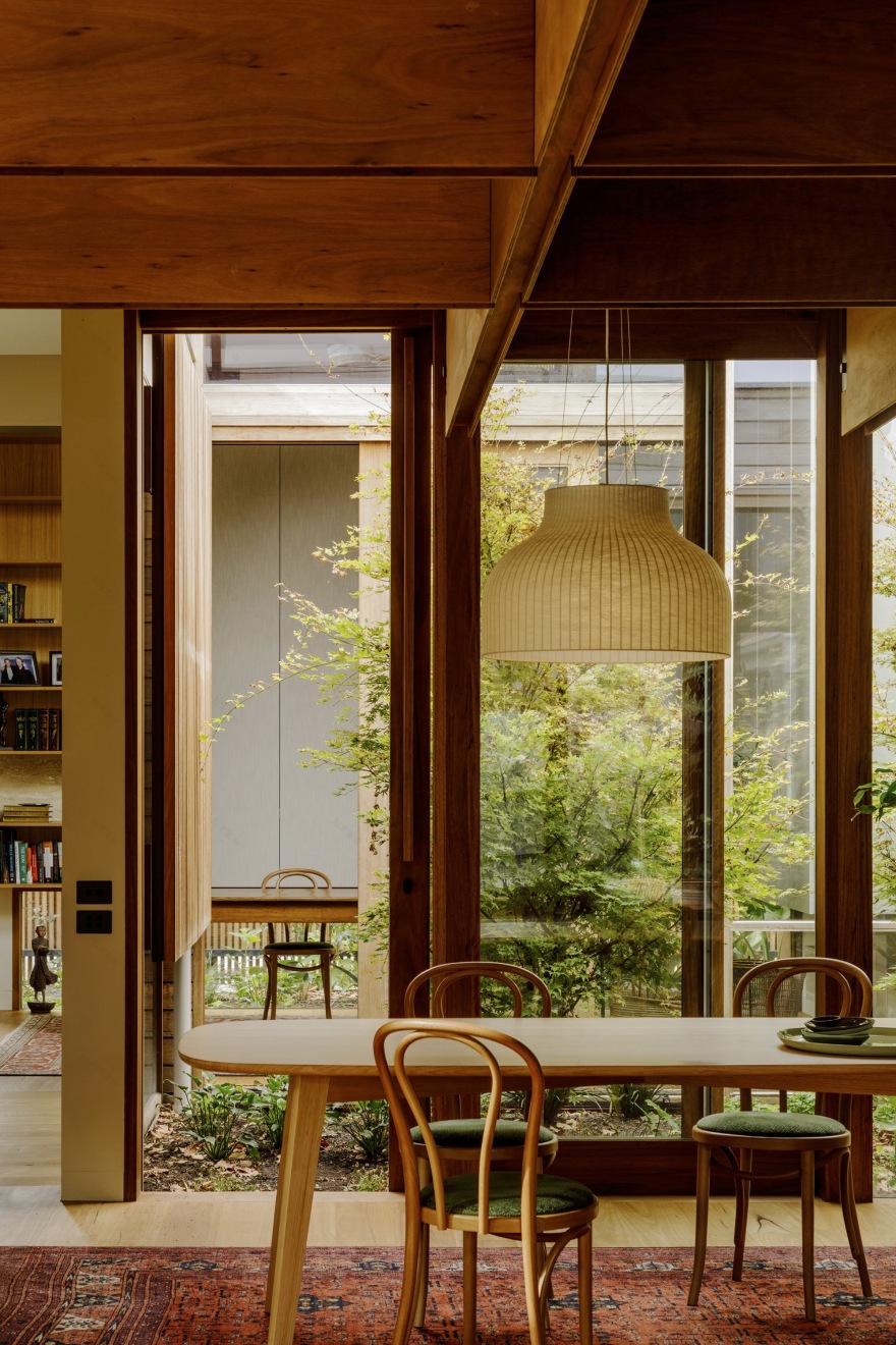
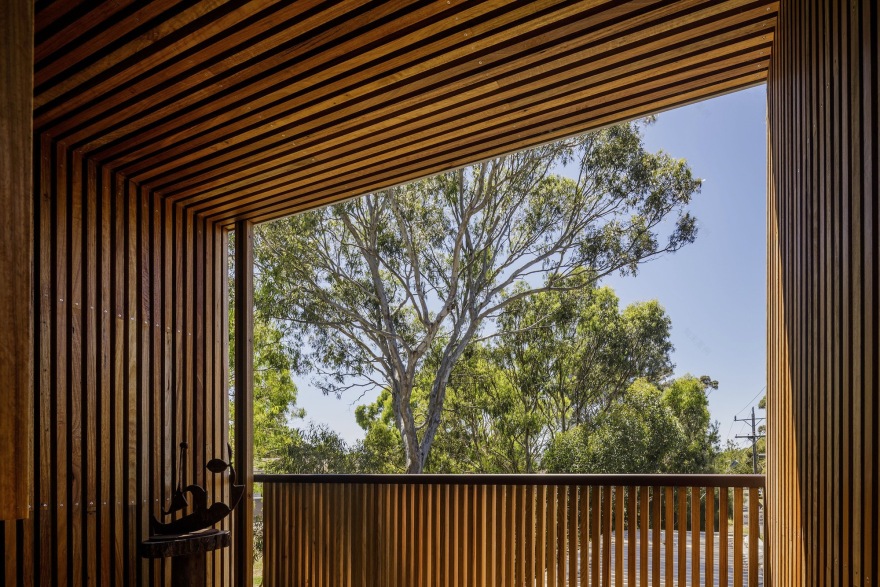
As is usual, the plan works hard to resolve the constraints inherited. To provide privacy from the passing parade, while presenting a generous, homely aesthetic on all sides. To create vistas from room to room over fledgling landscaped spaces, while the built form responds directly to place, and the materiality which quietly mimics the colour and textures of parkland to its northern flank is carried through internally.
The tall / small thing…. well, we played with height throughout, using coffered ceilings to the primary living spaces to mediate the expectations of both clients where, from the corner of the room one registers the bottom of the coffers, giving a cozy, intimate feel. And then when moving through the room the height of the ceiling becomes apparent… problem solved - job done.
Project gallery
客服
消息
收藏
下载
最近


