查看完整案例


收藏

下载
Wanna工作室对马德里大运河沿岸的一座建造于1929年的出租住房进行了改造,使其成为一家四星级的高级酒店。
Wanna, a creative, strategic, independent and multidisciplinary studio, presents its latest comprehensive branding and interior design project. A 1929 rental house that reopens its doors converted into a four-star superior hotel on Madrid’s Gran Vía.
▼项目概览,preview © Caulin Photos
该酒店所在的非凡建筑由建筑师Vicente García Cabrera和Jesús Carrasco Muñoz设计,原本是一间可出租的住宅,后来随着旅游业的兴起逐渐转型为一家旅馆。2019年,一家国外的投资商买下了这座房产,并委托Wanna工作室将其改造为一座包含45间客房的酒店,并为酒店打造全新的品牌形象。
Bienvenir酒店就是在这样的背景下诞生。如其名称所展示的那样,该酒店有着双重的使命:其一是以礼貌且热情的态度迎接和款待客人,其二是为旅行者带来独特的到达体验,使其获得专注、新奇而又平静的感受,如同进入一个完全不同的年代。
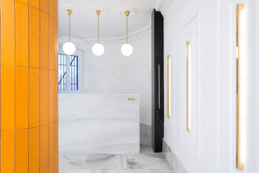
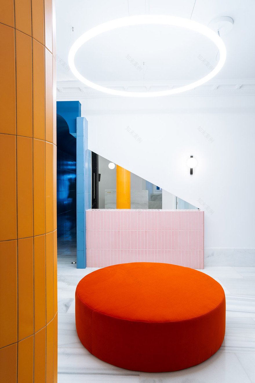
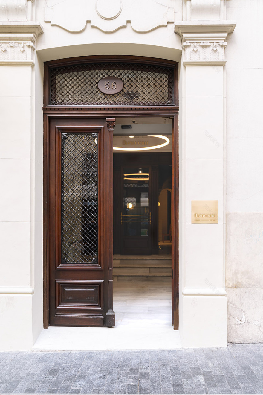
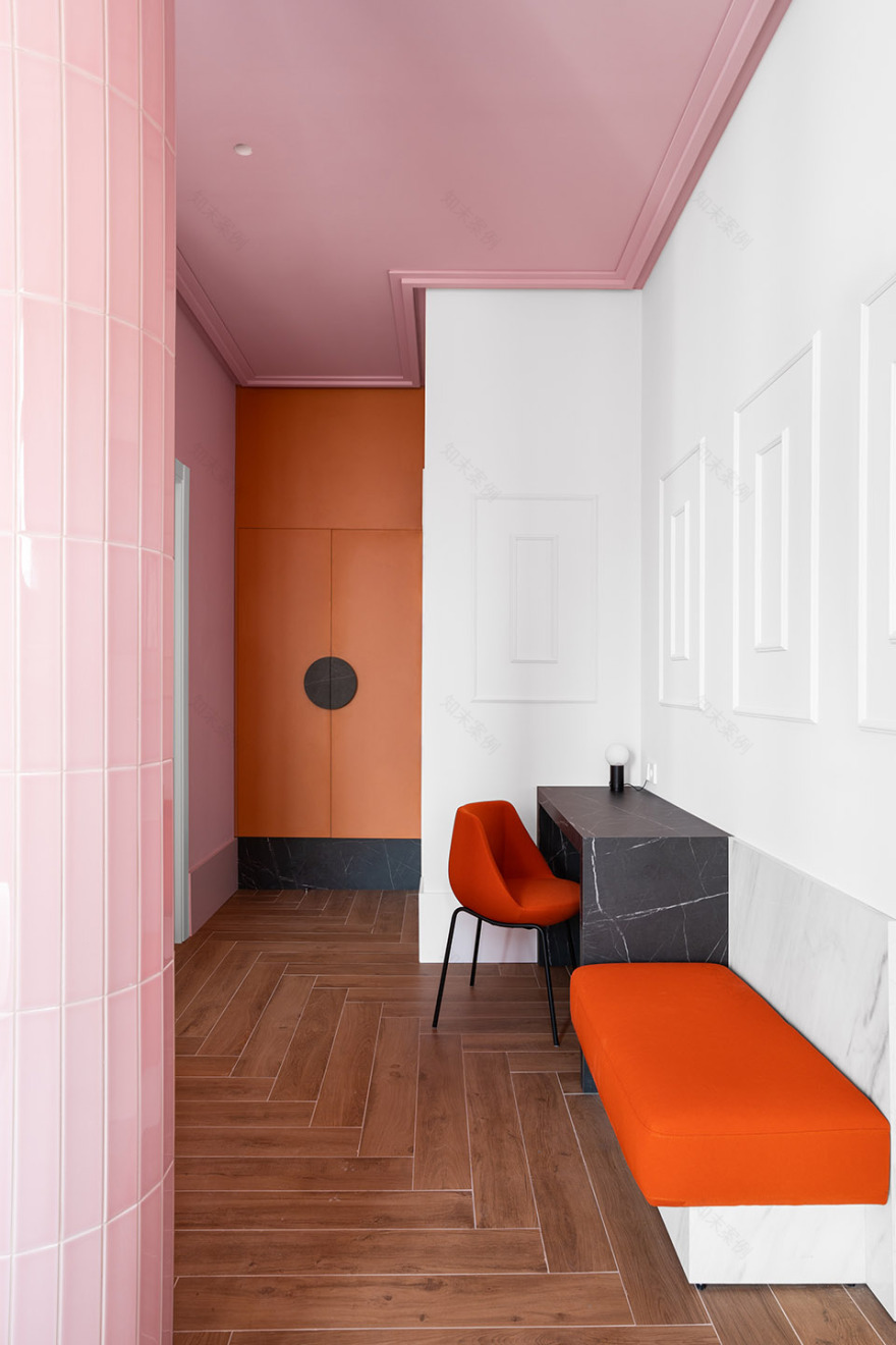
▼入口走廊,entry way © Caulin Photos
The hotel is located in a marvelous building from the 1930s, the work of architects Vicente García Cabrera and Jesús Carrasco Muñoz. Conceived as a rental house, over the years and with the rise of tourism, it became a guesthouse. In 2019 a foreign investment group bought the property and Wanna took on the challenge of transforming it into a 45-room hotel and creating its brand identity.
This is how “Bienvenir” was born, a hotel with a dual mission, as the naming explicitly shows. On the one hand, to welcome newcomers with open arms, courtesy and affection. On the other, to inspire travelers to practice the art of arriving well. With mindfulness, curiosity and calm, as it was in other times.
▼入口区域细节,entrance area detailed view © Caulin Photos
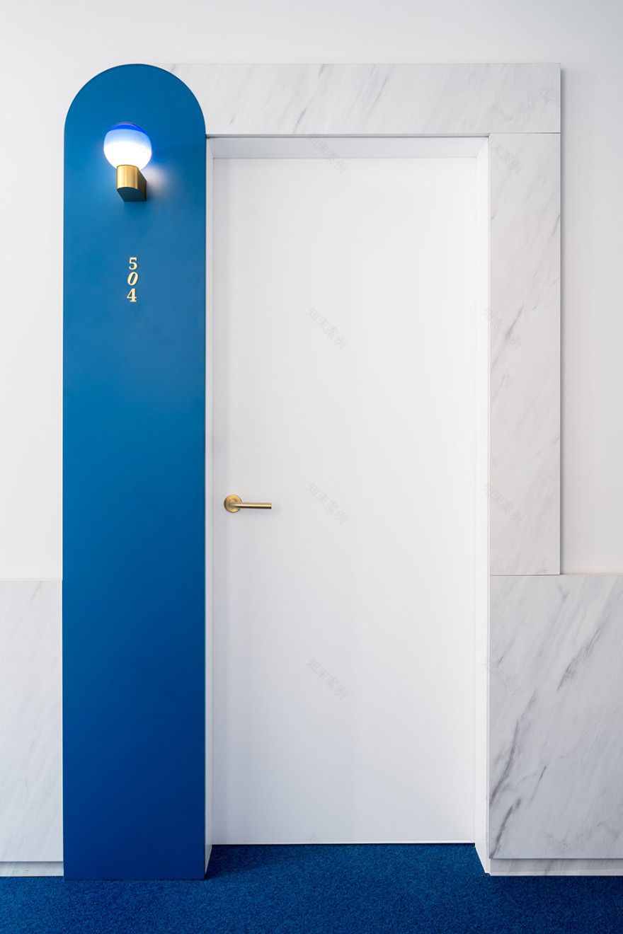
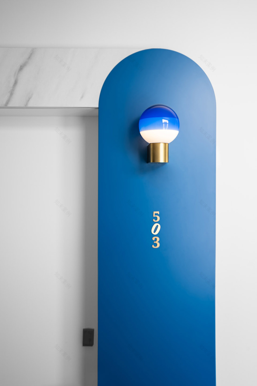
▼酒店房间标识,door signage © Caulin Photos
酒店所在建筑有着怀旧而又不失现代感的外观,这一点亦在全面的翻新过程中得到了保留。一些特殊的建造于1929年的结构受到当地法规的保护,并在新的室内设计方案中得到了修复、整合与加固。完工后的酒店内部呈现为具有极简主义Art Deco风格且几何感强烈的空间,以巧妙又令人耳目一新的方式将酒店的过去与现在融合在一起。
This nostalgic look that does not lose sight of modernity is part of the essence and history of the building. This is also reflected in the visual universe develo- ped by Wanna and in the comprehensive renovation that has been carried out. Proof of this is that certain original elements from 1929, protected by local regulations, have been restored, incorporated and enhanced in the new interior design proposal. The result is a graphic space with a minimalist art deco style. A wise and refreshing fusion between yesterday and today.
▼接待区,reception © Caulin Photos
▼具有极简主义art deco风格且几何感强烈的空间 A graphic space with a minimalist art deco style © Caulin Photos
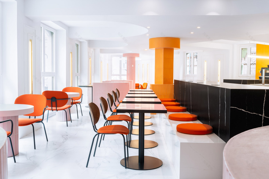
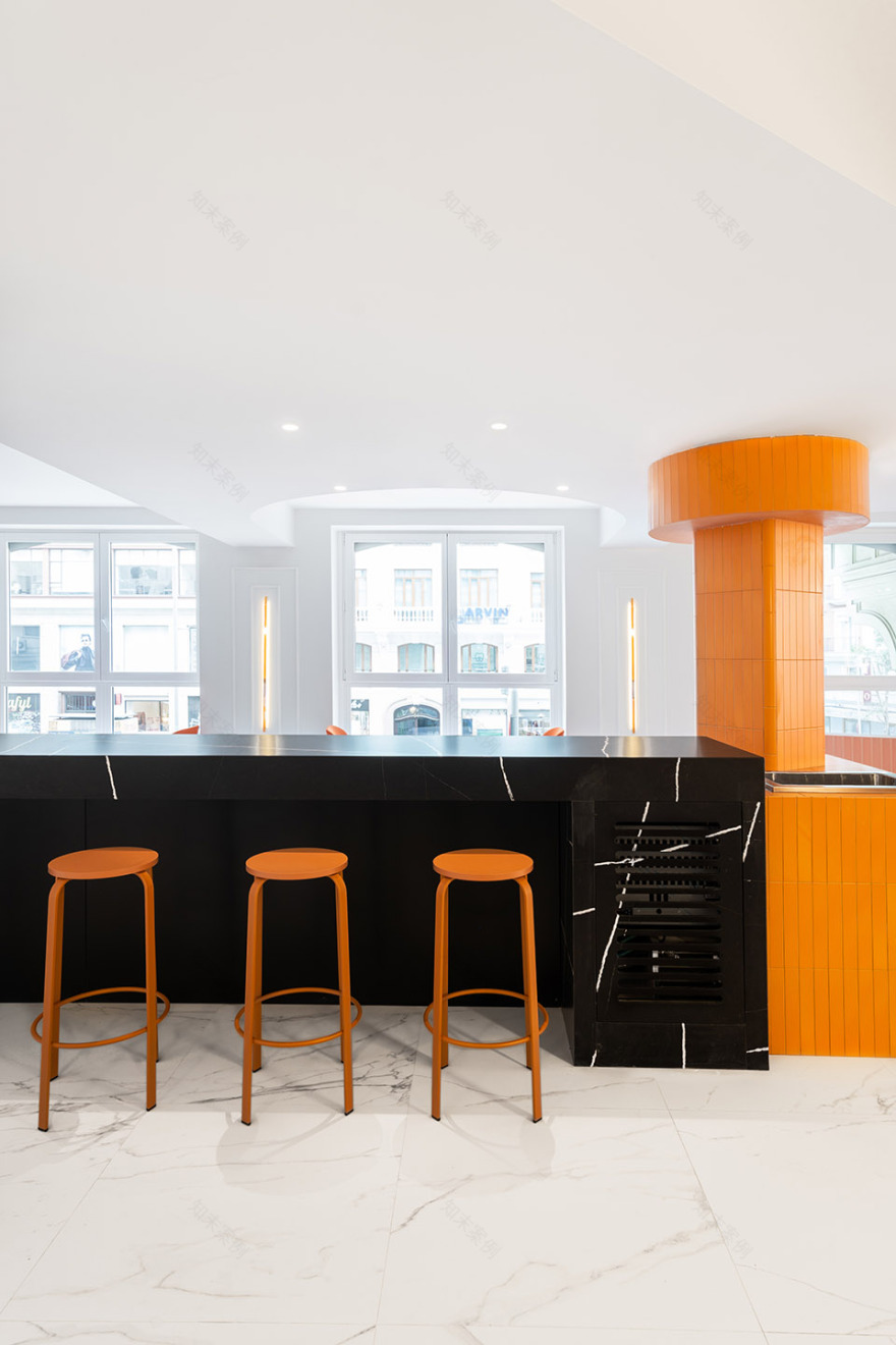
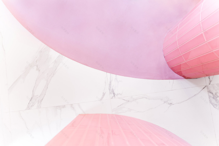
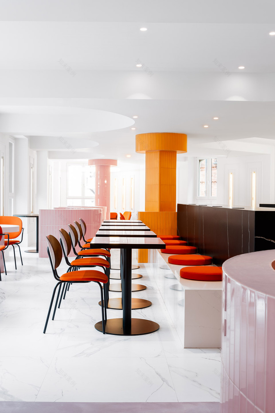
室内空间充满了纯粹的几何图形和对比强烈的色彩搭配。材料的选择以原始建筑作为参考,采用了黑白色大理石、人字形拼接地板和嵌条装饰、彩色玻璃窗以及黄铜细部,同时搭配以独具现代感的金属材料、Porcelanosa陶瓷和Complementto的鲜艳瓷砖。
Pure geometries and a modern and contrasting chromatic palette reign in the interiors. The new materiality is based on the original architecture: black and white marble, herringbone floors and moldings, colorful stained-glass windows and brass details. All of this is combined with contemporary materials, such as metal, Porcelanosa ceramics and vibrant colored tiles from Complementto.
▼休息区域,relax area © Caulin Photos
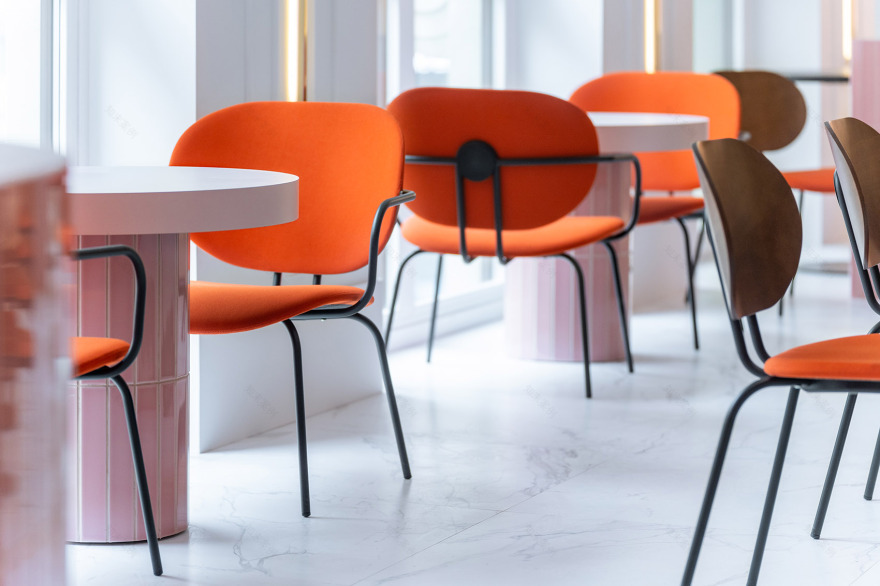
▼座位区,seating area © Caulin Photos
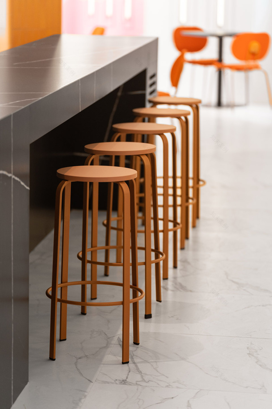
▼吧台,bar © Caulin Photos
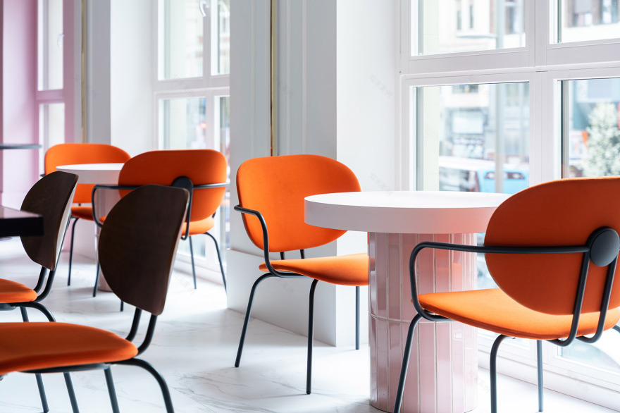
▼窗边座位,seating area along the window © Caulin Photos
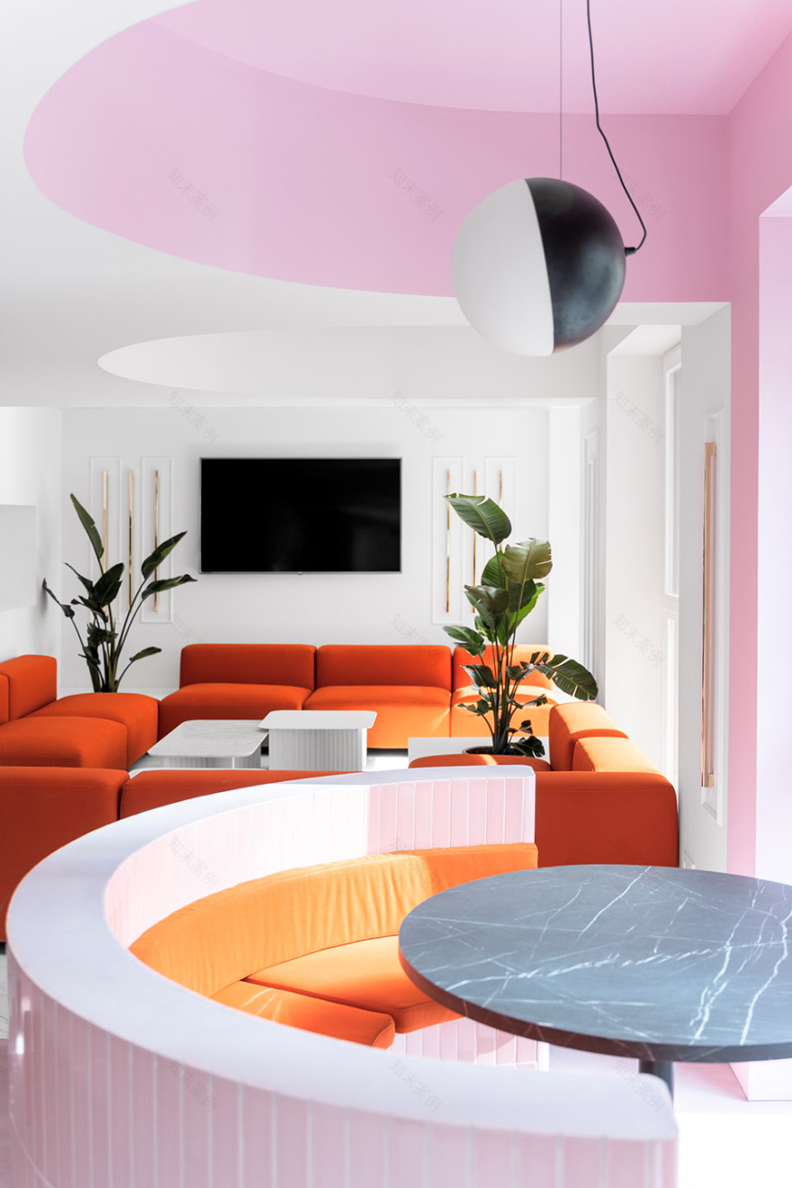
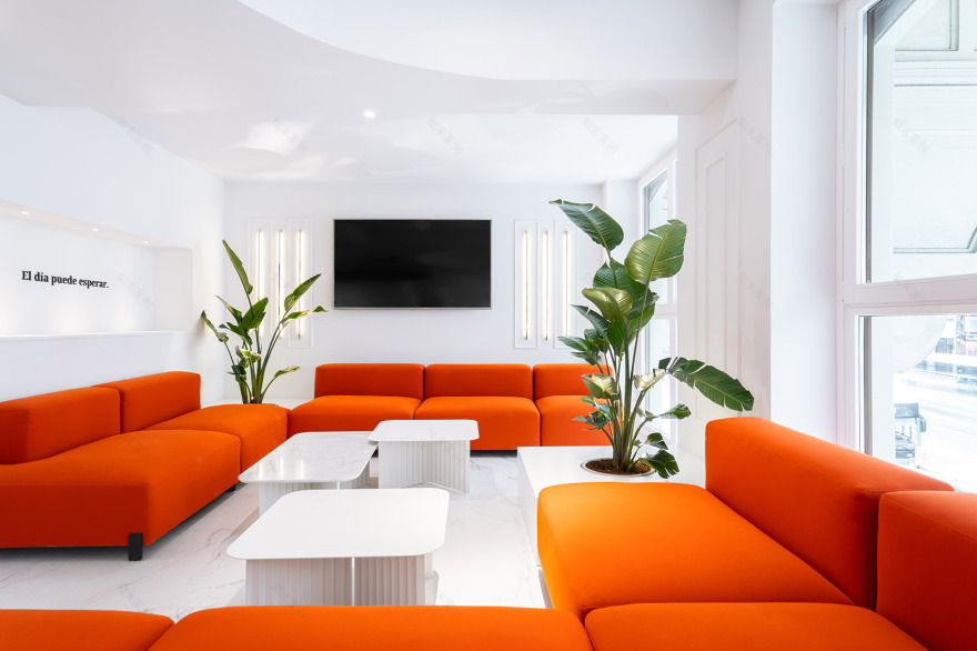
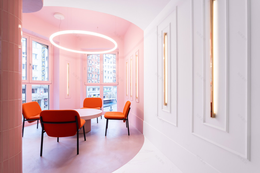
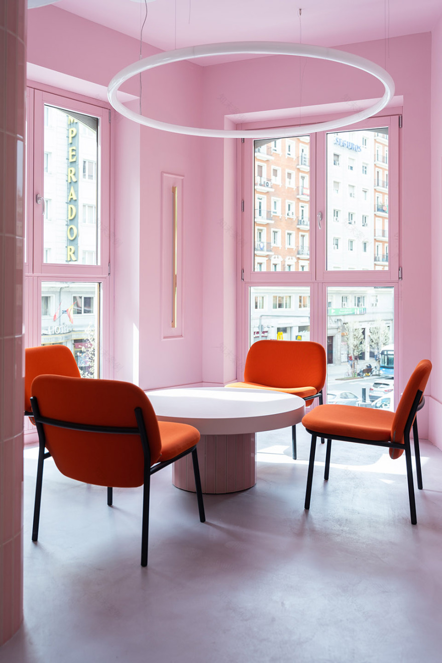
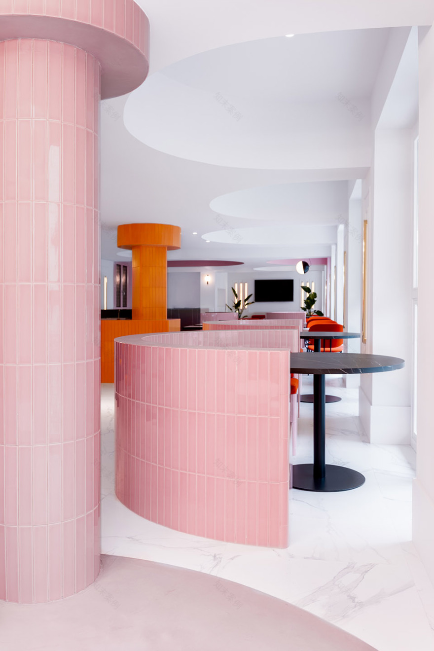
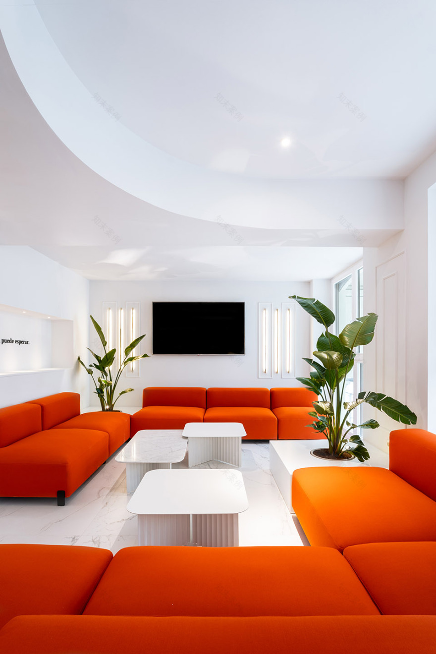
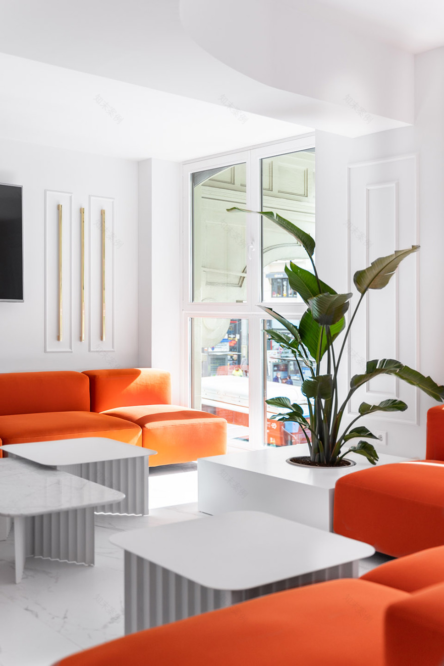
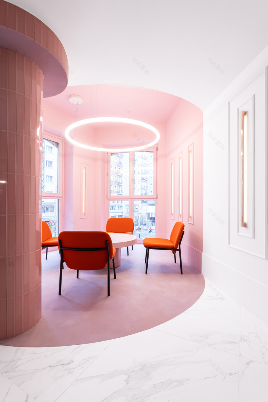
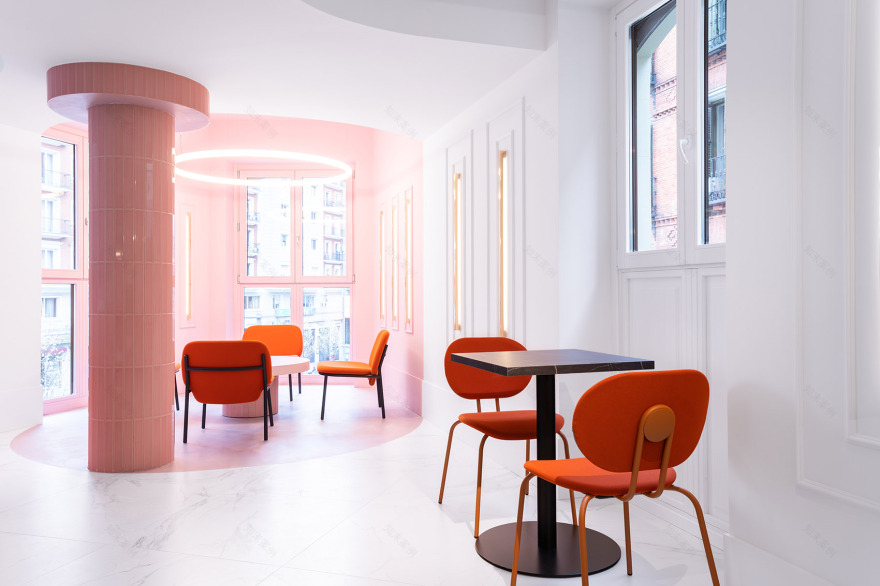
位于一层的起居空间拥有Gran大街的视野,Wanna工作室对其重新进行了分区,使其成为一个拥有三个层级的多功能区域。新置入的半圆形厢形空间能够在最大程度提高隐私性的同时保证开阔的视野。为了营造不同的氛围,不同高度的家具(来自等品牌)与各种几何形状结合在一起,在满足功能性的前提下为空间赋予了连续感。
Wanna has worked on the zoning of the living room, located on the first floor and with exceptional views of Gran Vía, to turn it into a multifunctional and flexible space on 3 levels. This is achieved through semicircular, loge-like structures that maximize privacy and allow you to see without being seen. To create different atmospheres, the studio has combined low and high furniture (from brands such as Ondarreta, Sancal and RS Barcelona) with other geometric shapes that give continuity to the functional signage, also designed by the studio.
▼半圆形厢形空间能够在最大程度提高隐私性的同时保证开阔的视野 © Caulin Photos semicircular, loge-like structures maximize privacy and allow you to see without being seen
▼沙发休闲区,lounge area with sofas © Caulin Photos
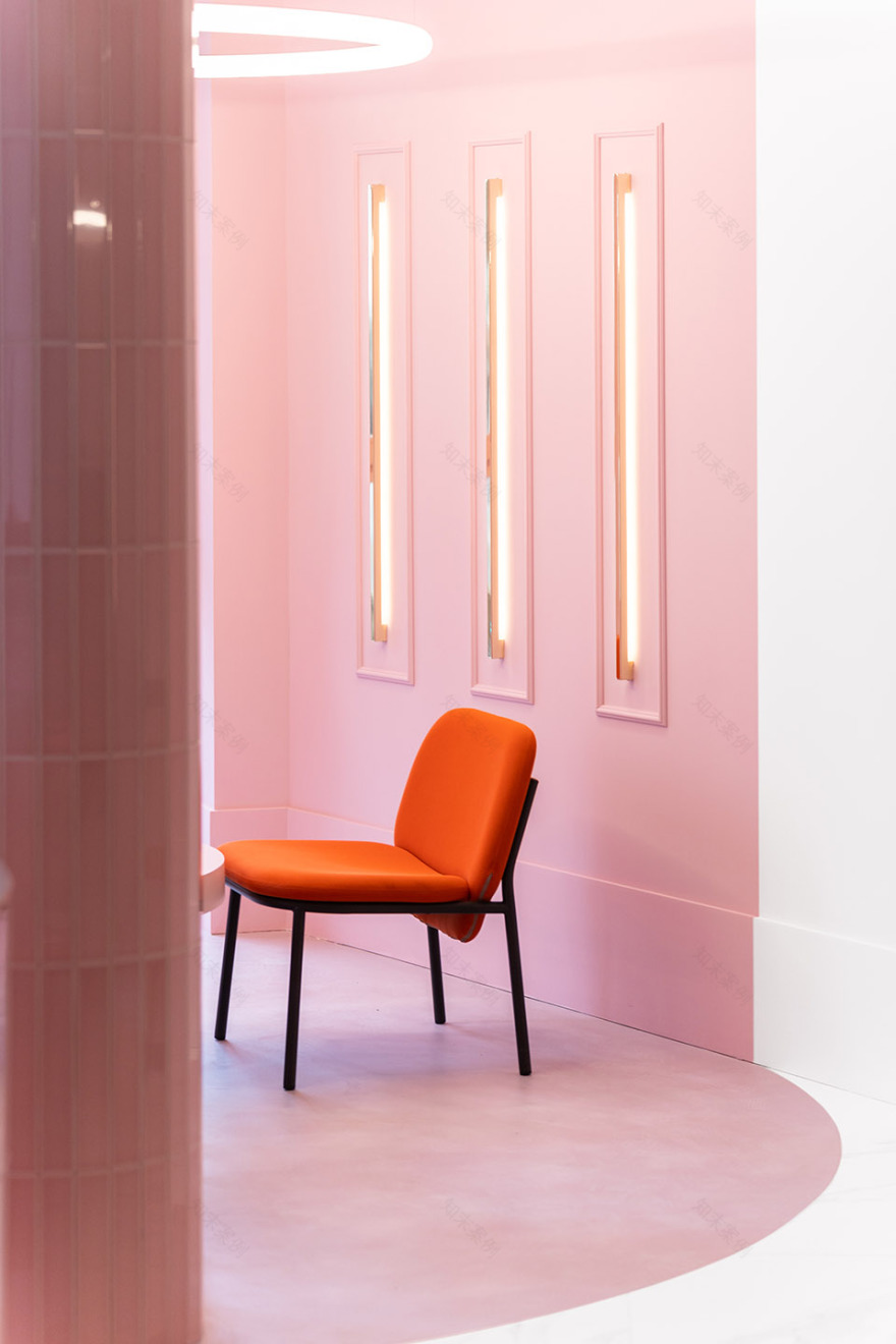
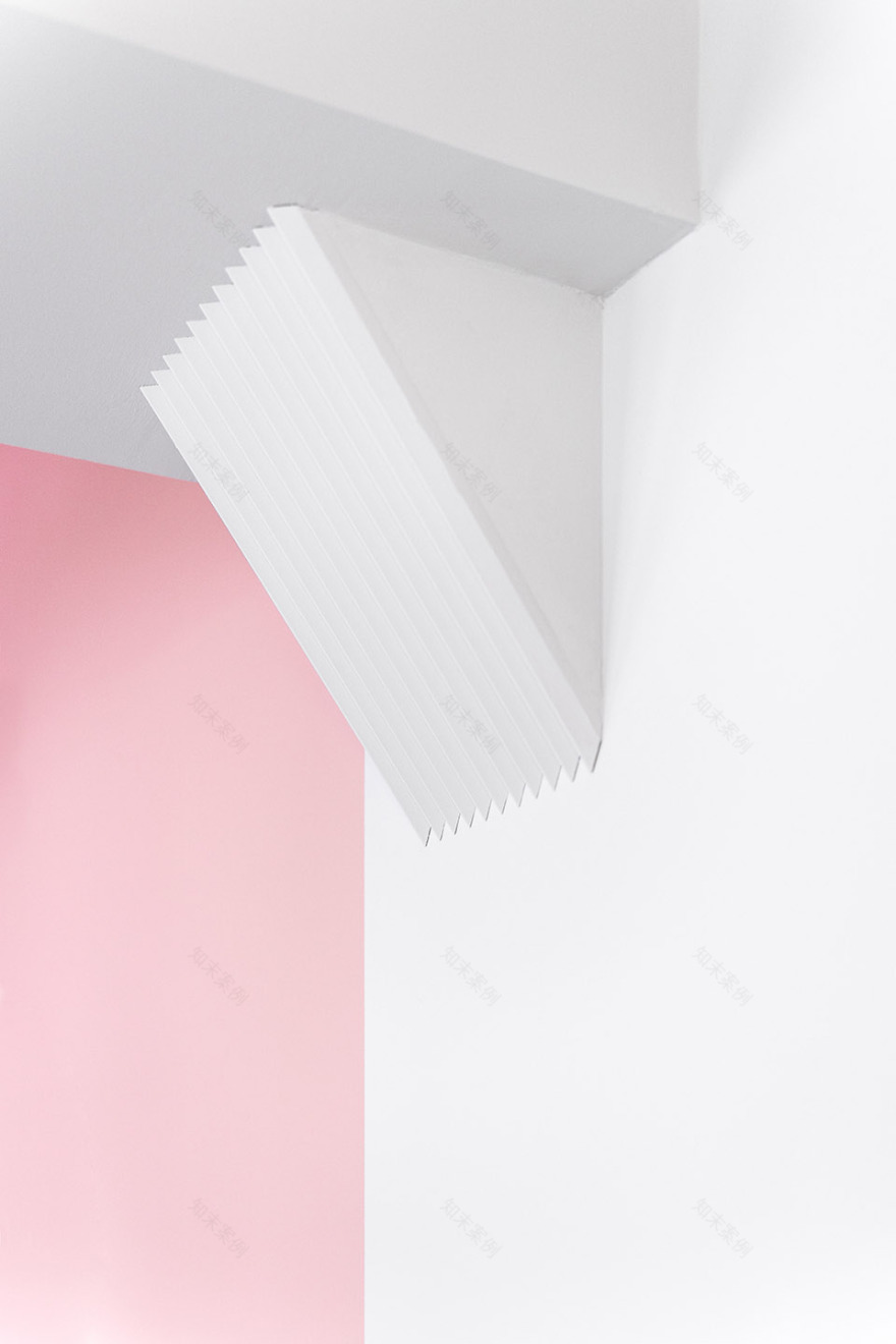
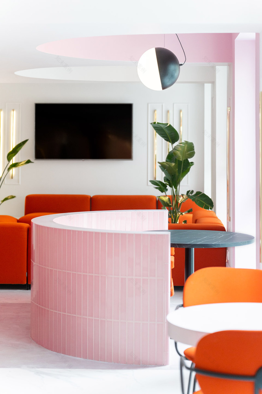
墙面上的灯具被嵌条装饰框在内部,与空间中的其他几何元素共同讲述出一个完整的故事。这是一个充满趣味的混合性的空间,客人们可以在此享用早餐、工作或度过休闲的时光。
The moldings are living their second golden age by framing light fixtures of their own design and the storytelling of the brand is materialized thanks to the graphics in the spaces. The result is a room of interesting mixes, perfect for breakfast, work or disconnecting after an exciting day. Whether alone or as a group.
▼墙面上的灯具被嵌条装饰框在内部 © Caulin Photos The moldings are living their second golden age by framing light fixtures
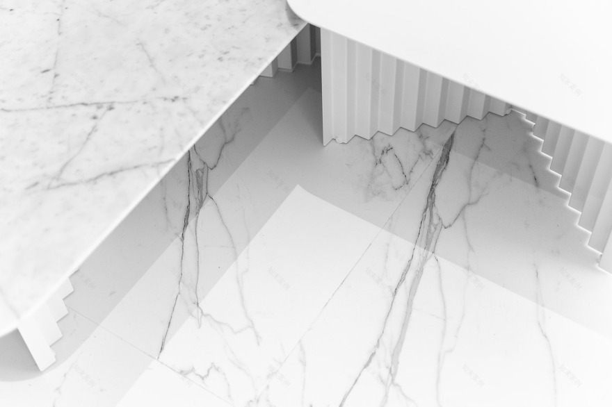
▼地面细节,floor detail © Caulin Photos
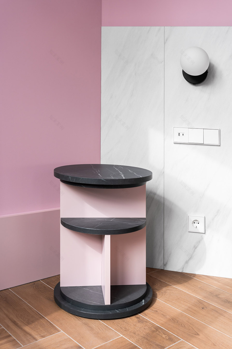
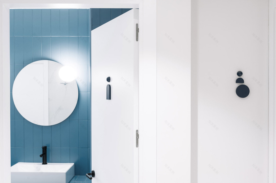
Wanna工作室还为客房设计了布局紧凑但观感轻盈的家具,将睡眠区和工作区结合起来以节省空间,并借助柔和的色彩来营造适合睡眠的舒适氛围。浴室的设计采用了另一种精致的风格,并置入了特别为项目定制的立柜。黑色和白色等中性色彩搭配一抹亮眼的蓝色,激发出空间的整体活力。
In the bedrooms, Wanna has designed a compact, yet visually light piece of furniture that combines sleeping and working areas to save space. This structure coexists with soft colors that favor rest. The result is comfortable and cheerful rooms. While in the bathrooms, the studio has opted for a refined style, with a bathroom cabinet of its own design, neutral colors, such as black and white, and a touch of blue to energize the whole.
▼客房内部,guest room © Caulin Photos
▼定制家具将睡眠区和工作区结合起来以节省空间 © Caulin Photos The bespoke furniture combines sleeping and working areas to save space
▼内饰细节,furniture details © Caulin Photos
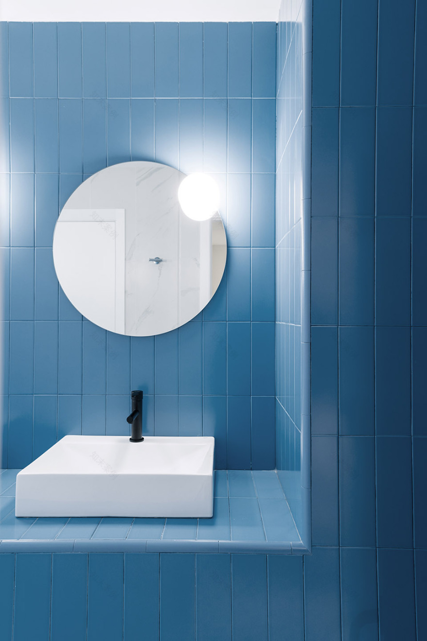
▼浴室,bathroom © Caulin Photos
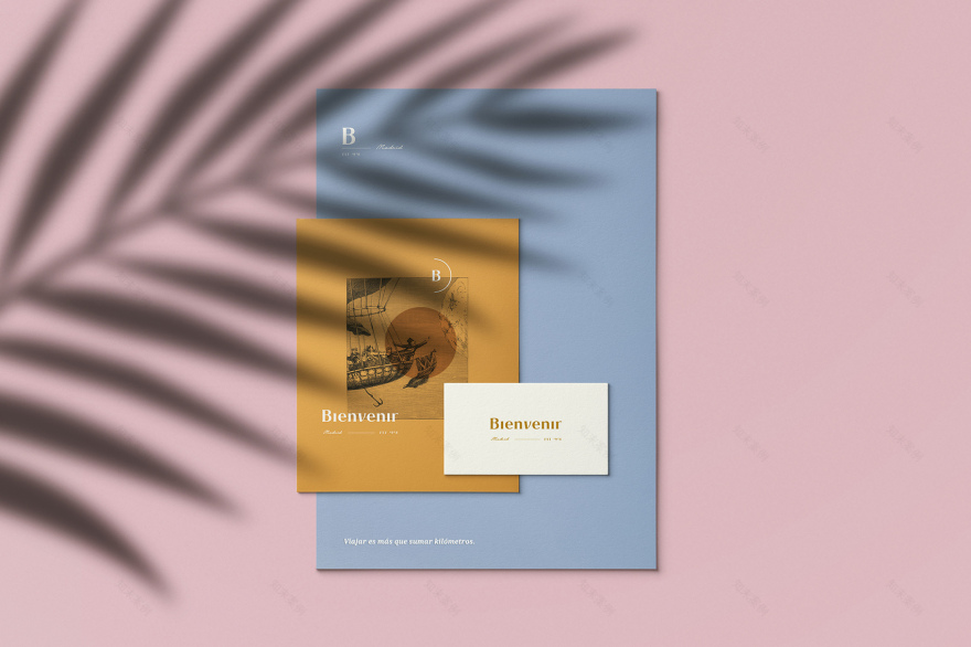
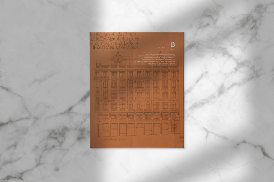
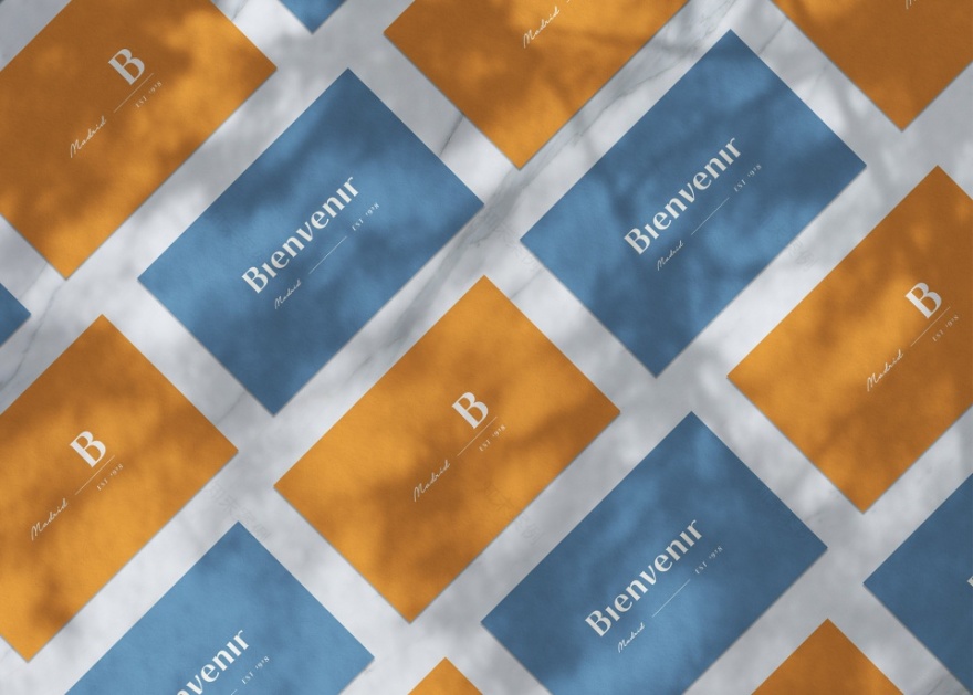
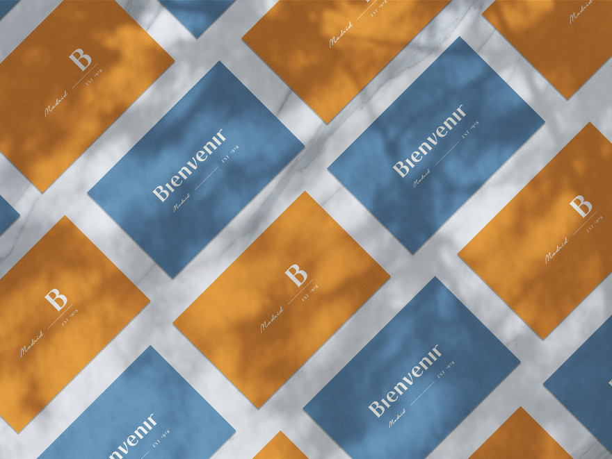
▼品牌形象设计,branding © Caulin Photos
客服
消息
收藏
下载
最近


