查看完整案例

收藏

下载
项目概况
Project Overview
应Tag Espresso的邀请,有余建筑和TUO建筑设计事务所为其设计面积约56平米的成都万象城店。业主期望通过此次设计更新品牌店铺形象。
At the demand of Tag Espresso, Studio yo-u and Atelier TUO were commissioned to design a 56-square-meter store in Chengdu’s MixC Mall. The client sought to update the brand’s store image through this design project.
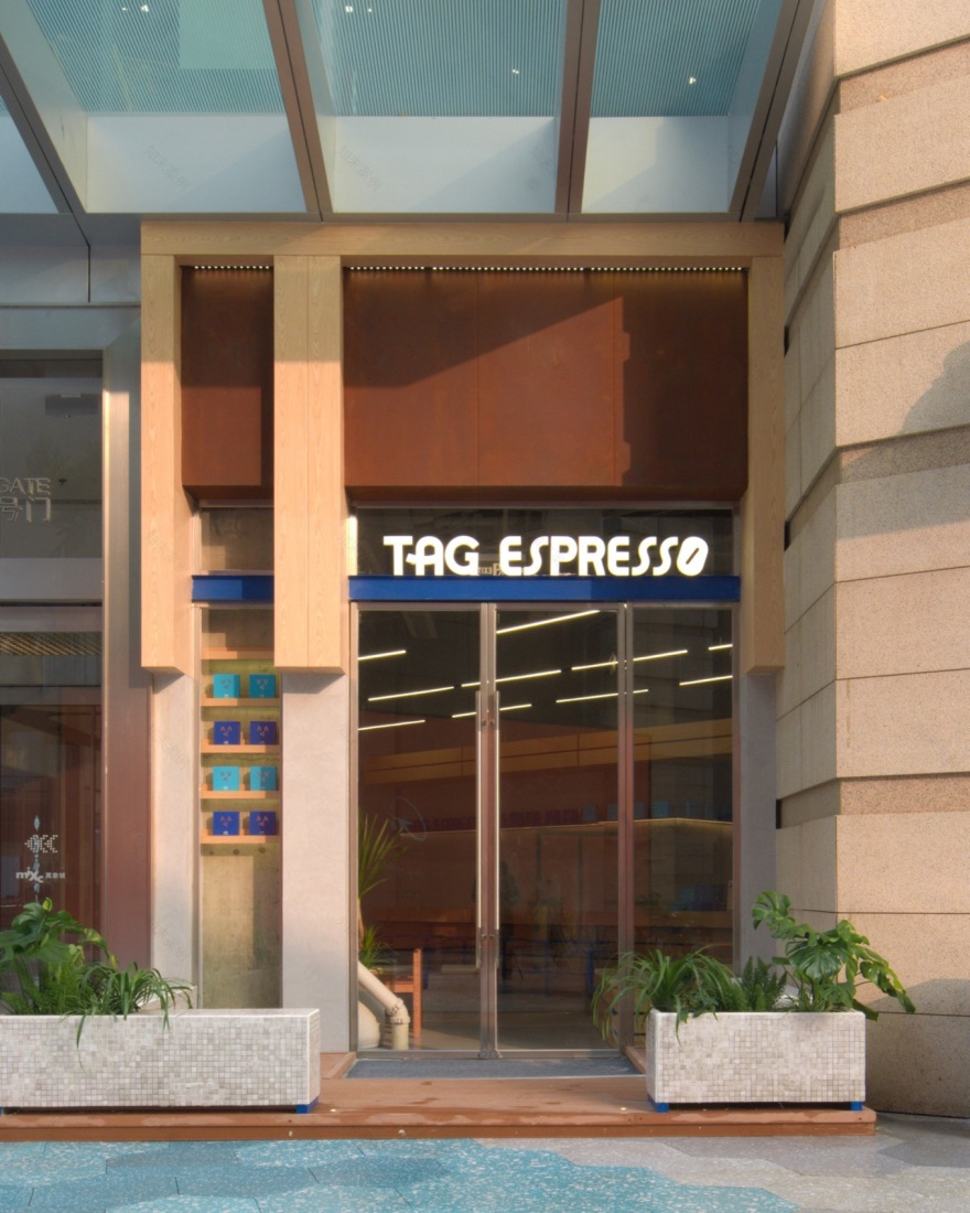
▼门头,storefront © A Yong
空间概念
Spatial Concept
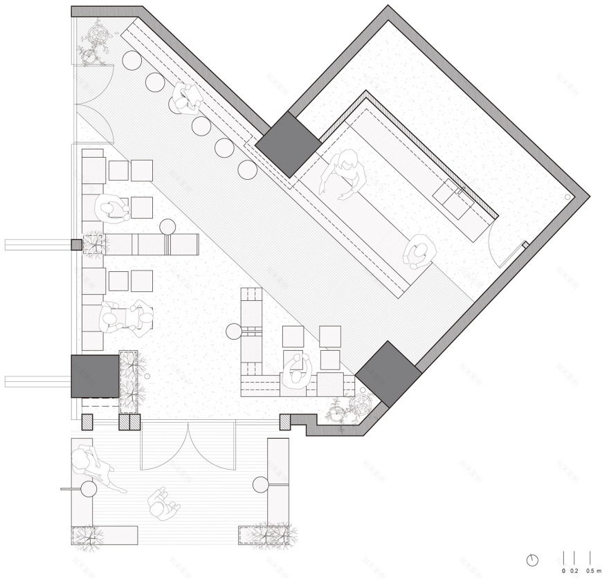
该店铺位于成都万象城的一个角落,在不足60平方米的空间内,有两个出入口,三根较大的结构柱和不规则的曲折周长。面对相对困难的场地条件,我们将设计的重点放在对不规则平面的优化上,包括空间的梳理、动线的安排和采光的改善,从而营造一个舒适而流畅的消费环境。设计方案在店铺最宽处设置了一条朝向大门的长条形吧台,将整个空间分为后勤区和客座区。吧台的设计不仅划分了功能区,也使原本琐碎的空间变得整体化和统一化。客座区相较之前,成为一个统一的整体空间,而光线较弱的区域则被划分为后勤区,以最大化利用空间资源。
Located in a corner of Chengdu MixC Mall, this store features two entrances, three substantial structural columns, and an irregular perimeter within its compact 60-square-meter area. Confronted with challenging site conditions, the design prioritizes optimizing the irregular floor plan, including spatial organization, traffic flow arrangement, and lighting improvement, to create a comfortable and fluid consumer environment. The design solution introduces a long bar counter oriented towards the main entrance at the widest part of the store, dividing the space into a service area and a seating area. The bar counter not only delineates functional zones but also unifies the fragmented space into a cohesive whole. The seating area becomes a unified spatial experience, while the less illuminated areas are designated as service zones, maximizing the use of available space.
▼空间概览,space overview © A Yong
▼客座区,seatings © A Yong
材料与工艺
Materials and Techniques
材料上,我们本着经济的原则,在吧台和客座区采用灵活布置的道具,墙面和天花顺应原有条件,以涂料为主。这样的策略不仅有效控制了成本,还减少了对施工现场精确性的要求,缩短了现场施工时间,将高污染的工序尽量控制在工厂内完成。
From a material perspective, we adhered to a cost-effective approach by utilizing flexible fixtures in the bar and seating areas, while the walls and ceiling were primarily treated with paint to align with existing conditions. This strategy effectively controlled costs, reduced the precision requirements on-site, shortened the construction timeline, and shifted high-pollution processes to the factory as much as possible.
▼灵活布置的道具,flexible fixtures © A Yong
吧台的设计是整个空间的中心,7米长的长条形吧台采用整段的香杉木实木方材,重量感十足,强化了吧台在咖啡店中的重要性。每根横截面尺寸为150mm x 150mm。木方之间加入品牌形象的表情符号制作而成的垫片,然后用丝杆链接整体,木方之间1.5厘米的缝之间,品牌形象色隐约可见。粗粝温暖的原木,细腻整洁的马赛克砖,搭配品牌蓝色,塑造了TAG ESPRESSO店铺的新形象。
The bar counter, the centerpiece of the space, spans 7 meters and is constructed from solid blocks of Japanese cedar, providing substantial weight and reinforcing the bar’s significance within the café. Each block measures 150mm x 150mm in cross-section, with spacers featuring brand logo emoticons inserted between them, held together with threaded rods. The brand’s signature color subtly emerges through the 1.5-centimeter gaps between the wooden blocks. The juxtaposition of the rustic warmth of raw wood, the refined finish of mosaic tiles, and the brand’s signature blue creates a fresh and distinct image for the TAG ESPRESSO store.
▼粗粝温暖的氛围,rustic warm atmosphere © A Yong
▼平面图,plan © A Yong
▼立面图,elevation © A Yong
项目名称:TAG ESPRESSO 成都万象城店
项目类型:咖啡店室内设计
项目地址:成都
场地面积:56㎡
设计时间: 2023.10-2023.11
施工时间:2023.12 –2024.01
设计团队:余紫芝,林拓,吕欣田,黄晓雨
摄影摄像:阿永
主要材料:香杉木, 马赛克砖, 烤漆金属
Project Name: TAG ESPRESSO Chengdu MixC Store
Project Type: Interior Design
Location: Chengdu
Site Area: 56 ㎡
Design Period: October 2023 – November 2023
Construction Period: December 2023 – January 2024
Design Team: Yu Zizhi, Lin Tuo, Lv Xintian, Huang Xiaoyu
Photography & Videography: A Yong
Primary Materials: fragrant cedar, mosaic tiles, lacquered metal
客服
消息
收藏
下载
最近


