查看完整案例

收藏

下载

翻译
Architects:Man Office
Area:360m²
Year:2024
Photographs:Deed Studio
Lead Architects:Hossein Ebrahimzade
City:Mashhad
Country:Iran
Text description provided by the architects. Initially, while designing this house, we aimed to resolve a fundamental question: how can we revise the architectural approaches of past decades (specifically, the architecture of 1970s Iranian houses in this project). While avoiding nostalgic value judgments that result in fleeting emotions, we wanted to find a solution to revive and utilize elements that have become obsolete due to the expansion of mass production or economic and market forces, such as elements that have significantly contributed to durability, proper functionality, and resistance to erosion. A specific example in this project is the appropriate separation of functional spaces, replacing synthetic and resin-based materials with forgotten materials like washed cement, which requires skilled craftsmen's artistry, and using materials with small tiles that perform better against contraction and expansion.
Afterward, we focused on the contextual necessities of the project. This house is in the "Nakhrisi neighborhood" of Mashhad, an economically underdeveloped area. Given the characteristics of this neighborhood and the project site, it became clear that considering the disjointed and unattractive urban landscape and the narrow alley width, eliminating the view from inside to outside and maximizing the closure of the facade could enhance security and reduce visual chaos within. This decision led to the formation of three main elements in this house, all centered on ensuring adequate natural light and ventilation, creating internal views, and organizing spatial connections.
The common thread among these three elements is the activation of the Z-axis functionality in the house, originating from the various height levels within the project:
1. Terrace-Exhaust: For the kitchen, which is located behind the facade, and the adjacent dining area, we designed a double-height terrace and placed a T-shaped structure above it, allowing light to pour down from the glass on top and air to ventilate (according to its form). Additionally, to control the ambient light and optimize airflow, a folding door was installed on its outer edge so that this terrace, with its multifunctional capabilities, can enhance spatial quality.
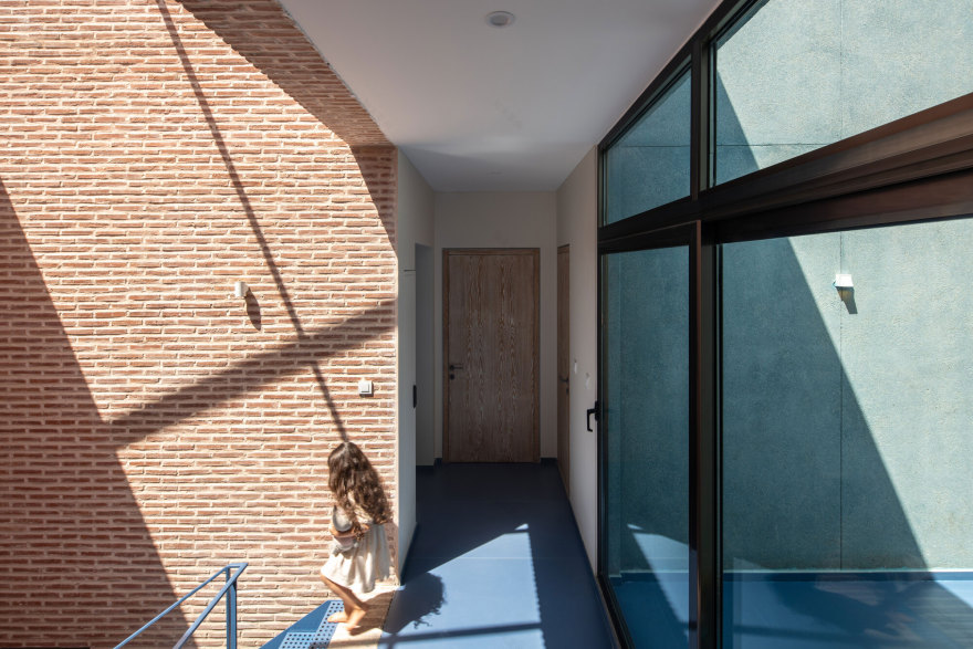
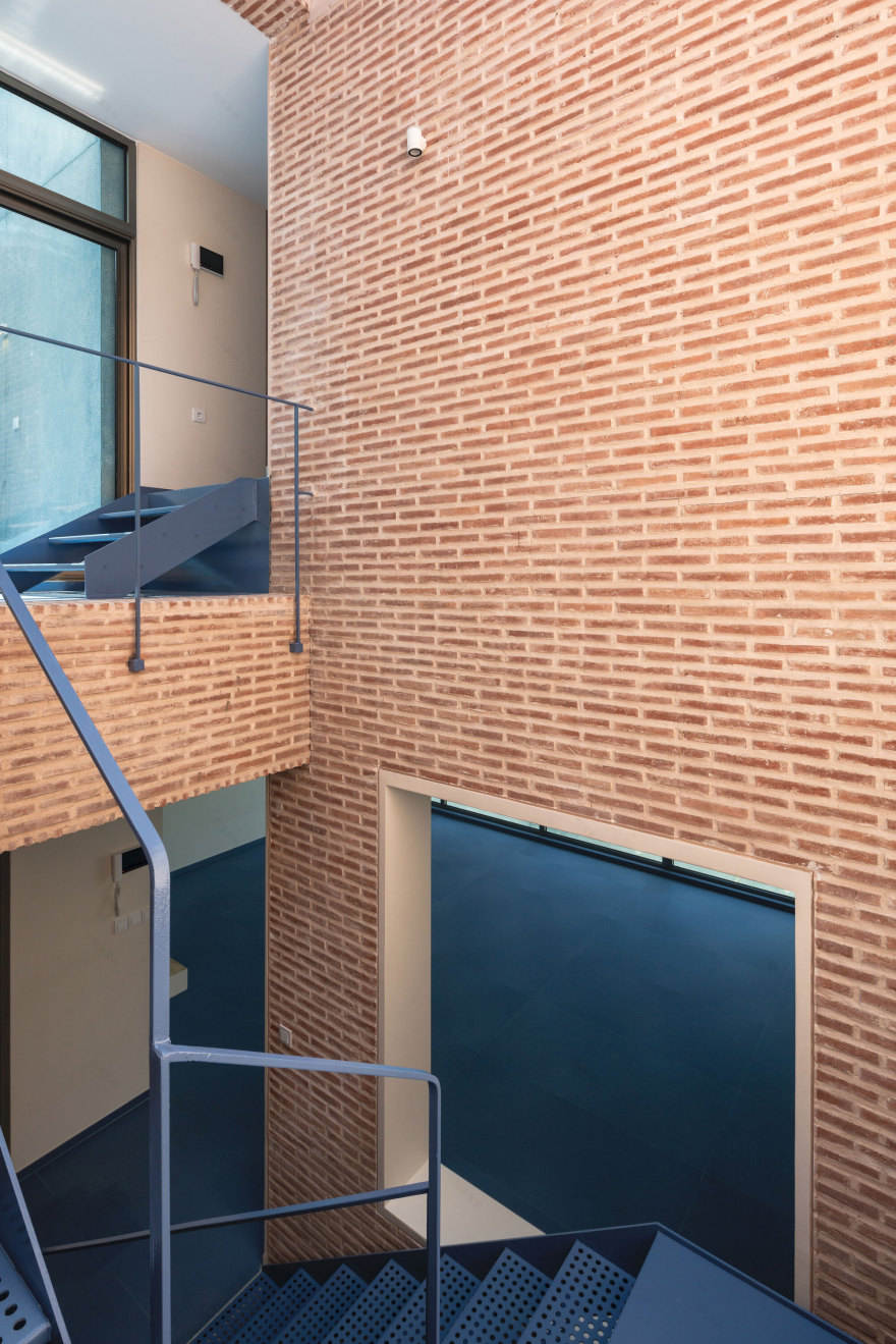
2. Void-overlook: This void in the center of the building not only brings a piece of the sky, light, and the passage of time into the house but also contains two important elements of the house. The main staircase connects the living, dining, and kitchen areas to the bedrooms, and the openings known as snooping windows are common in the architecture of the 1970s, which I prefer to call overlooks. The main feature of these overlooks is that they create a shadowed oversight from one space to another without compromising the independence of the spaces.
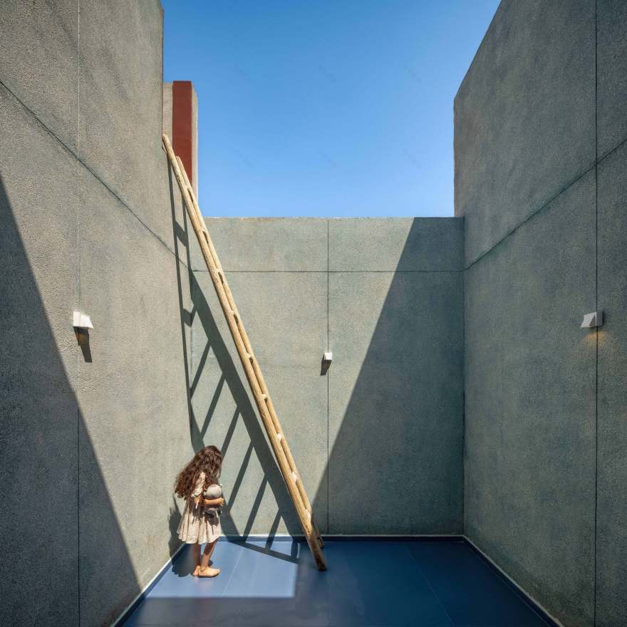
3. Two courtyards: one on the southern side of the property and another terrace-courtyard in the middle of the second floor, serving as a sitting area with privacy.
Project gallery
客服
消息
收藏
下载
最近


