查看完整案例

收藏

下载

翻译
In Japan, the concept of Wabi Sabi has long been a cornerstone of design, the notion that there is perfection in the imperfect, and that beauty goes far beyond what has traditionally been deemed the norm, something that is very much evident in this Chinese salon. SHI Space, by FFFUN, is Shanghai’s One-stop Beauty Centre, and the perfect, imperfect manifestation of this wabi sabi approach to beauty. Almost as if from a scene in a Denis Villeneuve film, the space dances between the hyper-futuristic and the raw, industrial with ease.
A multi-use building, the ground floor is a dedicated gallery and retail space, with the first floor making up the beauty centre and finally, a private event space on level three.
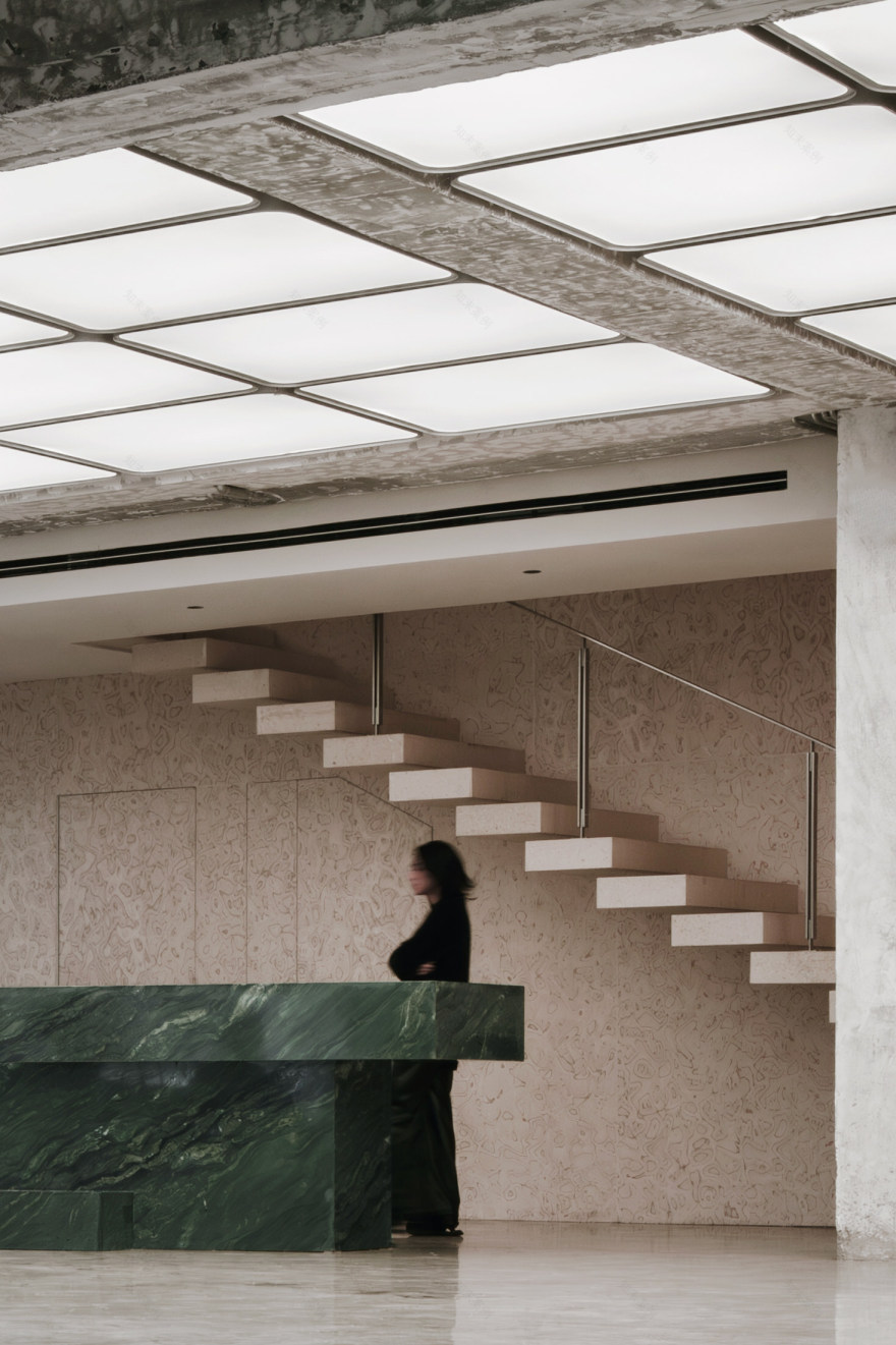
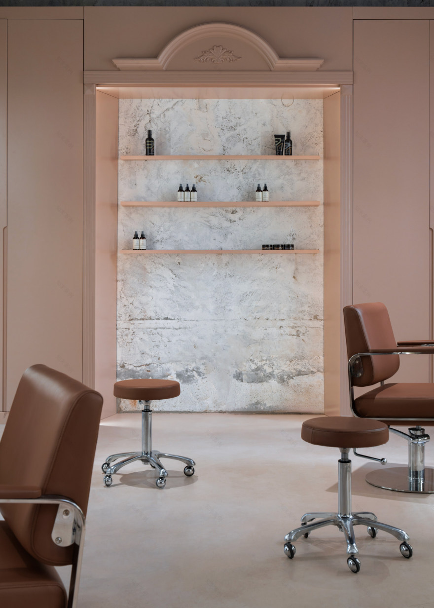
The gallery exhibits gelato colours of creamy pink and a vibrant, almost iridescent green stone reception desk, repeated upstairs in stone noir. The Miesian sandy stone slabs that lead you to the staircase seem to pay homage to the Farnsworth house as the space emits a similar sense of serenity and clarity of purpose. This is further enhanced by the lightbox Shoji-screen ceiling, once again adding to the sense of futurism and shedding light on the rough edges of the existing building framework from which this salon space has bloomed.
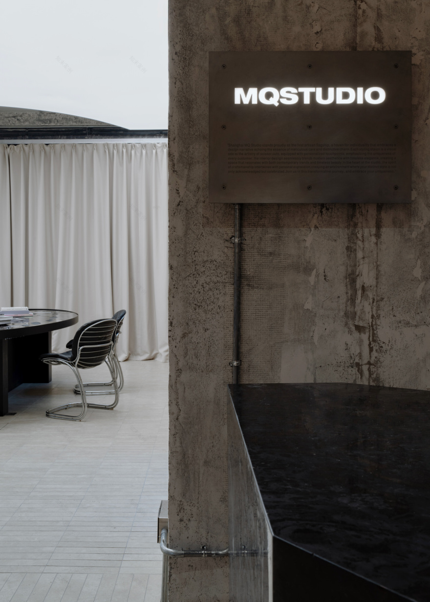
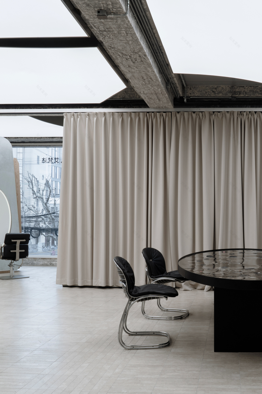
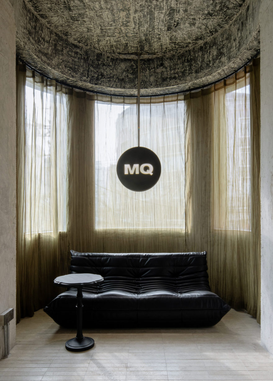
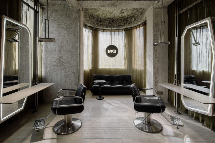
MQ Studio on level two ties together the imperfect structural framework of the building with the softer, considered interior elements. Here, the greens and pinks are repeated with purpose, as they dominate whole rooms at a time, displaying products and forming wallpaper backdrops for clients getting their makeup and skincare done. A theme of rough, rendered concrete structure emerges, juxtaposed by pillowy pink and gentle green curtains adjacent, softening the blow behind the salon mirrors.
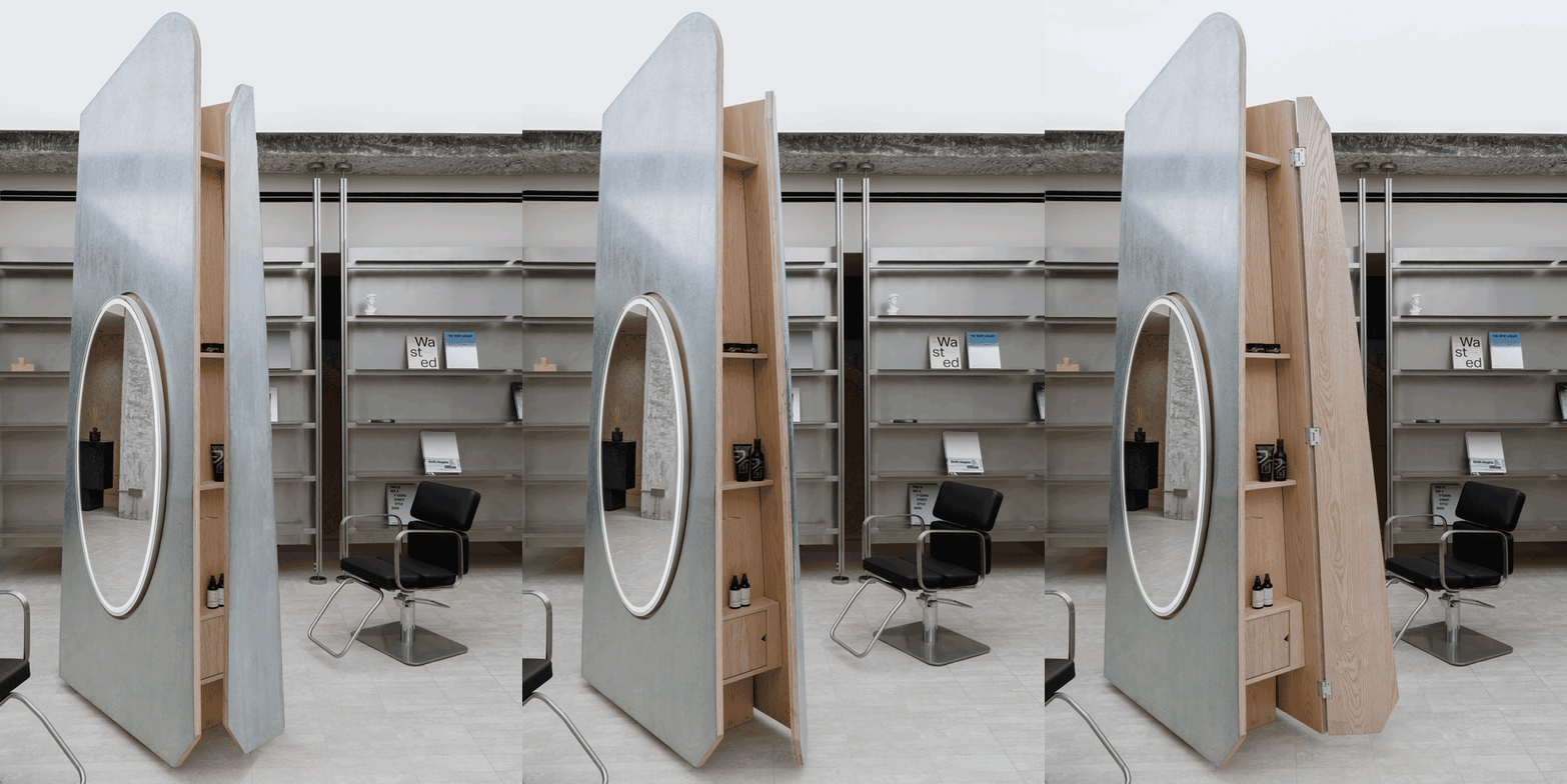
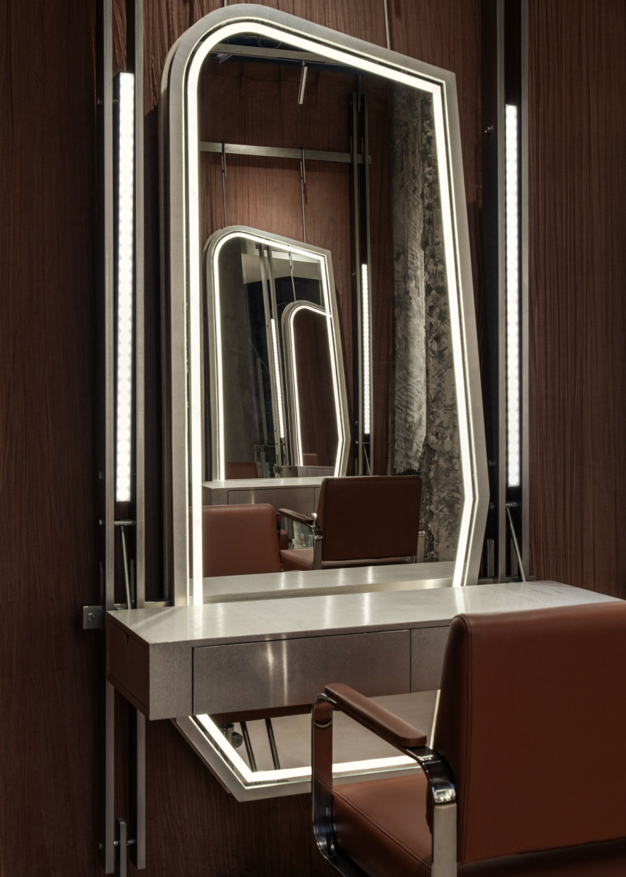
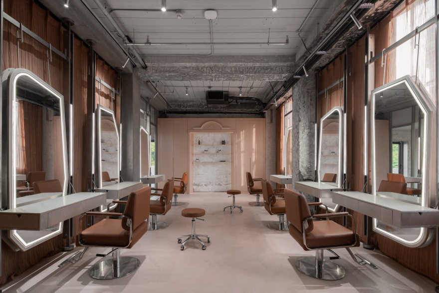
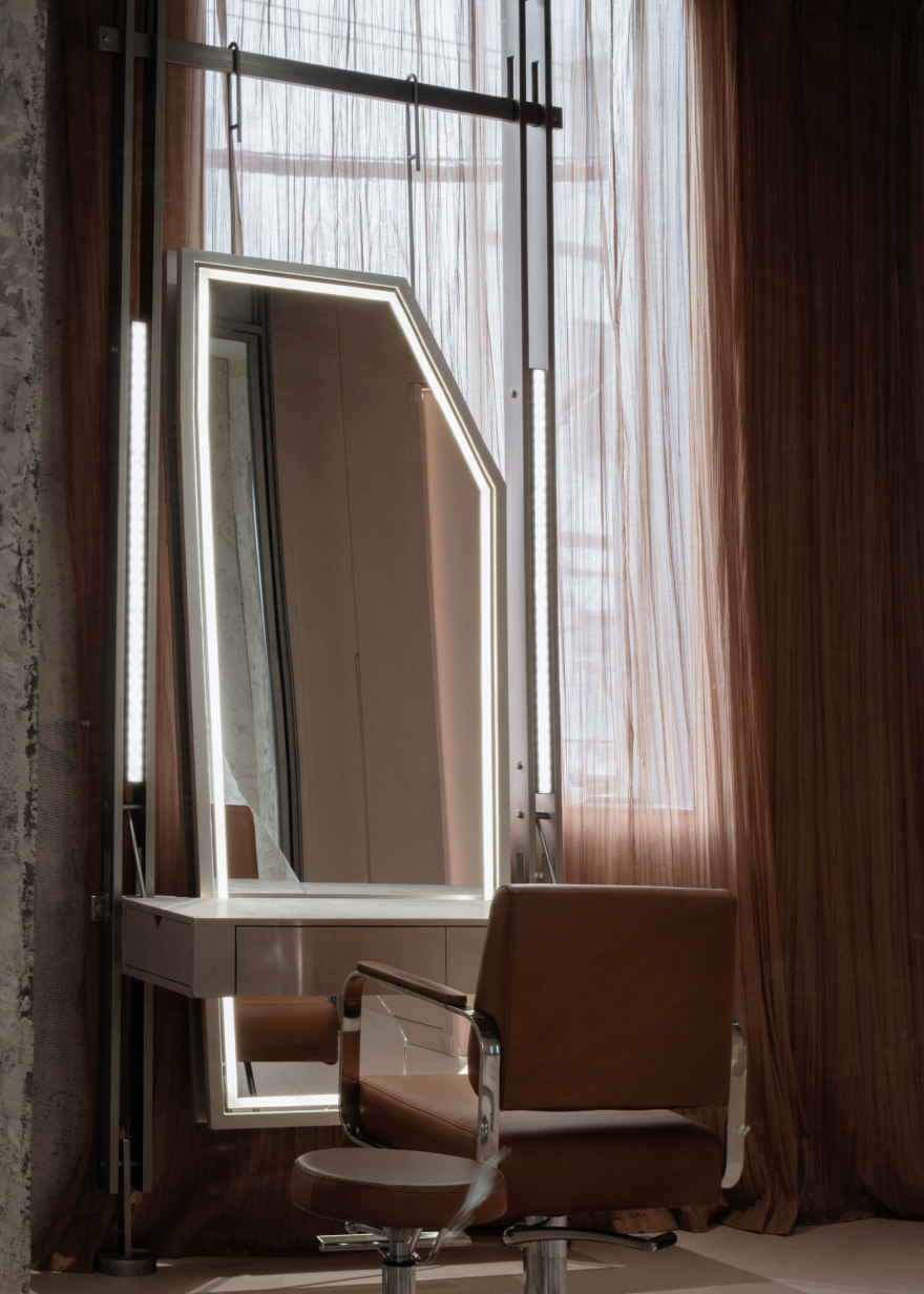
The spatial gestures in the hair salon speak to the artistry and linework associated with hairstyling, with sculptural cuts and directional linework evident in the custom mirrored cabinets curated throughout. Arranged in a format that mimics that of Stonehenge, these mirrored monoliths and their abstract forms add interest in intrigue to the space, yet another nod to the wabi sabi nature of it all. Following suit, the LED-linework throughout further frames the features of the varying salons and their clients alike.
Upstairs, the private event space holds its own, as we see mauve and musk toned carpets and walls, replete with intricate and eclectic artwork, get simultaneously challenged and complemented by the bright, lime green dining table circling the centre. Equal boardroom and gallery, it hints at private conversations and expensive considerations to be had inside. It is no small feat creating a sense of cohesion across three floors, and to do so with clear direction is even harder, but apparently not for the design team at FFFUN, who managed to prove that when it comes to buildings, beauty is skin deep.
[Images courtesy of FFFUN. Photography by AY STUDIO 就.]
客服
消息
收藏
下载
最近


