查看完整案例

收藏

下载

翻译
In the sixties, minimalism as an art movement came about as a reaction to Abstract Expressionism. It wasn’t until the eighties that it started showing up in architecture, and even then, it didn’t quite become an official movement in this space. That being said, evidence of minimalism in design is as abundant as its concept is simple, and in the hospitality world, that’s no small feat. We’re used to wine-and-dine spots emulating the energy that is often associated with the activity itself, which makes it all the more impressive when a design manages to capture the sophisticated serenity of the experience in a very trip-hop manner (imagine Sneaker Pimps playing in the background).
From Newcastle to Lisbon via Seoul and Helsinki, here are six hospo-havens proving that less is, in fact, more.
Words by Reinette Roux, Dana Tomic Hughes & Yellowtrace Editorial.
Photography: Studio Millspace.
Beanroom in Taipei by Waterfrom.
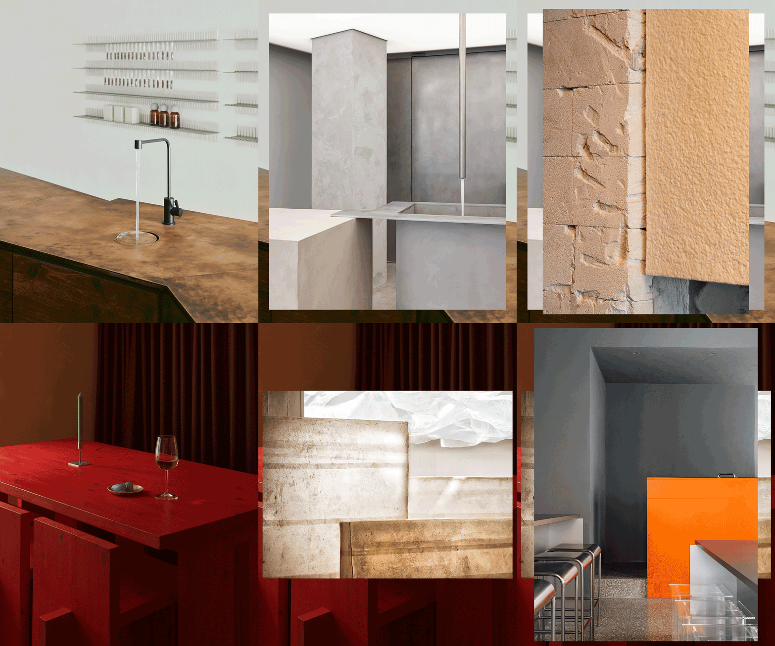
Continuing with the idea that minimalism is, at its core, a concept, Beanroom Coffee Shop in Taiwan’s Taipei City by Waterfrom proves this through the ideation and creation of their shelving system that treats the product as decoration.
Set within a serene space that emits a generous sense of purity, these cabled structures are super clever and cool and can only be described as top-shelf stuff. The simple suspension and gridwork arrangement of cables means that an extensive range of coffee beans can be displayed in this super minimalist space at any one time, without impeding on the aforementioned serenity. Oh, and the furniture is eloquent, elegant and maybe even a little extravagant.
From the window to the interior, the store evolves organically through consumer engagement and interaction with the product. Genius.
Ape Yakitori Bar in Newcastle by Prevalent.
When it comes to doing things right (read: good for the environment), Prevalent knows what’s up, and their design of Ape Yakitori Bar in Newcastle is no different.
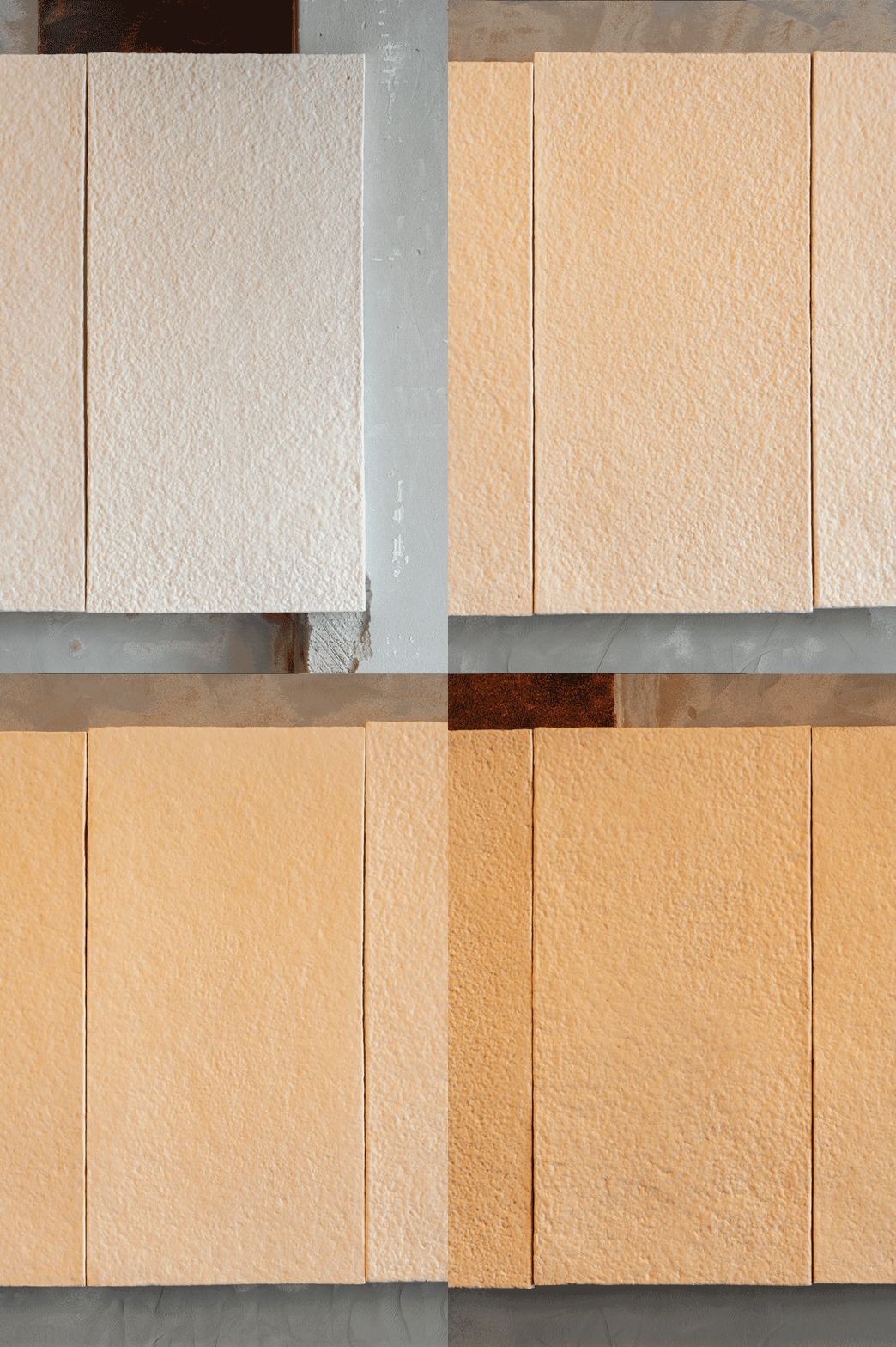
This carbon-neutral space is centred around the idea of the hearth, the centre of the home, and owes its name to the ancient Ainu Japanese word for fire, Âpé. This is clear the minute one enters the space, as you are welcomed by the vast shapes suspended from the ceiling, emitting an amber glow with a warmth that rivals real fire. But this is not the central element that drives the space; no, the real hero is the use of carbon-neutral or negative materials and doing so sparingly to begin with. Texture and depth are added throughout this decidedly minimalist space, not covering up the existing (considered a waste of materials), as well as visually raw elements such as sleek stainless steel and muted fibre cement to create unity throughout the aesthetic.
El Fant Café & Bar in Helsinki by Yatofu Creatives.
In a design experiment on the potential of local production, Yatofu Creatives designed El Fant Café & Bar, which sits in Helsinki’s Torikorttelit. This project aims to infuse creative energy into Helsinki’s 18th-century old town while exploring the potential of contemporary Finnish design.
The interior celebrates the use of local solid pine from Northern Finland via custom furniture. Young local craftsmen from Puutamo and Paja&Bureau were enlisted to bring the concept to life, giving rise to a relaxed and contemporary atmosphere for people and ideas to gather around food, coffee, and wine. Custom furniture made of solid Finnish pine and galvanized steel pieces delivers a harmonious clash of materials and textures. Through close collaboration with craftsmen and a minimalistic approach, Yatofu discusses and explores new local sourcing and production possibilities, blending contemporary design with traditional materials and methods.
Let’s Pastrami Cafe in Lisbon by DC.AD.
It’s simple, really; the colours are orange and grey, and the materials are stainless steel and perspex. Minimalism is more conceptual than anything, and DC.AD have got it down pat.
The play with transparency and light drives the space, with its strong and sensible use of stainless steel, alongside an overall dusty grey palette, the pops of orange lighting immediately elevate it to a fun space that speaks to its menu of pastrami sandwiches, wine and cocktails. On the other hand, the restroom is riddled with black tiles and appears to be a boxed insert into the space, the illusion further adding to the sense of fun. In one word: cool. And that’s the epitome of minimalism, too.
Noir Mardi Mercredi Store in Seoul by Studio Unravel.
This project by Studio Unravel is all about light. The space doesn’t beg for attention, as it quietly succeeds at curating clean lines, a minimal baby grey colour palette and quiet punches of black stools, frames and appliances.
The real moment here is the abundance of natural light and the supplementation thereof with one continuous LED ceiling. Throw in a couple of mirrored columns, and you’ve got light bouncing around like a customer who has perhaps had one too many coffees. Of course, the central sculpture that is the spiral staircase makes a name for itself as well, as it punctures the grey space with a Shou Sugi Ban-esque render, one that can be identified in each of the smaller stools dotted throughout the space.
Deokboon Korean Dining & Grill in Seoul by Flymingo.
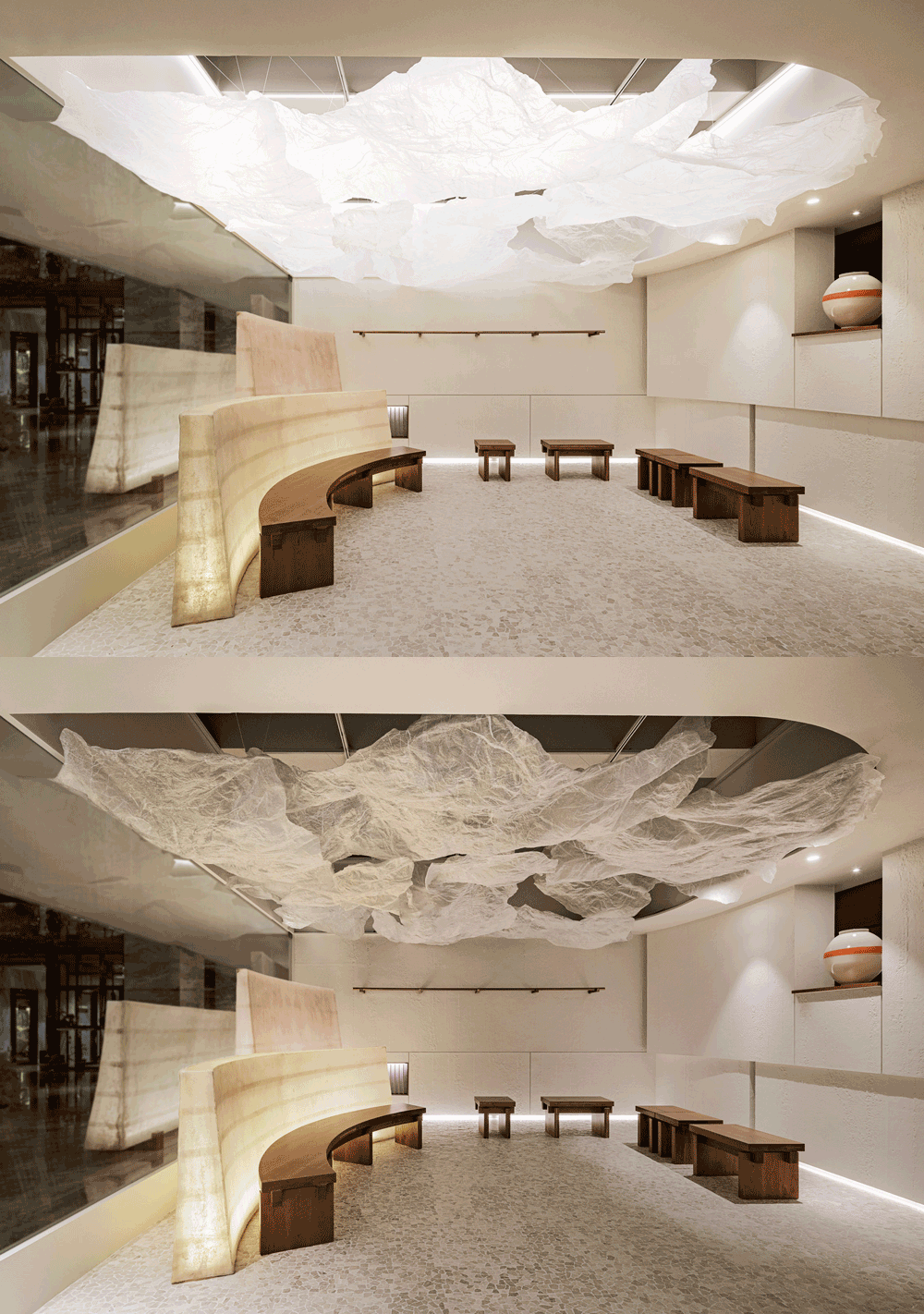
Resin-like furniture, cloud-like lighting installations and glass-like fruits and spices; these are the elements that make up the structural whimsy that is Deokboon Korean Dining and Grill. The Yin and Yang of the space is captured very directly through its light versus dark aesthetic.
On the one side, you have a space that looks like an artist’s impression of heaven, to be exhibited at the next Venice Biennale Arte. On the other, a dining room that suggests Casino Royale, with a darkness that feels almost warm in its quiet envelopment of light. What’s fun here is the walls of suspended resin tiles that house a variety of fruit, spices, seeds and pods. Minimalism here means a curation of a range of materials, textures, colours and uses, all in their simplest forms. Nothing here has been overcooked (and I’m not talking about the grill).
[Photography credits as noted.]


